The Reality of Fantasy session at UX Week 2010
August 27, 2010
Originally hosted at http://www.uxweek.com/pages/52177 which is the transcript of Mark's presentation from https://www.youtube.com/watch?v=Ep4nLFjEu20
It's gonna be a little bit of a difficult act to follow with what Chris and Nathan were talking around, and there's a lot of crossover with what I do. But I'm gonna approach this from a very different angle, as one of the people who actually create this stuff for film and television.
And I've gotta admit, this is one of the most feared talks I've ever had to do, because generally I'm talking to Photoshop artists or After Effects artists and motion graphics people. And this is the first time I've actually had to do it in front of a group of UI/UX professionals, and so it feels like I'm lining up for my execution here, so...
[Audience laughter]
Generally, it's very hard to describe what I do, and I dread social functions because the first question you always get after somebody - you even introduced your name is - anybody?
Response: What do you do?
What do you do? It's never what you like or who is your favorite Muppet.
[Audience laughter]
It's always like, "What do you do?" And I struggle to do this, so even my mother has no idea what I actually do. And I actually worked out a way in the end to try and describe what it is, and it's essentially - I'll just say, well, you know, when people are using computers, and they're tapping away, and there's like a couple of beeps, and the little mouse clicks, and all of a sudden it just flashes up on screen, and you see this one thing. They say, "Oh, yeah. Somebody does that? Why would they do that?"
But of course, people know the other version of this as well, which is more like, you know...
[Audience laughter]
And they're two clichés that are used a hell of a lot, but there's very good reasons for their existence in films. And what I'll do is I'm gonna explore some of the work that I've done here and then actually set it in the context that you'll recognize based on you doing proper UX work, as far as you have requirements, stakeholders, and design process, and delivery; you actually have to deliver a job.
But to kind of play into this and show you some of my background, what I'll do is I'll play my last showreel I created that has a collage of some of the work that I've done over the years.
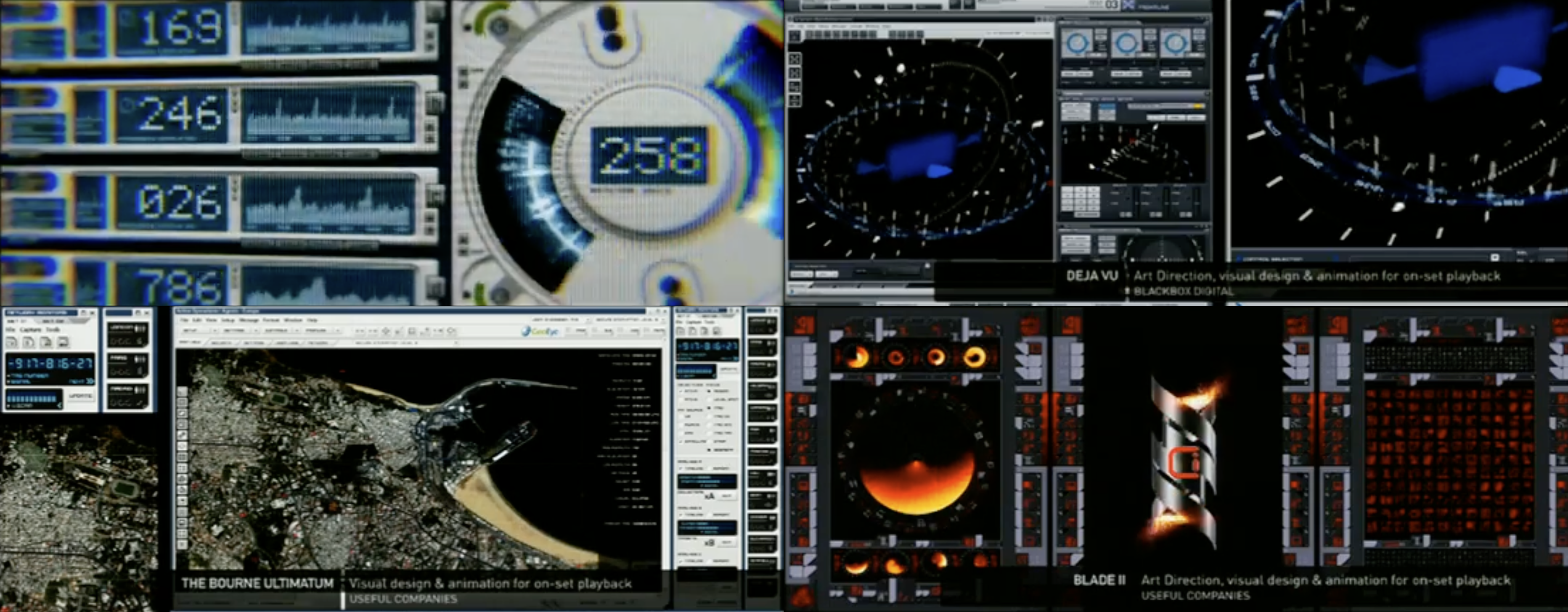
Now, that's a little collection of some of the film I've done over a period of about 12 years. And it is - one friend is described as "beautiful junk."
[Audience laughter]
And it's always something -
[Audience applause]
We've always really struggled to define what you actually call this stuff, and it's like, is it screen graphics, or is it screen interfaces, or - there's no real good term for it. A couple of years ago, I started using one particular term, and it seems to have kinda stuck. And of course, you're probably familiar with the idea of GUIs. So what we actually create are FUIs.
[Audience laughter]
And they can be generally referred to as fantasy user interfaces, and it's kinda started to stick now. When you mention the word "FUI," people actually think you're not actually insulting them or something.
But the one thing that - and the great criticisms that keep coming up about a lot of this stuff and how we actually do it is, is it really just about looks? And there is probably no group such as yourselves, other than maybe Slashdot forum members, who watch this stuff with such a critical eye.
But without context to something and understanding some decisions that are made around something, that eye can be really easily deceived, 'cause despite the gaudiness and general unreality of a lot of the FUIs that get created for movies and TV, there's really good reasons for why they look the way they do. And despite some of the similarity of purpose, visually, FUI has to GUI work and interface design work, there are actually massively different requirements, and it's the requirements that define how this stuff looks and works. And irrespective of how insane it can sometimes look compared to the real world, certainly once you know those things, you can start to get a grip on them.
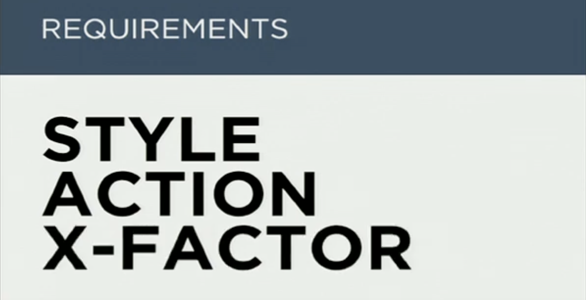
So what are those things? So there is essentially three major requirements for anything, so one of them is style. It has to look a certain way, for a certain reason. The next one is action. It's gotta do something, and it's gotta specifically apply in some way within the context of the film. And then, unfortunately, the third requirement is what I call X factor. So these are the hard-to-define factors that you get into anything. So I'm gonna look at each one of these things and go through some of the ways I've applied it within my work, and also a couple of small examples from other people's as well.
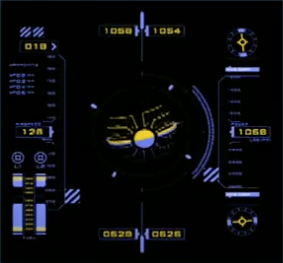
When it comes to style requirements, so why do they look the way they do? And it all depends. This requirement comes from the nature of the film. Is it realistic? Is it a sci-fi film? Is it realistic but kind of a little bit quirky, like, say, Mission Impossible, where the actual base part of it is very non-real. Mission Impossible doesn't exist, so you can push these things a little bit.
So first is just realistic, and most of the time you don't even see these interfaces in films. They actually melt away. You're so used to seeing this day in, day out, that you just don't spot them at all.
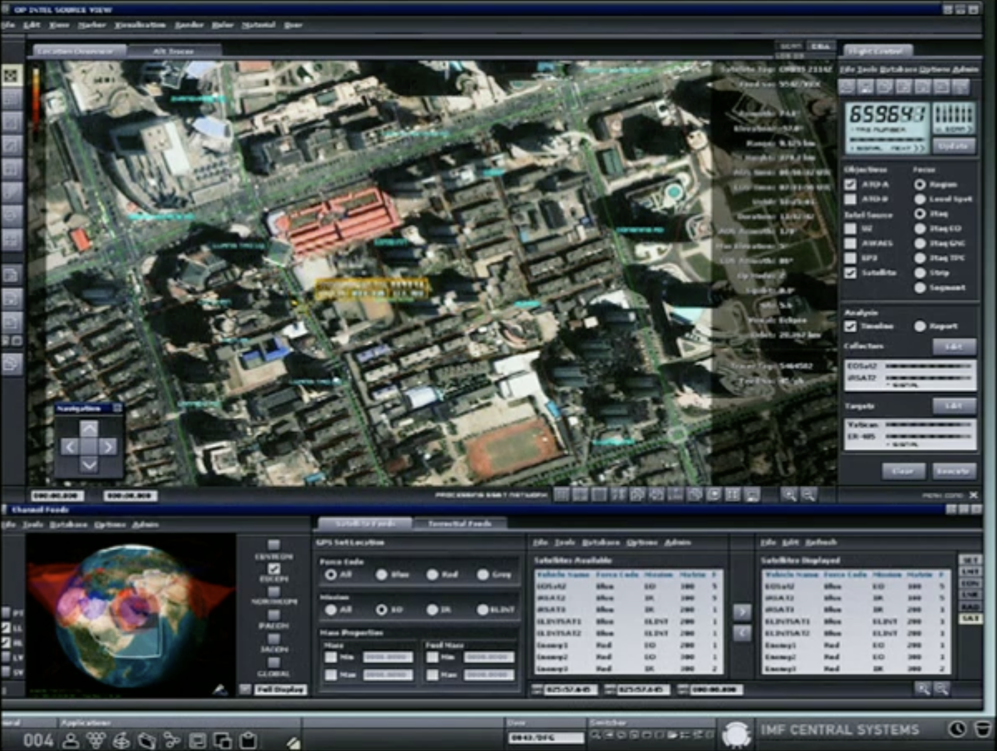
And then a couple of examples of this. As soon as I show them, though, you're gonna be going, "Well, that's not very realistic." Even when you do realistic, there's a couple of things that you have to alter and change. I generally don't use anything that looks like OS X or Windows. And there's very good logistical and technical reasons for doing that; there's also diplomatic reasons. They would love their stuff to be in films, unless it's the baddie. And if the baddie's got it, they don't want it. They don't want their product represented like that. And plus, they wanna approve all the changes and everything else, so it's very hard to use realistic.
What I tend to do with a lot of this design is actually almost look towards more things like GNOME and open-source systems like Linux, and skin these systems, so they have the cues. All the design cues are there. All the buttons look like they work. All the iconography looks similar. And some of this stuff is actually sourced from open-source libraries that get used in real software. It looks familiar. There's nothing about that that could look kinda funky.
The thing that is unrealistic about realistic screens, shall I say, is that we tend to speed it up. We make it look like it's doing something, make it look like it's doing something really, really fast, because unfortunately, if you have a database in your system and you type a search term in, nothing happens. It waits. It's searching. But in a film, you're having to tell "this is what they're doing," so you have to call it out somehow. You have to, like, put a progress bar that zips along multiple times or whatever. You just have to make it look like there's a lot more going on than there really is.
But a lot of times you just don't see it. I've even tried the realistic to actually - we once had to do a set of 150 computers for an office scene, and we just tried to put this up on every single screen.
[Audience laughter]
And in the end, we got away with half of them.
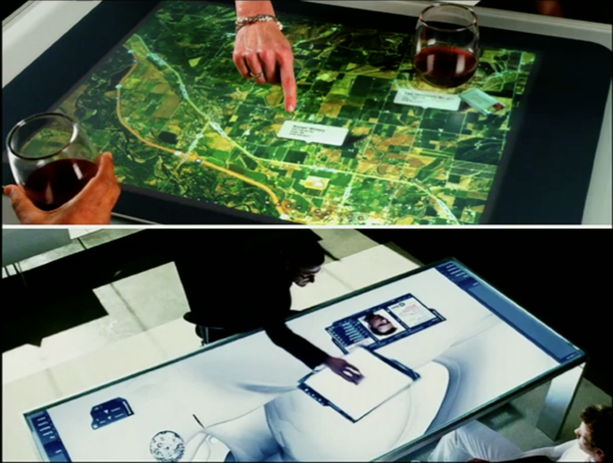
The next type is what I also call realistic, but this is where you can push it a little bit. It's still set in real recognizable worlds. It's in our time period. It's normal people doing normal things, but their machines might be more sophisticated. An example of this, like from Déjà Vu, it is a current-day plot - it's a current-day circumstance, shall I say. But the plot involves time travel. It involves looking through time. So the technology they have has to look different. It's gotta feel like there's something special and different about it.
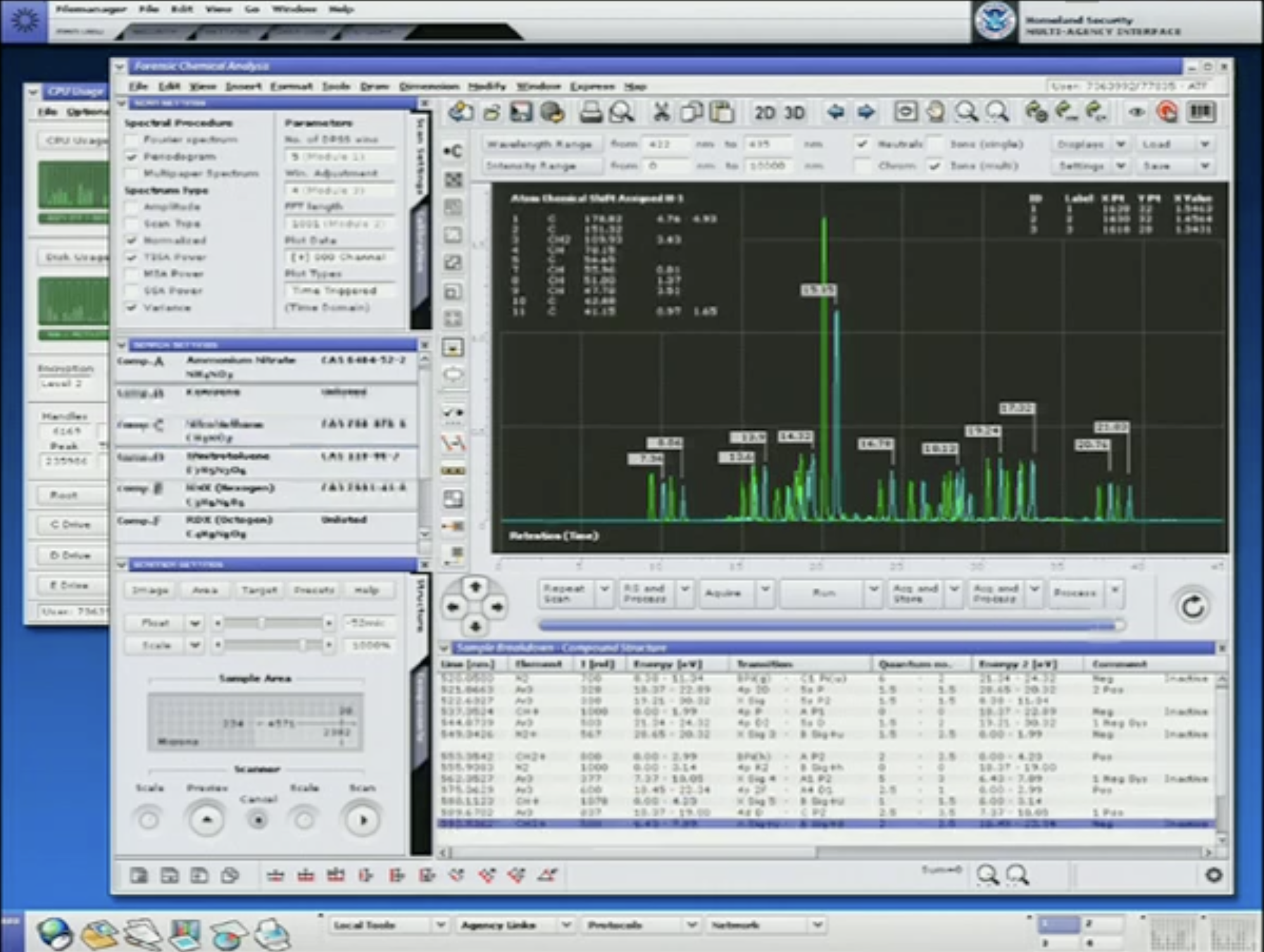
Now, the previous screen I showed you was also from Déjà Vu, but it was from a very different scene and a very different area in that movie, which was actually part of a forensics lab, which was just part of the regular ATF. But that has to look genuine and real, but in this section of the film, you have to convey that, actually, these guys have got something better. This is way more sophisticated.
You use essentially a lot of similar visual cues, with buttons and things like that. But it looks more polished in some ways. Design-wise, it looks like it's been thought about and laid out a little bit more. And it's the same across the whole system. We actually create an OS for this kinda thing. Even for full-screen work, all these elements are actually reused and retasked across a whole set of areas. This was actually in the original reel, right at the beginning of the big wall screen. This was across that entire thing.
But there's also areas in - they're the sorts of realistic stuff which at first glance you think, "Well, this is completely unreal." So screens done for Children of Men. Now, this is areas where you start to get into futurism. And I love doing futurism, but there's gonna be a whole lot of people who will throw shoes at me or something when I say it, but it's generally not that difficult a job, because most stuff evolves. It doesn't change radically. Things change very slowly over time.
OS X looks wonderful now. It's still a window, and there's a mouse, and there's buttons that close that window, and there's icons in there, and there's folders. And 30 years on, it's exactly the same. It just looks better in some ways. And there's a whole many more refinements to it now, simplifying it.
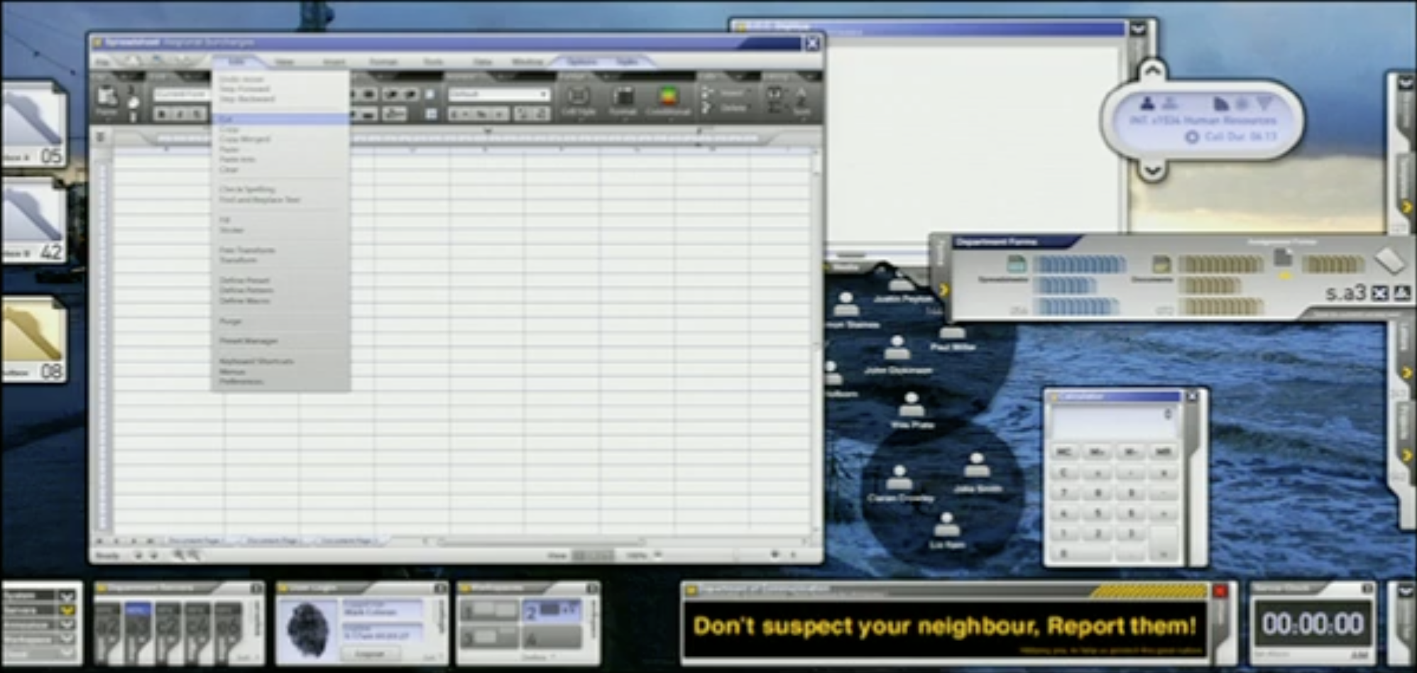
But things evolve. They become slicker. Even though for this particular film it was set in 2027, technology froze in 2010. So the idea was to use almost like a Windows 7-type look and feel to stuff, and even the spreadsheet is based on Excel, which was a prototype. I think they beta'd it at the time. This was two years before it came out. But you use those kinda cues from that kinda thing to make it look like it's set in a realistic period of time.
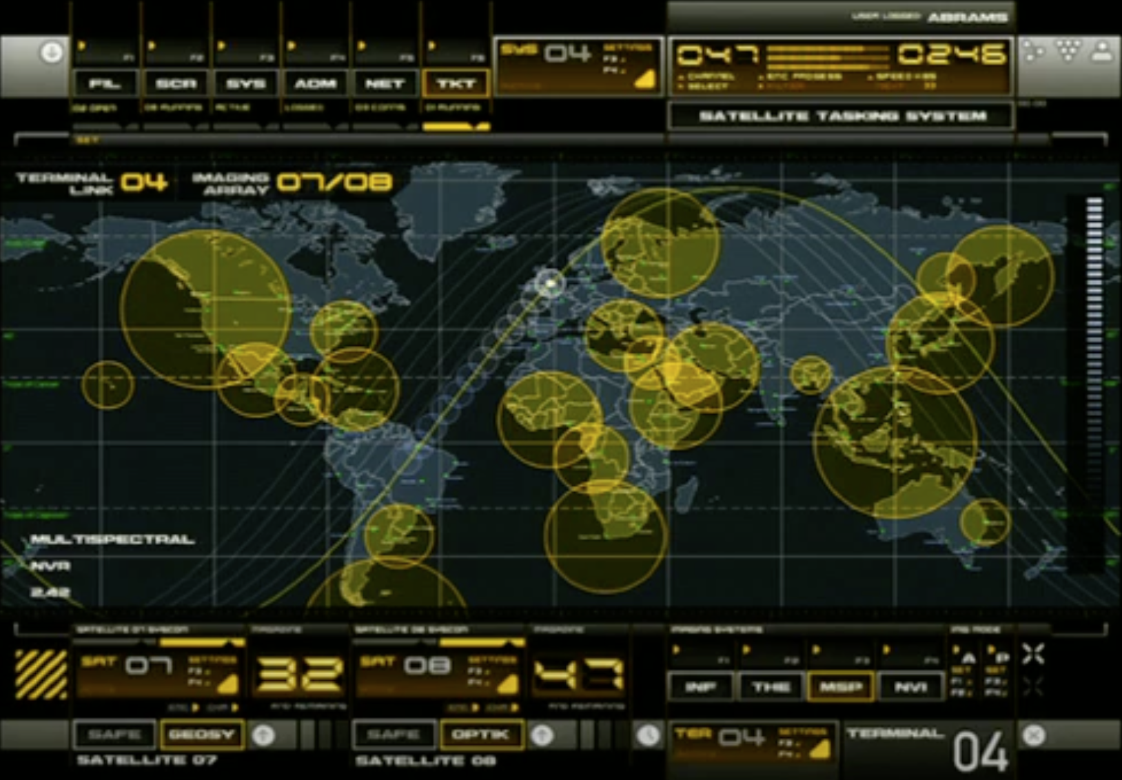
But oddly enough, in realistic stuff, it can go horribly wrong as well. So this particular screen was done for Mission Impossible. In fact, the entire Mission Impossible complex all has this interface on it. And did some really nice sophisticated design work for it and actually based it all off military devices. Military devices tend to be one task. They're set up to do one thing. Low color; very, very basic.
And it just didn't quite fit in to the sort of look and feel that the director was wanting for this film. And he had these reference photos and said, "This is what we want it to look like." And they were actually from the CIA, and there were some CIA systems, and it was IRIX from about '93, yeah. So I thought, "Yeah, that's what you want. That's what you get." And it is kind of altered a little bit to just keep it something - a bit more punch in there.
But then talking later with the military advisor, which seems to be complementary with every single film they do these days, he looked at the photos and laughed. I said, "Yeah, they're 15 years old." That's the clearance time on a lot of this stuff. Instead of having the current-day system, which is generally - looks pretty much the same as what we use, it's actually a lot older.
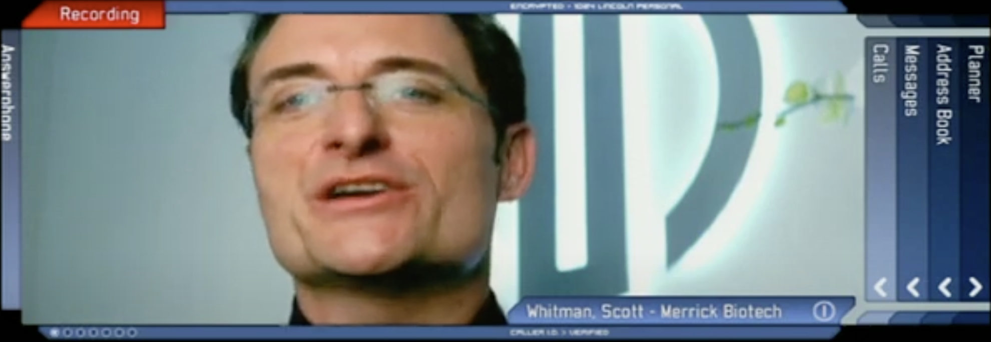
But also in realistic as well, of course, we're now used to having devices that operate as applications, so even an interface for something like The Island, which was like a communication device which is displayed on a piece of glass, and even though it's sci-fi, we can actually still use some of the same cues, so I'd actually class this as a realistic type of thing.
The third area of style is what we affectionately call "fluff."
[Audience laughter]
And you have a free range to do this kind of work. But the real irony here is, this is the hardest stuff to do. You still have to use a lot of design cues from the real world and yet create something radical and different. And that can be really, really hard to do because, generally, anybody who works in design knows that the tighter the limitations on what you can do really pushes you to do something really good. But with this kind of area, you can do almost anything you want.
So for this kind of thing, for Mr. and Mrs. Smith, it was taking, like I said, the military devices, and these were some of the design cues I used for the Mission Impossible originally. But everything can get used again somewhere.
The next one is actually the concept for Mission Impossible originally, so this is what it was supposed to look like. It's building upon existing devices and the way they look and work, and even keeping cues like using old LED fonts. And one of the tasks you actually have to do is recreate a lot of this stuff and actually make your own fonts.
But to keep the little design cues like that, to give the impression of "this is a device that does one thing, and one thing only," and then populate the set for that kinda thing. But sometimes it works and sometimes it doesn't, but everything gets reused. This formed the cornerstone of a lot of concept work I did for Call of Duty, one of the games, so all the cut screens that were done in that are based on the same sort of thing. It's good to recycle.
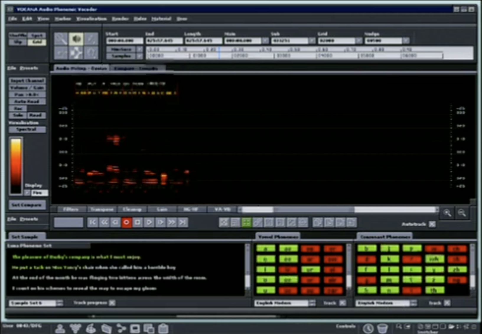
And then another example, even though it's fantastical - it was actually a medical device used in The Island. But this was actually taking cues from things like audio instrumentation, so a lot of audio software has this thing about reproducing the physical device to be used. We took it - in a medical context, people have medical devices they use. Why not do a similar thing? 'Cause they're using it on a screen rather than having some abstract kind of device. They can just use the almost identical device on a display.
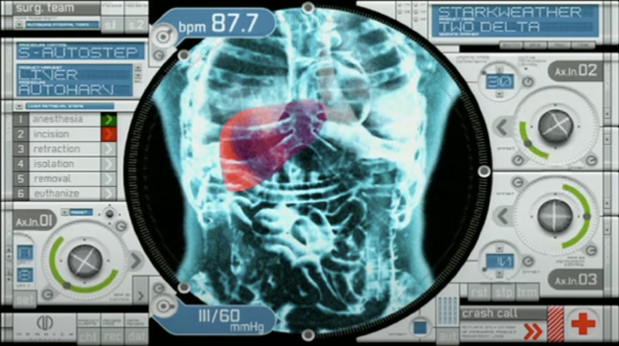
Even though this is still fluff, I mean, it's like it tells a little bit of the story there. They're looking at this guy. The part of the story is they're gonna remove his liver. You see this up on screen, and it focuses that target on there.
This actually shows another little point here with the next screen, 'cause this other one is also from The Island, and each screen is specifically tailored for its environment. So the screens themselves and the FUIs actually are tailored to particular sets, and they can actually be used almost as characters. These are defining looks to different things.
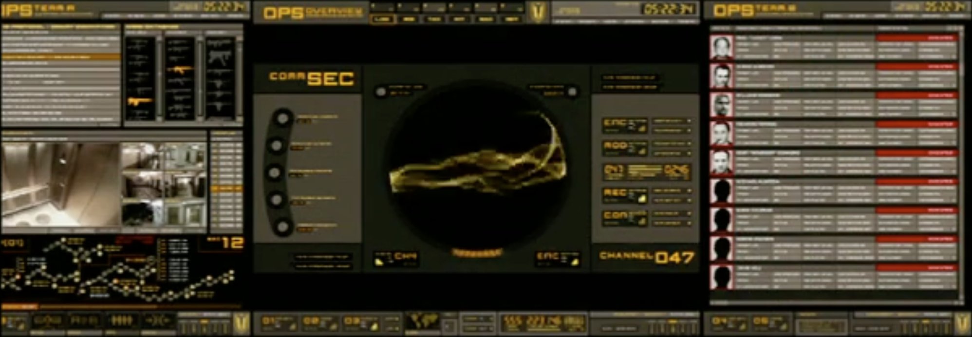
From the very same film, even though this is the medical area, there's a group of mercenaries, and their whole interface is radically different. But you'll use that consistent sort of look and feel for everything that they have. It also allows people to visually separate, so if you use the same system on everything, it all blurs together. It allows us to actually make things stand apart.
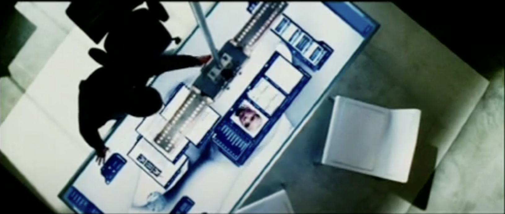
The second big area of requirements is actually what we call the action requirements. And what does this stuff actually have to do? The first part of this is the most basic, and it's just set dressing. Everything that's gotta populate a set, everything that is on a set, there's a decision about why that stuff is there, how it looks, and how it's gonna work.
An example from the previous film we talked about, The Island - this was shot just when the set was empty; everyone was at lunch. But it's just to make this thing look like a control room, so the vast majority of this stuff you never really see up close. It really just makes this place and gives it a certain sort of look and feel.
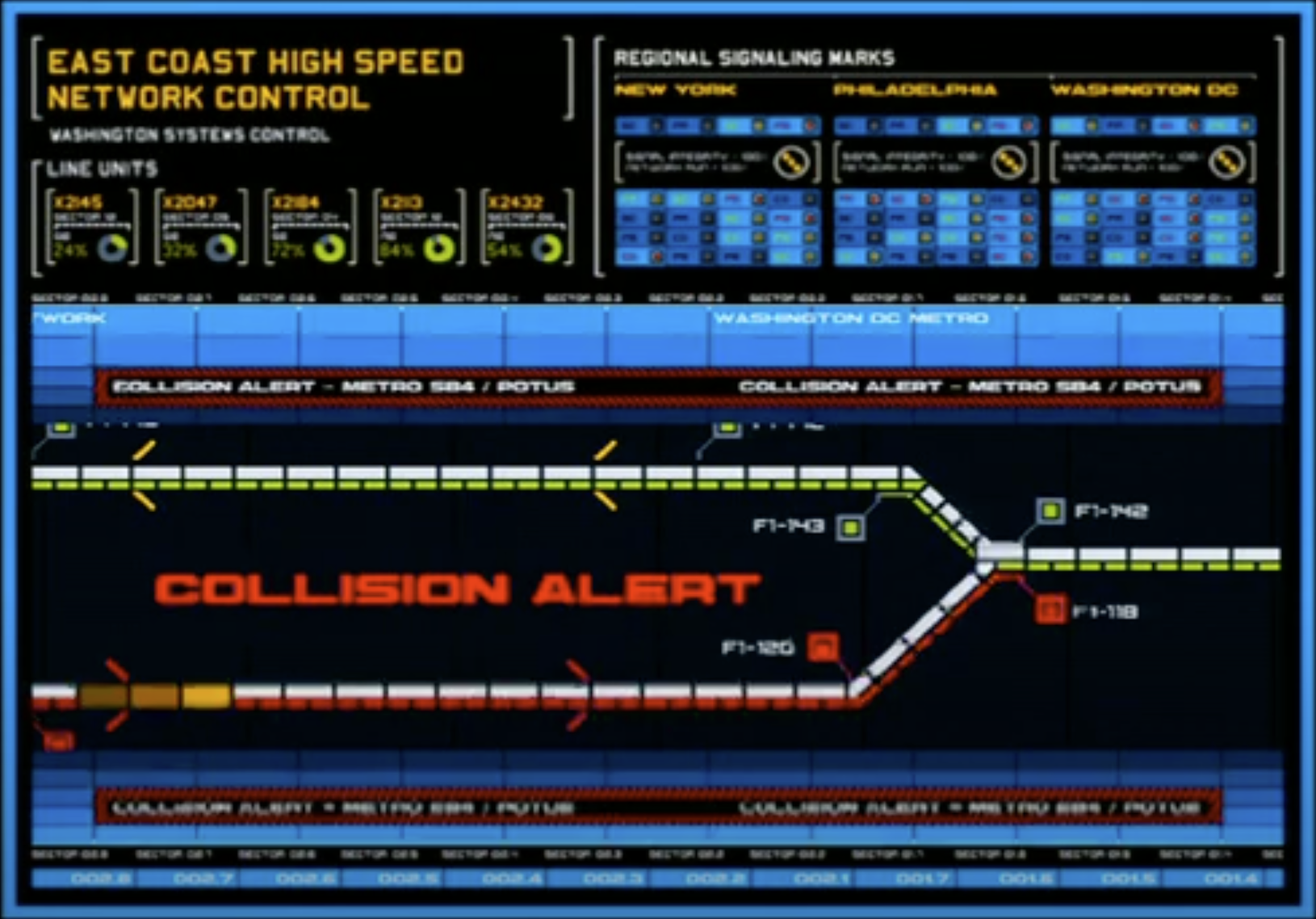
The second requirement within actions is what we call location linking, and this is where you start to really use screens to some good effect in movies. You have something going on in one place; you have something going on in another place. And to just imply that from an edit in the movie can be very, very difficult.
You'll always notice that they're either on a phone or they're talking to something, and the two people are always doing the similar things. But even if they're cutting back and forth, you can see these two are doing something with each other. A lot of the times, this actually gets used as well in films, so people will be at a terminal. They'll be looking into another place. This particular example was from Mission Impossible III. It's got that lovely interface again.
And another example from xXx 2. Some people are somewhere in a control room. They're talking to the guy who's on a train, and it's continually cutting between these two things. And I think in the end cut, this actually was cut completely. It's not even in the final cut. They're giving instructions back and forth, but you get big red letters. That's what we need.
[Audience laughter]
But it tells you what is going on, so just using pure film and pure visual effects doesn't always do it. Sometimes they wanna call this out and smack you around the head with it to actually tell you what's happening.
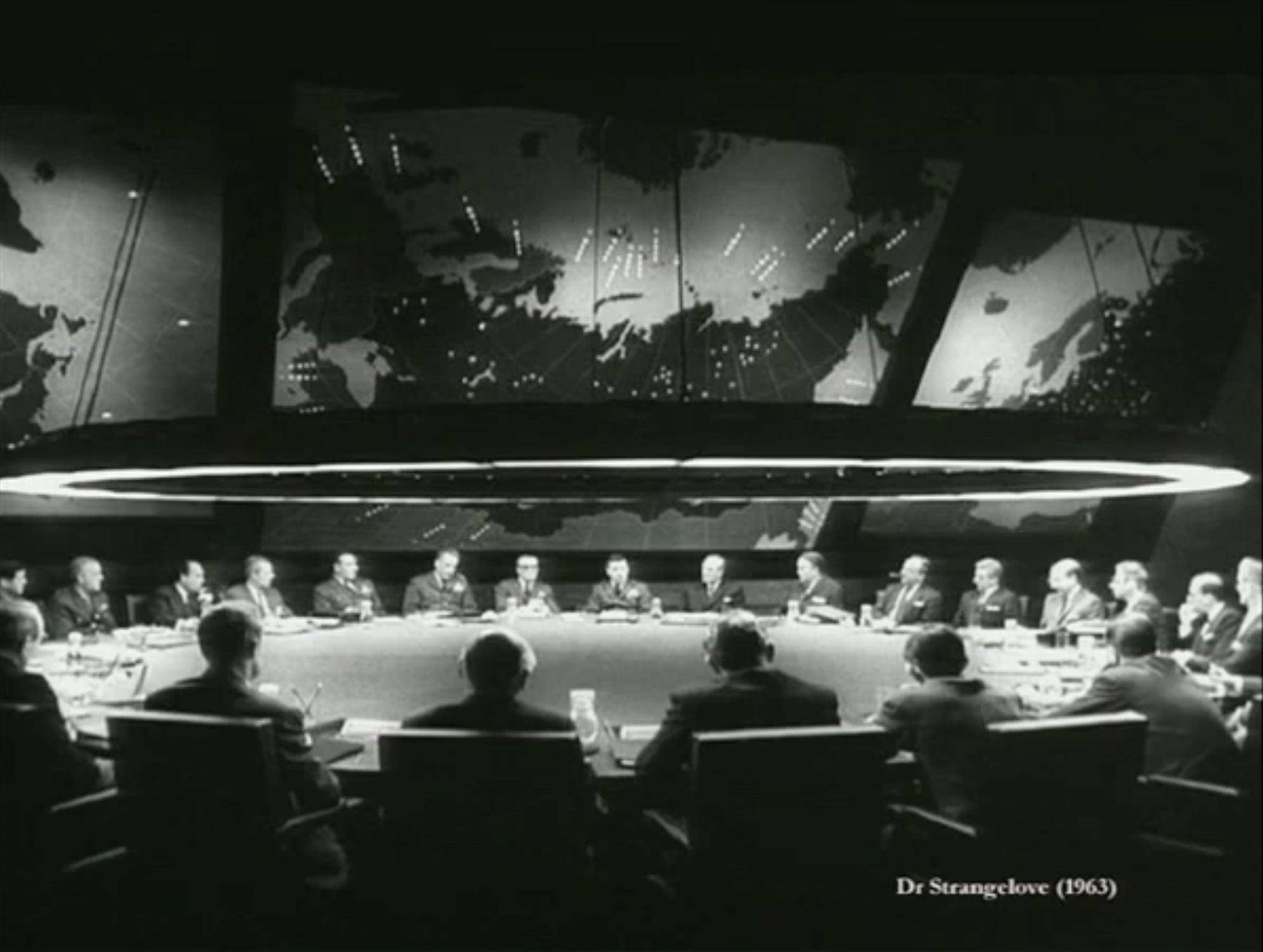
One of my favorite examples of this is what I thought - I used to think, until about half an hour ago - was one of the earliest examples of screen graphics in films, and that was from Dr. Strangelove. This is one of the best examples I've ever seen of location linking between two places, and there's only two real big scenes in this. There's the war room and there's the bomber. There's the base thing as well, but most of the action happens between these two places. And yet all the time you are linked to them. You see those - that bomber is always on that screen, and it's always there. You're connecting different things back together, and it's being used as a really powerful editorial device.
The third part of this is what we call story insights. Now, people do stuff in films; there's a story to tell. Sometimes it's tricky to get across what is actually going on. The people who now use visual effects, they'll try and do narrative, but it tends to get a little bit boring. It's like reading the Dan Brown book.
[Audience laughter]
You have 15 pages about the history of this envelope that they found. And it just doesn't work; it will kill any film that you watch.
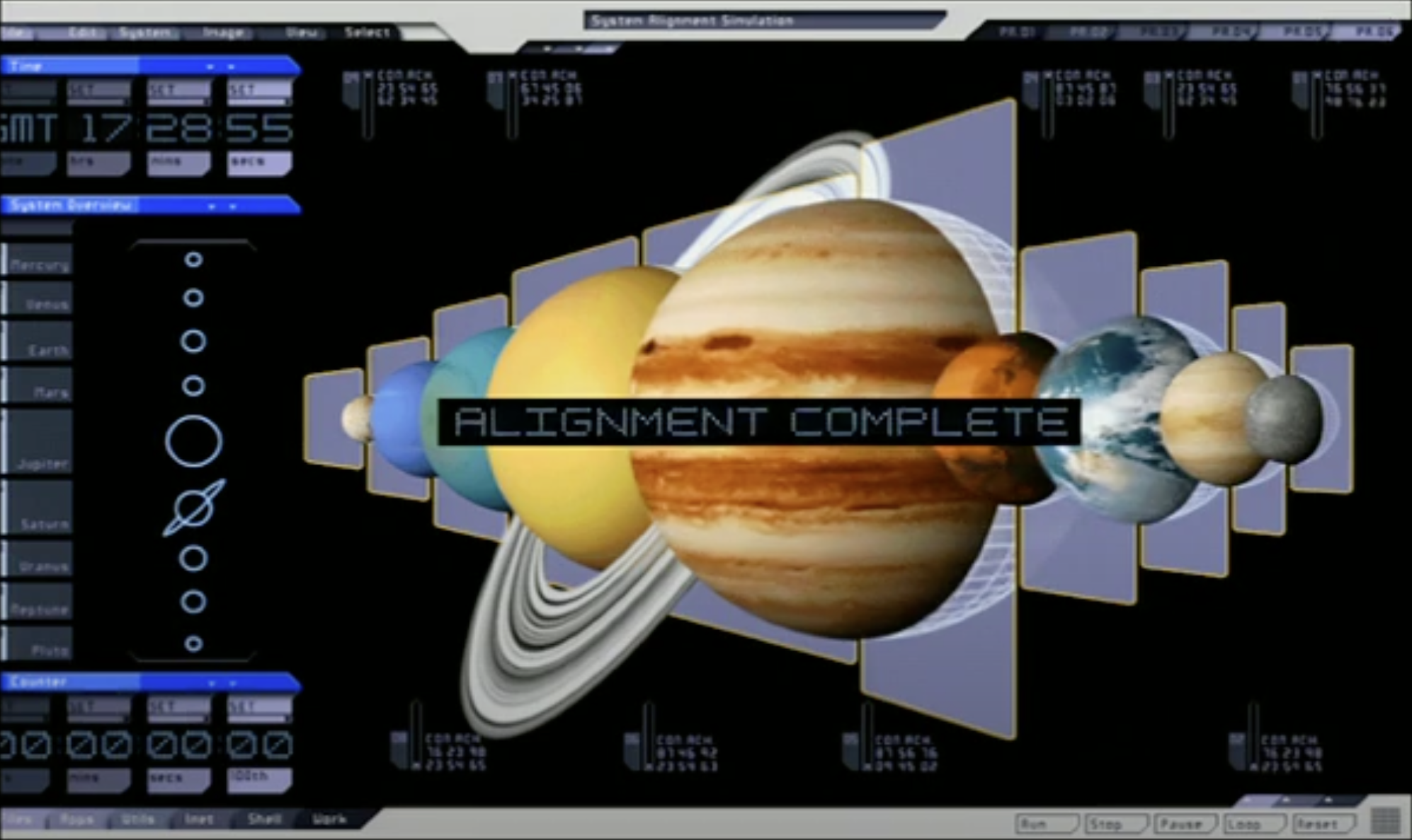
Sometimes they will do this talk, but while they're doing it, they'll call out a specific piece of action and they might even have a simulation on screen. This is from Tomb Raider originally, and a lot of the action's gonna happen because of all the planets aligning at certain parts, and they align in three different stages.
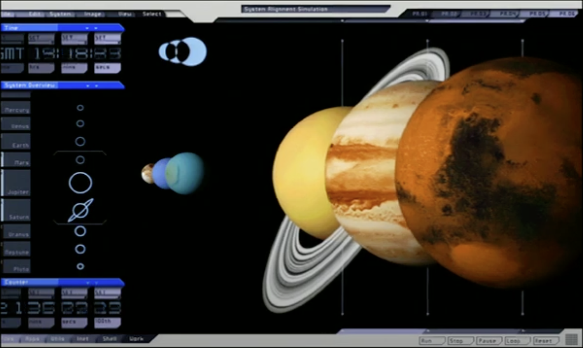
This was done just as an illustration, so as they're talking to each other about what's happening, you get this idea that everything is lining up. As a visual device, it immediately just tells people very quickly, "Oh, this is happening," and gets the piece of wood and hits them over the head.
[Audience laughter]
But they get it. There's no abstraction there or anything, so it becomes a lot easier.
Another area for this is for straight action. Something is going on. This is where you specifically pull out and talk about a key part of the story, and the screens are used to illustrate that. What I'll do here is I'll play the sequence, and what you're gonna hear is the audio cut from the scene, which I take that audio cut and then I animate and create the sequence based on what is going on in that background, using various sources of video and edits. So you can see and hear this.
Of course, you're gonna get cuts back and forth 'cause the live action here just goes on. Oh, by the way, those little sound effects that you hear, it turns out every editor has a CD that's been passed around with each other that has all these sound effects on them, and they've been doing it for almost 20 years. That's why every single film has the same sounds, so we can do this.
We'll use this to specifically call out actions and synchronize it with a cut that's going on. He's obviously not too happy about that.
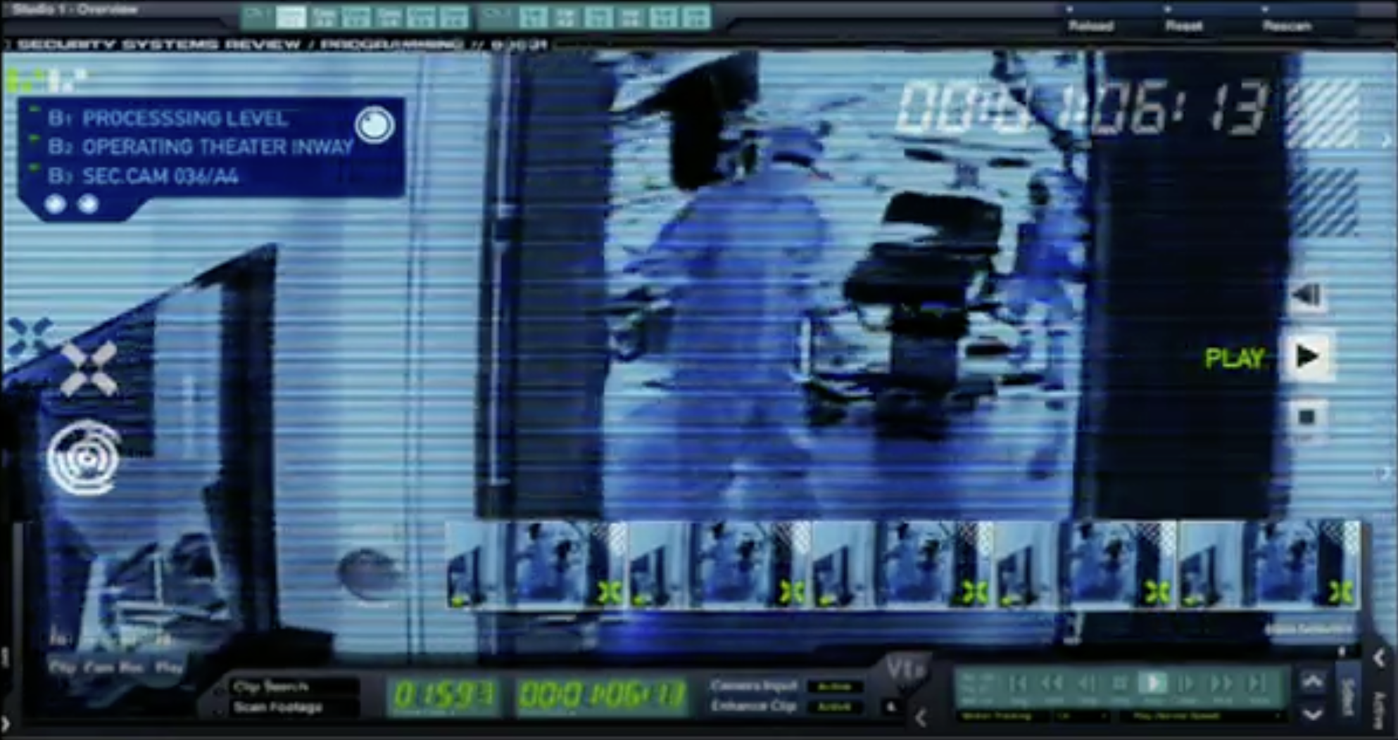
The next area, the last area of this is what we - doesn't fit into any particular slot, and it's a very different application for it. This is where you actually create either the way something - how something is looking at something or heads-up displays, so it's the ways of looking into the film. This is more of a visual effect than an interface, but it implies certain actions going on.
This example here is from Alien vs. Predator, to use a lot of the design cues that were based from the original film, from the set dressing, from the design of the creatures and everything. And this thing slides in and has an analysis thing on it, so it's doing something; it's looking at something. It just keeps those cues in there. It's not quite in the same category, but it's close. Though the irony is, the specification I had for this in the final film, they forgot about the soundtrack down the left side, so it got slipped off completely.
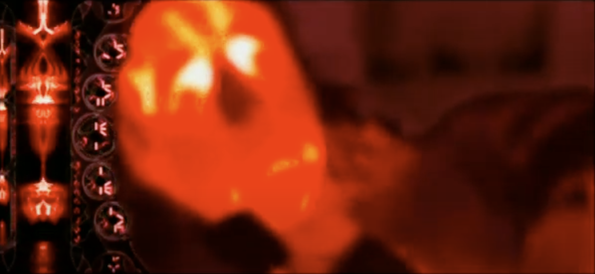
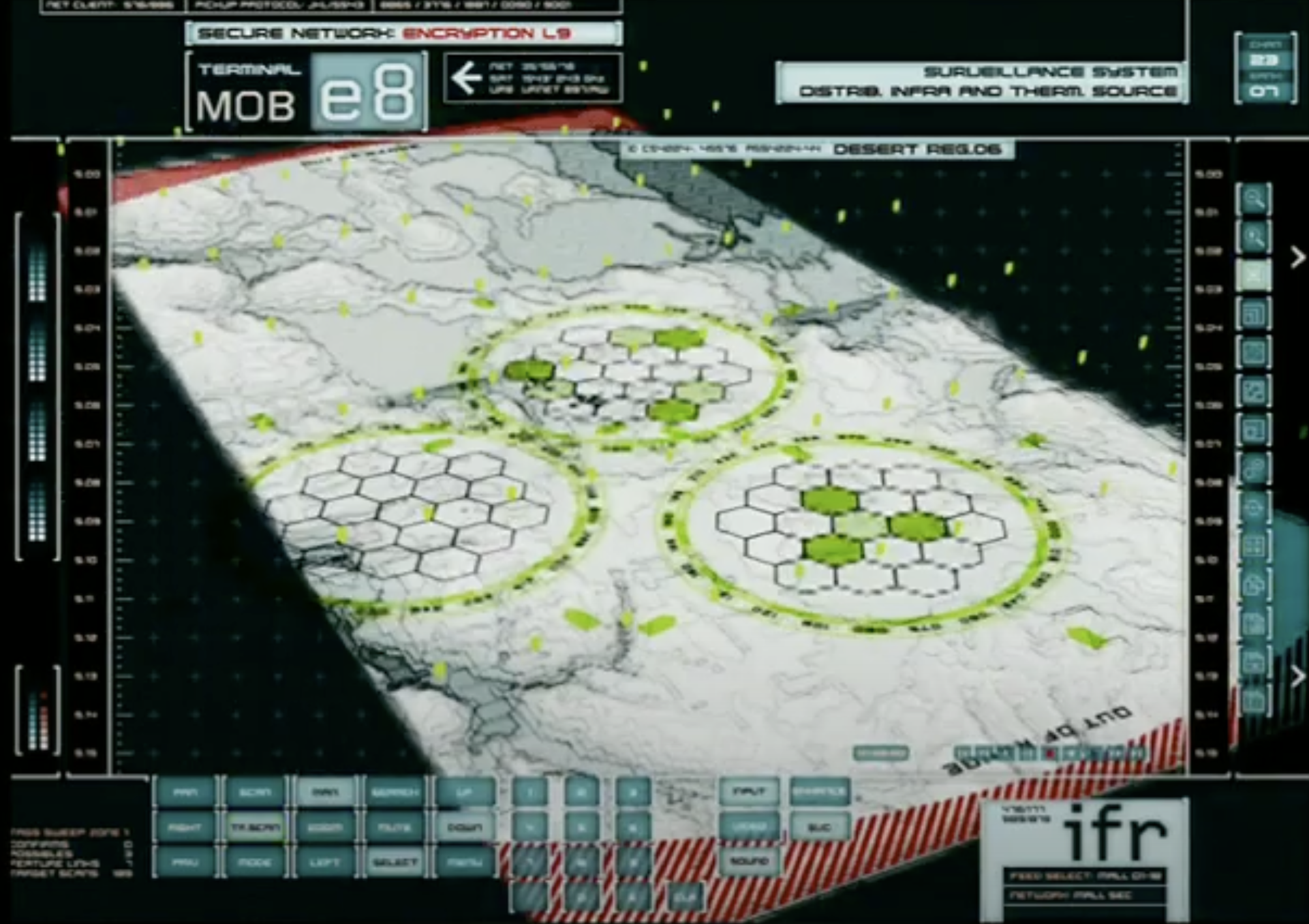
Another example from The Island, which is things like scopes. This is the wet dream of a sniper, a scope. And what do you want on there? What can you have on there?
Another short example from The Island, which was just the heads-up displays on the flying bikes, so these are just small things that you create as part of the product that goes into the whole film.
And then, of course, you get into what you might regard as the X factor. If there's one particular problem we get designing stuff for film, what do you reckon it is? Anybody? People. People are the hardest part of anything. The stakeholders in a project are generally the most influential part of the project, but they also bring a lot of their own ideas with them as well.
[Audience laughter]
What you have is all these groups of people on a set that want some input in some way. They bring a lot of these preconceptions and expectations, and usually always at the last moment. This is the last thing they're thinking about in the movie or on a TV show. It's like, "Right, we're doing this, we're doing this, we're doing this. Oh, what's going on that screen?" Two minutes before shooting usually, yeah.
They're not bad at what they do. These are fantastically creative and talented people doing very specific things, and it's the last thing that they wanna think about. They're not good at thinking about that. It's the same as a CEO of any large company: they're not UX people. They're not designers. They go at the process in a very different way, but of course, they're making decisions about what you're actually doing, which can be a real diplomatic tightrope to walk.
It can be a lot easier sometimes for these people to actually use prior art in movies that they've already seen, or examples in the real world that they've already seen. This is a real irony about Nathan and Chris's talk is that it's probably reversed now. We're no longer going from sci-fi influencing, in some cases, what is going on in the real world, even though a lot of sci-fi reflected what those expectations and social contexts were. They'll actually go back to the DVD library and say, "Uh, yeah, we want it like that." It's like, "Okay, you do something like -" "No, no, I want that." It can be very hard for this stuff to actually now progress and adapt and change.
Of course, they have one priority in all of this, and this really comes up to what defines the overarching requirements of all of this stuff, which is why it looks nothing like the real world and why it doesn't work anything like the real world. That requirement is to tell the story. That is all that is there. Doesn't matter what it looks like, how it works; it's just gotta tell that story, and that's all that matters to the people making the movies.
If it hits those first two points in the major requirements, about style and action and what it's going to do, that's it. They don't care. It's done what it's doing. Get it out. When it's only, unfortunately, people like ourselves who look at this stuff a lot more critically and think, "What the hell is that?" It can be really easy to be really harsh on the artist who created this stuff. The CSI effect applies to more than just jury expectations in trials. It can actually apply now to expectations about what computers can do.
But those guys do incredible work. They're turning out a show every week, and a massive amount of work. And they have one thing: all they're doing is telling a little piece of the story using a screen. It's not an interface. It's not a computer. It's just a screen showing a piece of video, telling this is what happened. In that respect, they've done their job fantastically.
Talking about that, what I'll do is I'll just play this one sequence from The Island. It encompasses a lot of those clips and expands on some from the reel. But thinking about how those requirements and contexts work, you can probably watch this in a very different way and actually get something back and see how this kinda works.
A lot of the time, things that do the head thing, it gets reused a lot because you can also have very limited resources and media to use, so you kinda have to make do.
This really ties up a lot of those pieces and how they go together. You have action; you have things telling the story; you have things linking locations. It's a really good example of all the different areas and how they're applied or get used.
But of course, there's one thing missing from that yet, and that is deployment. Everybody's gotta deliver something, whether it's a piece of software or it's a site, it's an application, whatever. But the way this is done might actually surprise you, and we never, ever create an interactive application. It just doesn't exist. It is impossible to do in the time that we have. You may have two months to create 200 of these things, so you have to knock several of these things out every day. You cannot create interactive applications at that rate.
What these have actually done - they're actually all faux animation in them, so they're all faux interactive. Everything's actually done in Photoshop and then animated in After Effects, but it's animated in a very, very particular way. I will actually use my mouse. I don't have a cursor, and I'll click here, click there. And I use the thing on screen.
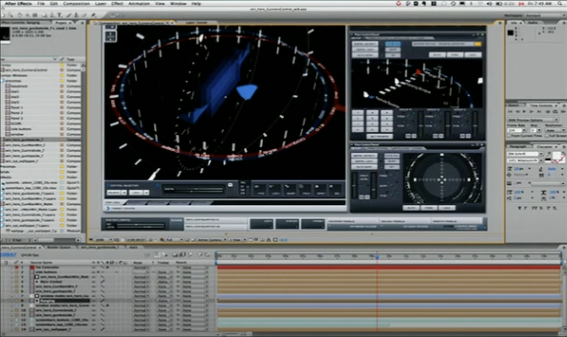
Then also think about the stages of this. It does this, and then it has to hold here and loop for a while, and then it goes into the next stage and then holds for a while. I can create these cues for it. And all I actually render out is a single animation, and actually using graphics format which I first used about 16 years ago, called just Graphics 256.
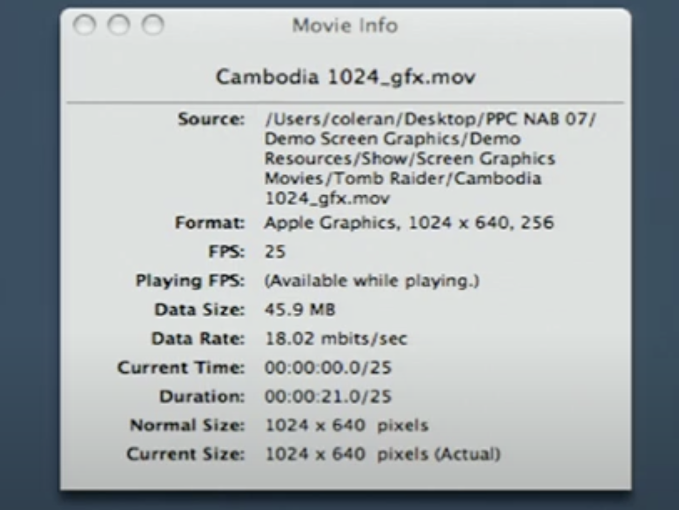
All of these things you see are all 256-color movies. When we actually apply this stuff on set and move this stuff around, it's tiny. It's like a megabyte, 2 megabytes a movie. A lot of those that you've seen are actually tiny movies. Using this horrific old - amazing piece of technology, but it's a usability nightmare, which was DeBabelizer.
[Audience laughter]
It is the most awful program to use, but extraordinarily powerful, so we use that for converting these movies down.
And it's also not, as you probably imagine - you see the special shot and the extras on DVDs and movies. There's all these blue screens everywhere, and people will track these shots in After Effects. It's very rare that you actually do that, and if you do that, there's a failure somewhere else, either to deliver the thing for it or it requires footage that's being shot out of sequence, so what is required on there has not yet been shot.
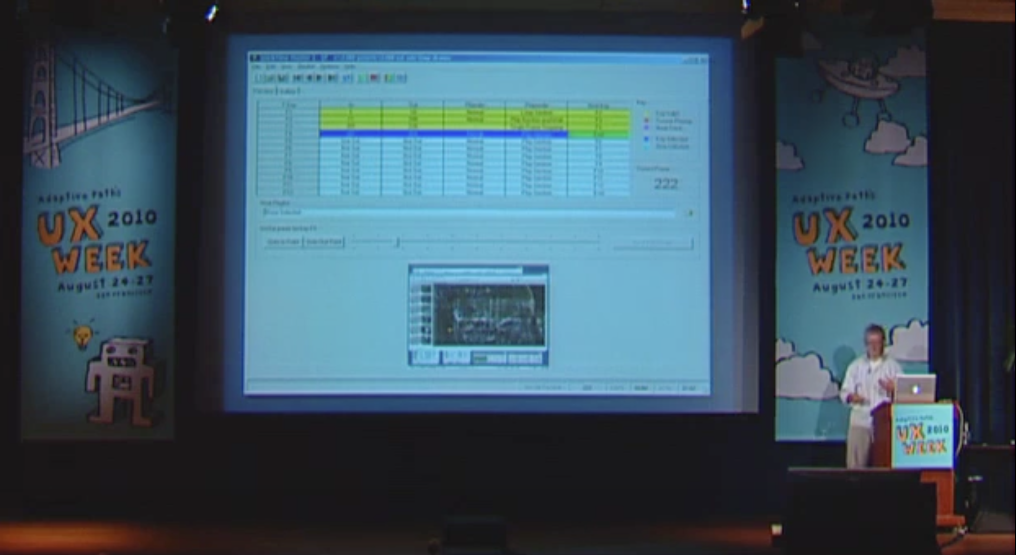
Generally, all of this stuff actually goes and gets played live on set, so everything looks and feels like it's actually working. All of these movies are up there, and we will queue them up and we'll have our own separate control room and a special piece of software where we can synchronize these movies and just put key frames on them. It's like, okay, from zero to 50, loop; from 51 to 100, next in the sequence, then go into the next loop. It's just take a single movie, and then you have to queue it on action.
What you see on set there is just the monitors. All the boxes are empty, because it is a nightmare for the sound guy. He will beat us with that big long boom of his if we bring a computer anywhere near a set.
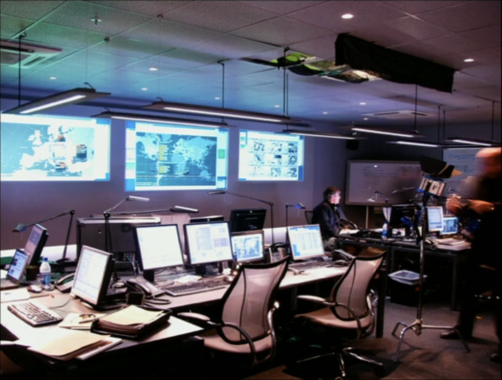
What we actually have is, right underneath this is - here. These are some friends, and this is our setup, and it's actually a mirror of the set above us. And we also have feeds from little video cameras we put all over the set. We have feeds from the video assist, and we watch the action. The actual actor/actress, cues, action, whatever's going on, we watch that and then we do the interaction. We don't let them touch anything. Actors have to concentrate on - they're quite capable, I'm sure.
[Audience laughter]
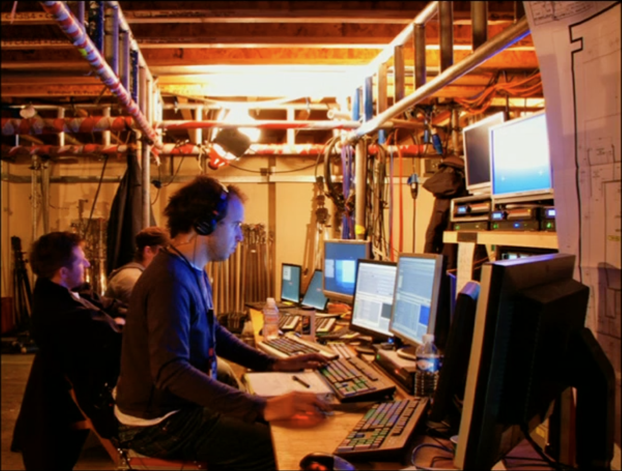
It's just they're concentrating on a performance, not using a computer, and that is gonna take them out of it completely to do that. So we'll be there as - my buddy Adrian is here - on a key, ready to watch this and then hit that key, next sequence, so it just looks like they did the action themselves. They can hit anything they want, but we make sure it was just that and they didn't hit the button twice or do something stupid with it. But this is the thing, so we'll load the movie up, set the range of key frames and put it on some keys and functions.
But quickly, where do these ideas come from? And this is really where it ties back to what Chris and Nathan were talking about. How do you create this stuff?
Generally, it doesn't exist in a bubble. We don't just make this stuff up. I look everywhere at the real world for a lot of influence and a lot of ideas and things I can use that inspire me for these things. There's not irony here. This is the other way around. The Surface came out about six months after The Island, and strangely enough, The Island got credited for it, but of course, that's not true. Surface computing's been around ten years before that.
You take a lot of these ideas from labs and universities and companies and garage projects that people are doing every day, but you try to take it and then just make it look like it works. You take all those rough edges off it; you make it look casual, almost, the way they do it, and really just make it sort of everyday.
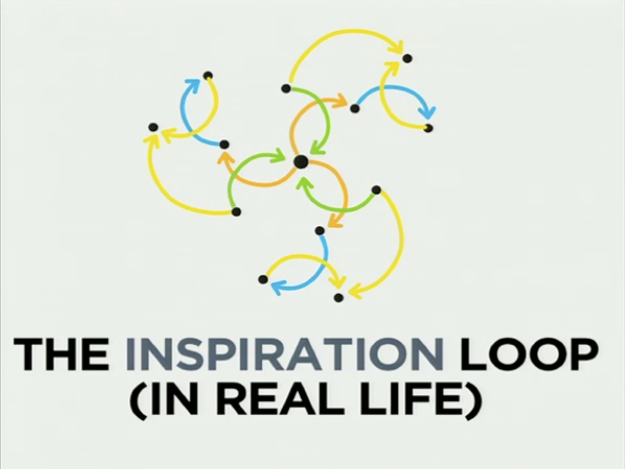
There's a couple of frames of something I lifted from a little short talk I did on copying. And it was the idea of where does your influence come from, why is copying a good thing rather than a bad thing, or how do you copy well. It was actually a talk of the inspiration loop.
You just do a straight copy of something, you end up exactly where you began, and it's not generally a good thing. But if you're inspired by something, you'll eventually end up with something slightly different; you take that one point and end up somewhere else. But of course, you have, like, multiple sources continuously, so you never do that, and in real life it's more like that.
It's actually good to copy, as far as I'm concerned. It's actually good to be inspired by real stuff. Somebody else has already made the mistakes. Stand on their shoulders and make it better. Don't ever be afraid of doing that. But as long as you make it better and don't just copy it.
But of course, I had to have this one shot I have in here that was exactly the same as the previous one.
[Audience laughter]
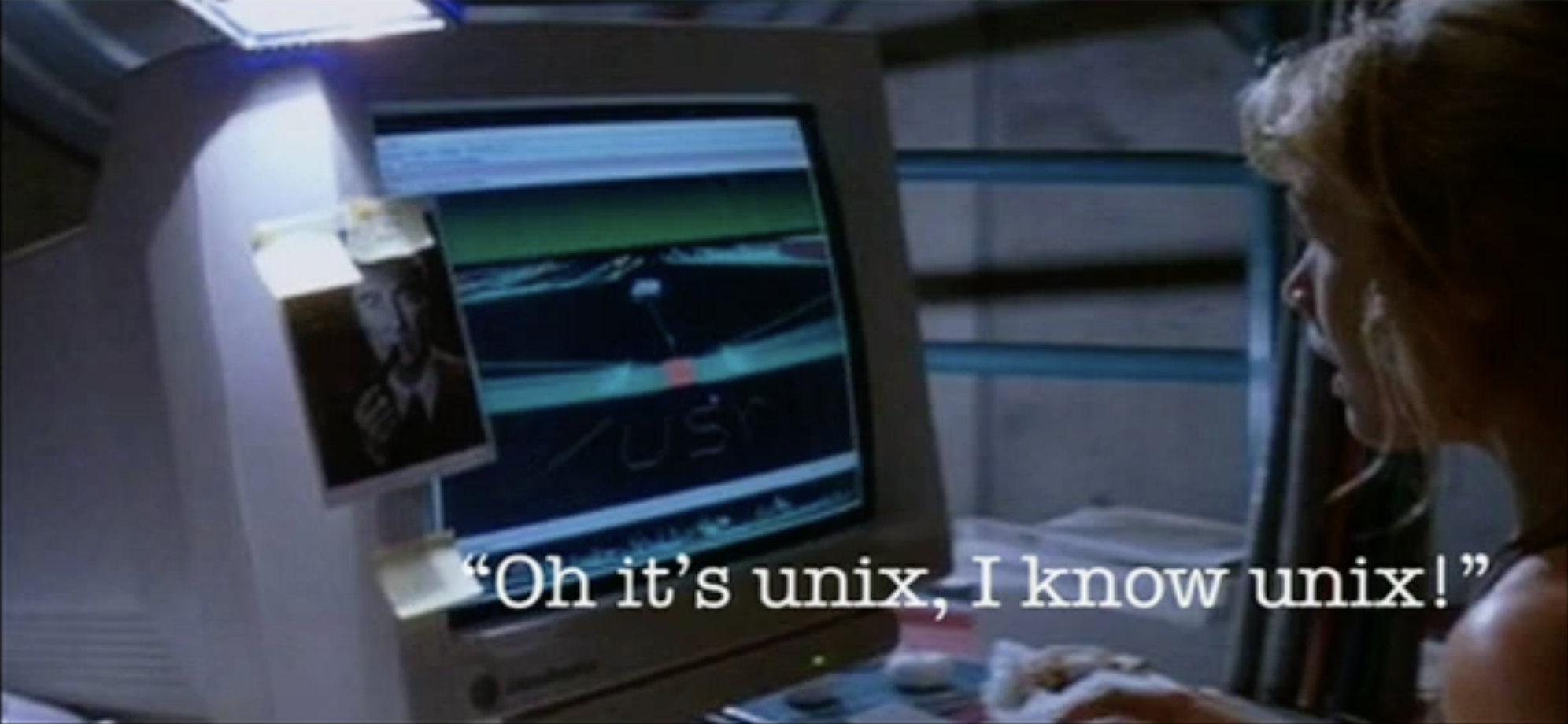
All I really wanted to say is, don't be too harsh when you see this kind of stuff, because without the context of what the stuff is there for and what it is doing, especially when people go, "That's the most unrealistic screen anybody's ever seen in a film," when it was actually real software. So it was called fsn [Mark here said NView instead] and it ran on IRIX back in '93, and it was a 3D file browser. But the script editor, that was a whole different thing.
Thank you. I hope that gave you some insight.
Peter Merholz: Thank you. There was one question on Twitter that I wanted to ask you, which is if you're willing to reveal any Easter eggs in your interface designs that we could hunt once we've left here.
There are. There are, actually.
[Audience laughter]
There's lots, but unfortunately, they won't mean much to anybody who is not somebody I know, because one of the greatest problems you have is populating, is content. Whenever you had that lottery thing in The Island, they're all people I know.
[Audience laughter]
All the names and everything. I get information, and I also - a lot of you have mug shots, like CIA mug shots, whatever; you have to flick through a library. They're all people I met at conferences and various different places.
[Audience laughter]
Peter Merholz (to the audience): So maybe you can get 'em to take a picture of you, and you can be in his next film. Well, thank you very much, Mark.