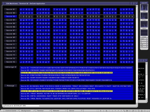
A question asked recently on Twitter:
@Coleran I'm writing an essay on the colour blue in science fiction interfaces. You able to help me? Read make it so, but look for more info
— David Mahoney (@davidmahoney) March 7, 2014
Make it so is an excellent book and does go into some depth on the subject of why blue is such a predominant color in many film interfaces. I had the privilege of reading a draft of the book and it was a chapter that I did take small issue with. Not for being incorrect, the book being a post hoc thesis and analysis and gave even myself an insight to the subconscious influences and reasoning taken for granted when doing that work. The primary issue was that it was perhaps a less academic reason than speculated.
To break it down as to why I thought blue was so common…
1. RGB Displays
Most generic interface content on set is filmed in-situ, working on real displays. Set lighting is bright and has a tendency to wash out screens, in particular LCD monitors. Using one of the primary display colors looks stronger and more distinct.Green is associated with old technology. Red looks too left-field or militaristic, leaving Blue. Commonly used in real UI and pretty familiar. This leads to point 2…
2. Lighting RGB Displays (or not)
As noted above, lighting affects displays, washing them out. It also has another effect. One that you do not see until the scene(and display) is on seen on film. In-between the range of effects and artifacts inherent in film chemistry and set lighting, displays come out looking blue, even when the content not actually blue. It is the visual difference of looking at your monitor at 5300k and 7200k. On-set you try and color correct for this but on numerous occasions, people looking at the display in situ, complain that the color is wrong, looking very warm. Despite attempts to guide them it occasionally gets turned off. Some people just don’t bother color correcting at all. Of course, if the majority of the design is blue, the effect is marginal and no-one notices.
3. All in your head.
I read once that we essentially mutli-plex the color signals that enter the eye and that blue always gets there first. One of the reasons we like it so much and why it grabs our attention. More reading on that subject here
4. Persistence (of Prior Vision)
People commissioning work in film are no different that those commissioning creative work in any other domain. While there maybe great clients who ‘get it’, most are as harried and stressed as anyone else, dealing with subjects that are out of their every day comfort zone, complicated and inherently risky. The most common fallback and way of reducing risk is to reference and bias towards prior art. It reduces unknowns to them and is perhaps why certain styles and themes persist.
To wrap it up, one of the most common phrases any of out team memebers would use coming back from a review meeting
M.I.B. – Make it Blue
