Continuing the series on the support for high-DPI monitors in Swing applications and having covered the big areas in the first two entries (alignment and borders), it’s time for miscellaneous stuff. There are quite a few less-defined areas that should be addressed by a look-and-feel that aims to provide complete high-DPI support. Let’s look at some of these.
The first one is linear elements, such as separators, titled borders and focus rings. Like the borders, these should be painted with a stroke width proportional to the default desktop font size and DPI settings (or the font size of the specific component). In addition to painting, these settings affect the preferred size and insets of the corresponding elements. Here is a screenshot of two titled borders under 22pt fonts:

In addition to titled borders, the look-and-feel should also scale such elements as focus ring stroke width, dash length and dash gap. This is illustrated in the next screenshot (second slider has the focus):

In this screenshot, you can also see an additional linear element – slider ticks. These are also scaled (length and thickness) with the font settings. Furthermore, the entire slider painting is scaled as well, including the track height, thumb icon, track border thickness and thumb icon thickness. All of these affect both the inner layout and the preferred size computations.
An additional area is cell renderers. There are quite a few of these on core Swing components, including lists, trees, tables and table headers. While some applications use custom renderers (which should be written to support high-DPI monitors), the look-and-feel is responsible for providing the default renderers. These should properly compute the insets and set the borders (for focus indication, for example). Here is a screenshot of a table under 22pt font:

As you can see, everything is scaled here, including the renderer insets, header renderer borders and table grid lines.
The areas mentioned in this entry are just a sample. There are many more, including vertical components (such as sliders and progress bars), menu items, right-to-left orientation.
All the screenshots in this entry have been taken under the latest 4.1dev drop of Substance (code-named Lima). It is scheduled to be released in mid-November, with a release candidate scheduled for late October. You’re more than welcome to download and play with the latest bits, as the development is going to move much slower towards the feature freeze in two weeks.
A mildly unexpected announcement on Jasper’s blog (a little earlier than hinted previously) that leads to this page on JDK 6.0 project unveils the first binary drop of Consumer JRE, or “Java SE 6 Update N” as it will be officially known. While the previous name was very catchy, the new name is very bland and generic (really, you couldn’t go with a letter more sexy than “N”?)
The naming aside, we finally get a chance to play with Nimbus. Surprisingly, the full class name is sun.swing.plaf.nimbus.NimbusLookAndFeel (why not in javax.swing?) There are a few visual glitches, as expected from early access drops. Here is a sample screenshot of an internal frame:
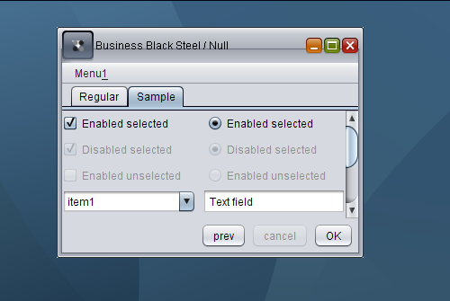
As you can see, while the desktop pane has a nice gradient image, other visuals still need to be improved, including the title pane main button, the title pane horizontal line and unselected enabled checkboxes and radiobuttons (they are marked as disabled and do not respond to mouse events).
It’s not clear how the community should report bugs. The feedback section points to the Swing & AWT forum, while the changelist shows that internally created bugs use the ancient and not so trustworthy bug parade.
A few months ago i wrote about Mac-specific font policy in Substance look-and-feel that makes all Substance-powered Swing application pick the correct font sizes when running under Mac OS. In the past few days i’ve added a font policy for Gnome desktops (Ubuntu among the rest), following a bug report opened by one of the users.
It pretty much follows the implementation of GtkLookAndFeel in JDK 6.0, querying the gnome.Gtk/FontName and gnome.Xft/DPI desktop properties to honor both the default desktop font size and the custom DPI setting.
Here is how an application looks like when it runs under Ubuntu 7.04 with the latest 4.1dev drop of Substance:

Here is how the same application looks like under TSCu_Times font with base size 9 and 144DPI setting (the default is 96DPI):

Note that you don’t need to change anything in your application – Substance handles the font size computation on its own. In addition, it also picks up the desktop anti-aliasing settings when it runs under JDK 6.0 and later.
The first part of this series showed that it takes a little more than vector-based painting to make a look-and-feel resolution-independent. That part discussed two of the basic building blocks of high DPI support – alignment and baseline. This part is going to talk about borders.
Going back to my original post on high DPI support in look-and-feels, here is a screenshot of an internal frame under Vista configured with 144DPI (150% original setting):

While the visual elements appear properly scaled (fonts, check marks, title pane icons, scroll bars), the borders are not; all the borders in this screenshot are still 1 pixel wide. While it appears OK in this screenshot (since most of the monitors are still running on 100’ish DPI settings), the borders will almost disappear under a monitor that has 144DPI as the default setting. Here is a screenshot with correctly computed border widths:

As you can see, all the borders are properly scaled, including buttons, tabs, scroll bar, text field, combobox, combobox arrow button and checkmarks of checkboxes and radio buttons.
In addition to computing border widths under high DPI settings, there are two additional points to keep in mind. The first one is that the border insets must match the border width. You can no longer return Insets(1,1,1,1) from getBorderInsets() method when the border itself is painted with more than one pixel. The second one is that under larger widths, you need to change the painting bounds of the border itself. Here is a screenshot of a checkbox menu item with the checkbox border painted at (0,0):

As you can see, since the border width is three pixels, the outer border rims are clipped (since the border painting itself is clipped to the component bounds). In order to properly paint such a border, you need to offset it to half its width:

This offsetting also affects the border insets, which now should be at least border width and not half border width.
The next entry is going to talk about additional issues that are specific to the support of high DPI settings.
