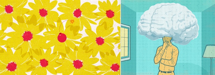
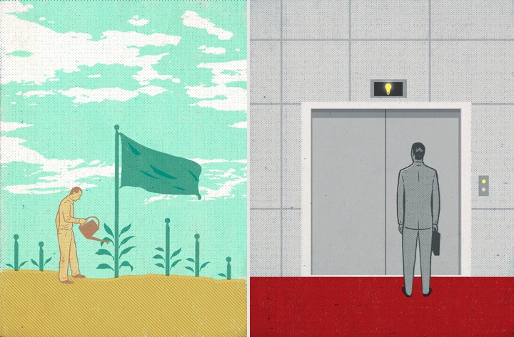
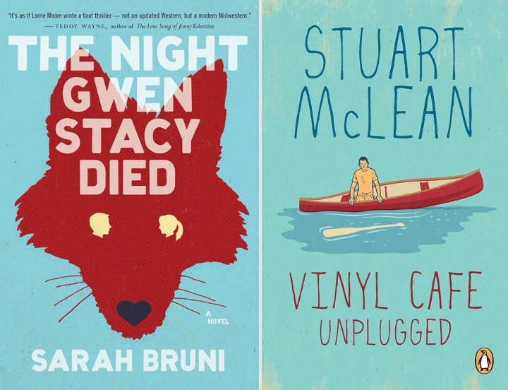
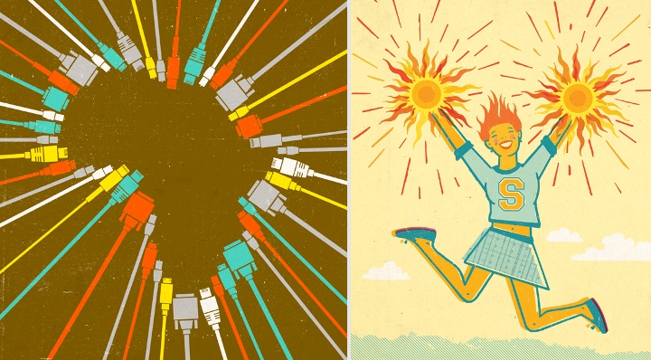
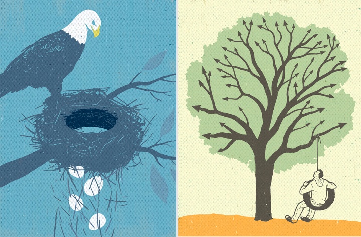
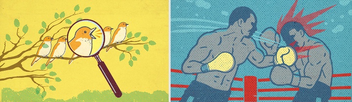
Continuing the ongoing series of interviews with illustrators, it is my pleasure to welcome the talented Dan Page. Dan’s editorial portfolio includes clients such as Time, The Washington Post, The Boston Globe, Forbes, Reader’s Digest and many others. Every illustration packs a powerful twist, with a unique, strong and expressive visual delivery. In addition to his extensive editorial work Dan has also illustrated a number of book covers, most prominently for the Vinyl Cafe series.
 Kirill: Tell us about yourself and how you started in the field.
Dan: I grew up in the suburbs of Toronto and went the regular route to be an illustrator. I had artistic talent growing up, went to art school (Ontario College of Art and Design), but never imagined an Illustration career at the time. Like many students, I simply gravitated towards Illustration from all the options art school had to offer. The course that hooked me was a third year Editorial Illustration class, taught by the late Jerzy Kolacz, an immigrant from Poland, and a respected conceptual Illustrator. Jerzy had a way about him, a master at crafting ideas, and inspiring students to think conceptually.
Kirill: What informs and shapes your taste and style?
Dan: My work is shaped by communicating ideas through images. I like to take a graphic approach. I love a good line drawing, playing with different textures or even now silhouetted shapes.
Distilling things down and not overloading a composition gives me the end result I’m striving for.
Kirill: Do you want to carve out a consistent and recognizable style, or are you willing to push and explore different directions as time goes by?
Dan: I love to explore and push things, it keeps things fresh and exciting for me. Exploring new techniques new possible ways to complete a final has become part of my process.
With technology you can make a few different finals up to the last minute of a deadline. This was not possible a decade ago, at least the way I would work back then. You needed to be sure of how you would approach a final with little wiggle room for changes. I’ve been Illustrating full time for over 20 years.
I know from personal experience that without pushing and exploring, surviving a long career is difficult. Creating new ways of approaching assignments is reenergizing. It makes work feel less like work.
Kirill: Your editorial illustrations seem to be about distilling the main subject into a single, powerful, thought-provoking idea. Is there any sort of organized process behind this, or more of a sudden bolt of inspiration?
Dan: Coming up with original ideas is the most challenging and difficult part of my process, but also the most rewarding. I wish it was easier since it’s always done under time constraints – the all powerful deadline.
It’s an unpredictable process. While I’ve experienced the gift of a sudden bolt of inspiration, I would never bank on it, but every day I hope for it! It’s usually old fashioned hard work and not organized at all. it could be a sketching process, researching subject matter, google searches, calling friends for insight, taking a break, taking a drive, grabbing another coffee, taking a shower, looking up past sketches… and then the a-ha moment! Immersing myself in the subject matter visually and intellectually, letting it soak in consciously and sub-consciously would best sum up this process.
Kirill: What’s the technical process? Pen-and-paper first, and then transition to digital tools?
Dan: Yes, pen and paper then scanning things into Photoshop, that’s the general rule. Along the way I may have an idea for something new to try. The technical end is the more predictable part of the process. I enjoy both the traditional and digital parts of this process equally, the combination of the two offer endless possibilities. I remember when my process was all traditional from start to finish. In retrospect creating art work then wasn’t as exciting compared to incorporating the digital element in my current work. This additional element eliminates the monotony of the process. Its like driving somewhere and taking the same route every time. I find that the digital process takes you on new interesting twists and turns all the time, yet arriving at the same destination.
Kirill: Once the magazine is published, do you ever wish to go back and tweak that illustration? Has it ever happened that you had what seemed to be an even better idea after the process has been completed?
Dan: Absolutely, I’m not satisfied with everything I’ve done. With all the different variables involved when an assignment is underway, the stars don’t always align. There is a collaborative element to illustration. My sketches have to be approved by Art Directors and Editors and my preferred idea may not be the one approved by the AD / Editor for whatever reason. You just proceed, and that’s part of the job. Getting a second and third set of eyes involved in the process can improve my ideas as well. I am flexible and have benefited from great art direction many times.
Kirill: How different is it for you working on book covers? How do you approach capturing a larger story in a single illustration?
Dan: It does feel different when working on a book cover, but I try to remind myself that it’s not. There is a throw away aspect to magazine illustration, if you do a bad illustration, it will be gone the next week or the next month.
Not with book covers, you put more pressure on yourself thinking they will be around for a real long time – you don’t want to screw it up. Plus, that feeling carries over to the book publishers, this is their baby you are working on, you can sense it in all your communications with the Art Directors. They want to make sure it’s just right. I try to just focus and keep doing my thing. I do find reading the whole book helps in the process, rather than working from a synopsis. On the other hand, I’ve done a number of covers for the author Stuart McLean and he’d rather I create an intriguing image that may compliment the title without reading the books or knowing anything about them. This has been very successful as well.
Kirill: How do you preserve color fidelity when the final product is targeting print media, such as magazines or book covers?
Dan: Amazingly what I see on my iMac usually is translated to print, whether they are RGB or CMYK files, it always seems to print without problems. I don’t have to do anything special to preserve it.
Kirill: You’ve done a lot of work for what used to be traditional print media. Do you see any changes that affect your work as the magazine and book publishers are exploring digital editions and a variety of smaller screens and different form factors?
Dan: I keep hearing there may be changes, I’m sure there will be but it hasn’t impacted my work at this point. I remember what I was doing when they announced on CNN that Newsweek is going all digital. It hit me that times were changing. I don’t foresee it affecting work flow, as media still will need graphics in some shape or form. I have done some assignments for digital use only, it seems like the transition is a slow process, giving graphic artists time to adapt along the way. But as for now, print is not dead.
Kirill: What’s the weirdest client feedback that you’ve received so far, if you don’t mind sharing?
Dan: It involves one of the most famous magazines on the planet and one of the most famous editors. It ended with a kill fee. I tried to push the boundaries a little and found out that there is an actual line that you can cross.
I thought I’d never work for them again, but I’ve worked for them recently. I guess I didn’t go too far over the line.
Kirill: What do you think looking back at your own work from a few years ago?
Dan: There’s an evolution that takes place. I always want to go forward and try new things and feel like my work is changing and growing, but deep down you want it to be better than before. That is difficult to do.
Kirill: How important is it to invest time in personal projects?
Dan: It’s good to break away from the regular routine and structure of making images. You can find a new technique or explore subject matter that you’ve always wanted to do but never get the chance.
Personal projects can elevate your work as you usually delve into subject matter that is close to your heart. This is probably when you can get the opportunity to do your best work, so it’s very important.
Kirill: What do you do when you run out of ideas and get stuck?
Dan: I may have already touched on this when I discussed my process. I get stuck all the time. Having a deadline surely helps, sometimes having a shorter amount of time in a deadline gets ideas flowing more.
There must be a psychological reason for this. I’ve been through experiences where I’d send in a set of sketches where I racked my brain, turning over every stone… only for all the sketches to get rejected.
You get asked for more ideas, and you think to yourself that there are no ideas left, I’ve thought of absolutely everything! Instead I say, OK I’ll see what I can do… and surprisingly I end up nailing it with something unexpected right at the last minute. PHEW.
Kirill: What’s the best thing about being an illustrator?
Dan: The best thing is that you are making art every day – it doesn’t feel like work.
And here I’d like to thank Dan Page for taking the time to answer a few questions I had about his craft. You can find more of Dan’s work on his main portfolio site and his agency page. All illustrations used with the author’s permission.
Continuing the ongoing series of interview with illustrators, it’s my pleasure to welcome Brian Edward Miller on my blog. Brian is the creative mind behind the Orlin Culture Shop (OCS) based in Erie, Colorado. His evocatively stylistic landscapes and vibrantly energetic human figures are brought to life with bold strokes and strong color palettes. In this interview Brian talks about his roots, his creative process and designing for various media.

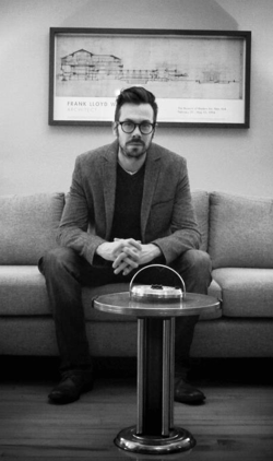
Photograph by Brad Edwards.
Kirill: Tell us about yourself and how you started in the field.
Brian: My name is Brian Edward Miller and I’m the owner and illustrator behind Orlin Culture Shop (OCS for short). I got my start as a creative professional in the field of graphic design and worked for a number of different agencies and studios.
Around 2005-2006 I realized that my favorite part about design was illustration, something I leveraged heavily in all of my projects. I made a decision to pursue drawing more seriously in my spare time and was able to shift the course of my career in a way that afforded me more opportunities to draw. I started by showing up to work an hour early so I could draw and stayed up 2 hours later every evening to create. Next, I took jobs which were less taxing creatively and demanded less of my time so I’d have the energy to pour into drawing. Every drawing I did I saw as an opportunity to grow and it helped me to maximize my study and drawing times.
I ended up working at a few gaming studios as a graphic designer with a handful of opportunities to try my hand as a concept artist. It was here I had my first taste of a career involving drawing and I couldn’t get enough of it. I tried a number of times to make the transition from graphic design to concept art, though none of the opportunities worked out because I could make more money as a Senior Graphic Designer or Art Director than I could a Concept Artist – which is a big deal for me as I have a wife and 2 kids!
Eventually, the decision was taken out of my hands as the first game studio I worked for was dismantled and sold, while the other closed down less than a year later. After the studio closures, I decided to put my abilities to the test by venturing out on my own and starting my own business.

Spot illustration of a broken down vehicle.
Kirill: What drove you to start your own studio, and what is behind the “Orlin Culture Shop” name?
Brian: I started my own studio out of an even mix of necessity and opportunity. As I mentioned above, the gaming studio I was working for had gone under just as I was on the cusp of pushing into concept illustration. I was torn as a creative professional because I had more confidence in my skills as a graphic designer, but I was much more passionate about illustration.
After a handful of interviews at other gaming studios out of state, my wife and I decided we didn’t want to leave Colorado. As there were no local gaming studios which fit our search criteria, we decided to create our own studio which would allow me the freedom to work in the industries of my choosing. Thus, Orlin Culture Shop was born!
Behind the Orlin Culture Shop name is the continuation of an artistic legacy which began when I was very young. My grandfather (whose middle name is Orlin), used to have a workshop in his basement where he’d work on a number of different crafts such as leather working, cross stitching, wood working, etc. – all hallmarks of the vintage Americana generation he grew up in. I spent countless hours in that shop dreaming and building (as well as hammering thousands of nails into boards).
When it came time to name my shop, the name Orlin popped into my head and stuck. Its my hope that I’ll be able to contribute artistic works which will have a positive impact on culture, whether its through editorial illustrations or picture books.
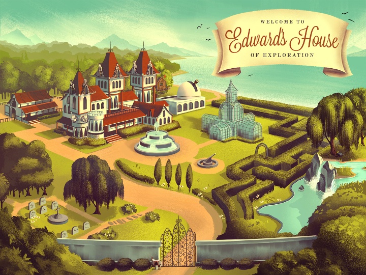
Mowrey Manor, illustration for an educational iPad app.
Kirill: What informs and shapes your taste and style?
Brian: My taste and style was shaped by an amalgamation of influences ranging from Vintage Disney, 1980’s cartoons, Manga, Comic Books, 1940-1960’s advertising illustration, and countless picture books. I tend to fixate on mood and atmosphere in the art I love the most which means I appreciate a broad spectrum of styles and approaches, so long as the mood is right.
Kirill: Are you experimenting with illustration elements outside your comfort zone? Is this a constant process of defining and refining your own style?
Brian: There is always a process of defining and refining my own style. I am constantly on the hunt for refinement within my process and there’s still a TON to learn.
One of the greatest things about running my own business is I have the freedom to experiment as much as I want (so long as I’m bringing in paying work of course). I’m no longer tied to a single job title and description which means I’ve been able to work in a number of different industries.
I also find that every project and client has unique requirements which challenge me in ways I’d never willingly challenge myself. There’s lots of growth that happens because of this, and very healthy boundaries set with deadlines to ensure I don’t get too lost exploring.
Kirill: As you start working on a new project, is it pen and paper first, or all-digital?
Brian: When I start working on a new project, its usually a mix of pen and paper first, followed by all digital. I tend to think better on paper where I can quickly write notes and throw down rough lines to get all my ideas out first. From there I’ll head to the digital platform where I do my ‘official’ sketches and final production.
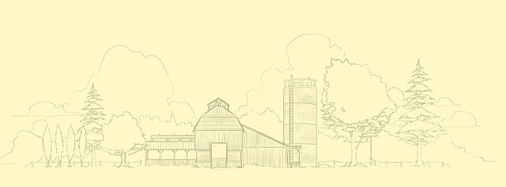
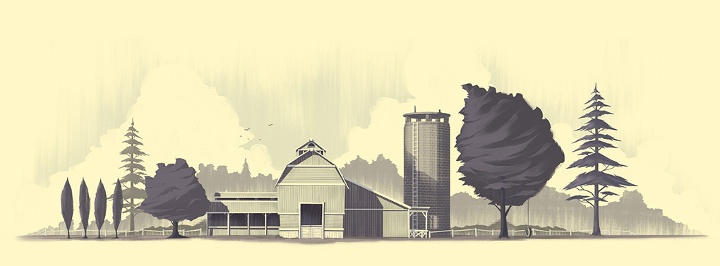
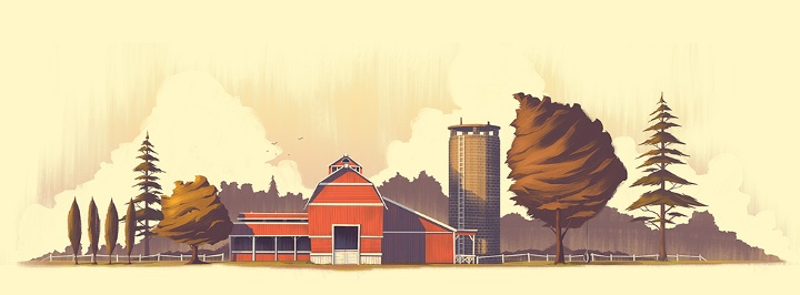
A farm illustration – from the initial sketch to the final look.
Kirill: How do you preserve color fidelity when the final product is targeting print media, such as flyers, posters or magazines?
Brian: Unfortunately, I have very little control over that as most of the clients I’m working with live out of state or out of country. I don’t have opportunities to go on press checks or do anything about quality control so I’m left to the mercy of the client and their chosen printer.
Ideally I’d be able to make the two match but that would require I’m present at every stage of the process. The disparity between print and digital platforms has been something I’ve learned to accept simply because both are so different. I always love pouring over the details of a printed piece, but I also love the dramatic backlighting of a piece viewed on a screen or tablet. I’m comfortable keeping the two distinct which helps keep me appreciate the way a piece shines within different media (as well as keeping me sane).
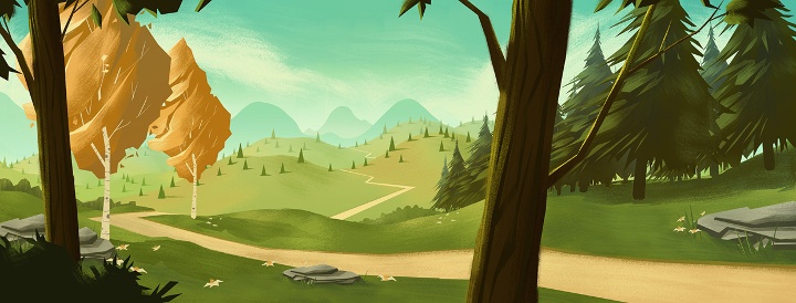
Peaceful valley scene.
Kirill: How much different is the final illustration from the initial concepts that you’re imagining in your head?
Brian: Most often, the final piece is extremely close to what I had imagined in my head (or at least some evolution of what I was envisioning). I tend to focus my imagination on a mood or a feeling so there’s a lot of latitude and room to explore as I move from initial concept to final illustration while staying true to the original vision. That latitude and room for exploration is important to me because drawing can be very tedious work. If I’m simply retracing steps over and over, I get bored.
What are your thoughts on illustrations for web sites, and how does it scale with responsive design and smaller mobile screens?
I’m so used to seeing my illustrations digitally and on websites (usually my own) that I tend to think of the web as the true home for my work. When I do a piece for a client, I see it on screen for months before finally seeing it in print. This makes the print version “the stranger” who looks vaguely like the person I remember sending off…
As for scaling, I believe strong color palettes, diverse tones, and bold shapes help an illustration to scale well, though there’s always some level of detail that is lost as the image size decreases.
Editorial illustration for 1940’s era Snow Bowl.
Kirill: Do you have a particular inclination towards illustrations of nature?
Brian: I definitely have an inclination towards illustrations of nature. Growing up in Colorado, nature was a part of my childhood as I spent the majority of my time playing outside, enjoying the seasons and outdoors. I was also fascinated with Bob Ross as a kid. I remember watching his show with my dad almost every day (I even tried my hand painting using the kit they sold at Hobby Lobby!)
The funny thing is looking through my sketchbooks from the past, you won’t find any drawing of nature. Its all human figure studies, comic book and cartoon characters, etc. Its only when I started my own business and began to figure out who I was as an artist that the inclination towards illustrations of nature took on a powerful presence in my work.
Kirill: How important is it to invest time in personal projects?
Brian: Personal projects are vital to my ongoing development as an artist. It was only with personal projects that I was able to focus my efforts as an aspiring illustrator. My projects included writing and drawing comics / graphic novels, designing characters for animation pitches, and dreaming up story ideas for picture books. It helped me to learn creative writing, illustration, and forced me to face my weaknesses. It also empowered me to transition an idea from my imagination to the digital canvas.

Illustrations for Tarsus Group’s “Label Expo 2013”.
Kirill: What do you do when you run out of ideas and get stuck?
Brian: There is nothing magic about my approach when I’ve run out of ideas or get stuck. I’m very dependent on deadlines to help drive through insecurities and pride (the two culprits I most often discover when I’m trying to understand why I’m stuck). Deadlines force me to sit down and draw despite the fear or uncertainty I’m experiencing. Its only after I’ve thrown down a few ideas (usually the most generic ideas I can think of, the ones which occur to me first) that I begin to get comfortable with the project, my abilities, and my objectives. I have to move forward no matter how much those first few steps hurt, otherwise I’ll sit and stare at a blank page forever.
Kirill: What’s the best thing about being an illustrator?
Brian: The best thing about being an illustrator is being able to provide for my family in a way that allows me to work from home by creating work I love. I also get to see some of the best parts of being an illustrator through the eyes of my kids. When they get excited about the picture books and illustrations I’m creating, that is always cause for me to be thankful. Its there I realize the headaches that accompany being a small time business owner are worth it simply because I’m living a dream I’ve had since childhood

Villainous robots from the “Totes Adorebots” series.
And here I’d like to thank Brian Edward Miller for answering a few questions I had about his art and craft. You can find Brian online at his portfolio and blog, as well as on Behance and Twitter.
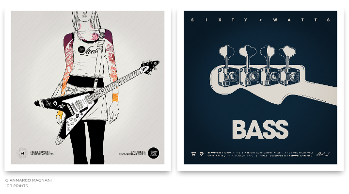
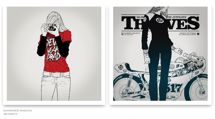
Strikingly beautiful compositions of simple lines and complex structures highlighted by limited color palettes and bold typography. Welcome to the world of Gianmarco Magnani (or M for short). In this interview he talks about his early influences, finding his own style and working on two large-scale projects, “100 Prints” and “Sixty Watts”.
 Kirill: Tell us about yourself and how you started in the field.
M: I studied graphic design but I focused my attention as an illustrator. I love books but I’m not one of people who read a lot. I love everything about design and I love to be involved in projects and art direction. I have always been drawing since I was a child, so I think that in some way I’ve always been in the field.
Kirill: Why did you decide to move from animation and video to illustration?
M: When I was in college I was completely focused on animation and everything related to the screen. Then I started working as an animator for different clients, as well as on some personal projects. At the very beginning everything looks great but then I started to see that developing a great product took a lot of my time, and required to have a team to work with. Then you add up all those things about screen resolution, plugins, or any other technical issue that changes under you every six months. So I decided to think about something more simple technically, something that it won’t change so quickly and also something something that I really would want to do.
I always loved everything about drawing, so I made some explorations being an illustrator and the things went really great.
Kirill: What informs and shapes your taste and style?
M: It was the 80’s. I was around eight years old, and we didn’t have Internet, computers, phones or even 150 channels on the TV. Communication was very limited, but I had an opportunity to be involved with things that came from Japan. It was really hard to come by things like that in those days, and for me they were the first design references. A good friend of mine who traveled from time to time to Japan gave me some VHS tapes with TV shows from Tokyo, a lot of Japanese magazines and some action figures as well. I couldn’t understand anything of what I was seeing, but all those images, icons, packagings, booklets and texts were very attractive to my eye.
I’m really sure I’m going to keep those references always in my work and in my mind. I’m also very influenced and very interested in books about graphic design and identity. And there is a recurrent interest about designs made in Germany in every field, and also some interest on the Scandinavian style.
Kirill: The human figures in your illustrations have deceptively simple yet skillfully accurate outlines. How do you distill the multiple facets of the body language into a single silhouette?
M: I realize that my work is composed with just lines with no shades or depths, so I tried to keep working in that style.
At the beginning I tried to do my work in different styles using shades or grayscale palette, but it didn’t look natural, so I came up with my own simple line style and tried to learn a lot of things. For example, I looked at the composition of vintage comics and manga, how they were composed just with black ink and how they didn’t need anything else besides that. I understood that I have to use just the things the work needs and nothing else. Right now I always try to have that in mind when I start every single project.
Kirill: It is often said that the eyes are the window to the soul, and yet you go to great lengths to hide them or crop them altogether. Why?
M: One of the things I always keep in mind is the hint / insinuation in my work. When I studied photography I learned about the difference between showing a complete scene and just a part of it. I understood that if I have just a part of an idea, the viewer begins to imagine and complete the idea in his mind. On the other hand, if I show a complete idea and totally describe it, the imagination of the viewer simply disappears. So in my work I prefer to have at least one window closed.

Kirill: Your latest works has moved away from using multiple colors, employing pure black with one or two accent colors. Is this a self-imposed constraint to push yourself into exploring and refining your style?
M: When I started my first project called “100 Prints” I decided to start all over again. So I worked for a year trying to have a good balance between my style and all my interests.
I chose the same square format for all my pieces, defined the line style, worked on the technique and kept the color scheme very simple.
I think that in my work the black ink always defines the main structure of the composition. On the other hand, color, in some cases, just says where do you have to see, and in other cases it provides a good balance.
I also think that greatest designs have always been composed just by the simplicity, so I would like to work – or try – to make the things that way.
Kirill: And then, on the other hand, you have these intricately layered complexity of musical instruments and motor vehicles. Is the goal to provide a counter-balance to that perceived simplicity?
M: Yes, maybe is a good contrast and balance between both elements.
Kirill: How do you work with type? Do you design your own fonts, or adopt and adapt existing ones?
M: I love to work with type. Right now I can’t imagine my work without headers or texts around other elements.
Sometimes I create my own, or adapt existing ones. For example, when I have to create a logotype or something next to an icon, almost every Print I use existing typefaces. I also keep in mind that in my work words do not necessary need to be read. For me words also need to be seen. For example, the header on the Print Nº019 doesn’t mean anything, it just looks good.
Kirill: On average, how much time do you spend on a single illustration, and where does that time go?
M: When I make an illustration it depends on the complexity or how much detail it has. It just takes time.
Things change a lot when I have to make a Print because it’s an entire composition between headers, icons, logotypes, color schemes, texts and all the those things around the main character.
In general it can take around a week or two working all day, but in some cases it can take more than a month. There are a lot of unreleased Prints and also an entire Series that I have worked on for months, and for some reason they are still incomplete, and from time to time I try to look at them and identify what they need.
Kirill: How much different the final illustration is from the initial concepts that you’re imagining in your head?
M: They change a lot, but I think it’s a positive feedback because it surprises me and sometimes gives me new ideas.
The problem is (and it happens a lot) when you have a great idea in your mind and you think about all the details for a while and then, when it’s on paper, it loses all that magic that is still in your head and you don’t know what happened. I’m pretty sure I’m not going to have anyone of my Prints complete at the first try, and if I think differently, I’m sure I wouldn’t have any of them.

Kirill: How do you preserve color fidelity for the printed media?
M: I try to use them in the simplest way. I try work using just one or two flat colors with no textures, complex gradients or any other effects.
Kirill: How does it feel to hold a physical print of one of your illustrations?
M: When I have the first copy of a Print, I always spend time to look at it and hang it on the wall. That moment really feels great, but after a few minutes of looking at it I start to think: let’s move this, and this, and this, and also this … but that part of the work and the process is also fantastic.
Kirill: You number all your prints, starting from Nº001. What’s the final goal?
M: I have always been interested in working on huge and long projects.
This project is about creating 100 Prints, divided in 25 Series composed of 4 Prints each. They are all created in the same square format with the same style and are numbered from Nº001 to Nº100, and at the end of the project I would like to publish a book.
I started with this project in 2010, and since then I don’t think about the upcoming Prints or Series. I’m sure that’s one of the reasons this project always keep my mind busy and every new Series is a surprise for me. I think I’m going to finish the last Print around 2016, but sometimes I think that it would be better to call it “200 Prints”.

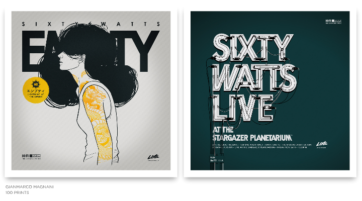
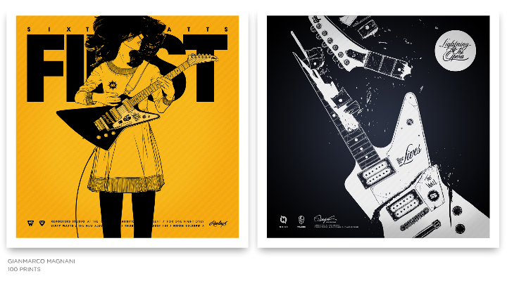
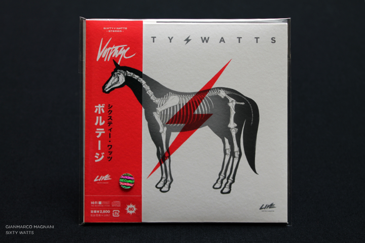
Kirill: “Sixty Watts” has a prominent place in this series, and a few months ago you’ve launched the companion site. And yet, there is no actual band. What is this experiment about?
M: “100 Prints” is divided into 25 Series. When I started the project I decided to create a theme for each Series. When I thought about creating a Series about music, I started thinking about a rock band, but I didn’t want to make designs for any existing band. So I created a band called “Sixty Watts”. At that moment it was just a Series composed of 4 Prints and nothing more. I needed a band and I needed a name, so I came up with something that had a good phonetic sound and also had a very symmetric number of letters for each word.
I published that Series called “Sixty Watts” and a few weeks later I read a post on some French blog about my work and that specific Print. The post said something like: “it’s a Series about a rock band called Sixty Watts, but don’t try to search for the music because it doesn’t exist”.
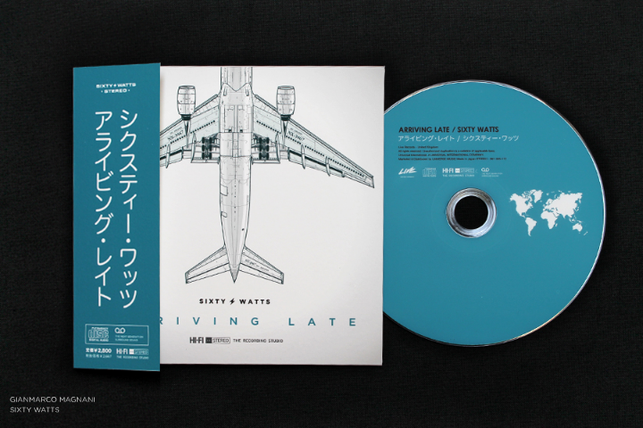

So at that moment it made sense for that Series to start a new project. It sounded like an interesting idea, with a great opportunity to design everything about a rock band – the discography, the posters, the album covers, the instruments and all those kinds of things.
I started researching some great rock bands. I also bought a lot of things just to know how to design the packaging, how to compose the tour posters, all the logotypes or icons included in each piece, how to create an album, a single, the Japanese versions, an LP and things like that. It was very exciting and I had a lot of ideas in my head.
I always wanted to be in charge of art direction for a rock band campaign, album or tour, and I never thought that if the opportunity never comes I can invent it. So I decided to create my own rock band.
When I started the process I thought several times how ridiculous such an idea might sound like, but then I started thinking about it as being “different”. That’s why I continued with the project and published it, and I am still working on new illustrations and also on an upcoming new album.
This project makes a lot of sense for me when I think about the moment when someone looks at an album cover for the very first, and without listening to the music what kinds of ideas come to your mind. Your imagination start creating a complete story, and if you want it, it can be endless.
Kirill: What do you do when you run out of ideas and get stuck?
M: I talk to my wife.
Kirill: What’s the best thing about being an illustrator?
M: That I love what I do.

And here I’d like to thank Gianmarco Magnani for this interview. You can find more of his work at his main portfolio, as well as the companion “Sixty Watts” site. All the Prints are available for sale, and you can follow him on Facebook and Twitter.
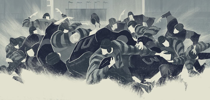
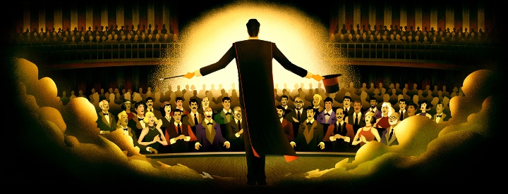
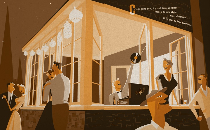
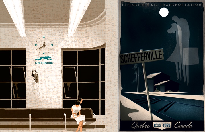
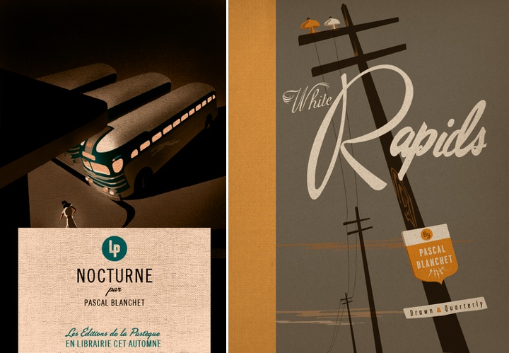
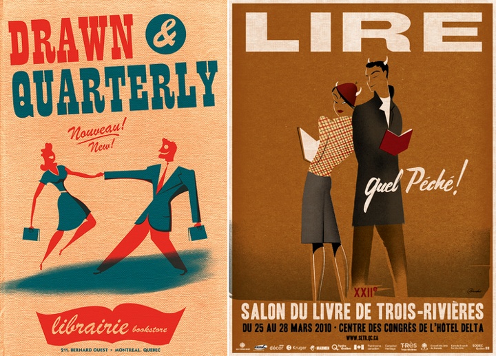
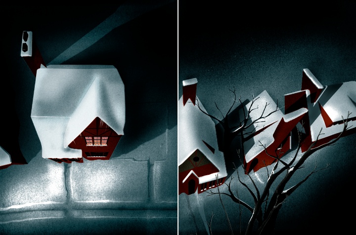
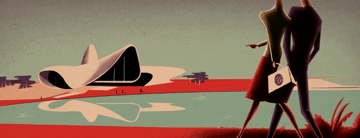
Light and shadows. Rough angles and streamlined curves. Misleadingly simple color palettes and explosively dynamic body language. Browsing the portfolio of Pascal Blanchet takes you decades back into the roaring era of Art Deco and does not let you go. I am absolutely thrilled to have the privilege to Pascal and ask him a few questions about his art and craft.
 Kirill: Tell us about yourself and how you started in the field.
Pascal: I’m a self-taught illustrator. I’m 33, living in Trois-Rivières, a charming old small town right between Montréal and Québec city.
When in my early 20s I moved to Montréal to try finding jobs as an illustrator and I failed. It was a really rough time. I finally tried to send my portfolio to some NYC illustration reps and signed with Jacqueline Dedell agency. The first jobs came really quickly from the San Francisco magazine and Penguin Books. It was a big surprise for me!
Kirill: What drove you to be a freelancer?
Pascal: I always had a serious problem with authority. School and student jobs were a nightmare (for both the bosses and I)
so I guess it was only natural for me to end up as a freelancer.
Kirill: What informs and shapes your taste and style?
Pascal: My first contact with illustration was when I was a kid with the old 78rpm records sleeves at my grandparents house. It makes a huge impression on me.
I learned many many years later that they were made by guys like Jim Flora and Alex Steinwess and many others… I also remember having a huge crush for handlettered windowshop ads. It seems I loved art deco posters and streamline style illustrations long before knowing what those styles were. I’m still trying to find and explanation about my love for the 30s and 40s. All I know is that even when I was around 5 or 6 years old it was there.
Kirill: How has your style evolved over the years? Are you comfortable with it, are you pushing it in new directions, and do you want people to recognize your new work as uniquely yours?
Pascal: I like to think it changed a lot over the years. Looking at my first graphic novel and my last one makes me think that I’m (I hope) not too squeezed in my own “style”. It’s also really important to me to look for something else, something new (to me). I never tried to make something I could call MY style, I guess it just comes out that way. I am mostly afraid to repeat the same thing again and again.
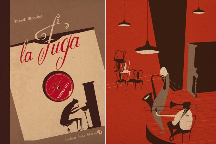
Kirill: You cite music as your main inspiration, and some of your graphic novels incorporate artists and music instruments. How do you convey this dynamic experience in a static medium?
Pascal: I think music has shapes, colors, shadows just like a drawing. To me when I’m working on a graphic novel it’s pretty hard to know where music stops and drawing starts. Most of the time music comes first and often even gives me the subject of the story or the characters.
To me there’s no difference between music and visual arts. A jazz musician has to take a standard and recreate it in his own personal way – just the same as an illustrator. Usually the themes aren’t new at all but we have to make it our own.
Kirill: What drives you to publish graphic novels? How does it feel to hold a printed book of your own?
Pascal: I think it was the thrill to tell the story behind a single image in a more complete way. Most of the time in illustration you have to tell something in a single image and sometimes it’s a bit frustrating.
When you finally hold your book in your hands, it’s months after you finished it, so you kind of look at it with stranger eyes. The feeling you had when you were doing it is already gone and nothing much left but: This page is not good, that face looks ugly, bad shadows here…
Kirill: How do you preserve color fidelity when the final product is targeting print media, such as magazines or books?
Pascal: Pantone colors number. But I’m not that much a freak, since all the colors will change but the balance between them will stay the same. So it’s ok even if they are not exactly what I had in mind.
Kirill: As you start working on a new project, is it pen and paper first, or all-digital?
Pascal: It really depends, I do not have any kind of work routine except for music. Sometimes i make a digital sketch and the final on paper, sometimes it’s the other way.
Kirill: What’s the weirdest client feedback you ever received, if you don’t mind sharing it?
Pascal: “Can you make it more à la Pascal Blanchet”
Kirill: How do you work with type? Do you design your own fonts, or adopt and adapt existing ones?
Pascal: Most of the time I make my type. To me it seems impossible to make a poster and have a graphic designer put fonts on it. It needs to be an integral part of the illustration.
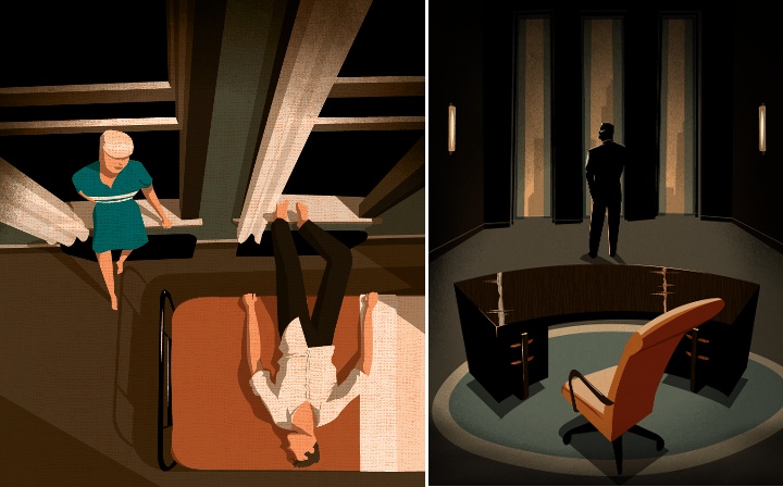
Kirill: Some of your illustrations employ high angles, claustrophobic environments, long shadows and stark silhouettes. Do I detect a fellow film noir fan?
Pascal: Totally! But the origins of the high angles and dramatic views came from my passion for architecture. I discovered film noir long after I started doing exaggerated perspectives. My father was working as a technical draftsman and I learned it at a really young age. Also, I am really fascinated with the relation between human being and architecture – how can the latter magnify or oppress the former. I guess my love for art deco also adds to the dramatic side.
Kirill: What do you think when you look at your own work from a few years ago?
Pascal: Bad work, lousy illustration, need to draw something better NOW.
Kirill: How important is it to invest time in personal projects?
Pascal: I think it’s absolutely necessary to keep myself “creative” and incorporate new techniques and make experimentations. Graphic novels are also the best portfolios you can make, my personal projects gave me most of the jobs I’ve had.
Kirill: What do you do when you run out of ideas and get stuck?
Pascal: When i have enough time in front of me I just sit and think. Drawing just makes me sink even more in the bad concepts way. When in a hurry (most of the time). I like to discuss it with the art director. Sometimes it gives a sudden new turn to the job and helps a lot.
Kirill: What’s the best thing about being an illustrator?
Pascal: Drawing and challenges.
And here I’d like to thank Pascal Blanchet for this great interview. You can find him online at his portfolio and blog.
