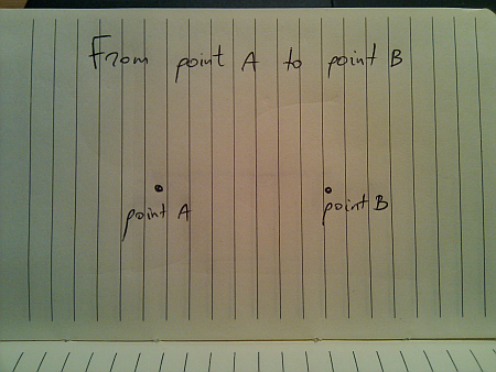
Movement is all around us in the physical world. We take it for granted since we see it from the moment we’re born. Today, i’m going to talk about a seemingly mundane act of moving from one given point to another given point. I would imagine that if you’re reading this, you most probably enjoyed your math lessons in middle school, so the following drawing should be familiar:
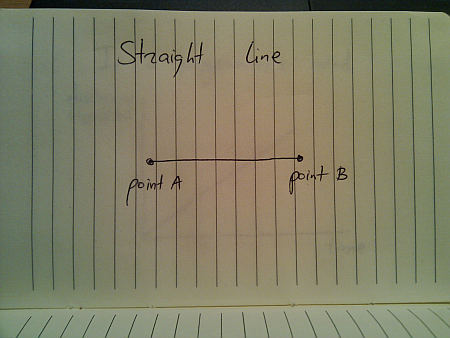
In a perfect world (imagine a deserted highway), moving from point A to point B is just following the straight line:
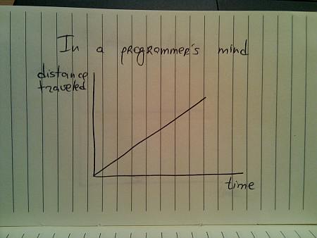
And if you’re a programmer, this is how you would implement this journey:
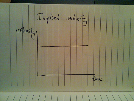
While this seems quite straightforward (and i have seen quite a few presentations that use linear animations), this falls apart once you translate the traveled distance to velocity:
This is hardly the way things move in the real world (be they man-made, inanimate or animate). The usual approach taken by the existing animation libraries is to use a variation of spline (or perhaps a sine / cosine wave) that looks like this:
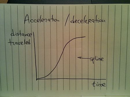
Here, you start from zero velocity, accelerate as you go, reach your maximum speed towards the middle of your journey and then start decelerating towards zero speed as you reach your destination. Translating the distance traveled to velocity, we get this:
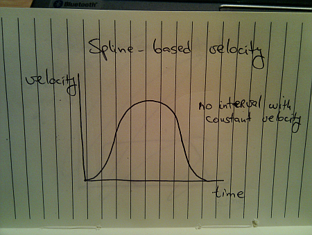
Once again, this is not how things move in the real world. A moving body (human, animal, vehicle or other) has a certain speed limit and a certain preferred speed. It takes some time to reach that speed, but once you get there, you stay until it’s time to decelerate:
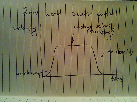
This is a better approximation of a slightly less ideal movement. The velocity graph models the “cruise control” mode that you’d employ on a deserted straight highway. Translating the velocity to distance traveled, we get this:

Here, we have a curving acceleration (might be a spline, a sine or even a quadratic curve – depending on the way the object is accelerating), followed by the perfectly linear segment which ends in a curving deceleration.
All the examples above assumed that you’re supposed to arrive at point B and just stop there. That is not always the case:
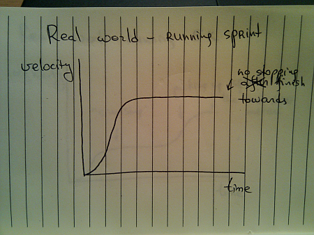
You do stop once you reach the sprint finish line, but you don’t stop until you reach it. Once you gain your maximum speed, in the ideal world you’ll be able to maintain it – especially over a very short distance.
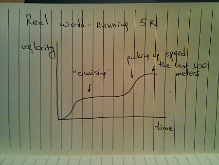
When you’re running sprint, it doesn’t really matter what are your opponents doing. They are running on parallel tracks and do not interfere with your pace. However, if you switch from running sprint to running a longer distance (say 5K), the story gets quite different, and the most common velocity graph looks like this:
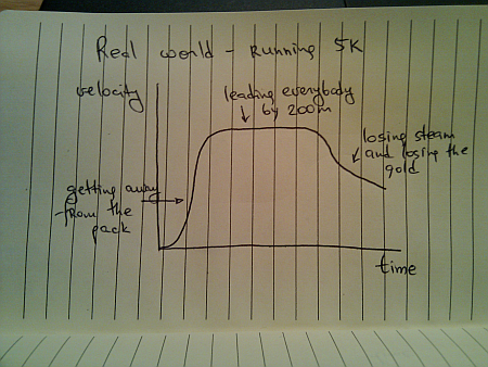
Of course, some runners try to outsmart the competition and end up running like this:
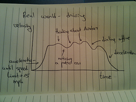
Once you leave a deserted road and have some traffic around you, you cannot always use cruise control. Even if you’re on a straight highway, your velocity graph will likely look like this:
Of course, these graphs are nothing new. We see countless movements of physical objects around you every day. All you need to do is look beyond the simplified approach of “train is moving with constant speed of 40mph” and start analyzing the real world.
To be continued tomorrow.
 brownbear i see a @redbird looking at me. @redbird, @redbird, #whatdoyousee?
about 2 hours ago from web
 redbird i see a @yellowduck looking at me. @yellowduck, @yellowduck, #whatdoyousee?
about 2 hours ago from twitterfeed
 yellowduck i see a @bluehorse looking at me. @bluehorse, @bluehorse, #whatdoyousee?
about 2 hours ago from twitterfeed
 bluehorse i see a @greenfrog looking at me. @greenfrog, @greenfrog, #whatdoyousee?
about 2 hours ago from Tweetie
 greenfrog i see a @purplecat looking at me. @purplecat, @purplecat, #whatdoyousee?
about 1 hour ago from TweetDeck
 purplecat i see a @whitedog looking at me. @whitedog, @whitedog, #whatdoyousee?
about 1 hour ago from Tweetie
 whitedog i see a @blacksheep looking at me. @blacksheep, @blacksheep, #whatdoyousee?
50 minutes ago from API
 blacksheep i see a @goldfish looking at me. @goldfish, @goldfish, #whatdoyousee?
46 minutes ago from Twittelator
 goldfish i see a @teacher looking at me. @teacher, @teacher, #whatdoyousee?
31 minutes ago from Blu
 teacher i see a @children looking at me. @children, @children, #whatdoyousee?
15 minutes ago from Echofon
 children we see a @brownbear, @redbird, @yellowduck, @bluehorse, @greenfrog, @purplecat, @whitedog, @blacksheep and @goldfish looking at us. #thatswhatwesee
less than 5 seconds ago from web
Image credits: Marshmallow, Lee Coursey, Amy Loves Yah, Leonid Mamchenkov, Stephen Barnett, jon_a_ross, Photos8.com, úlfhams_víkingur, kevindooley and Tom@HK
When you want to catch a slice of the ever-shrinking attention span of web surfers, when you compete against hundreds of similar sites but don’t really have anything new to say, when you want to see your web server crashing under the load of visitor from social link aggregators, all you need to do is to create a list post.
But wait – everybody else is already doing it! What can you do? Just follow these 8 easy steps to unlock the secret doors that will bring forward a rush of AdWord-click-hungry visitors right to your blog:
- Step 1 – pick a subject. For example – adding image galleries to blogs
- Step 2 – pick a reasonable number of different techniques to address the subject from step 1. In most cases it will be 5 or less.
- Step 3 – multiply it by 7 and round up to the closest multiple of 5. Now you have a nice round number to put in the title.
- Step 4 – create marginally indistinguishable versions of the original techniques from step 2 to make the list of techniques that add up to the number from step 3. Invent new terminology if necessary.
- Step 5 – combine the number from step 4 with the subject from step 1. For example – 45 techniques to add image galleries to your blog.
- Step 6 – pick the most unsettlingly inappropriate superlative from the list below and stick it right after the number. For example – 45 overwhelming techniques to add image galleries to your blog.
- Step 7 – invent an imaginary benefit that will convince your readers to spend the next 20 seconds on skimming the list. The benefit doesn’t have to be real, since they won’t spend time on objectively assessing it. For example – 45 overwhelming techniques to add image galleries to your blog and blow your competition out of the water.
- Step 8 – make sure that the title is under 100 characters. If it’s too long, nobody will be able to retweet it. You do want to be on Twitter, right?
A handy list of superlatives:
- Overwhelming
- Mindboggling
- Amazing
- Otherworldly
- Overpowering
- Astounding
- Breathtaking
- Staggering
- Stunning
- Bewildering
- Awe-inspiring
- Hair-raising
- Heart-stopping
- Spine-shivering
- Magnificent
- Thrilling
- Inconceivable
- Phenomenal
- Unimaginable
- Unfathomable
- Stupendous
- Unprecedented
- Unbelievable
You’re welcome. And oh, I’m on Twitter too, and I’m eagerly looking forward to being followed by 10,000 people who will unfollow me after three days if I don’t follow them back.
One of the best presentations I’ve heard at this year’s EclipseCon was given by Alexandra Imrie on the topic of usability. Usability is sometimes abandoned altogether due to budget constraints, often addressed as a hasty afterthought, and almost never viewed by developers as a necessity. In this interview Alex looks at the usability angle from the end user perspective, highlighting its importance to us, the developers.
 Tell us a little bit about yourself
I’m Alex Imrie, and I work at BREDEX GmbH in Braunschweig, Germany. I have various roles at the company including Marketing, customer demonstrations, training and support as well as documentation and conceptual design for some of our software. I also do some testing. The unifying part of all these roles is that I represent the user and customer side – I have a non-technical background in linguistics, but a good knowledge of how to work with our software from the user’s perspective, so that makes me a good advocate for our users and customers!
What does usability mean to you?
The main aspect of usability for me is that software should help the user to do his job, not make the job harder! The application as a whole should be consistent in its work-flows and allow the user to work in different ways (and each way should be as simple as possible). The software should adapt to the user, not vice-versa. I also believe that most applications shouldn’t involve the user in internal technical aspects. The user should be able to work with the software without knowing how it ticks in the background.
Even if a piece of software is well written in these terms, we need ways of helping new users with the software. From context-sensitive help to tutorials and examples, it should be easy to find out more about the application without having to read the whole manual or attend weeks of training. Obviously, training may be necessary for some applications, or to learn how to work best with an application, but it shouldn’t be necessary from the very outset.
Why should developers be aware of usability aspects of the products they’re creating?
I think the very simple answer is because the products are meant to be used by the users! Whether the users themselves are developers or not, we always need to bear the target group in mind when an application is being designed, or when new areas are being added. Features are all very well and good, but if the application is hard to understand or hard to use, then users will be alienated and annoyed. In terms of commercial software, this can lead to dissatisfied users – and word of mouth about bad software can spread quickly.
Can usability be sacrificed for internal products that people will have to use in any case?
On the contrary, I think that internal products can be a good way to practice making software more usable. After all, internal feedback can be quickly incorporated into the product and developers can really get the chance to see how users think. Internal users are still users at the end of the day, and deserve to have an application that will make their life easier, not more frustrating! Another way to think of this is in terms of the support costs your team will save by not having to answer “basic” questions about how to use the software. In smaller companies especially, making usable software can be conducive to good relations between developers and users. Making usability a priority internally brings value for external products. The design process will no longer separate functionality from usability – all functions will be designed to be usable right from the start. The benefits are endless, really.
Why is usability at best an afterthought, and in most cases non-existent in business applications?
On the one hand, it’s often very difficult to see things from the user’s perspective. Developers think like developers, and rightly so. It’s just very difficult to put yourself into someone else’s shoes and forget all you know about the internal workings of something. (This is the same reason that developers aren’t necessarily good as functional testers!).
The other issue is time and costs. If usability isn’t explicitly considered at the beginning, it can be harder to add later when the need arises. With deadlines for features and releases, it can be hard to make the decision to lose a feature to gain usability. I think that too much time is often spent working out how a feature should work technically, and not how the user should be able to access it, even though the two aspects actually belong together.
What are the most common usability errors that you see in popular applications?
One thing I notice quite frequently is inconsistent behaviour. Like some delete actions requiring confirmation and others not. Or options being available in a context menu in one area, but not in another. This also affects menus where certain entries are completely missing instead of just disabled when they are not available. That can be confusing!
These are also quite minimal things that can easily be changed. I like knowing where I am in a workflow – what are the prerequisites, and what must I do next. I appreciate progress dialogs for so I can see how much longer I need to wait, and which reassure me that the application hasn’t crashed. I also find it difficult to work with applications that only offer one way of doing things. I’m a fan of using keyboard shortcuts, so a mouse-only application can be frustrating.
Do we need to facilitate an emotional connection between the users and the ap-plications?
I think so. I think that a user should feel “led” by an application, and should feel safe in the knowledge that the application will not let him or her do anything horribly wrong. One concept we use quite extensively at Bredex is the idea of the “first 15 minutes”. I think this can be where a large part of the emotional connection comes from. At the very least, these first fifteen minutes should be the easiest, and there should be no way at all of running into trouble. Layout and graphics can play a large part in making an application simply look more friendly, and I’m particularly fond of welcome screens, like those in the Eclipse framework, to present important information in an accessible way at the start up of an application.
Do we still need manuals and organized help in the age of wikis, blogs, forums and mailing lists?
Yes, I believe we do. The idea of the documentation as a wiki is certainly appealing, but I think there is still a place for manuals. Wikis are certainly more dynamic, but this can be a problem – with manuals, you can always tell which version of a software the manual is for. For me, the appeal of a manual is having one single source of reference for all of the possibilities of a piece of software. As well as describing tasks, a manual can also introduce best practices and can be directly integrated into the software as context sensitive help to save trawling through a forum or waiting for an answer in a mailing list. Media like mailing lists and forums certainly have their place, but I see them more as a place to ask very specific questions, whereas the manual should deal with the various tasks you can do with the program and the concepts of the software.
No documentation, and the users will be upset. A lot of documentation and nobody will read it. How to find the “sweet spot”?
If I knew the answer to this question I’d be rich! Seriously, I think that a task-oriented approach to the documentation is the best way to go. For each task, pre- and post-requisites as well as related tasks should be linked. This makes searching for the piece of the documentation considerably easier. I also think it’s important to reduce the amount of explaining the documentation has to do. If the technical writer is spending days trying to get a section right, it’s a sure sign that the application itself is too compli-cated. If each and every text field has to be explained, that’s a hint that the labels for the text fields aren’t very good. Documentation is necessary, but it shouldn’t become an issue of “XYZ doesn’t work like ABC, so we’ll document it instead of fixing it”.
Is there anything else you’d like to add?
One thing we have found works well for us in making sure that usability is considered from the outset is to have the technical writer(s) (and also the testers) present at the design and concept meetings. These are usually the people who can tell you “that’s not how it works in other areas” or “that’s not clear enough” or even “why not do it another way”. By not having the same background and perspective as the developers, they can offer valuable advice for the usability of an application.
