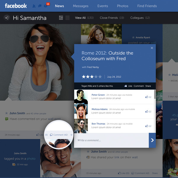
Fred Nerby’s “Facebook – New Look & Concept” is the latest in a stream of unsolicited redesigns of well-known products.
Some random thoughts having survived a few redesigns myself, and having seen quite a few unsolicited redesigns for other apps.
- The mockups always (really always) use full-bleed nicely balanced pictures of young smiling handsome people. The vast majority of the actual content as seen during the development cycle is somewhat less appealing.
- 50% of the replies say “I hope Company X is listening”. Another 25% say “Company X should hire this guy”.
- Companies are listening, and in quite a few cases the redesigns live in an ideal world divorced from harsh business and marketing realities of the specific product.
- “Hiring the guy” assumes that “the guy” is actually willing to do the dirty work of understanding all the non-glamorous details of various scenarios and tweaking the initial mocks endlessly to adapt. A non-trivial number of proposed mocks are a no-go to begin with.
- Static mocks are static. It’s only when you start putting them on the actual device / browser that you start thinking about the myriad dynamic aspects of layouts, transitions, animations and other pixel-level mechanics.
- On a related note, most of such redesigns that I’ve seen focus on the visual design, and put very little emphasis on addressing problems in the existing interaction design or moving between the redesigned screens.
- By the time an actual implementation is ready to ship, the pixels on the screen don’t bear much resemblance to the original mocks. They are not necessarily less pretty. Just different.
- In a world of an almost continuous spectrum of device form factors, it’s very rare to see a redesign that bothers to address how the layouts respond to changes in screen size and orientation.
If you’re doing such a redesign, it’s an opportunity to show your skills. If you get noticed, people will link to you, and you might get hired to work on good projects – or even on a product that you’ve tried to redesign.
If you’re a reader looking at the redesign, you can look at the nice pixels and do “your part” by saying that Company X should hire this guy or do exactly what he did. You essentially did nothing, and you’re feeling superior because if Company X is not going to do this today, they’re a bunch of clueless dudes. It sure gives you a nice warm feeling, but otherwise is a waste of time for everybody involved.
To mark the end of my third year on the Android team, here’s a TL;DR version of the last thousand days or so.
Do code reviews. You’ll occasionally butt heads, as there’s rarely a single “best” way to make even the simplest bug fix. But no matter what’s the seniority of your reviewer, you’ll always be better off at the end. I lost count of the number of times that I said to myself “Huh, I didn’t know that” after seeing a reviewer leaving his comments. Not to mention that you’ll have somebody else having at least some level of familiarity with your code if you ever get too swamped.
Every once in a while you’ll get out of your comfort zone working on a new feature or fixing a bug. At some point you know your reviewers, their style and their strengths. Don’t be tempted to add reviewers that will be inclined to rubber stamp such code. Seek out people who are deeply familiar and well versed in the specific area. You will be afraid that they’ll pick your code apart like a poorly constructed house of cards it is. Better now than after it ships. Such a reviewer knows how to do this better than you, and the result will be better for both you and your code base. It will just take longer. Don’t let your ego take a hit. It’s just code.
When you’re asked to do a review, do it quickly. Don’t drop everything and do it immediately, but do it the same day. The quicker you provide good and actionable feedback, the fresher it is on the side of the code author. Don’t let your reviewers rot. This also helps preventing unnecessary rebases. Not to mention spreading your strengths around, and learning from the strengths of others.
Don’t do gigantic code drops. If it’s a big feature, start on smaller steps towards the final goal. Mark unfinished places with TODOs so that the reviewer knows this is not the final thing. And make damn sure there’s not a single TODO left at the end.
Cross reference all code changes with bug tracker entries. Document all discussions, decisions and alternate solutions that didn’t work in the bug tracker. When somebody asks why things were done this way a year later, they’ll be thankful. In most cases, that somebody will be you.
Do code reviews. I might have mentioned it. But seriously. Don’t be that guy whose code ends up on The Daily WTF. By the way, if your team members start posting your code there, you might want to contact your internal security guy. Just saying.
Our daily job as programmers is to solve problems. Some view this as a just a job with a steady paycheck, rarely venturing outside the daily routine, not interested in learning new techniques or pushing their own boundaries. Some enjoy working on side projects, exploring new languages or just reading blogs to stay current. Hopefully, as the years pass, you grow and enrich your own personal arsenal of tips, tricks, techniques and ways to assess and solve problems. Finding the best solution to the specific problem at hand within the constraints of available time and specific programming environment.
Simple problems should have simple solutions. That’s kind of obvious. Except when people insist on creating artificial complexity while solving them, either out of lack of knowledge or out of fear that if simple solutions is all they have, they will fail to uphold their seniority status. And so you end up with people writing their own string replacement routines instead of using regular expressions, writing their own persistence layers with opaque binary blobs that serialize multi-field multi-level object hierarchies instead of using databases, or inventing WSDL and UML.
Complex problems can have simple solutions as well. At times, we tend to forget the underlying math complexity behind such elegant data structures as hash tables and balanced trees, the ingenuity behind bloom filters, Perlin noise generators and inverse square root approximation, or the sheer power of recursion that gives us such beauty as Quicksort. Once these are tucked safely behind library APIs – provided by either the runtime itself or written as a utility layer in your own project – they become just a few more entries in your toolbox, and you rarely spend time to appreciate their powerful elegance.
And then there are complex problems for which we don’t seem yet to have simple solutions. Sometimes you need to combine a few tools that you have, and sometimes you need to sit down and create a brand new complex solution. That’s what we’re paid for, after all. And then, sometimes, there is an existing solution. And it feels just the right fit for this problem we’re trying to solve.
Such is the case of using vector image formats for scalable graphics, which is most often boiled down to using – or at least trying to use – SVG for icons on platforms that run on a wide variety of screen pixel densities. On one hand, you have a problem of scaling your graphics on screens of various sizes and resolutions. On the other hand, you have a solution that claims to do just that. And it feels that these two are a perfect match.
And you can start by thinking that it’s a simple problem of scaling the entire icon up or down, and that it’s a simple solution of taking one of the existing SVG libraries and asking your designers to export all their assets in that format. And if your designers know what they’re doing, they’ll come back to say that they don’t want to just scale everything. They want to hide some visuals for smaller point sizes, tweak proportions as the target point size changes, or even switch to a different overall composition beyond a certain threshold. And while for you it’s all pixels, for them it’s points. And then you need to understand what’s the difference. And then you may realize that it’s no longer a simple problem, but you don’t want to throw away that nice simple solution. So you go read a bit more about the SVG format, and it’s this gigantic spec that supports embedded bitmaps, embedded fonts, animations and even interactivity layer that can run scripts on user interaction. And it’s no longer a simple solution. It’s this complex solution. And its complexity scope seems to match the new complexity scope of the problem.
And so now you have a complex problem and an existing complex solution. And it feels like they are a good match. If only you can just find the right subset of functionality and the right set of tools that will allow your designer to create those custom elements in the exported files. And with every objection your designer raises, you only are more determined to dig into the format spec and find a section that seems to be a good match. And as you dig deeper and deeper, the feeling that you have a good match becomes a firm conviction. And you never look back at the complexity you have built trying to match the “almost there, but not quite” solution to this problem. It was never “almost there”, mind you. But it takes time to actually realize that. And then SVG becomes another entry in your arsenal of tools. A tool that is not great – or even decent – at solving the problems that it claims to solve. Not yet. Not this year. Maybe the next one.
Josh Lehman on the value of UX design:
A weak user experience was forgivable during a time when software was more expensive (sunk-cost fallacy in action), the competitive playing field was much more “sparse” and users unwrapped a nice shiny manual which accompanied their software acquisition. Users in this bygone era understood that they would likely need to alter themselves to meet the demands of the software. When the interface didn’t make sense the user would blame themselves and cite the fact that they “hadn’t yet learned it”.
Things are very different today. Customers now expect the softwares (apps) to meet their needs and match their usability expectations right out of the proverbial box. If you’re building a new consumer-focused app, great design and solid usability are no longer just positive differentiators or features on a checklist. A solid, usable design is part of your entry fee into the software market, giving you a chance at success. Without a solid design your app can too easily become a casualty of the new “discardable apps” phenomenon.
