Going with the biannual release cycle of my Swing projects, it’s time to do latest release batch.
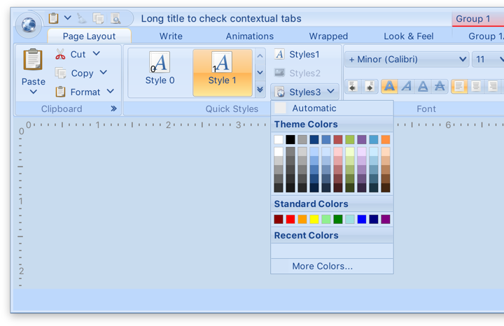
Substance 8.0 (code-named Wyoming) is a major release that addresses technical debt accumulated in the API surface over the years and takes a major step towards enabling modern UI customizations for Swing applications. Full release notes and API listings are available, with the highlights being:
- Unified API surface (Project Cerebrum)
- Configurable title pane content (Project Visor)
- Folded laf-plugin / laf-widget (Project Corpora)
- Explicit instantiation of component and skin plugins
- Switch to Material icons + icon pack support
- Better support for fractional scaling factors
Flamingo 5.3 (code-named Liadan) has extracted the non-core functionality into two new projects:
- Ibis has the code for using vector-based icons in Swing apps. It supports offline transcoding of SVG content into Java2D-powered classes, as well as dynamic display of SVG content at runtime (powered by the latest version of Apache Batik)
- Spoonbill has the code for browsing SVN repositories with the
JBreadcrumbBar component from the core Flamingo project. Future plans include extending this functionality to GitHub repositories as well.
If you’re in the business of writing Swing desktop applications, I’d love for you to take the latest releases of Substance and Flamingo for a spin. You can find the downloads in the /drop folders of the matching Github repositories. All of them require Java 8 to build and run.
Going with the new biannual release cycle of my Swing projects, this week is seeing the latest official releases of Substance and Flamingo.
Along with a few visual polishes and tweaks, Substance 7.1 (code-named Vermont) brings support for using correct default system font on macOS 10.10+ when you’re running your app under the recently-released Java 9. In addition, your JOptionPanes will see a tweaked order and alignment of the buttons. By default, the order and alignment follows the interface guidelines for the specific platform. On a macOS machine, for example, the buttons will be aligned to the trailing edge of the dialog (right on LTR and left on RTL), with the default button placed as the trailing button:
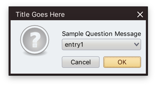
Use the APIs on the SubstanceLookAndFeel class for app-specific control over the order and alignment of the JOptionPane buttons if you want to deviate from the platform guidelines.
The previous release of Substance brought full support for high DPI screens, and the latest release for Flamingo 5.2 (code-named Kennocha) aligns both libraries to be first class citizens on modern screen hardware. The unofficial release notes are:
- Full high DPI support for all components, including
- Command button icons and arrows
- Color selector popup menu
- Ribbon galleries
- Ribbon bands in collapsed state
- Support for vertical scrolling of secondary level content in ribbon application menu
- Better mouse wheel handling in command menu popups
- Addressed clipping issues on some transcoded SVG content
If you’re in the business of writing Swing desktop applications, I’d love for you to take the latest releases of Substance and Flamingo for a spin. You can find the downloads in the /drop folders of the matching Github repositories. All of them require Java 8 to build and run. Happy Swing coding!
See the recent follow-up on the changes to the font family name on Catalina and changes needed at the JRE level to support proper kerning.
Starting from OS X El Capitan (10.11), there’s a new default system font in town – San Francisco. And it came with a very big underlying change, as detailed by Craig Hockenberry:
Apple has started abstracting the idea of a system font: it doesn’t have a publicly exposed name. They’ve also stated that any private names are subject to change. These private names all begin with a period: the Ultralight face for San Francisco is named “.SFNSDisplay-Ultralight”. To determine this name, you need to dig around in the font instances returned by NSFont or UIFont; it’s not easy by design.
The motivation for this abstraction is so the operating system can make better choices on which face to use at a given weight. Apple is also working on font features, such as selectable “6” and “9” glyphs or non-monospaced numbers. It’s my guess that they’d like to bring these features to the web, as well.
Even though the underlying .otf files are still in /System/Library/Fonts, San Francisco is no longer exposed via the regular APIs that web and desktop developers have grown used to. Specifically for Swing developers (of which there may not be many, so at some point it will kind of take care of itself), passing “San Francisco” to the Font constructor ends up using the previous default – Lucida Grande.
JavaFX is already doing the right thing, using San Francisco as the default UI font on El Capitan and Sierra. Swing’s legacy is to have each look-and-feel decide which font to use, and I was expecting the “System” look-and-feel which maps to Aqua to be using the right font family on the latest OS releases. That is not the case as I’m writing this entry, and Swing apps on both El Capitan and Sierra are still using Lucida Grande on both 8u112 and 9-ea.
Last week Phil Race pointed me to this issue that tracked syncing up the internal implementation details of glyph mapping between JavaFX and AWT. That issue has been fixed in early access builds of JDK 9, and is slated to be available in JDK 8 u152 scheduled for October 2017. At the present moment there is no public API to get either a name or a font instance itself that will be mapped to Lucida Grande on 10.10 and earlier, and to San Francisco on 10.11 and 10.12. The only available solution is quite brittle as it depends on the internal naming conventions exposed by the underlying OS:
- .Helvetica Neue DeskInterface on El Capitan (10.11)
- .SF NS Text on Sierra (10.12)
Note that you need a leading dot in both cases, and that this only works on early access builds of JDK 9 at the moment:
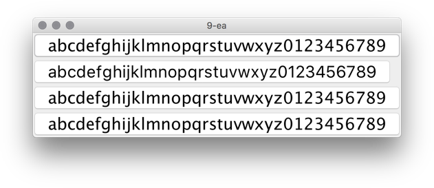
In this screenshot the second button is using new Font(“.SF NS Text”, Font.PLAIN, 24) while the rest are rendered with Lucida Grande. The most noticeable differences are in the curvy strokes of “e”, “g”, “5” and “9”, as well as the straight leg of “a”.
Ideally, there’d be an officially supported way to use the right font on OS X / macOS, either in a form on some kind of a static Font API or a synthetic font family that maps to the underlying system font on all supported platforms. Phil has filed a bug to track the progress on that front.
About five years ago I wrote about vector format, and how it is not quite well suited to be used for application icons. Five years is a long time in our industry, and the things have changed quite dramatically since then. That post was written when pretty much all application icons looked like this:
Some of these rich visuals are still around. In fact, the last three icons are taken from the latest releases of Gemini, Kaleidoscope and Transmit desktop Mac apps. However, the tide of flat / minimalistic design that swept the mobile platforms in the last few years has not spared the desktop. Eli Schiff is probably the most vocal critic of the shift away from the richness of skeuomorphic designs, showing quite a few examples of this trend here and here.
Indeed it’s a rare thing to see multi-colored textured icons inside apps these days. On my Mac laptop the only two holdouts are Soulver and MarsEdit. The rest have moved on to much simpler monochromatic icons that are predominantly using simple shapes and a few line strokes. Here is Adobe Acrobat’s toolbar:

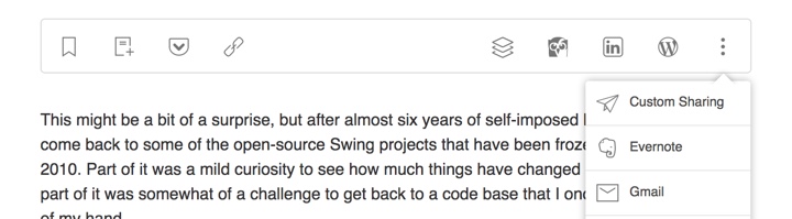
and Evernote:

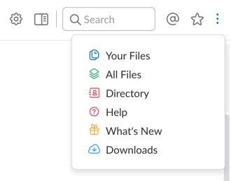
This is Slack:
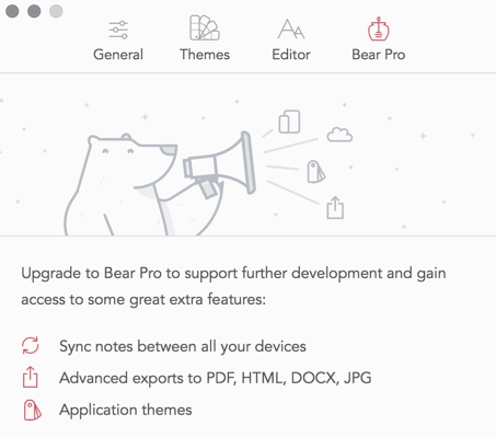
and Bear:
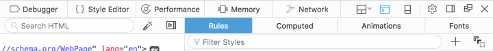
Line icons are dominating the UI of the web developer tools of Firefox:
They also have found their way to the web sites. Here is Feedly:
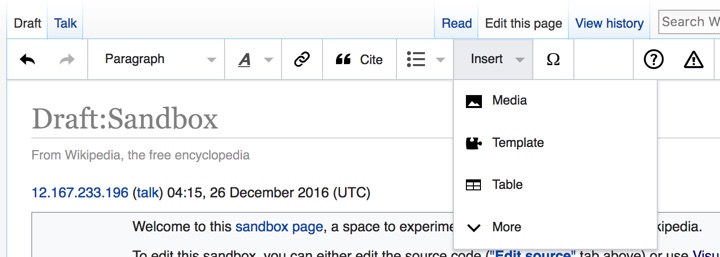
and Wikipedia’s visual editor:
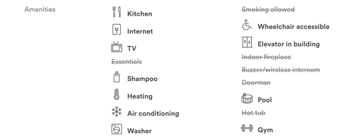
You can also see this style on Airbnb listing pages (with a somewhat misbalanced amenities list):
and, to a smaller extent, on other websites such as Apple’s:

Google’s Material design places heavy emphasis on simple, clean icons:

They can be easily tinted to conform to the brand guidelines of the specific app, and lend themselves quite easily to beautiful animations. And, needless to say, the vector format is a perfect match to encode the visuals of such icons.
Trends come and go, and I wouldn’t recommend making bold predictions on how things will look like in another five years. For now, vector format has defied the predictions I’ve laid out in 2011 (even though I’ve ended that post by giving myself a way out). And, at least for now, vector format is the cool new kid.
