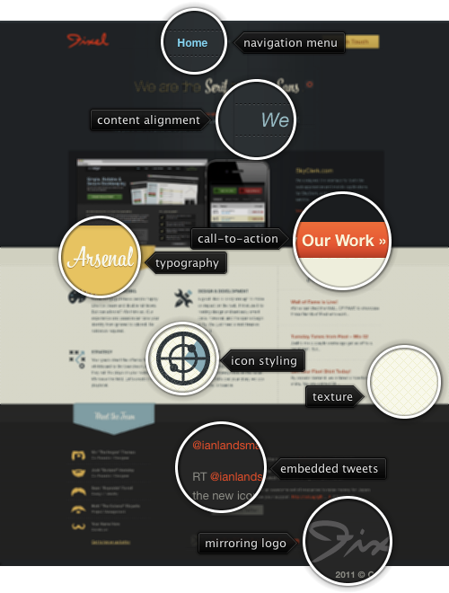
 Today’s post highlights the design of WeAreFixel.com. The landing page strikes a nice balance between text sections and images; note a relatively small portfolio slideshow that blends perfectly into the oversized header section. The calligraphic Bistro Script font is a perfect match for the subdued color palette of sand yellow, cardboard orange and faded blue – with further reinforcements of the vintage feel coming from the distressed icons and finely styled section headers. Different sections use different mix of foreground colors, with the orange used consistently for hyperlinks; note how the diagonal pattern in the middle section makes the transition between dark and light sections seem less offensive.
The humorous “We are the … to your …” banner is quite memorable, but it has a couple of problems. First, a lot of the punchlines are rooted deep in american culture and may cause bewilderment and some negative feelings if the prospective client does not understand a certain connection. Second, the position of the reload icon keeps changing based on how long the current line is. If you’re interested in quickly skimming all the combinations, it’s rather distracting to be forced to move the mouse.
On a more positive note, the “View our work” call to action button has just the perfect positioning and styling. It’s located above the fold right next to the portfolio; given that none of the entries use the orange color (an extra credit for choosing screenshots dominated by the main palette colors), it is a very distinct element. It is also situated on the “main diagonal of interest” for the visitors that are used to quickly skim the content. Note how this diagonal is anchored by four elements, all using the orange color. Finally, study the excellent styling of the tweet section in the footer – from the muted calligraphy of the section header to the consistent styling of embedded hyperlinks.
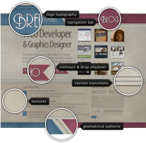
 Today’s post highlights the design of BrentHarmann.com. The design is anchored by three main elements – an attractive vintage color palette, strong angular geometric lines and embedded Andes font that combines precise square angles, skewed cross strokes and frilly loops. Desaturated brown, magenta and blue are carefully balanced throughout the different sections, with colors switching between foreground, background and separator elements. Note the gradient and strike through effects on the main logo and the call-to-action “ribbon” buttons and attractive whitewash noise textures that bring a welcome relief to wide swaths of content in the main section that uses light brown for the background color. My favorite element here would be the contour effects on the “Portfolio” and “Learn More” ribbons – follow the interplay between inner and outer contours and the drop shadows. The usage of small size Andes on the blog posts dates is the only thing that i would question – there’s too much visual noise at this font size that destroys the beauty of this all-caps font; Myriad is perhaps a better match for the task at hand. On a more positive note, make sure to visit the “Contact” page and study the intricate “Send mail” graphic.
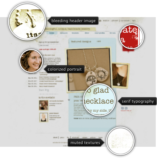
 Today’s post highlights the design of LisaLeonardoOnline.com by apRoberts Arts. The site has a nice soft feel that meshes well with the hand-crafted jewelry available for sale. Paper yellow, beige and feather blue are used for most of the elements, with heavy red highlighting three “action” items. Here, it’s rather disconcerting to discover the quite small clickable area in the big red ribbon – i’d expect the entire element to respond to the mouse click in order to maximize the desired effect.
On a more positive note, i like the mix of thin serif typewriter font, hand sketched lines, desaturated portrait thumbnails and patches of grainy background textures. The overall effect is reminiscent of vintage scrapbooks with the warm, unique and inviting appearance.
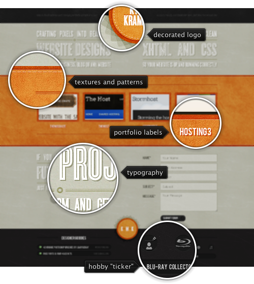
 Today’s post highlights the design of KyleMKramer.com by @MrKyleKramer. The landing page has a nice vertical symmetry that mirrors the beige and slate gray sections around the large orange strip that highlights the designer’s portfolio. Note the visual rhythm that switches between intricate textures and flat beige fills, great typography that mixes embedded fonts with image-based oversizes text sections, and the consistent usage of double separator lines with variable stroke width.
And this is what i particularly like about this site – picking a very few elements and employing them consistently everywhere. You can see this in the three-color palette and the way it is used for styling the social icons and switching between light and dark text colors in the header and footer sections. You can see this in the grainy texture used in the portfolio section and the two round orange badges. You can see this in the edge patterns of the portfolio section and the badges – with the same thick slightly depressed outer edge and the lighter dashed seam running along the inner edge. You can see it in the layout and font styles employed in the three poster-style text blurbs in the beige sections – with exactly the same color treatment, text effects and the styling of the separators. And finally, you can see it in the visual treatment of social icons and the “hobby” icons in the two bottom sections – outer shape, icon styling and rollover effects. And while i’m talking about the last icon strip – this is definitely a unique flavor to the “about me” section, with single line snippets on Kyle’s hobbies, all nicely packaged and neatly tucked away, with simple and yet very effective jquery-based toggle effects.
![]() Today’s post highlights the design of WeAreFixel.com. The landing page strikes a nice balance between text sections and images; note a relatively small portfolio slideshow that blends perfectly into the oversized header section. The calligraphic Bistro Script font is a perfect match for the subdued color palette of sand yellow, cardboard orange and faded blue – with further reinforcements of the vintage feel coming from the distressed icons and finely styled section headers. Different sections use different mix of foreground colors, with the orange used consistently for hyperlinks; note how the diagonal pattern in the middle section makes the transition between dark and light sections seem less offensive.
Today’s post highlights the design of WeAreFixel.com. The landing page strikes a nice balance between text sections and images; note a relatively small portfolio slideshow that blends perfectly into the oversized header section. The calligraphic Bistro Script font is a perfect match for the subdued color palette of sand yellow, cardboard orange and faded blue – with further reinforcements of the vintage feel coming from the distressed icons and finely styled section headers. Different sections use different mix of foreground colors, with the orange used consistently for hyperlinks; note how the diagonal pattern in the middle section makes the transition between dark and light sections seem less offensive.