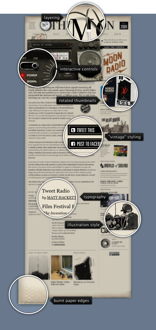
Today’s post highlights the design of Radio.NYMoon.com. The site has a nice vintage feel that starts with framing the content on a piece of faded paper with great burnt textures along the top and bottom edges. This feel is reinforced with a consistent illustration style, inverted rollover effects on the navigation menu and serif typography. The interactive radio that overlays the header section completes the picture; check the “TweetRadio” section for more info behind this element.
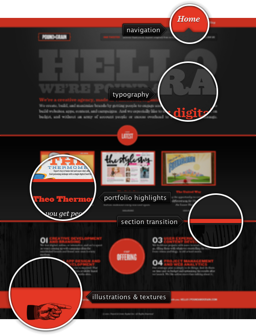
 Today’s post highlights the design of PoundAndGrain.com. The landing page has a nice visual rhythm with strong red color framing and separating the content, clean typography and a number of background patterns to bring visual separation between the different sections. Subtle drop shadows, consistent usage of dotted lines and the radial highlight behind the oversized header typography further highlight the attention to details. The “Work” section deserves a special mention – with its nice sliding transition to the first portfolio entry and the static positioning of navigation buttons that enables comfortable browsing without moving the mouse – within the specific entry and between entries.
Moving the mouse over the thumbnail slideshow of the specific project shows not only the navigation buttons, but also a translucent plus sign that indicates a larger available version. When you click it with the mouse, the larger version is displayed in a lightbox. The styling of the lightbox is my favorite design element – with a thick red outline as a background layer, accented by the thin drop shadow around the screenshot. This layering is further highlighted by the gorgeous styling of the “close”, “prev” and “next” buttons (the later seen on rollover); the only visual gaffe seems to be an extra pixel shift on the folded part of the “prev” button that overlaps the thick outer border of the lightbox.

Today’s post highlights the design of ElectricDynamic.com by Matthew D. Jordan. The site takes you on an impressively styled visual journey, with rich elaborate illustrations, precise typography, vintage textures and a warm color palette. You can clearly see the amount of attention that went into every single element on the page, with consistent alignment, positioning and styling. Note the nice loading progress and full-window fading of the content during the initial stage – while this is usually reserved for Flash-based sites, it’d be a welcome addition to other sites that depend heavily on images and other asynchronously loading content, especially when the first impression is formed as the site is loading. I also like the inverse and grayscale rollover effects on the navigation menus and social links.
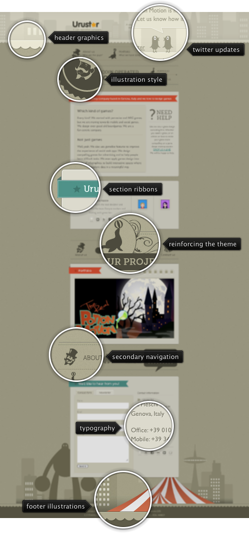
 Today’s post highlights the design of Urustar.net. A nice illustration style that features circus-related elements; i especially like the city landscape with giant robot and striped tents in the footer, transitioning to the simple information section at the very bottom. The design has an interesting way to embed multiple navigation menus in between the sections, varying the position and size of the icons to break the usual monotonous look of such elements. Also note the precise geometry and lighting of the various separators and borders, as well as consistent usage of a single beige hue with varying brightness levels throughout the entire page.