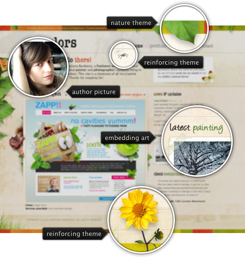
Today’s post highlights the vibrant design of 84 Colors, the personal showcase of Cristiana Bardeanu. It has a strong nature theme that starts with desaturated earthen browns with slight background textures, continues with contained areas of desaturated season colors (red, orange, yellow, green) and is further reinforced by well-placed decorational elements of leaves and animals. An unintrusive flash animation of leaves and squirrel completes the picture and adds final polishing touches. Note how the images blend into the site design – including the main portfolio image, the artist picture and links to the latest photo / painting.
Active links have nice rollover effects, and the rollover effects for the navigation menu use the same season colors as the rest of the site. My only reservation is about using the orange color in “hello there” header which is the same color used elsewhere for links.

Today’s entry highlights the design of KilianMuster.com. Precise grid layout, consistent use of unsaturated orange for the logo, links, menu highlights and the main separator, fine background texture and hand-drawn illustrations – all add up to create a slightly vintage, warm and yet professional personal site.

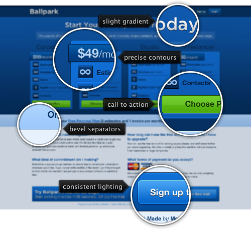
Today’s post highlights the excellent design done by MetaLab for the pricing page of Ballpark. Known for its precise and clean designs, this is MetaLab at its finest. Clean and simple color schemes, consistent lighting model that is applied to background, buttons, text and separators, precise contours and clear call-to-action buttons. The best pricing page on the internet in my opinion.

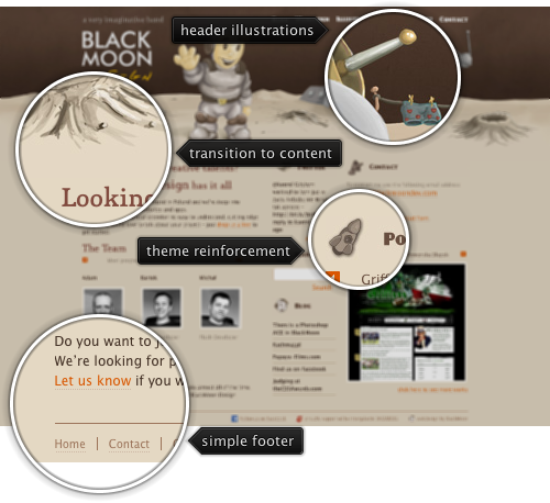
Today’s entry highlights the design of BlackMoonDev.com. A very stylish theme that uses a consistent brown color scheme for background, header and text, beautiful header illustrations further reinforced by small graphics next to subsection titles, a small and informative footer section, and moderate use of a mildly saturated orange color for the links.