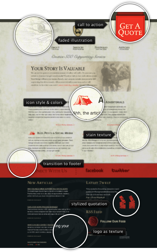
Today’s post highlights the design of WordRefuge.com by EctoMachine. February must be the “Peach Red month” on this series, with this design joining ImageMechanics.com.au, ShellyCooperDesign.com and Kapepur.com for splashes of vivid, vibrant and warm color offsetting a reserved vintage color palette of worn out yellow, faded brown and dark gray. The retro look is reinforced with background textures, heraldic icon (with a few irregularly “colored” pixels), a large stippled drawing in the promo section and an elaborate wax seal rendition of the feed icon in the footer. The transition to footer is clearly delineated by the thick red section with a drop shadow along its top edge. Note how this color is used for everything related to contacting / social interaction with the agency – from the big “get a quote” ribbon in the header to the twitter / rss decorations in the footer.
On a less positive side, the embedded fonts used in the site (serif Albertina with its slanted serifs on lower case letters and bulging Klavika) have poor baseline alignment, grid fitting and kerning. Trace the alignment and gaps on the section headers to see rather sloppy performance of the font, only some of which may be attributed to the Cufon library. Switching to fonts with better support for modern web typography will undoubtedly boost the overall visual appeal of this otherwise excellent nouveau-vintage design.

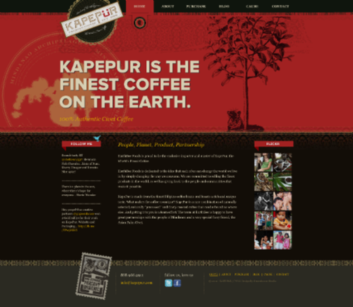
Today’s post highlights the design of Kapepur.com by Greenhouse Studio. A light-on-dark design uses a warm color palette of peach red, light gray, dark brownish gray and tangy yellow; the later is used for both hyperlinks and section headers leading to somewhat unpredictable browsing expectations. Rich vignette illustration elements contribute to the warm feel, from the oversized logo to separators to the stippled drawing of a coffee tree. The header seems slightly off balance (to the left) – the tree illustration is too “anemic” to balance out the heavy tagline, big logo and the background map. There’s also some work needed to align and balance content in the footer to use more consistent typography and alignment. Finally, while the embedded flickr widget adds a nice splash of color, it feels that the social icons (twitter / facebook) need to be stylized with one of the palette colors; the cyans / blues are too bright and distracting.

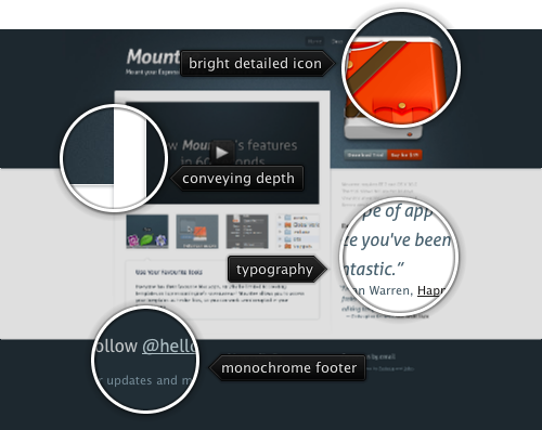
Today’s post highlights the design of HelloMountee.com by Padraig Kennedy and John Ryan. Playing off of the product name (which combines the action of mounting a drive with the abbreviation of the publishing platform), the design guides the eye towards a large full-color icon that replicates a stylized uniform of the Canadian mounties. This splash of bright orange surrounded by somber steel gray is a great backdrop for the main call-to-action “buy” button located directly below it – note how the button uses a muted shade of orange to maintain a professional look of the product.
Unlike an overloaded product page for Cornerstone featured earlier in this series, this landing page opts to use brevity and puts all the content above the fold. An embedded overview video of the product takes the center stage, with the default freeze frame using the same muted dark steel gray as the surrounding color palette. Note subtle textures, drop shadows and radial highlight around the video; combined with clean typography (embedded Aller font family) and a strong alignment of elements – especially in the right column – placing just the right amount of product information on the landing page, leaving the rest to additional pages readily accessible from the navigation menu.

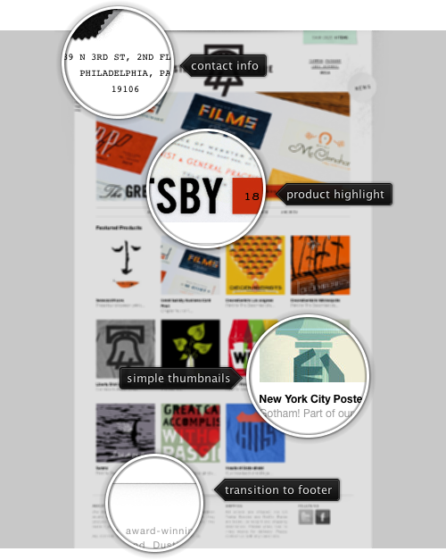
Today’s post highlights the design of Shop.TheHeadsOfState.com. Placing main emphasis on highlighting the different products, it uses a clean monochromatic palette, simple typography (mixing Helvetica Neue for body text and monospace Courier for most of the header content) and an austere header logo. Note how the logo slightly overlaps the full-width slideshow that highlights promoted products.
Most of the store products have a distinct vintage look, which is further reinforced in the header section. The cart tracker is decorated with a slightly distorted background that combines a desaturated turquoise color and a dot noise pattern. The muted background grunge patterns can be seen further along the sides of the main slideshow. Finally, each one of the slides (note the nice cross-fade transition effect) features a unique retro-style description of the specific product, combining typography, colors and ribbon elements.
This seemingly simplistic design has a great visual balance, strong alignment and, most importantly, great presentation of the featured merchandise.