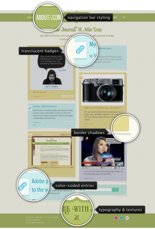
Today’s post highlights the design of MinTran.com (@mintran). This Tumblr-powered site features a relaxed and attractive color palette of pastel blues, greens and browns, adding a number of fine-grained textures and beautifully styled “badges” in the header and footer; note the vignette typography, varied lighting, top double outlines and worn out texture in these two badges. The main content is laid out in two simple columns, with ample spacing and subdued drop shadows around embedded images. Note how the palette colors are used to code each entry based on its type (link, image, video, search box), and how the color is applied consistently to all the elements in the specific entry – from the thumbnail to background to title caption to hyperlinks.
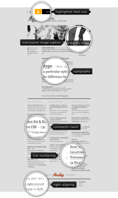
 Today’s post highlights the design of JonTangerine.com by Jon Tan (@jontangerine). The site features fantastic typography, great content alignment (even with column lines inconsistent between the three main section) and a nice twist on the site name that uses tangerine yellows and oranges for navigation menu and hyperlinks rollovers. Make sure to visit the “About” page and the rest of the site, and spend some time analyzing the balance, white space and typographical treatment of every text section.

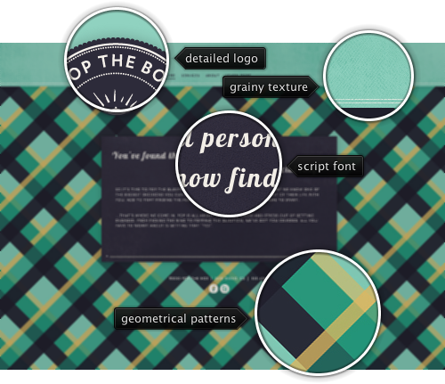
Today’s post highlights the design of Pop-The-Box.com (@Pop_the_Box) by Dash Station (@dashstation). It’s an instantly memorable and easily recognizable site that opts for placing all the content above the fold, horizontally scrolling between the four sections on changing selection in the navigation menu. While the content of each section is rather spartan, it is framed with exquisitely crafted textile background textures; my favorite visual element by far is the interlocking repeating plaid pattern of vintage greens, yellows and grays.
The warm intricacy of thick curvy Lobster and the simplicity of all-caps traditional Underground look great on the grainy denim texture of the large gray content box. The embroidered main logo completes this great specimen of an elegant, well balanced and excellently styled modern design.
Every month this series is tracking the latest design trends and collecting the best examples of modern web designs. Here is the list for February 2011 with over 700 links from 27 aggregator posts: