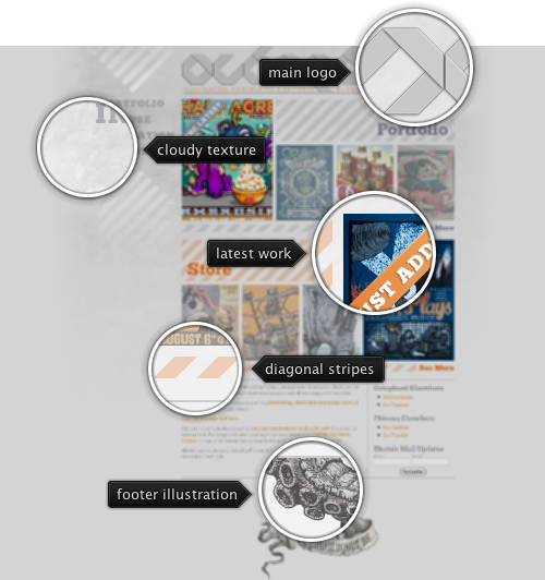
Today’s post highlights the design of Octophant.us by Phineas X. Jones (@Phineas). Playing off of the site title, the main header uses eight-way stripes in an attractive monochrome typographical logo. A detailed stippled octopus tentacle in the site footer frames the content from below, reminiscent of illustrations of sea creatures found in old books. Diagonal elements that start in the main logo continue throughout the site, serving as background textures, decoration elements and section separators. The simple light gray monochrome color scheme is enriched with a desaturated orange used for links, highlighter ribbons and some of the diagonal stripes.
Note the interesting layout of the portfolio and store thumbnails – the latest work has a larger thumbnail (placed on either left or right to preserve the overall visual balance), while other three thumbnails are smaller and have a translucent white overlay on top of them. The large diagonal stripe serves as the background for the section header; at the same time, it helps aligning the larger thumbnail within the section bounds. The translucent overlay focuses the attention on the latest work, while still providing enough visual details on the specific work – with full-color version appearing on mouse over. While i’m on the subject of rollovers, i’d like to point out that the site can benefit greatly by adding a short animation fade-in to the image rollovers, as well as using a darker shade of orange on hyperlink hovers.
Overall, it’s a nicely executed design that breaks away from the traditional paradigm of arranging all the work as a grid of thumbnails, with a unique twist on the site name serving as the inspiration for all the supporting illustrations.
The original slides
available for download from the SlideShare site.

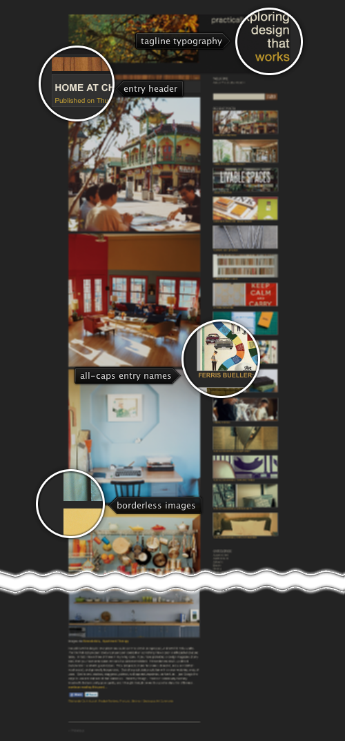
Today’s post highlights the design of PracticallyModern.com by Jesse Brew (recently featured in the Retro:Active series). The site takes you on a fascinating visual journey that features meticulously chosen images and a great color palette. With only minimal text content for every entry, the main focus is on exploring the visuals that surround us – taken through a retro lens. The images are rich in soft natural browns, yellows, blues and greens, with only minimal incursion towards the red-violet spectrum. The predominant golden browns also form the basis of the supporting graphical elements – from the textured wooden bar in each entry header to brownish yellow links to the textured lead photograph in the site header.
The sidebar navigation is my favorite element here. While most sites resort to a simple bullet list of the recent entries, Jesse has crafted a vertical list of thin thumbnail slivers, each one showing a small visual glimpse of the matching entry. Given such strong reliance on images in the main content column it’s not surprising to see the same amount of visual polish that went into this bar. And finally, if i had to change one thing, i’d play with theming the facebook / twitter buttons, at least for the default state – the bright blues stick out like a sore thumb.

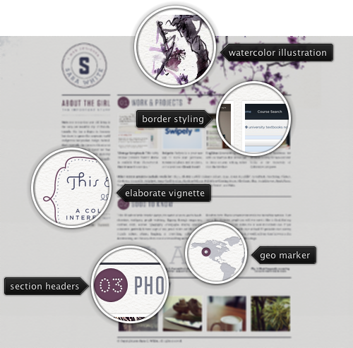
Today’s post highlights the design of SaraWhite.com (@Sara_, as an aside, Sara works as the creative director at MetaLab which is responsible for entry #3 on this series). This soothing tone of this single-page site is set by the creased paper texture and the beautiful watercolor illustration of a blooming lilac tree. Note how some of the rougher brush strokes emulate the physical appearance of a watercolor painting, defined by the paper creases and uneven travel of pigment through the paper pores. This muted lilac color also defines the color palette that adds a darker shade of lilac for section headers, link rollovers and a few tongue-in-cheek illustrations in the second section.
A relaxed tone set by the header illustration is mirrored in simple, human and soft tone of the text sections. Attractively styled thumbnails of Sara’s portfolio and her Flickr stream follow the precise four-column grid of the main content that switches effortlessly to one or two columns as needed. Note that while the thumbnails are not styled with the site’s color palette, they don’t appear to overload the eye with too much color; this can be attributed to subdued tones and a great color balance across the bottom row that stays within a rather narrow hue segment of soft natural colors.