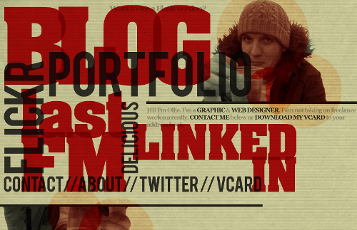
Today’s post highlights the design of OliverKavanagh.com. An instantly memorable landing page that uses overlapping – and sometimes rotated – slabs of extra large texts as navigation links. Note the secondary level of overlapping in the chunky red texts that use a font with a hint of serifs; combined with translucent dark gray color used for the other navigation entries results in an intricate typographical maze that frames the content in the top-right corner.
The texture and color treatment of Oliver’s headshot is my favorite part – note how the three overlapping circles bring out the coarse background texture, with burnt mahogany color deriving from paper yellow, cardboard orange and deep red of the surrounding elements. Moving the mouse over different parts of the page shows simple rollover effects that help understanding which part is active – this is especially helpful given large swaths of overlapping elements.
Finally, a small note on how well the design adapts to different browser window sizes. Just as in case of DesignWise, the actual implementation uses “pre-baked” images – one for each navigation element. While this ensures high-fidelity look, and the pixel-based CSS definitions maintain the exact overlap ratios, the design does not scale well when the browser window is resized – and overflows the right edge on even medium window sizes. It’s hard to say what can realistically be done to accommodate all possible window sizes, or even how far the current state of web typography and the latest CSS support can take designs that rely so heavily on precise typography and positioning.

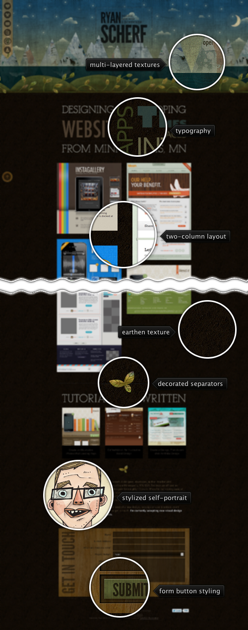
Today’s post highlights the design of RyanScherf.net. An intricate oversized illustration by Jacob Souva of Two Fish Illustration sets the visual tone for the rest of the site, with its dark cool colors and multi-layered grungy textures. The transition from the dim starry sky to mountains to grassy hills completes with the deep brown earthen styling of the main content – a nice break from similarly styled designs that choose to put the “underground” part in a small footer. Consistent use of desaturated browns, greens and blues continues throughout the rest of the site, with decorated separators and wooden texture of the contact form reinforcing the nature-based main illustration theme. Note the two translucent static elements along the left edge of the site that allow quick navigation in this single-page site; the only usability issue with the main navigation strip is that it does not provide any visual indication which icons scroll the site content and which icons lead to external social sites. The site footer can also benefit from extra polish around the budget selector in the contact form and twitter widget in the footer – both stick out like a sore thumb on an otherwise elegantly styled site.

Today’s post highlights the design of Jaredigital.com by Jared Christensen (@jaredigital). An attractively styled and spaced header sets the visual tone for the site, with an old-style picture of Jared that dovetails nicely with a self-deprecated humorous description to its left. This tone lends a nice human touch to the site – from the navigation menu rollover texts to the footer blurb, from the portfolio section description to the “About” page (6’5″ of pure uselessness). Notice the slightly expanding drop shadow that surrounds the bottom part of the portrait, helping to offset it from the patterned background and anchoring it to the multi-layered separator that transitions to the portfolio.
Fuchsia pink used in the main logo is the main highlight color, used for navigation menu rollovers, portfolio blurbs and (reverse) hyperlinks. I particularly like the rollover effect on the main logo, with the logo and supporting text toggling between the pink and gray.

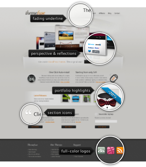
Today’s post highlights the design of ThemeFuse.com. It’s a nicely spaced and well balanced design that does a great job highlighting the company’s portfolio. A Flash-based carousel of promoted themes features attractive transitions, reflections and a 3D perspective shift as the thumbnails slide in and out. The reflection effect works particularly well with the “shelf” effect created by a fading rectangular outline with a strong vanishing point. Note how the background and texture elements above the fold artfully use a very small brightness interval of light gray, providing just enough visual support to the colorful portfolio – from fading lines to background swooshes to beveled outlines.
A combination of dark slate gray and orange is used for action buttons, section headers and hyperlinks with content transitioning from two columns (note the right alignment of the left column) to three columns, with an interactive thumbnail strip in between. I particularly like the white icons in the header titles of the last three sections, with just the right amount of dark drop shadow to prevent them from blending into the background. However, it feels that the action buttons should be center-aligned and not skew each column to the left.
If you follow this series, you’d notice that i’m a big fan of using monochrome theming for large rows of social icons. Given rather small sizes of those icons and their desire to be immediately recognizable, it’s no wonder that they augment the vector lines and typography with strong and often saturated colors. Placing a number of such icons in an otherwise balanced color palette usually creates too much visual noise and breaks the overall visual structure. However, a full-color strip of social icons looks just right on this page – playing off of color splashes in the large portfolio carousel, and, more importantly, following the saturation levels, horizontal layout and rough dimensions of vibrant icons in the smaller highlight strip. Speaking of which – move the mouse over those small thumbnails to see custom styled fading popups with bigger images.