A couple of weeks ago i posted a few screenshots of Gowalla 3 app for the Android platform, and today i want to take a closer look at the great work done by Drew Yeaton (designer, @xeeton) and Philip McAllister (developer, @mcalliph).
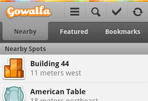
This screenshot illustrates the omnipresent header section. It starts with the thin rainbow strip that reinforces the web branding, transitioning into a combination of action bar and tab strip. Note how the single-pixel light gray separator just below the rainbow strip helps the transition from a full-color area into the predominantly monochrome section. Thin vertical icon lines fade away at the ends, providing just enough separation without too much visual noise. The icons themselves have a light halo offset one pixel to the bottom – this effect is mirrored on the text of selected tab. Together with the thin separator line mentioned above this establishes a consistent lighting model.
The selected tab has a nice subdued gradient that smoothly fades its fill into the action bar, with gradually darkening colors as it nears its bottom edge. Here, the design follows the same approach as taken by Safari 4.0 and Firefox 4.0 – both blend the currently selected tab into the address bar: Firefox downward and Safari upward. This is the right decision to make – while the header remains anchored to the top edge of the screen, the content is scrolled vertically below the tab strip; blending the selected tab into the content would have broken the visual continuity on both ends.
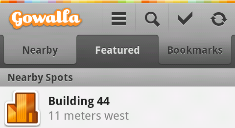
This screenshot shows the styling of pressed tabs. A pressed tab (bookmarks in this case) uses the same curvy contour as the selected one, with much darker gradient and the same color “flip” of the tab text.
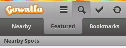
And here you can see the styling of a pressed action bar button. Note how the gradient fill extends to the vertical separators on both sides (with some fuzziness along the right edge), with a much darker line along the top edge and a fade away towards the bottom. On a related note, the current version of the app does not show any visual indication of focus traversal making it rather hard to navigate the app with a nav ball, d-pad or any other navigation method.

As the information is loaded, the rightmost icon shows a spinning progress indicator. This follows the convention set by modern browsers that combine the opposite-state buttons to save valuable space while still providing visual indication of a running task.

Some pages show a button bar anchored to the bottom edge of the screen. Here, the main call-to-action button uses a strong orange fill, while still maintaining the global lighting model. Note how the button text has a darker shadow offset one pixel to the top. It also looks like the much darker gray color of the button bar background makes the outer dark orange line look fuzzy – this can be addressed, perhaps, by tweaking the colors used for the outer and inner contour along the bottom few pixels.

The button bar does not scroll away with the content. It looks like the designers were aware of the precious vertical space taken by this container, and decided to make its background partially translucent. While this may slightly help in “discovering” the scrollability of the main content, i’m looking forward to see the landscape-optimized layout of screens that currently show three static bars.
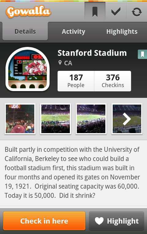
And finally here is a full-size screenshot that shows all the elements together – from the selected action bar button mirrored in a small seaglass overlay next to the location name to the drop shadows around the thumbnails, from the styling of “people” / “checkins” buttons to make them appear as part of the same button strip to the precise content alignment in the location summary section – to all the static navigation elements mentioned above.

Today’s post highlights the design of MindWork3D.com by The Core Units and Goksel Eryigit for Can Tuncer. The portfolio section above the fold sets the visual tone for the rest of this single-page site. Breaking away from a traditional grid, the portfolio thumbnails are arranged across cells with different weights and sizes, while still using the same underlying “cell square unit”. The navigation controls along the left edge of this section, as well as the bright blue arrow button further anchor this underlying unit and lay out the visual foundation for the following sections. Each portfolio thumbnail has an attractive rollover effect, and once activated, opens an overlay lightbox with slideshows of the specific work.
Scrolling down the page reveals that the navigation controls are anchored to the browser viewport. The buttons highlight as you scroll to the matching section (with a rather jarring “skip” over the “Blog” button that leads to an external site). Each button has its unique distressed texture, while still reusing similar underlying brushes; note the helpful shortcuts embedded in each button that provide quick info on navigating the sections with the keyboard. An extra amount of attention went into vertically aligning the buttons when the content is scrolled all the way up; however, the perceived bottom edge of the last button does not perfectly align with the matching edge of the portfolio row due to extra drop shadows.
Each subsequent section has its own combination of the main underlying elements – distressed textures, monochrome grayscale palette with sky blue highlights, large uneven serifs for section headers. Carefully aligned large square buttons in the bottom right corner of every section help balancing out the large swaths of textures; my favorite texture element here is the hexadot pattern of the portfolio section trying to “break in”, peeling away the crumbling whitewash texture. Overall, the design is a great match to the visual style of Can’s CG work.
P.J Onori on the difference between native and browser apps in his excellent “The Materials of Digital Products“:
There is a reason why we do not see highly refined and precise parts made out of most plastics. This does not negate the usefulness of such a material, but it has its specific uses. Similarly, certain technologies are more suited to precision crafting but often times have greater costs associated with them. A perfect example is developing for the mobile platform. A native iOS app will allow for much greater refinement in performance, motion and visual treatment, but there will likely be greater build costs compared to an HTML5 mobile app. Conversely, HTML5 will allow much greater flexibility in deployment and distribution. Both technologies have their place in mobile, we just need to know when plastic is more appropriate than stainless steel.
 Today’s build highlights the design of 2010.BuildConf.com by Andy McMillan (@goodonpaper). After reviewing the sites for HDLive 2010 and dConstruct 2010, it’s time for another designer conference site. This design combines a simple color palette and nicely balanced grid to highlight the conference speakers and extra material.
Spare appearance of lime green for section headers and hyperlink rollovers allows using it to draw attention to two action buttons – one if the header and another in the footer. The content is laid out in a four-column grid, with different sections switching to different column spans. Note how the first row of the speaker thumbnails is “missing” the first cell – to balance out the heavy logo just above it; this creates a “content diagonal” that goes from the top left to bottom right. A counter diagonal that connects the action buttons in the header and footer sections brings the balance back to center. The last two sections feel a little off in this regard – with awkward content in the twitter / blog section, an extra wide separator below the “Blog” caption, and off-grid positioning of the footer content. The entry headers in the “Fringe” sections lead to the full content, but are missing the muted double arrow icon found below the speaker thumbnails in the section above; it feels that the UX consistency would be worth a little bit of extra visual noise here.
Be sure to visit the “Workshops” and “Fringe” pages to see consistent application of the same principles throughout the rest of the site. This is quite commendable given how some designers spend a lot of time on the landing page at the expense of the rest of the site.
