This is the second part in the ongoing series about responsive mobile design. The main goal of this series is to answer three underlying questions: what are we designing, why are we designing it in a certain way and how are we implementing the target design. The basic principles of responsive mobile design were highlighted in the first part – the same content, with the same logical and visual hierarchy, but the representation of the content adapts to the current context. Today, I’m going to show a few examples of responsive web design, and how we can adapt the basic principles of responsive web design and extend them to the world of responsive native mobile applications.
In his seminal article published in May 2010 Ethan Marcotte coined the term “responsive web design“, paving a way for a unified approach to designing web sites that adapt to the current media context:
Rather than tailoring disconnected designs to each of an ever-increasing number of web devices, we can treat them as facets of the same experience. We can design for an optimal viewing experience, but embed standards-based technologies into our designs to make them not only more flexible, but more adaptive to the media that renders them. In short, we need to practice responsive web design.
Ethan’s research into crafting browsing experiences that scale from large desktop environments down to tablets, netbooks and small mobile phones has culminated in the“Responsive web design” book published in June 2011. The original article and the book have prompted forward-thinking web designers to reevaluate their work flows.
Web designers no longer live in a world where there are two distinctly separate ways of accessing web sites, large desktop setups and small, oftentimes feature-limited, mobile phones. The explosion of different form factors, screen sizes, resolutions and ways to interact with the device itself has created an almost continuous spectrum of browsing experience, and you can no longer think in terms of desktop-optimized and mobile-optimized versions of your site. You can no longer generate and maintain separate HTML files for different “versions” of your site, simply because you can no longer take the spectrum of devices used to access your content and split it into precisely defined and well delineated buckets.
Instead, responsive web design talks about different representations of the same content. The basic logical hierarchy of the content, and the content itself is defined in a single HTML file. The overall visual language and styling are defined in a single CSS file. In addition, the same CSS file contains multiple sections, each defining the layout and flow of the content itself. Let’s see a few examples.

This screenshots show two representations of the design blog by Happy Cog. A few years ago, you would use the terms “desktop version” and “mobile version” to describe the two representations, and most probably the second version would have, indeed, been a separate HTML definition that would need constant maintenance – or custom content management system – to stay in sync with the “main” version of the site. In the world of responsive web design, it’s the same HTML file with well defined hierarchy of content, and a single CSS file (with a nice ASCII art) that optimizes the presentation of the content to the current context.
Tracing the logical hierarchy of the content, you will see the simple navigation menu in the header, the leading section with main logo, tagline and search box, a large preview of the latest blog entry (with image, first paragraph and author blurb), smaller previews of the next three entries, blurbs about additional media materials, contact information and copyright footer. The logical importance and connections between the different sections are reflected in the way these sections are ordered in the grid, and in relative sizes of grid cells themselves.
There’s a strong visual language that reinforces the logical hierarchy and supports a unified flow of information. A simple duotone color palette of purple and orange, consistent and clean typography, subtle drop shadows framing the main content, colorized images associated with each entry blurb – all of these together create a unique visual branding for this site. Also note the transition between light-on-dark and dark-on-light styling for different sections, and a gradual darkening of background in the footer sections – until it gets to the copyright footer that “closes the loop” started by the similarly styled, if only slightly lighter, header.
There is no mobile version of this site. Instead, if you open this page on a device with smaller form factor, you will see a slightly different representation of the same content, a representation that maintains the same logical and visual hierarchy of the content:

A more restricted context means that some of the content will need to be either reflown or hidden altogether. In addition, some of the content will need to be rearranged to optimize for a different interaction model that is exposed by smaller devices. Take a look at the right side of the navigation header. The words “happy cog” are gone to remove extra clutter and noise. Instead of having two separate click targets, one taking you to the main site, and another opening a slider menu, you only have the cog that opens the slider menu. The search button transitions to using an icon instead of text. The main blog entry loses the big thumbnail, and the author thumbnail. The author blurb moves above the first paragraph, as reflowing text around such a box is going to result in bad typography under small widths. The arrangement of blurbs for next three entries become vertical, with comfortable touch areas. The side-by-side layout in the second footer transitions to vertical stacking – to keep the three-column arrangement of office overview.
There’s an interesting thing to note – the blurbs about additional media content in the first footer are gone. This information is still accessible from the main navigation menu, and removing the blurbs keeps the overall scrolling experience on a smaller form factor more pleasant.

This is another example of responsive web design, this time from Meagan Fisher. Three-column representation of the content takes advantage of large form factors, keeping most of the content above the fold. A single-column representation reflows the content blocks, making a number of interesting decisions along the way.
Three blurbs from the left column are gone – presumingly as they are not important enough to further increase the overall height of the content. The five-element navigation menu keeps its horizontal layout, but every navigation item loses subtitle. I personally am not the biggest fan of this representation, as it results in very poor usability on touch-based devices, where you need to be extra careful where you click to navigate to the specific subsection of the site. The main content stays the same – large thumbnails, first paragraph and additional links – but it transitions to be vertically stacked. This is a tradeoff between keeping the large thumbnails and increasing the overall height of the scrollable content. Finally, the single-column arrangement of links in the right column (which balances nicely with tall content to its left) transitions to three-column arrangement on a smaller form factor. This is my favorite part here – keeping the overall height from growing even further, taking advantage of short link texts and increasing the scannability of the section content on smaller form factors (where displaying the links in a single column would have required scrolling up and down to locate the specific link).

Simon Collison’s site takes responsive web design and strips it down to the bare minimum. The transition from four-column to single-column representation is a high-precision, high-fidelity preservation of the layout and styling of content within each section and each cell – including textures, typography, colors, alignment, margins and gaps.

This is one of my favorite examples of responsive web design – from Stephen Caver (which, perhaps not incidentally, works at Happy Cog). The header is a rather spacious navigation menu, with extra lines given to describe each navigation link. The beautiful textured black tagline typography is supported by the second version of the same navigation menu, this time using a similarly textured black block. The somewhat disjointed arrangement of additional content in the bottom half of the page has a nice weight distribution that balances out the heavy black shapes above it.
The representation of the same content on a smaller form factor is absolutely perfect. The navigation menu items are stacked vertically below the main icon, using much larger font size and providing nicely delineated and comfortable touch targets. The overall typography look of the tagline is preserved, along with the texture, even at a smaller scale. The rest of the content is arranged in a simple and very effective fashion, flowing all the way down to the spacious footer and omitting the sparse – and not very useful – factoids found in the bottom-left part of the full-size representation.
My favorite part about this transition is how well it maintains the visual flow, language and styling. In addition to scaling down and preserving the typography of the tagline, it also mirrors the sky-neutral-land background styling of the content, and even while the header and footer sections are much taller than what you usually see on scaled down versions of other sites, and the navigation menu is a spacious vertical list of links – the overall height of the content is identical between these two representations.
This is just a small glimpse into the myriad of UX and UI design decisions that must be done in the field of responsive web design. Addressing this complexity requires a larger upfront investment during the design stages, and, at times, an increased initial development cost. However, it is absolutely worth it in the long run, as your final product, no matter if it’s a web site or a native mobile application, can scale and adapt to a much wider variety of contexts, with much less future investment on your side.
Stay tuned for the next entry where i’m going to talk about the implementation aspects of responsive mobile and web design, and what is available to Android developers that want to take advantage of these principles.
It’s time to take a closer look at the design and implementation principles of responsive mobile design, and this will be the first part in a series that will answer three underlying questions: what are we designing, why are we designing it in a certain way and how are we implementing the target design. This series is based primarily on our experience in unifying the two separate code bases that we had for the Android market client – one optimized for small phone screens, and another optimized for large tablet screens. The main goal is to show the basic principles of designing and developing for a wide variety of screen sizes, ratios, resolutions and form factors. Keep in mind that the Market client UX and UI design used to highlight the specific points is always work in progress, as we continue refining and polishing the application across the entire gamut of supported devices.
The Android ecosystem is a thriving and almost continuous spectrum of devices that range from small 2.6″ phones all the way up to large 10.1″ tablets (and beyond that into TVs and perhaps additional form factors in the future). The main goal of responsive mobile design is to take your application content and present it in a way that makes the most effective use of the available context, or the available screen estate. Let’s take a look at a couple of screens in the Market client:
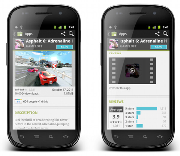
This is a screenshot of the application details page. Some of the content here comes directly from the developer, some of the content comes from the users (reviews, ratings, download count) and some of the content is aggregated by Market itself (related apps). As always, the first step during the application design process is to identify the user scenarios – or user flows – that you want to support, and build your screens to facilitate those flows. The main purpose of this page is to show the information about the specific item (application, book, movie) so that the user can decide whether it’s worth his time, money and attention to purchase or download this item.
There’s a lot of content on this page, and it can be arranged in a logical hierarchy of sections, each section presenting a more focused facet of the content. Knowing what is the main purpose of the page you can then start taking this logical hierarchy and make decisions what is the importance of each piece, and what is the logical flow. In the context of a small phone screen, you decide which sections go on top to appear above the fold, and which sections are so important that they should stay locked in place and not scroll vertically.
In this specific page the UX decision is to “lock” the summary section (that shows the small thumbnail, item name, item owner and price / download button) so that it is always visible on the screen. The rest of the content is arranged as a vertically scrollable stack of sections, with careful consideration about the order and logical flow.
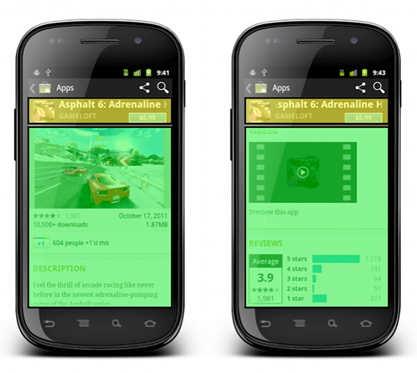
These UX decisions then go to the UI design stage, which should provide a unified visual language that supports and reinforces the logical hierarchy of the content and the behavioral decisions. The current styling of the Android Market uses black action bar with pinstripe pattern and dark-gray background color for the summary section. Using a light-on-dark styling for the summary section – as opposed to the dark-on-light styling of the rest of the content – further reinforces the logical importance of this section. You would also note that showing screenshots directly below the summary section serves two purposes. First, we consider it to be a high-quality signal that supports the user decision to start the purchase process or go back. Second, it provides a nice visual transition between differently styled sections.
What happens when you have more space? At some point, as you move “up” the spectrum of available devices, you get to screen sizes that have so much available space that a single-column representation of the content becomes too unbalanced, too sparse and much less consumable. This effectively becomes a UX decision – how are we going to represent the same content in a different context, in a context that enables for a different layout of the same visual building blocks.

This is the current layout and look of the item details page on large screens (as noted before, this is still work in progress as we work on refining and polishing the UX and UI for a variety of form factors). The content is now displayed in two columns, where we have more horizontal space overall. There is a number of decisions to be made where we transition to a double-column representation. How do we “break” the single vertical flow into two columns while preserving the same logical hierarchy of the content? What goes above the fold in each column? What stays locked and what scrolls? How do we maintain the same visual flow, language and styling so that you can reuse your knowledge of our application on one form factor and apply it directly (or “intuitively” to a larger form factor)?
The current decisions are reflected in the screenshot above, where we maintain both logical and visual hierarchy of the content while separating the building blocks into two columns. The summary section is styled in exactly the same way, and the only difference is a larger thumbnail that we can show since we have more horizontal space. The visual connection between the summary section and screenshot is maintained in two ways. First, they are placed as the topmost blocks in two columns. Second, the height of two sections is identical, providing a nice visual alignment along both the top and the bottom edge (until you start scrolling the content in the right column, of course).
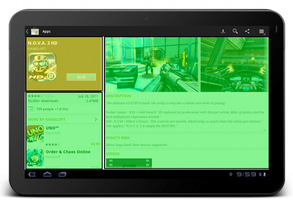
The “locked” state of the summary section is maintained on a larger form factor as well. The left column scrolls below the summary section (and in general it does not have a lot of complex dense content). The right column is fully scrollable, and has more horizontal space for displaying more complex facets of our content.
Let’s look at another flow which involves more than one screen on a smaller form factor:
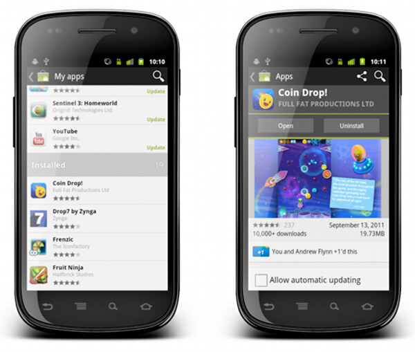
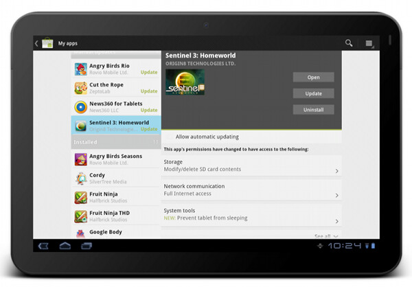
“My apps” screen on the left shows the list of all applications owned by the current account. The list is bucketed into four sections – installed applications with available updates, installed applications with available updates that require manual acceptance of new dangerous permissions, other installed applications and applications owned by the account but not installed on this device. When you tap on a specific application, we transition to a full details view of that app – screen on the right.
The full details view of an installed application is very similar to the details view that we’ve seen above. There are four main differences:
- We show the action buttons, “open”, “update” and “uninstall” – depending on the applicability in the context of the specific app
- We show the “allow automatic updating” checkbox to allow the user to let Market silently auto-update the app as long as the updates do not require new dangerous permissions
- We show the “rate & review” section
- We rearrange some of the sections where it makes sense for applications owned by the current account
Each such change must go through a UX and UI design cycle. The UX cycle decides where it falls within the logical flow, and the UI cycle makes sure that it is styled consistently with the rest of the page – and the rest of your application as well. The decision to show the action buttons above the screenshots – and to style them to “appear” to be part of the summary section – is driven by the user flows that we want to facilitate. The main goal of “my apps” is to maintain and groom your collection of apps, and this is why the “update” and “uninstall” buttons are displayed in a prominent location on the details page. Even though you can get to the details page of an installed application from a variety of sources, we want to address the “maintenance” part of the flows, and this is why we show the action buttons in a consistent location (below the summary section).
What happens on a larger form factor?
At some point (and i’m going to talk about this transition in much more detail in the subsequent parts of this series), we have enough horizontal space to transition to what effectively is a master-details view of your app collection. As on a smaller form factor, maintaining this collection is the main user flow that we aim to support. In addition, we have two other major UX considerations for “my apps” screen on a larger form factor:
- Expose the main user flows – installing an owned app, accepting a new update, uninstalling an app – without leaving the screen or showing any extra UI (such as floating dialogs, for example).
- Require minimum amount of scrolling – or prevent scrolling altogether – as much as possible.
This page illustrates that different representations of the same content can remove (in a somewhat drastic fashion at times) some of the content building blocks. The decision to show a much more sparse details view of the selected app in “my apps” on a large form factor was not taken lightly, and we’re going to revisit and refine this experience in the near future. I’m also going to talk about the rationale behind the current decision later on in this series.
The visual layout and styling of “my apps” list is exactly the same, no matter if you display it on a small or large form factor. Preserving the logical and visual hierarchy is important not only within the context of the specific device – where the basic building blocks can be reused across a number of different screens. It is also a vital part of creating a unified user experience for your application overall. Your users should be able to take their knowledge of your app and apply them directly when they start using a device with a different form factor. This is done by maintaining the overall logical hierarchy of the content, where the arrangement of the subsections and content within each section are the effective conduits of the logical relationships within your content. This is also done by maintaining a consistent visual flow, language and styling of different content blocks, not only within a single screen, but across all screens in your application.
You can see the principles of consistent visual styling applied in the details pane of “my apps” on a larger form factor.
The summary section – with application title, developer name, thumbnail and action buttons – uses the same light-on-dark style as we do on the details page. It is also locked within the right column and does not scroll away. The permission section has the same styling and behavior (toggle to see normal permissions, tap a row to see more details about the specific permission group, highlight new permissions required by the app update) as we show in the combined purchase-permissions screen on a smaller form factor.
To summarize – you have the same content, with the same logical and visual hierarchy, but the representation of the content adapts to the current context.
Stay tuned for the next entry where i’m going to show a few examples of responsive web design, and how we can adapt the basic principles of responsive web design and extend them to the world of creative responsive native mobile applications.
Why can’t we just use vector-based icons in our application? This question, in a variety of reinterpretations, keeps on resurfacing in various forums, blogs and articles. It is asked in the context of desktop applications where the same icon is used in different ways, starting from very small 16*16 icons in file lists, up to 128*128 icons used on the dock and all the way to 512*512 icons that mostly serve to highlight the artistic capabilities of icon designers, at least until the computing world is taken over by 1200dpi desktop displays. It is also asked in the context of native mobile applications for the Android platform, where a single vector icon (in SVG format) is proposed as the replacement for multiple versions of the same icon, each optimized for the specific density bucket (usually medium and high).
At first glance, both designers and developers only stand to gain from switching to creating their icons in vector format. A designer is going to create a single version of the icon in his tool of choice, hand it off to the developer to add to the project structure, and have the runtime scale the combined shapes of the icon to whatever context it is used in – be it the small icons for the action bar, or an extra large icon for the “about” page. In fact, a lot of comments on the articles and blog posts referenced later in this entry indicate that this approach works quite well. At least, technically. And so, to summarize the feeling of discontent, Y U NO SVG?
A few days ago I invited one of our visual designers to lunch and asked him about the general process of creating icons for multiple screen resolutions (for the core Android experience). The answer was, at least to me, quite surprising. The first stage happens in a sketchbook or on a whiteboard, where different ideas, shapes and combinations are explored to find the iconography that works well within the overall direction of the platform, while still providing a distinctive shape and form for the specific action or object represented by the icon. Then the flow transitions to the computer, with Adobe Illustrator and Fireworks being the most popular choices. There, the designers create the “master” version of the icon – in a vector format. This version is scaled down to all target resolutions (medium, high, sometimes low and, most recently, extra high), and this is where the fun begins. This is where the designer looks at the scaled down version of the icon, for each resolution, and begins a sometimes painstaking process of pixel-perfecting the visuals.
There’s a lot of art and a lot of craft involved in creating and maintaining a consistent visual iconography language within the specific application, and across the entire platform. Lines should be sharp, rounded corners should have consistent curvature, lighting and gradients should have consistent direction and amplitude. In addition, icons at smaller resolutions should not have too much visual detail, while icons at higher resolutions should not feel too sparse. This is illustrated in the “Icon Design: Bitmap vs Vector” article by Firewheel design:
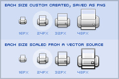
The top row shows the hand-optimized versions of the same application icon at four different resolutions. The bottom row shows icons mathematically scaled from a single source. If you compare the relative sizes and detail complexity of various parts of the icons in the top row, you will see that they don’t scale at the same rate. Some parts grow linearly with the icon size, while some grow at a much slower rate. This is further illustrated in “All the sizes of iOS app icons” by Neven Mrgan:
It’s simply not possible to create excellent, detailed icons which can be arbitrarily scaled to very small dimensions while preserving clarity. Small icons are caricatures: they exaggerate some features, drop others, and align shapes to a sharp grid. Even if all icons could be executed as vectors, the largest size would never scale down well.
Here’s the icon for the Pictures folder in Mac OS X:
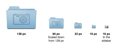
Note that scaling down works to about 64 px; after that, shapes have to be redrawn, simpler and clearer, in order to read. The sidebar version of the icon is entirely different, in fact; since we know it will be shown in the sidebar, it’s not so important that it look like a folder, and other features can be emphasized instead. Creating the large icon as a vector shape –which, to be clear, you should be doing! – won’t help where clarity is really needed: at small sizes. High-resolution displays will in fact make this problem more urgent because today’s 64 px is tomorrow’s 128 px. We’ll have to refine ever larger icons.
Dave Shea takes a closer look at the mechanics of optimizing the original shapes and lines for smaller size in the “Icon Design: Sizing“:
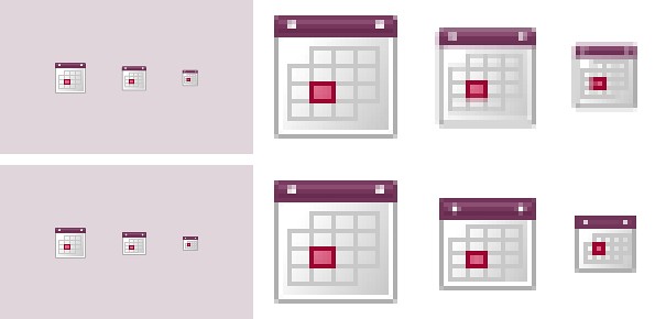
The solution is to start with the reduced version, and tweak it at the individual pixel level. Make the details fit within the pixel grid, remove extra detail that’s causing blur, or even add extra detail if it helps you get to your end goal. Whatever it takes, the solution is to provide a critical eye to the problem and tweak until you get a result you’re happy with, which is why the size variations are so much extra work.
In the calendar above, you’ll notice what I’ve tweaked the two different sizes so the inner boxes end up with whole pixel values on either side. To do this I’ve had to reduce the size of the boxes at 24×24, and actually create more boxes at 16×16. I couldn’t come up with a combination of 4 columns with a 1 pixel wide border that would fit within the space allotted at that smaller size, the only workable combination I found involved adding an extra column and dropping a row. The icon is a bit different than the 32×32 equivalent, but it’s clearly derived from the larger one and works as an acceptable size variation.
Additional examples of small icons moving shapes around and even “losing” some of them can be seen in a variety of modern applications and UI toolkits. Here is an example from the widely-lauded iA Writer for Mac application:
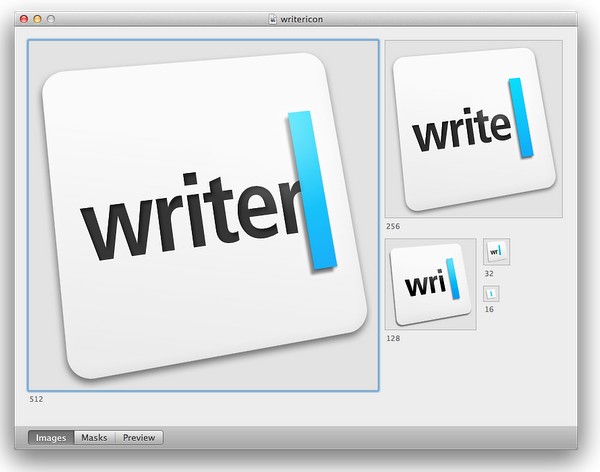
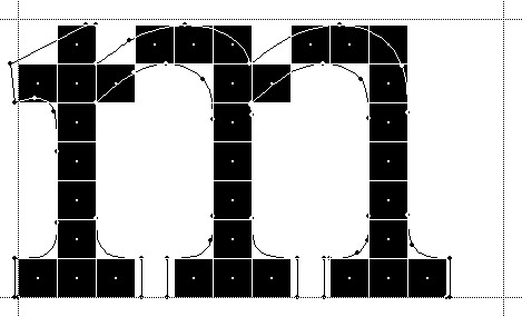
While the central element – a slanted sky blue caret – preserves the overall shape, angle and gradient, the text next to it begins “losing” characters the closer you get to 32*32 size. The 16*16 icon is just the caret, with no characters next to it.
The same approach to simplifying the shapes, textures, perspective and density can be seen in the system icons introduced in GNOME 3.0:


If you trace the progression of the transition to smaller icon sizes across these three icons (and additional icons on the original entry), you will see a consistent approach that starts stripping away dimensionality, complexity, textures, gradients and density, preserving not only the overall shape and feel of the icon, but also the consistency of iconography language across all icons of the same size.
If you do not wish to spend extra time to pixel-perfect your icons at smaller sizes, using a single-source vector format as the “master” and scaling down to any arbitrary size is a perfect fit for SVG. In this context, the following quote from the self-titled “Graphics Ninja” Zack Rusin talking about SVG in KDE is quite illuminating:
The loss of quality in vector graphics at small size is a severe problem. Rendering vector graphics primitives at low resolutions introduces a certain amount of blur into the output. This is mainly caused by horizontal and vertical primitives which happen to fall between pixel boundaries, which in turn makes the anti-aliasing algorithms try to cope with it by rasterizing two, instead of one rows/columns but at a lower color intensity. For primitives which are rendered at small sizes the goals of “resolution independence” and “preserving their good looks across resolutions” diverges a lot. We have the former, we need the latter.
One of the ways of dealing with this problem is hinting. The problem of hinting vector graphics primitives has been extensively researched by the way of font technologies. Grid-fitting (aka. “font hinting”) is a crucial step on the way to produce legible output at small sizes for a lot of fonts. Hinting can be manual (e.g TrueType has a stack-based language for it, each glyph in the font contains its own little hint program and as a result of running that program control points for the outlines can be adjusted in any way the creator of the hints desired) or automatic (as used by FreeType). An interesting medium is described in “Example-Based Hinting of TrueType Fonts” paper, in which a method of reusing hints from one font for another are described. All in all it’s a very common problem for fonts.
The research the engineers from the FreeType project conducted on auto-hinting is outstanding. Right now the way KDE artists go around this problem is by producing certain SVG icons with different viewport sizes. This allows them to manually adjust the rendering for certain native resolutions.
The reality of the situation is that without very high DPI displays the quality of small SVG renderings is going to suffer. A solution would involve introduction of either an auto-hinting algorithm or adding a declarative approach of specifying the hints which the artists could easily utilize. It’s a problem which affects all SVG users and should be handled in the standard itself.
There are a lot of similarities between pixel-perfecting vector graphics and auto-hinting of font glyphs. Both aim to address a very similar problem. Both operate in a flow where the master version is created under extremely high resolutions to look well in booklets, portfolios and promotional material, but versions scaled down to the “real world” use suffer from poor grid fitting, detail clutter, detail loss and blurriness. In fact, some designers go as far as proposing to forgo the standalone icons altogether and use the advanced capabilities of type engines instead. Proposed by Wayne Helman last year, it was further expanded upon by P.J. Onori in his “Font-Embedding Icons: This Is a Big Deal” article that goes on to say:
The article was well-received, but I was honestly expecting more excitement around this idea. From my view, this now seems like the way to set icons in a site. I feel strongly about the potential of this method, so I thought I would take the time to generate a font set for Iconic and to talk about why we should all be using this method for displaying icons.
Listing “one icon, infinite sizes” as one of the advantages, it seems to be a great solution, but only for duotone, or more precisely purely black and white, icons. In addition, it completely fails to address the giant elephant in the room – what to do for complex icons that do not scale well to small sizes? Type engines have two major approaches to solve this problem – embedding bitmaps and font hinting.
Embedding bitmaps is a rather straightforward approach. You start from a high-resolution master definition of the glyph, and identify those glyphs that do not scale down well past a certain point (lowercase ‘m’, ‘s’, ‘a’ and ‘g’ are usually among the prime suspects). For those glyphs, you hand-tweak the visuals for all target point sizes, export them as bitmaps and then embed the bitmaps as binary blobs in the font file. In fact, it can work the other way around, as detailed by Simon Earshow, a typographer at Microsoft:
In the past I’ve been burned starting from outlines and trying to be extra clever in the hinting. So I finally deciding, ‘I’m better off grasping the nettle. What’s most important is to get the bitmaps right at the sizes people use most often.’ So instead of starting with outlines and then working to hint them for the screen, I started by simply making bitmap fonts. No outlines, just bitmaps.
Bitmaps are relatively easy to make and they show exactly how the fonts will look on-screen. This allowed us to make decisions about sizes, weights, and distinctions between serif, sans, roman, italic, all viewed in context. Working this way we came up with a definition for a certain number of critical sizes and weights.
Once the key bitmaps were done, I very carefully wrapped an outline around them. I always have in mind that this outline will then be given to the person responsible for hinting–and they’ll need to be able to hint outline to get back, pixel for pixel, to the bitmap faces where we started.
Embedding bitmaps worked well on CRT monitors, but did not scale into the world of LCD monitors and subpixel rendering. This is where hinting comes into play, as summarized in this great overview by Peter Bil’ak on Typotheque:
This is exactly what hinting is about: programming instructions that fine-tune a font’s rasterisation, the process by which its mathematically ideal outlines are mapped onto a monitor’s pixels. Hinting can control the heights and widths of a font’s uppercase and lowercase letters, the widths of its individual lines, the amount of white space around letters, the size at which uppercase letters start to use different stem-widths from lowercase letters, how the angle of italic characters changes to best fit the pixel grid, and many other extremely technical details, all on a pixel-by-pixel basis. If this sounds like a rather tedious, time-consuming activity, it is, (even for type designers, who are accustomed to tedious, time-consuming activities).
The complexities of type hinting are illustrated in “The raster tragedy at low resolution” article by Beat Stamm that gives just a small taste of what it takes to hint a single glyph – not to mention the implementation complexity of the type engine itself.
Beat Stamm even followed up with RasterTragedy.com, delving much deeper into anti-aliasing, hinting, layout and rendering across a wide spectrum of modern type engines.
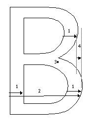
To further appreciate the complexities of creating a type-hinting program for a specific glyph, you can start with this “Hello world” tutorial that hints the uppercase ‘L’, follow up with more complex examples for glyphs with curves, serifs and slanted stems, and finally revel in the full TrueType instruction set, the complexity of which rivals, if not exceeds, that of SVG itself.
Throughout the article I stayed away from the complexity of the SVG format itself, and its full implementations. There’s a simple reason – if the format is powerful enough to address the needs and requirements of designers who pay special attention to pixel-level details, it will provide a natural push to have the full implementation of that format to be included in the UI toolkits and platforms. In its present state, however, SVG is not there. Furthermore, extending SVG with capabilities similar to those of TrueType hinting instructions will not only make the full implementation much more complex. A much more important question is whether it’s going to make it easier for icon designers to create a single vector-based version of their icons?
If you’ve followed my reasoning up until now, the simple answer is no, it will not. When each icon line, each icon stroke, each icon shape need to be hinted for precise rendering under small sizes, when you need to go well beyond each individual layer to make sure that they are hinted as one collective assembly, when you need to learn an extra set of tools that will undoubtedly go beyond the current instruction set of type engines as it’ll need to support lighting, gradients, collapsing and hiding detail – this is just not a tenable solution.
As to the process of pixel-perfecting icons? Once you scaled down the master version down to all the target sizes, you can do different things. You can start moving pixels directly, at the expense of redoing the same exact thing when you go back and change the master. Or you can go back to the master and create “secondary” masters, one for each target size. Each secondary master is not meant to be used at the highest resolution, but is instead optimized to create the best pixel-level version when it is scaled down to the target size. The down side is that once the original master is changed, you have many more tweaks to do.
A final thought about the high-resolution displays and the quote above from Neven Mrgan. Making a leap of faith, let’s say that in 50 years we’ll have screens with resolution of 1200dpi (which is “only” four times the resolution of iPhone 4 and Galaxy Nexus, but sixteen times as many pixels in a square inch). In such a world, a single grain of sand will cover four 16*16 pixel icons. In fact, all the mentions of small-size icons in this article refer to the physical scale of small – not the pixel scale. To maintain a usable touch interface, an interface that can be easily scanned with a human eye, you will want to maintain the current physical scale of the icons – making them much larger on the pixel scale. The smallest icon on such a device with the current UI building blocks will be around 128*128 pixels. However, it does not automatically mean that you can all of a sudden cram all the fine details from your (even higher resolution) master icon into the available pixel space. As each pixel gets smaller, it does not mean that you want to progressively increase the detail complexity and density.
As Neven points out, clarity is king, and in such a future icon designers will have to hand-tweak even more icon sizes. And unless the future is a concept video where everybody is walking around with high-end devices that have seemingly unlimited battery life and connectivity, the feature gap between high-end and low-end devices will be even larger. And in such a future, icon designers will have to maintain multiple versions of the same pixel-size icons, each version pixel-perfected for use on a device with a specific density. But then again, in 50 years there may as well be a completely different way to present information and a completely different technology to interact with.
So no, SVG is definitely not the answer. At least not today.
The “Design Secrets for Engineers” blog post over at Pulse engineering blog opens up with the following:
If you are a designer like me, you must be asked on a regular basis to “make it look pretty.” The request can stroke your designer ego, making you feel like a design rockstar with super powers to make this world a more beautiful place. This is especially true at startups, where you are one of the few, maybe the only designer there. However, it can also be really annoying–almost degrading at times. Thoughts like “why the hell can’t engineers do this on their own? It’s all common sense” always go through my head. If only engineers knew how to do visual design, designers would have more time to focus on cooler, more exciting problems like future product concepts.
This is a snarky, and quite abrasive statement. It diminishes the value of a good UI designer. It implies that if only engineers were to sit down and memorize the eight steps outlined in the article (one of which is “Use Keynote” of all things), they’d be magically imbued with the ability to take any rough wireframe and not only wire it to the data, but also come up with a pixel-perfect polished elegance for every single element. You know, something that usually takes equal parts of talent, years of formal training and even more years of hard work. No wonder that the very first comment from the self-titled engineer was no less snarky:
If only designers would do the parts of their job that isn’t cool, then engineers would have more time to focus on cooler, more exciting problems like building the actual product.
And here i want to illustrate the difference between engineer-driven and design-driven UI, using one of my favorite elements in the new Android Market client. When a developer publishes an update to his app or game and requires new dangerous permissions, the user will be asked to manually approve the permissions before the update is downloaded and installed on the device.
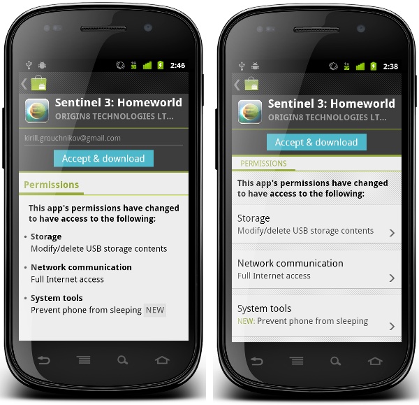
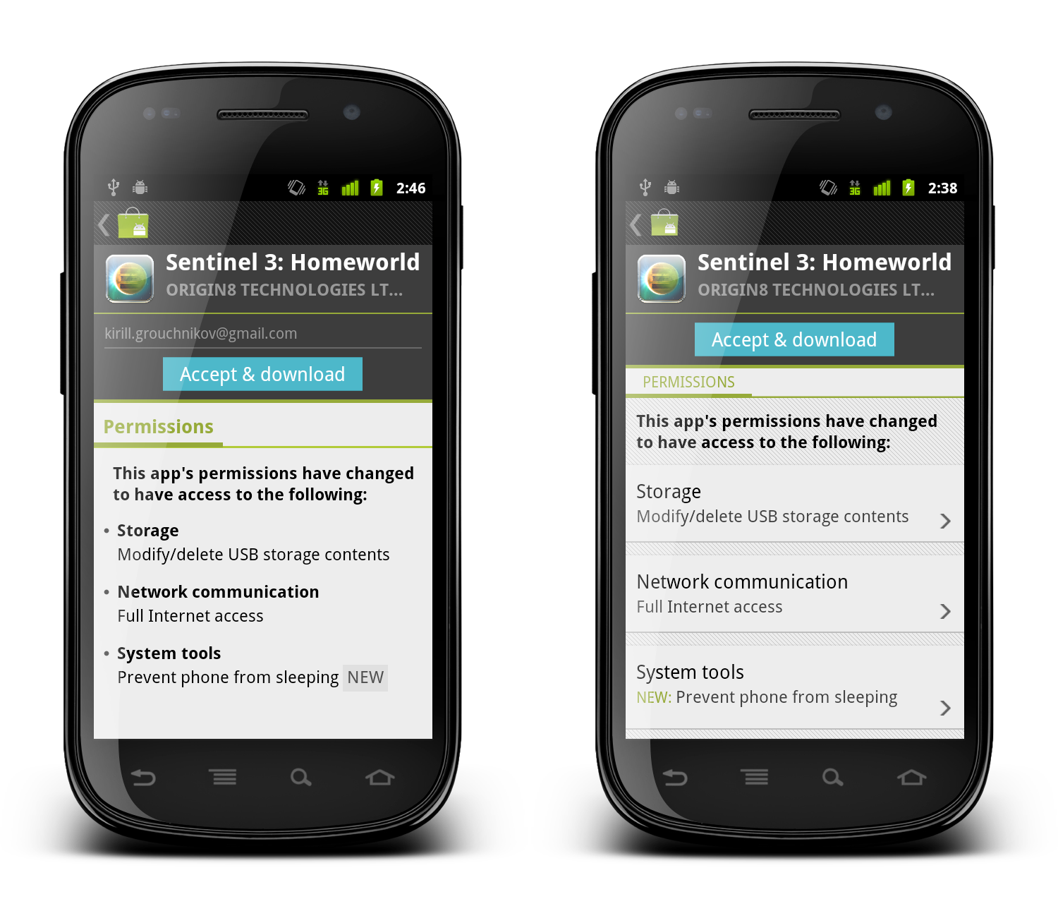
When the user opened the details page of such an app in the old versions of the Market client (pre-3.0), we would display all the permissions required by the new application version. There was no easy way to tell what are the new permissions, unless you went to the system UI, wrote down the permissions required by the currently installed version and compared them to the new list. This has been bothering me for a long time, and we ended up implementing a rather rudimentary way to mark new permissions requested by the published update:
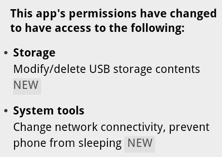
When we concatenate all permissions under the specific category, we check to see whether the specific permission is new. If it is, we add the word “NEW” and style it with different shades of gray (using ForegroundColorSpan and BackgroundColorSpan respectively). If you (as the user) are interested to see what exactly is the update requesting, this allows you to quickly skim through the list and find the answer. Functional, and designed by engineers.
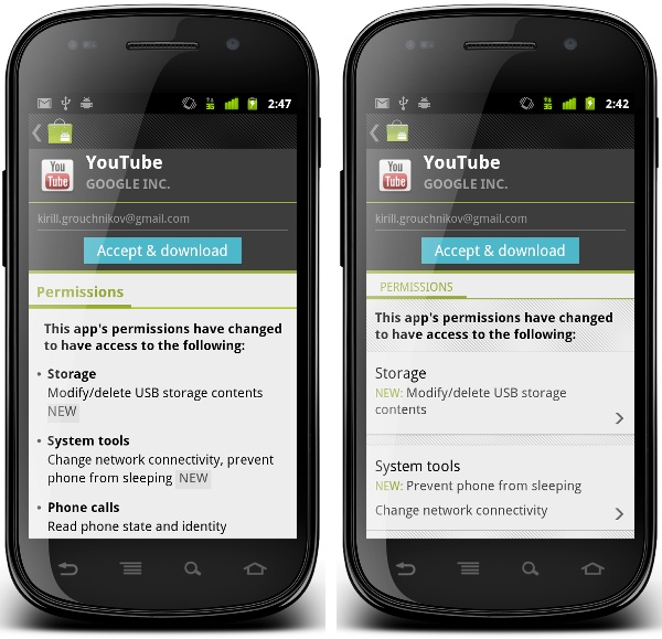
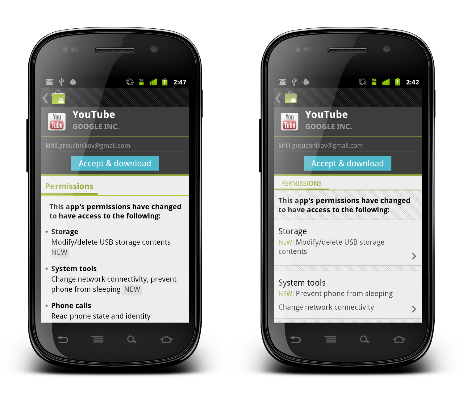
And this is how it looks after it underwent UX and UI treatment by our designers:
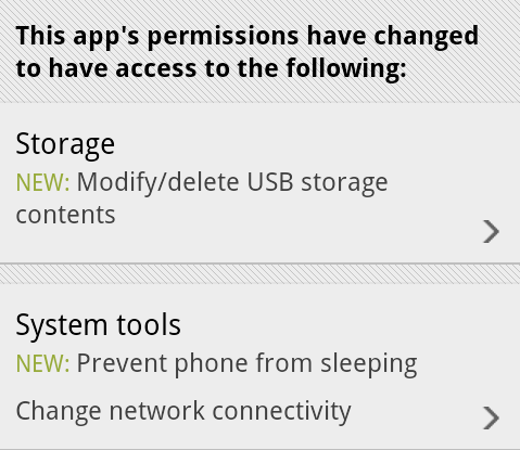
Let’s look at the differences:
- Each permission category is separated with the same visual styling as we have on the details page (translucent separator on top and pinstripe footer on bottom). This creates consistency across the entire Market application.
- Each permission category is clickable – denoted by the arrow icon that is used elsewhere to indicate additional content that will be displayed in a separate screen or dialog. Clicking on a section will display a dialog with more detailed information on permissions in that section.
- The category title is no longer bold – but rather uses a slightly bigger font. In the original version the category titles were screaming for attention, where in fact it is the individual permissions that are important for users interested in seeing what level of access the specific application is requesting.
- New permissions in each section are placed in a separate row. If there are multiple new permissions, the word “NEW” will appear only once. This allows for quicker scanning as all new permissions are grouped together, and removes extra noise created by all-caps strings.
- Placing the word “NEW” in the beginning addresses the issue seen in the previous screenshot – where the leading space before the first appearance of the word “NEW” was effectively cut by the linebreak algorithm. This removes the “illusion” of this label being a badge.
- Using the same green color as the rest of supporting elements on the details and purchase pages of applications allows removing the background fill – also removing an awkward visual balance of the gray rectangle that surrounded the word “NEW” in the original implementation.
When you get such a design, you may or may not notice the intertwined subtleties of such a change. It takes some time and practice to detect each specific choice that went into this redesign and understand what it is trying to solve. But that does not mean that after seeing a few of those you (as an engineer) will be able to do the same. Much as with programming, it takes years of constant practice at designing, taking apart, redesigning, brain storming, understanding usability aspects and limitations of device context, absorbing constructive (and sometimes brutal) criticism from your peers and superiors until you get to a point where it just “comes” to you.
When an engineer comes to you and asks you to make it look pretty, it means that the engineer actually understands that a working and functioning implementation is in a bad UX and UI shape – much like a good designer would understand and work within the platform and device limitations. Not all engineers appreciate the difference, and both sides should thrive on an opportunity to collaborate and educate each other on their respective crafts. Starting from the view point of “don’t bother me because i’m working on the next shiny thing” is not only counter-productive, but also engenders a bad environment where both sides passive-agressively blame the other side for shipping bad products.
As a point of reference, here are both implementations side by side. Click to see high-res versions.