While the main focus of release 3.4 of Android Market client was improving performance and stability, we also continued refining and polishing the visuals of the different screens. Instead of taking a long hiatus, the philosophy is to release often, adding new features and polishing the existing ones in every single release. Release 3.4.4 (which is now at 100% rollout target) is not an exception, and today I want to talk about improving the layout and visuals of the details page for various screen sizes.
This is how the details page looked like in version 3.3.12 (Nexus S on left, Galaxy Nexus on right):

And this is how the details page looked like on a larger screen – a 10″ Xoom tablet in landscape mode:

First (and long overdue), we’ve moved the video preview into the screenshot gallery. It used to be in its own section below the fold, unbalanced and quite awkward. Here is its new place:

Note how the video thumbnail goes into the left margin, with the left sprocket strip aligned with the content in the sections below it.
Next it was time to take a much closer look at arranging the information for larger screen sizes. The existing layout and styling were functional, but not very pretty. The location of action buttons to the right of the thumbnail made the entire left column too wide for the rest of the content, while at the same time restricting the maximum width of the thumbnail itself. This also had another chain effect – due to large width of the left column, we only switched to two column layout at 1000dips, resulting in a very sparse (and quite ugly) single column layout on 10″ tablets in portrait mode.
Our designers had a good starting point for reimagining this layout. The addition of music support in version 3.3.12 added a new type of page – music artist:

Using this layout as a starting point, the new layout for the details page moves the item title and owner into the colored banner, and the action button(s) below the now larger thumbnail:

Tracing the alignment and contents of the screenshot section, you would notice a couple of things (in addition to hosting the video thumbnail). First, the bottom edge of this section is perfectly aligned with the bottom edge of the summary block in the left column, providing nice anchored balance of predominantly image-based content. Second, the screenshots extend into the right margin, taking full advantage of the available screen estate, while the rest of the sections in the right column are restricted to improve scannability and readability of predominantly text-based content.
As with the artist page, the right column scrolls below the colored banner. However, the left column has a new scroll-to-snap behavior “borrowed” from the purchase page. The content scrolls fully, until the rating stars reach the top edge. Then, the rest of the content continues scrolling while the rating stars and the action buttons snap to remain always visible:

While full vertical scrolling, as will be shown later, is particularly relevant for smaller device sizes, snapping the action buttons to always be visible reinforces their functional importance.
A more balanced two-column layout means that we can switch to it at an earlier point. Switching to two-column layout at 800dip means that a 10″ Xoom in portrait mode looks like this (with better layout for embedded cells coming in the next Market release):

The same layout structure is used for details pages of all media verticals. Here is the details page of a movie (note the new and consistent styling of the movie preview section, with darker background extending into the right margin, and the video preview thumbnail horizontally centered in a black box that is bottom aligned with the summary section in left column):

Here is the details page of a book (note that, as with movies, a more non-square thumbnail is right-aligned with the action buttons below it). Some items have very long titles, and in this case the title extends into the right margin and, if necessary, wraps to a second line.

And here is the details page of an album (note that, as with books, the right column is mainly text-based content that starts scrolling directly below the colored banner):

A more compact two-column layout scales down well to smaller 7″ screens. Here is the details page on an Acer Iconia A100 in landscape mode:

This highlights the importance of full scrolling left column – limiting the scrolling to the area below the summary section would have resulted in a very frustrating experience. What about portrait orientation for a device such as Acer Iconia A100 or HTC Flyer?
These are 7″ tablets with 1024*600 pixel screens at MDPI resolution. In landscape we have enough space to show the two-column layout (as mentioned above, we switch at 800 dips). There is not enough space to display this layout in portrait mode (at 600 dips), but we wanted to use the little extra width that we have – compared to the phone screens – to revisit the layout of the summary section. Here is how the details page looks like on a portrait Iconia A100:

Here you see the same visual language, from layout to styling to margins, paddings and gaps. This effectively means that we have three “buckets” of screen configurations for the details page:
- Default single column layout
- Single column layout with a different look for the summary section. This is enabled at 600dp.
- Two-column layout. This is enabled at 800dp.
The numbers are, effectively, switching points of the responsive mobile design, where the presentation of the content adapts to the current context. In addition, a more compact two-column layout has the margin point of 1000dp, with only item title and screenshot section extending into the right margin. The next entry will talk about the technical aspects of implementing the switching points in the current version of the Android Market client. In the meantime, I wanted to show another element of the details page, and how it fits into these different layouts. Here, once again, is the details page on devices with small form factor (Nexus S and Galaxy Nexus):
When the user initiates the download sequence, we show a dynamic section just below the summary to keep track of the download and install process:

Instead of making room for this dynamic section on larger form factors, we show it “embedded” in the summary section for the 600dp-800dp range:

Note how nicely it fits to the right of the thumbnail, as there is no need for a full-width progress bar that will look unnecessarily wide and unbalanced. And in two column layout, the dynamic download progress is shown in the summary section in the left column, replacing the action buttons as long as the download is running:

Stay tuned for more in the coming months as we continue refining and polishing the application across the entire gamut of supported devices.
The main goal of responsive mobile design is to take your application content and present it in a way that makes the most effective use of the available context, or the available screen estate. The three most essential principles of responsive mobile design are: you have the same content, with the same logical and visual hierarchy, but the representation of the content adapts to the current context.
The main goal of this series wass to answer three underlying questions: what are we designing, why are we designing it in a certain way and how are we implementing the target design.
- The first part highlighted the basic principles of responsive mobile design
- The second part took a detailed look at a few examples of responsive web design
- The third part talked about the implementation aspects of responsive mobile and web design, and what is available to Android developers that want to take advantage of these principles.
- The fourth part dealt about additional, slightly more focused, aspects of responsive mobile design
The series has followed the presentation I have earlier this week at AnDevCon, and you can use the following slidedeck as the refresher reference. Stay tuned for more in the coming months as we continue refining and polishing the application across the entire gamut of supported devices.
This is the fourth part in the ongoing series about responsive mobile design. The main goal of this series is to answer three underlying questions: what are we designing, why are we designing it in a certain way and how are we implementing the target design. The first part highlighted the basic principles of responsive mobile design, the second part took a detailed look at a few examples of responsive web design, and the third part talked about the implementation aspects of responsive mobile and web design, and what is available to Android developers that want to take advantage of these principles. Today I’m going to talk about additional, slightly more focused, aspects of responsive mobile design – using smallest width resource selectors, displaying different content for the same page on different contexts and applying the high-level principles on a lower-level mechanics of a single page.
Using different resource qualifiers
The decision which resource qualifier to use to optimize the presentation of your content to the particular context should always be based on the logical hierarchy of your content, the logical complexity and density within each building block of your content, and the pixel-perfect metrics of the specific visual styling. You can use multiple qualifiers, consulting the full list with order of preference. There is no silver bullet, and as with any new capabilities provided by the platform, it takes time and experimentation to identify what works best for your specific application. Our current implementation in the Android Market client relies, for the most part, on using the -w (width dp) to switch to two-column representations of our content. As we continue refining and polishing our UX across a wide variety of device form factors, screen sizes, ratios and resolutions we will be revisiting these specific implementation details.
There are two places where we’re using the -sw (smallest width dp) resource qualifier. The first is the decision to switch to the dialog representation of purchase UI:

While the purchase UI is displayed as a full-screen fragment on devices with smaller form factor, there’s just not enough content to display it as a full-screen UI on larger devices. We went through a number of UX exercises. Replace the right column of details page with purchase UI did not feel right from the navigation perspective, as the overall system behavior of back button is on the level of either full-screen UI or the current dialog. And displaying this rather sparse content as a single-column full-screen UI with large side margins would result in a jarring transition from dense details page. The eventual decision was to show the purchase UI as a dialog.
In values-v11/themes.xml we define a style that extends android:style/Theme.Holo.DialogWhenLarge. This provides decent support for devices running Android 3.0 and 3.1. In addition, we override this style in values-sw600dp/themes.xml to extend android:style/Theme.Holo.Dialog instead. This gives us a more precise control over the decision to switch to the dialog representation of our content. In addition, using the smallest width dp as the qualifier we make sure that rotating the device while the purchase UI is showing is not going to switch between a dialog and a full-screen UI:

Another usage of -sw resource qualifier in the current implementation of Android Market client is around the fonts.

We have a small set of three font sizes that account for the vast majority of typography that you see in our application, creating a consistent typographical language across all our screens. There was an interesting thing we found as we started refining the UX on larger form factors. At first we used the same sp (scale independent pixel) values across all form factors (only defining them in values/dimens.xml). However, the font sizes that looked well on smaller form factors fell somewhat flat on larger screens. The entire UI felt weak and faint, with typography almost disappearing – instead of serving as the backbone skeleton of the entire content. After experimenting a little, we saw that we had to bump up the font sizes by 1 or 2 sps (depending on the screen size) to “get back” to strong typography. At first we encoded this transition (for all three fonts) together with the transition to double-column representations. This presented two problems. First, we have different switching points for different pages, some at 800dp and some at 1000dp. Making a rather arbitrary decision about font switch as well would have broken the consistency of our typographical language. The second is more interesting.

We found that you can find a good solution to rearrange the content from single-column to double-column representation if you properly maintain logical and visual hierarchy during these transitions. However, if the transition also involves changing the font sizes, it is by far much more noticeable, and it takes by far much more time for the eye to detect where each block moved and where do you find the specific piece of content after device rotation. This is why the transition to larger font sizes is currently encoded in values-sw600dp/dimens.xml. What does it mean for the content displayed on configurations that have between 600dp and 800dp of smallest width (for example, the 1024*600 Flyer in portrait mode)? Same thing as before – the design and implementation must be flexible enough to scale the representation based on the available space, where in this case the increased font sizes will contribute to increased visual density of the content.
Displaying different content

The main goal of “my apps” is to maintain and groom your collection of apps, and this is why the “update” and “uninstall” buttons are displayed in a prominent location on the details page. Even though you can get to the details page of an installed application from a variety of sources, we want to address the “maintenance” part of the flows, and this is why we show the action buttons in a consistent location (below the summary section).
On devices with a larger form factor, we have enough horizontal space to transition to what effectively is a master-details view of your app collection. As on a smaller form factor, maintaining this collection is the main user flow that we aim to support. In addition, we have two other major UX considerations for “my apps” screen on a larger form factor:
- Expose the main user flows – installing an owned app, accepting a new update, uninstalling an app – without leaving the screen or showing any extra UI (such as floating dialogs, for example).
- Require minimum amount of scrolling – or prevent scrolling altogether – as much as possible.
This page illustrates that different representations of the same content can remove (in a somewhat drastic fashion at times) some of the content building blocks. The decision to show a much more sparse details view of the selected app in “my apps” on a large form factor was not taken lightly, and we’re going to revisit and refine this experience in the near future. There are pros and cons to stripping down the details pane of the selected app.
On one hand, this is the list of applications owned by the current account – either already installed on the device or purchased elsewhere (web / other device). As such, we don’t absolutely have to display the full details to enable the major target flows. Displaying too much content will explicitly go against the UX considerations above – too much details is too much scrolling, and adding links to developer website, reviews or related apps is taking the user out of the current context. In addition, you can argue that you don’t need to see screenshots or full description as this information was already processed when you purchased / installed this app.
On the other hand, you can say that we’ve removed too many sections. For example, “what’s new” provides relevant information when you are deciding whether you want to update the app. And what about the reviews? Perhaps the latest update is not the great, and you want to skip it. What about the download size – did it grow dramatically in the last update? What about “rate and review” – these are the apps that i own, why not let me star them directly?
These are valid questions that raise good UX points, and as I said before, we will be revisiting and refining the “My apps” experience on larger form factors. Nonetheless, this is an example of a situation where the target user flows and UX considerations can result in removing some content blocks, or taking content blocks that are shown on multiple screens on smaller form factors and combining them into one screen on larger devices.
Lower-level mechanics

The purchase screen has four major building blocks – item summary, purchase table (including the account name), purchase button and tab container that shows additional information relevant to the specific item (permissions, terms & conditions, rental terms, …). The arrangement of content follows the logical hierarchy, and supports the decision the user is making to part with his attention, time and money. Specifically, the decision to click the “Accept & buy” button is done based on what is purchased (the summary), how am I going to pay and how much am I paying (purchase table). As the supporting information might not fully fit above the fold, some of the content needs to be placed in a scrollable container.
You can start by saying that the first three sections are very important, and should stay locked while the bottom half scrolls. This is a very bad UX decision. If you rotate the device, you will effectively push the entire tab container below the fold, with no way to even get to it. If you show this screen on a small 2.8″ device, you will effectively push the entire tab container below the fold, with no way to even get to it. And even on larger phones you’re restricting the scrollable viewport to very small part of the screen. Let’s see what happens when you start scrolling the content vertically:

In addition to having a consistent styling and layout of the summary section (same as on details page), it has a consistent scrolling behavior – it does not scroll, staying locked below the action bar. But trace what happens in the middle and right screenshots as the purchase button gets to the bottom edge of the summary section – it snaps and does not scroll anymore.

We consider the purchase button to be such an important UX element that we always want to show it on the screen, but the logical flow detailed above prevented us from displaying it above the purchase table. And so, we have three distinct scroll behaviors on this page – content that is locked, content that scrolls, and content that scrolls to snap. In fact, we consider the purchase button to be so important that it is always displayed on landscape orientation – even when the summary scrolls away with the rest of the page:

If you want to see the specific implementation details, they are available in an earlier post. However, these are minor details that follow a much more important decision on how the content is organized, and what is the scrolling behavior of different blocks – within the context of target flows.
Stay tuned for the next (and last) entry which will summarize this series.
This is the third part in the ongoing series about responsive mobile design. The main goal of this series is to answer three underlying questions: what are we designing, why are we designing it in a certain way and how are we implementing the target design. The first part highlighted the basic principles of responsive mobile design, and the second part took a detailed look at a few examples of responsive web design. Today I’m going to talk about the implementation aspects of responsive mobile and web design, and what is available to Android developers that want to take advantage of these principles.

Google Maps is an example of canvas-based apps. It provides a configurable viewport to an effectively infinite canvas, where you can pan, zoom, tilt and switch between the different graphical representations of the map data. From the design perspective, there’s not much to address when this application is running on a larger form factor. Of course, Google Maps is not just canvas, and it has certain secondary control-based UI layers – displaying search results, configuring layer visibility or enabling available lab experiments. There is certain amount of design and implementation work to make sure that these layers adapt to the current context – such as displaying the search results in a narrow column along the left edge on a larger form factor, for example. A book reader application is another example of canvas-based apps. It might have additional UX behaviors, such as switching to double-page mode on large form factors in landscape mode, or allowing to select and annotate blocks of text – but the main UI is still canvas. Google Sky, Google Earth, image viewers, audio stream visualizers, wallpapers are other examples of such applications.
The main focus of this series is on applications that expose and manipulate content that falls into text-based hierarchies.
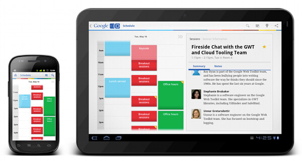
Google I/O scheduler app is an example from this much larger category. It provides a number of views on the underlying data, including the map of the venue, a calendar with all available sessions, a list of tracks, details for each session, live twitter feed, sponsor blurbs and more. The venue map is the only “true” canvas based view, while all the rest of the screens show text-driven information. Don’t let the richly styled calendar view of the all sessions fool you – this is just a nice styling of purely text-based hierarchy of content, where each piece “belongs” to multiple logical categories – date, time, type, star status.
The separation of content into screens differs depending on what is the current form factor. Viewing all sessions for the specific timeslot requires transitioning to a separate screen on a smaller form factor, as illustrated on the left screenshot above. On a larger form factor the calendar is displayed in the left half of the screen, while the right half shows the details of sessions in the selected timeslot. This is, effectively, a master-details view that takes advantage of available screen estate, addressing the specific user flow while minimizing the amount of navigation.
This category of apps is much more diverse – from core applications such as Gmail, Contacts, Calendar, Market, Talk and Google+ to a wide variety of third party applications. Twitter, Facebook and Skype clients, apps to review restaurants or pay online bills, apps to maintain your grocery list or read news – these are just a small subset of applications that must invest resources into proper support for a variety of device form factors.
The Android resource system supports a variety of resource qualifiers that allow the application developers to optimize the content representation to a variety of screen configurations. Physical screen size and screen density are the two main qualifiers, each “partitioning” the spectrum of devices along the specific axis into four generalized buckets:

In addition, the core resource system provides support for switching to a different content representation based on device aspect ratio, orientation and a variety of other qualifiers. What about the tools available to web designers?
CSS3 media queries documentation lists the resource qualifiers that are the cornerstone of responsive web design. In addition to orientation, aspect ratio and resolution, the two main resource qualifiers are width and height of the targeted display area of the output device (and a somewhat secondary width and height of the rendering surface of the output device, which can be much larger on windowing systems that do not enforce single-screen maximized mode, with a little bit of extra complexity thrown in as well). Unlike with the four size buckets in the Android resource system, the width and height media query selectors are specified in absolute values. The two most popular ones are CSS pixels (a definition very similar to Android device independent pixels) or ems (very similar to Android scale independent pixels). The difference between these two approaches is quite profound, and has far-reaching effects on the level of control you have over the design and behavior of your application.
When the spectrum of physical device sizes is partitioned into four buckets with overlapping boundaries, you cede most of the control over the transition between different representation of your content to the system. Introducing the new resource selectors, Android framework guru Dianne Hackborn writes:
Based on developers’ experience so far, we’re not convinced that this limited set of screen-size buckets gives developers everything they need in adapting to the increasing variety of Android-device shapes and sizes. The primary problem is that the borders between the buckets may not always correspond to either devices available to consumers or to the particular needs of apps.
How do you to take advantage of a larger form factor and switch, say, to the double column master-details view? When all you have is four size buckets (combined with, perhaps, the qualifiers for orientation, density and aspect ratio), you either sacrifice the target design to “fit” within the lower bound of the specific size bucket, or sacrifice the usability by presenting content in an unbalanced, and sometimes crowded way. The proper way is to start with the content, decide what is the optimal UX for each presentation mode, continue with the visual language and styling the define the metrics for each building block, and only then take a look at the final pixel-perfect mock to answer the most important question – how much space do I need at minimum to switch to this specific representation of my content. This question can only be answered when you know the logical hierarchy of your content, the logical complexity and density within each building block of your content, and the pixel-perfect metrics of the specific visual styling.
Android 3.2 adds support for three new resource selectors:
- width dp: the current width available for application layout in “dp” units; changes when the screen switches orientation between landscape and portrait.
- height dp: the current height available for application layout in “dp” units; also changes when the screen switches orientation.
- smallest width dp: the smallest width available for application layout in “dp” units; this is the smallest width dp that you will ever encounter in any rotation of the display.
Unlike the existing size buckets, these selectors start from the content and not from the context. Instead of mapping your content presentation into the buckets of physical screen sizes or densities, you start by defining the main building blocks that represent your content and mapping those to different presentation strategies. Each strategy will arrange the content blocks based on their importance and require certain minimum width for a balanced arrangement. Then, you can use the new resource selectors to provide implementation for each presentation strategy.
The new resource qualifiers give you a much finer set of tools to control the representation of your content. This granularity looks well beyond the rather artificial buckets of screen sizes, and instead partitions the device spectrum into buckets that match your specific content. Using these tools to address the complexity of a truly responsive and adaptive mobile design requires a larger upfront investment during the design stages, and, at times, an increased initial development cost. However, it is absolutely worth it in the long run, as your final product, no matter if it’s a web site or a native mobile application, can scale and adapt to a much wider variety of contexts, with much less future investment on your side.
Responsive mobile design, as well as responsive web design, identify two major types of transition points – switching point and margin point. Let’s look at the examples to illustrate these two terms.

Five years ago you would take a look at the two screenshots of the same site, and you would clearly label the first as the desktop version and the second as the mobile version. This distinction is long gone in the world of web design – just extrapolate the device spectrum of the Android ecosphere into the world of netbooks, laptops, small desktop setups, multi-screen desktop setups, kiosks, TV sets, billboards and many more device types that provide support for browsing and displaying web content. Instead, you’re talking about two different representations of the same content, preserving the logical and visual hierarchy and adapting the presentation to the current context.
When you identify the target three-column layout, when you identify where does each piece of your content go, where you create the visual language for styling the content and finalize the pixel-perfect metrics – this is when you identify how much space do you need at minimum to switch to the three-column representation. The implementation part is much simpler – encode this switching point with the available qualifiers (max-width with CSS media queries or -w qualifier in Android 3.2+).

This screenshot illustrates that the concept of switching point applies directly to responsive mobile design. Knowing the complexity and density of the content in master-details view, and knowing the visual styling of the building blocks the designers decide what is the specific value where switching to the master-details view not only allows the user to complete the target flows in a much more comfortable fashion, but also results in a balanced and pleasing visual appearance.
Nothing prevents you from defining and implementing multiple switching points for the specific part of your content.

Jon and Leigh Hicks were one of the earliest experimenters in the field of responsive web design, and even though the current transitions do not provide an ideal experience under small sizes (particularly around small touch targets in the navigation menu), they showcase how far you can take the underlying principles if you have enough time and resource on your hands.
In the current design of Android Market client we have at most one switching point for all of our screens. This decision is specific to your content, and should be done after UX research and usability studies. Depending on the specific type of your application, you may find yourself switching from a single column on smaller form factors, to two columns in larger screens and then to three columns on even larger screens, effectively resulting in multiple switching points for the same content. For example, one approach to grocery shopping reminder app would be to display the list of all grocery items in the left column, the details of the selected item, along with controls to change the quantity or postpone the purchasing to the next trip in the middle column, and the item selection for your current grocery trip in the right column.
Implementation wise, you would have the following three layout files:
- layout/grocery.xml
- layout-w600dp/grocery.xml
- layout-w1000dp/grocery.xml
Where the values of 600dp and 1000dp are decided based on complexity and density of the content being displayed, and the visual styling of different content blocks.
Making the decision based on the criteria above looks at the specific part of the content displayed on the specific screen. While the visual language (margins, gaps, paddings, typography) has to be consistent across all the screens on a particular device, it is not uncommon to have different complexity and density for different parts of your content. In this case, you can end up identifying different switching points for different screens:

The difference between the complexity and density of the content shown on these two pages results in different values for the switching points. As with most design decisions, this is balancing and finding the right tradeoff between the overall consistency across the entire application and finding the right visual balance within each screen. As with all design decisions, nothing is final, and everything is being continuously polished and refined.

What is the right switching point for your content? The answer to this question is intertwined in a more complex process of answering many more questions. How do I maintain the logical hierarchy of my content when I start moving different content blocks around? How do I maintain the logical importance (above the fold) and the logical relationships between the different sections across different representations? Which content blocks are so important that they are always locked and never scroll? If I display one logical hierarchy in multiple columns (not master-details view), does everything scroll together, or does each column have its own scroll point?
Now let’s take a look at margin point. To illustrate, here’s a screenshot of a site already featured earlier:

All the content on this site is confined to very clearly delineated content column. The rest of the horizontal space is distributed evenly between the side margins, while maintaining the consistent visual styling across the entire page. Why restrict the content? Why not let it expand all the way and grow with the browser window? Why not use all the available screen estate to reflow the content or add more columns of thumbnails, blurbs and links?
In addition to identifying the different representations of your content, you also need to identify the ideal consuming experience for the widest representation. Adding blurbs to additional blog entries just because you have extra screen estate does not necessarily improve the consuming experience. If you’re looking to gauge the quality of the content, showing three blurbs and exposing the rest behind the navigation menu may be enough. And if you’re looking for contact information or extra media material, adding more entry blurbs is just noise. Similarly, splitting the link footer section into 6 columns of 4 links each does not necessarily results in better scannability than capping it at 3 columns with 8 links each, even if it increases the overall content height.
Finally, increasing the width of text paragraphs is well known to dramatically deteriorate the reading experience beyond a certain point. The longer each line is, the longer it will take your eye to travel all the way back to the beginning of the next line, and the more strain it will place on your eye to keep the same vertical position as it scans back – otherwise you will end up skipping a line or two.

This is why a well designed web site will always frame the content with margins instead of adding more columns or expanding existing columns to fill the entire width of the browser window. This is also what we do on some of Market client pages on large form factors:

As before, the decision on the specific value of the margin point depends on the complexity and density of the content on that screen. For “My apps” master-details listing we have rather sparse content (more on this in the next entry), and expanding this content to the edges would have resulted in an unbalanced and uncomfortable consumption experience.

For the “My apps” screen on large form factors – as well as for any other page in Market client that has a different representation of content for different contexts – we identified and implemented the switch point (currently at 800dp) and the margin point (currently at 1000 dp). Viewed on portrait Xoom, you can see that the content density is very close to be over-cluttered, especially for applications that have available updates – and this is why the switch does not happen earlier. Viewed on landscape Xoom, the content expands to 1000dp and is framed with 140dp margins on both sides.
The extra 200dp between the last switch point (or the only switch point in our case) and the margin point represent another design decision – where does this extra space go? Do you give it all to one of the columns, do you distribute it evenly, or do you distribute it based on some other ratio between the columns.

To summarize, you can have one or more switch points where the representation of your content changes to better adapt to a larger form factor. The decision on each switch point is done based on the logical hierarchy of your content, the logical complexity and density within each building block of your content, and the pixel-perfect metrics of the specific visual styling. Within each custom bucket, you also need to make decision how to distribute additional space – among the different content blocks, and within each block. Finally, you need to identify the optimal consuming experience for the widest representation – the margin point – and start framing the content with side margins.
Stay tuned for the next entry where I’m going to talk about additional, slightly more focused, aspects of responsive mobile design – using smallest width resource selectors, displaying different content for the same page on different contexts and applying the high-level principles on a lower-level mechanics of a single page.
