Screenshots of doubleTwist Alarm Clock for Android
March 30th, 2012
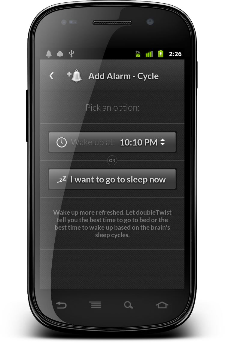
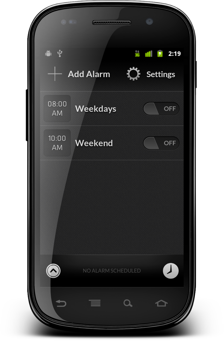
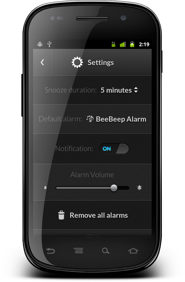
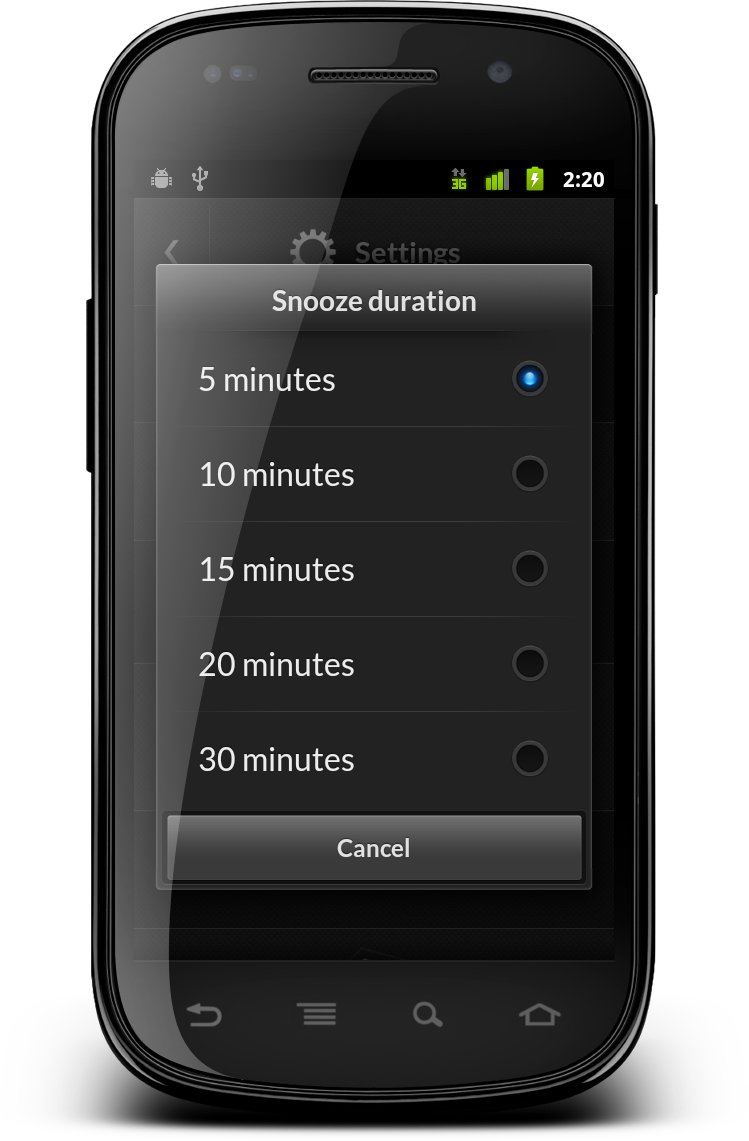
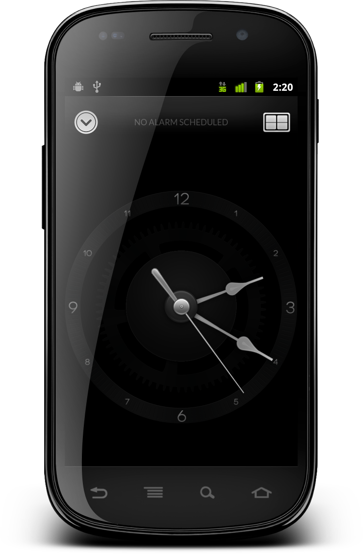
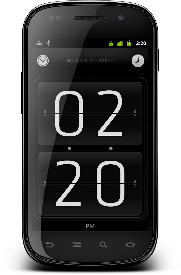
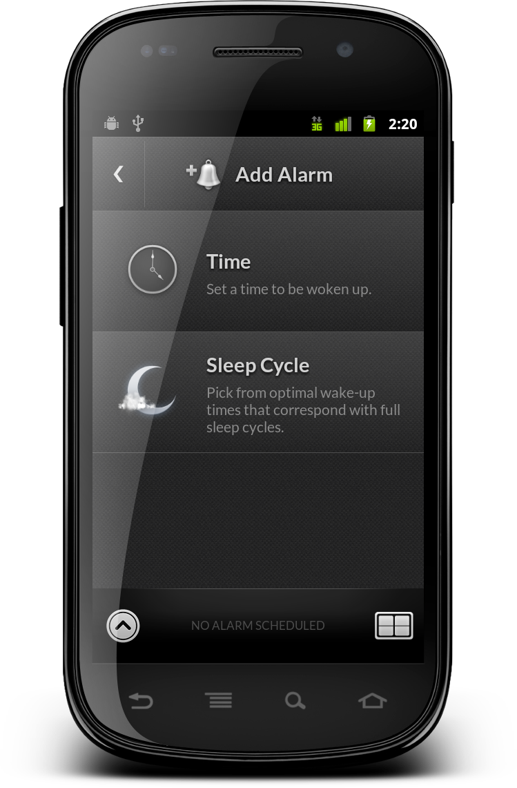
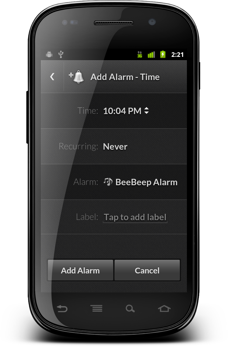
A few screenshots of the doubleTwist Alarm Clock 1.0 for Android. Download on the Google Play Store.
A few screenshots of the doubleTwist Alarm Clock 1.0 for Android. Download on the Google Play Store.
The basic principles of responsive mobile design are guiding our work on enhancing and refining support in Android Market / Google Play Store for a variety of device sizes and configurations. The “deep dive” series that ran on this blog in November 2011 was based on this work, providing a detailed description of the underlying concepts and technical implementation as presented at AnDevCon II conference (slides can be found here). The new tabbed look for “My Apps” in Google Play Store 3.5 has a new pattern that we’ve started exploring – click for the full size version.
On small devices where we use a single-column layout, we use the ViewPager class for consistent appearance and behavior. However, when the device is big enough to display the master-details view in two columns, swiping sideways between the tabs is awkward. If the pager strip extends across both columns, it is very sparse and takes extra vertical space. If the pager strip is only on the first column, the transition in the right column (to the new selection) is not well defined. In addition, having the pager strip not span the entire width of the device, and having it not aligned below the action bar is a little weird.
Instead, we display the tabs in the action bar itself (check ActionBar.Tab and ActionBar.TabListener). Since we switch to the two-column layout when we have at least 800dp in width – with the -w800dp resource qualifier – we’re not going to run out of horizontal space to display the tab titles. This way we save the extra vertical space for the main content, and do not require wide swipes to switch between the tabs.
This redesign of “My Apps” page joins the recent redesign of item details pages, as we continue refining and polishing the application across the entire gamut of supported devices. Stay tuned for more in the coming months.
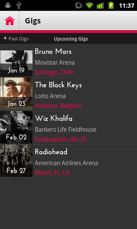
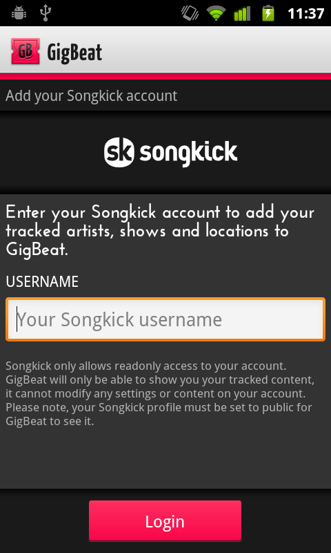
A few screenshots of the Gigbeat 1.1 for Android. Download on the Android Market.
The main principle of responsive mobile design is to adapt the presentation of the content to the current context. Let’s take a look at the redesigned item details page in the latest release of Android Market client (shown here are Galaxy Nexus, Iconia A100 and Xoom):

In order to take advantage of the available screen estate, the layout and styling of different elements differ between the various size ranges (with two switching points at 600dp and 800dp). The thumbnail becomes progressively larger, application title and developer name are displayed with different foreground colors, the rating stars move from the byline section into the summary section in left column and the overall styling of the top banner is different.
Having three different layout definitions for the same page can result in a lot of duplicate resources and Java code. To prevent this from happening, we strive to follow these two guidelines:
Support for multiple presentation buckets is implemented with the resource selectors introduced in Android 3.2. Earlier implementations of large screen support in Android Market client used the -w resource selector, switching to two column representation of the details page at 1000dp (depending on the specific page). A new, more compact layout for the two-column representation allows us to switch as early as 800dp, with an additional switching point at 600dp to take advantage of the available width for better layout of the summary section. Instead of using -w600dp and -w800dp, we use a combination of -w and -h. Here is why.
When you identify the target layout (in our case two-column layout with different scrolling points in the columns), when you identify where does each piece of your content go, where you create the visual language for styling the content and finalize the pixel-perfect metrics – this is when you identify how much space do you need at minimum to switch to that representation. Knowing the complexity and density of the content, and knowing the visual styling of the building blocks you then decide what is the specific value where switching to the different representation not only allows the user to complete the target flows in a much more comfortable fashion, but also results in a balanced and pleasing visual appearance.
Using -w selector only ignores the restrictions imposed by non-scrollable content. In the 600dp-800dp range, the summary section is taller and remains locked. If we use this representation on a device with, say, 600*300dp viewable area, the scrolling content will take an uncomfortably small screen area. In the 800dp+ range that displays two column view, the colored banned area is even taller and remains locked as well (with action buttons in left column snapping). The same scrolling considerations apply here as well. And so, in addition to using -w selector, we “augment” it with -h:
A few things to note.
Stay tuned for more in the coming months as we continue refining and polishing the application across the entire gamut of supported devices.
