Here’s how an artist page used to look like in the Google Play Store app:

And this is its new look:
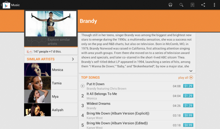
In addition to displaying the section that launches Music Explorer, we also scaled down the appearance of cells in the Similar Artists section in the left column. Why?
Take a look at the first image. We display up to four similar artists (if we have that info), and using full-bleed artist images with overlayed names creates this gigantic block that completely overpowers the main artist image. It’s just too heavy, and it constantly draws your attention away from the rest of the content on this page. The second image shows how we tweaked the visuals of that section to be more scaled down. The artist image takes half the cell, and the artist name is displayed to its right. And now we can also fit more of these cells above the fold.
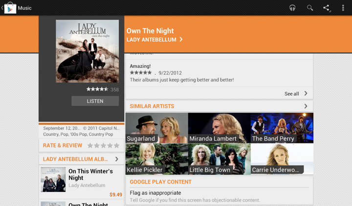
This highlights how the visual styling of a content block follows its logical importance in the overall hierarchy of the screen content. Here’s the same principle applied to the album page. First, this is how the album page used to look like:
And this is how it looks like now:
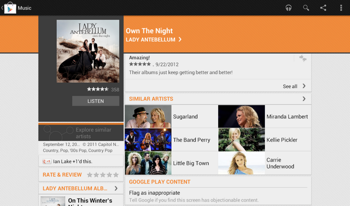
Once again here, we are breaking this big heavy block into smaller pieces. As we’re displaying the artist image side by side with the artist name, we switched from 3 columns to 2. This provides enough space for reasonably short artist names, and we wrap them if necessary to multi-line mode.
As we are completing the external rollout of the latest version of Google Play Store client for supported Android devices, I want to talk about the reasons behind the redesign of the top part of item details pages. Our main goal is to expose the most relevant and fresh content to our users, and make purchasing this content as quick and simple as possible.
There are multiple ways to get to the details page of the specific item – from curated top-level lists, from category listings, from search results, from shared links in your G+ stream, from the widgets and more. When the user eventually lands on the specific details page we want to do two things. The first goal is to help the user reach the decision whether he wants to buy the item, or continue browsing elsewhere in the store. And in case the user has decided to make the purchase, the second goal is to make the purchase process itself as quick and seamless as possible. The main intent behind the first part is to “support” the decision to view the item details by exposing additional relevant content that would work further towards making the user click the Buy button. We aim to help the user find what he’s looking for (explicitly or implicitly) without overwhelming him with too many choices or too much information. This also goes to support the second part – in our quest to make the purchasing experience as seamless as possible we do not aim to enable accidental purchases or skip important steps such as showing application permissions or movie rental terms. If the user decides to part with his money, it’s good for the entire ecosystem, including our content providers (app developers, studios, book publishers) and our partners (carriers), but we do not want the user to feel taken advantage of.
With these two complimentary goals in mind you can now take a longer look at the logical and visual structure of the details page. Each and every single element is there to support these two goals, with visual styling working to both present a unified look across the different blocks, as well as create a distinct separation for those blocks that are deemed crucial to achieve the goals.
The vertical order of the sections is crafted to expose the most important information above the fold – where importance is weighed based on how well it supports the user’s decision to click the buy button. This is why you see app screenshots, movie trailer and album tracks above the fold. This is why we worked on moving the app preview trailer into the unified screenshot section in the last two releases. This is why you see badges (where applicable), rating stars and +1 count above the fold. This is why the item title and creator (app developer, book author, album artist) are larger and bold. This is also why we have a distinctly styled summary section. It contains the most important information about the item – the title, the creator name, the thumbnail and the action buttons.
If we did our job right, there’s enough information above the fold to guide the user to click the Buy button. But what if the user wants to read the full description or browse the reviews? That brings him below the fold, and if the action buttons scroll away with the rest of the content, the user will have to take an explicit action to scroll all the way up once he decides to buy. This is why the summary section stays anchored below the action bar while the rest of the content scrolls. Here I’d like to point out – and I’ll return to this point later – that this design decision has a side effect. Reserving a certain amount of vertical space to non-scrollable content necessarily means that you have less vertical space for the scroll container. This means that those users who do want to read full descriptions or read user reviews will have to scroll more. By the way, you would note that the entire content, including the summary with action buttons scrolls vertically on phones in landscape mode. Here we felt that taking half of the available height makes the scrollable area too small and severely affects the user experience.
Finally, in addition to having the Buy button always there in portrait phones and tablets, note that it is styled in bright blue. Here the intent is to make it stand out as much as possible – without using kitschy oversaturated neons – so that it can be found quickly scanning up the screen.
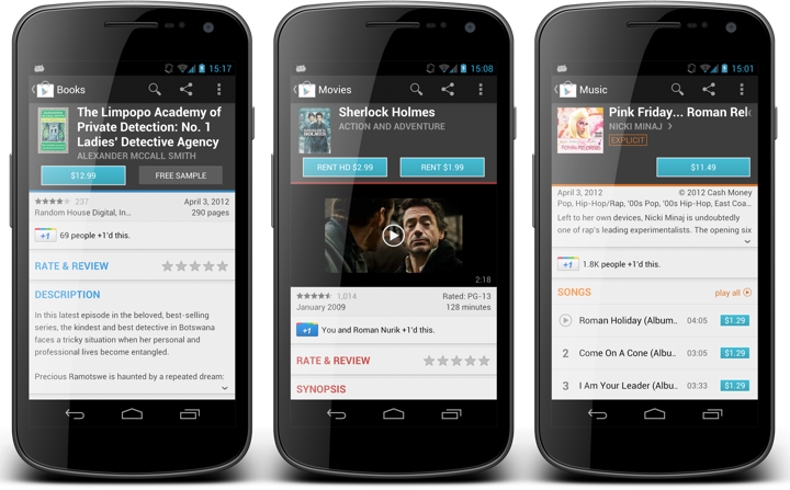
Now that I’ve talked about what we show on the details page, why we show it and how important is the summary section, let’s take a look at how we redesigned it in the latest version of Google Play Store – the screenshots below have the previous release on the left and the current redesign on the right. Our directive was that there were two things that were not working for movies, books and music. First, the cover art for these types of items is much more complex than for apps. Second, the horizontal layout of action buttons has resulted in an unbalanced distribution of section content for predominantly short titles of popular books, movies and albums.
The first part relates directly to the goal of providing the right information above the fold to help the user reach the decision to buy the item. If we show a very small artwork for book / movie / album cover, we are working explicitly against this goal. The second part is a little more subtle. If there are two action buttons, such as Rent SD / Rent HD for movies or Buy / Preview for books, then the user has to switch from vertical scanning of the sections to horizontal scanning of the buttons once the decision to act is reached. It’s a small bump, but a bump nevertheless. And so, the request was to show larger covers and to layout the buttons vertically.
At this point it is a pure design / eng exercise to come up with a solution that addresses these two requirements and improves the user experience as measured by the explicitly stated goals and as restricted by physical characteristics of small mobile devices.
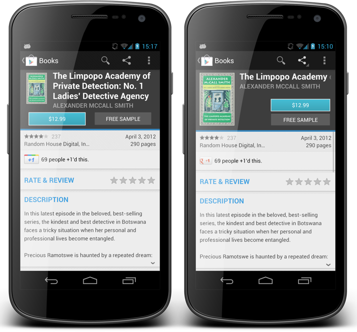
If you look at the first screenshot that compares the details page of the same book in the two designs, you will note that indeed the cover is larger and that the buttons are stacked vertically. But changing the metrics and layout of an element cannot be viewed within the tight context of that specific element. We must consider the effect it has on its immediate vicinity, as well as more far-reaching impact on the sections around it.
Making the thumbnail bigger works well with stacking the buttons vertically. After all, it was the left button that “prevented” us from making the thumbnail taller to begin with. But if we leave the metrics of the title unchanged we will have to make the entire summary section taller to accomodate the height of two buttons. That, in turn, would make the scrollable area even shorter. That, in turn, requires revisiting the decision of smaller scrollable area vs. ever-present action buttons. Making the entire summary taller was ruled out pretty early on, and the only choice left was to lose the multi-line mode on the title – as you can see in the comparison of books details page. The immediate result is that books with longer titles kick off marqueeing and make it more cumbersome to read the full title. On the other hand, you can argue that showing a much bigger cover art balances this out, as most book covers (as well as movies) use large high-contrast typography so that it can be quickly scanned among other items on magazine shelves. So here you can see how changing the metrics of one element necessarily affects elements around it, and how it impacts the parameters that influence the overall design decision on where each element goes and how much space it gets – all based on how the entire design works towards achieving the target goals.
There’s yet another, although less noticeable impact caused by larger cover art. If it’s taller, it must be wider. The vast majority of covers for books and music are oblong, and we add more height than width. But the end result is that the new larger cover art takes more horizontal space. This necessarily means that both title and creator texts have less horizontal space than they had before – you can see how much extra space is left after the specific book author name. So not only we’ve switched from three-line to single-line for the title, but we’re also giving it less horizontal space. And we’ll also have to elide the author name sooner (it was single-line before, and you really don’t want to marquee more than one element on any screen).
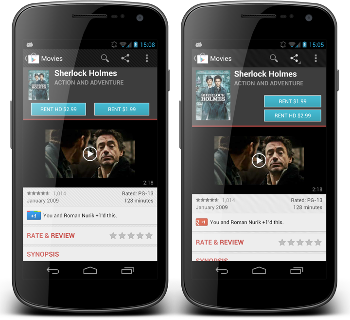
This screenshot compares the movie details pages. Here you can see how the old and new design supported shorter texts. The smaller cover art was completely overwhelmed by the two gigantic blue buttons, and the entire summary section was leaning heavily towards left in case of two buttons, or was completely disjoint in case of a single button. The new layout makes things much more balanced and shows a much more attractive cover, all at the expense of a few extra vertical pixels. By the way, the extra pixels are actually the result of using a consistent layout – the height of the summary section for books and movies used to depend on how long the title was.
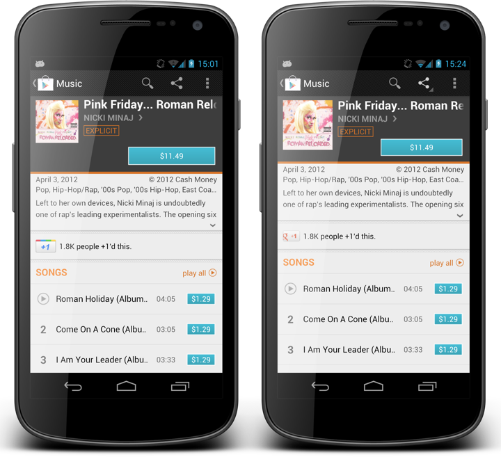
This screenshot shows how the new design supports album details. The predominant aspect ratio of album covers is 1:1 and we only have a single action button (to either buy an album or to listen to an owned album). Here, the cover art is slightly wider and taller which results in less horizontal space available for the title. In addition, the single consistent layout has eliminated stray vertical space between the Explicit tipper sticker and the Buy button, giving a few extra pixels to the track list. Last but not the least, we’ve eliminated much of the hanging whitespace below the album cover. Not all whitespace is bad, but that whitespace was.
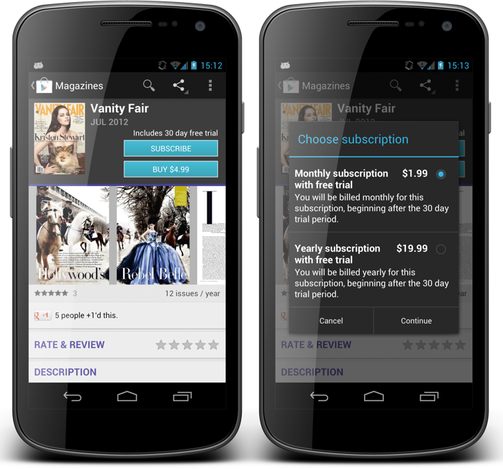
This is the latest addition to Google Play Store – magazines. You can see the same grid being used for the magazine summary, where we show an extra label above the Subscribe button. The right alignment of this label makes it clear that it is associated not with the label above it (magazine issue date), but rather with the button below it. The offer resolution dialog on the right is our new dialog that is shown in case we have more than two actions you can take on an item that you don’t own – such as multiple magazine subscriptions, or renting / purchasing a movie with SD / HD quality.
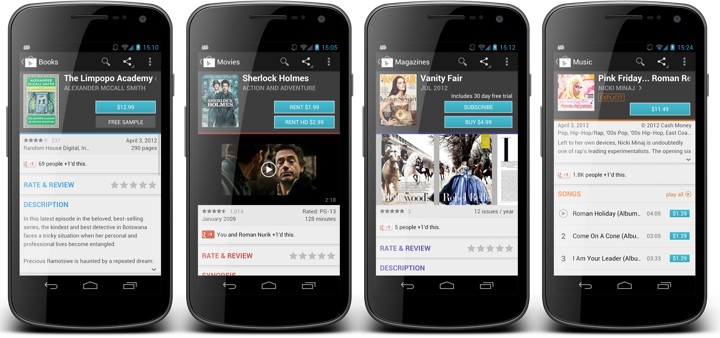
And here you can see details pages for books, movies, magazines and music albums side by side. Consistent cover size, button placement, paddings and margins ensure consistent user experience across all the different items, even if the user is not consciously aware of these changes.
The TL;DR version is quite simple. A design does not live on its own. Every single element in it, and the design as a whole must work explicitly towards the precisely stated goals. As the goals change, so does the design. It is a living breathing thing. Design turns a functional piece into a usable piece, and maintains the usability as the function changes. Don’t leave your screens to rot. Laziness begets laziness, and vigor begets vigor.
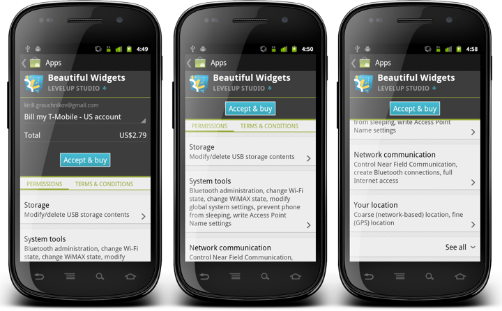
These screenshots show the content of the app purchase screen in one of the older releases of Android Market (before rebranding to Google Play). The screen combines billing information along with the list of all app permissions and various terms & conditions. If the specific application requests a non-trivial number of permissions the user can scroll down to view them all. An earlier entry on this blog has talked about the technical aspects of synchronized scrolling, whereas some content stays fixed (summary), some scrolls to snap (buy button) and some fully scrolls (billing table and permissions).
This screen is consistent with the system UI for showing application permissions. Permissions are grouped, you can tap on each group to view more detailed description, and by default we only show the dangerous permissions. The “See all” toggler allows expanding the normal permissions, following – once again – the system UI. I’ve been working on this screen on and off for quite some time (you can compare these screenshots with the earlier iterations to see slightly different styling of each permission group and vertical spacing around the buy button, for example). The next group of screenshots shows what happens when you tap on the “See all” toggler:
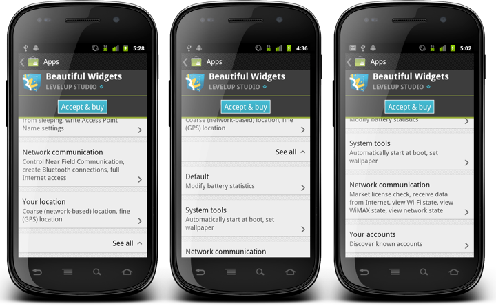
When the “See all” toggler row is clicked, it changes the arrow orientation to indicate that there is now more content below it that can be swiped up – as shown in the last two screens. This behavior was obvious to me because I know all the technical details behind the implementation and has been through these motions countless times during the original development and subsequent bug fixes and styling enhancements.
Which is why I was quite surprised to get an internal bug report that this behavior is not very usable. And indeed, if you compare the last screen in the first trio with the first screen in the last trio, the only user-facing difference is the direction of the arrow icon. That’s it. Nothing more. In fact, since we don’t want the arrow icon to be too heavy, you can even say that nothing changed as a result of user tapping this row. Which is bad. Quite bad. In fact, multiple subsequent taps on this row do nothing (user-facing) expect toggling the icon. Which means that if you tap this row in the rough vicinity of the “See all” label, your finger has most likely been obscuring the icon all along. This is a sure recipe to make your users angry.
It took me some time to understand why I didn’t see this as a big issue. I’ve been spending so much time on this screen, both as a developer and as a user, that I was going through the motions automatically. I know – as the developer behind this screen – what happens when I – as the user – tap that row. I stopped looking at the icon, just knowing that additional permission rows will be shown after the tap, and all I needed to do to see them was to swipe up. In fact, I’ve never looked at this screen as a first-time user.
Alex Faaborg talks about this in the “Advanced Design For Developers” session at Google I/O 2012 (starts around 4:40, with the quote at 8:30 mark):
I would argue that even though it’s really useful to have access to user research facilities, you don’t have to have them. You can just start running user tests in your head, basically short term amnesia. What you have to do is to encapsulate your mind, to forget the things that you know about your interface, to try to look at it with fresh eyes. Try to think about it as “OK, I’ve never seen this thing before.” If you can do that, if you can look at it with fresh eyes, try to let all the assumption that you’ve built up to fall away, then you’re able to do that kind of user test, just on yourself. And if you’re regularly doing that, it’s going to quickly improve your applications.
Here is how the interaction with the “See all” toggler looks in the latest version of the Play Store application:
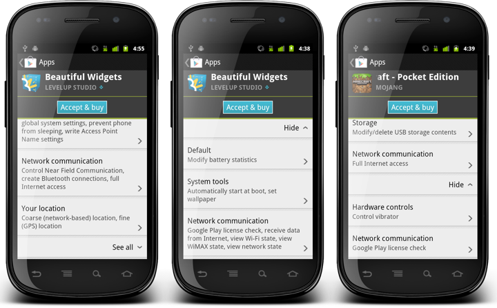
The first screen shows the default state, where only dangerous permissions are shown and the toggler shows a downward arrow. When “See all” is tapped, we do two things:
- The label changes from “See all” to “Hide”. This follows the system UI and highlights the change in the visibility of normal permissions.
- We also scroll up the newly added content using the ScrollView.smoothScrollTo() API.
While the label change elevates the arrow direction toggle to a somewhat more visible degree, it is the smooth scrolling that shows the user not only that we have processed his tap, but that we’ve also added the relevant content (normal permissions). By scrolling the new content into the view we indicate that it’s there, and it’s ready to be read and consumed.
As you can see in the second screen, we limit the actual scrolling so that the “See all” / “Hide” toggler stays within the visible content area. For applications with few normal permissions (such as in the third screen) this means that we’ll scroll the content all the way to show all the normal permissions. For applications with more normal permissions the smooth scrolling will ensure that the user sees as many of them as we can fit, while not getting “bumped” down all the way to the bottom of that long list.
And so, be mindful of what you “know” about your application. The more you know, the less you see.