Continuing the series on the more interesting UI pieces of the new Android Market client, today i want to talk about image reflections.

Here, the Market landing page shows two square cells with image reflections in the bottom half of each cell. If you’re coming from desktop client development, your first thought would be to take the original promo image, create a larger version of it with reflection and then set the resulting image on the ImageView displayed in the cell. There are enough code samples floating on the web that show how to write a method that gets an image and returns another image, twice as tall, with the original one on top and reflection on the bottom. There are two problems with this approach, one small and one big. Let’s start with the small one.
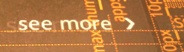
If you look closely at the reflection part in the screenshot above, you will see that the “amount” of gray does not change linearly as you go from the top edge of the reflection towards the full opacity near the bottom edge. It starts very slow and then accelerates to full alpha once it’s about two-thirds in. There’s nothing fancy about such an acceleration, and it can be quite faithfully approximated by a simple spline. The problem is that there are no core Shaders that do hardware-accelerated spline-based gradients. There’s a number of ways to work around this:
- Use a multi-step LinearGradient, carefully choosing the positions to minimize visual artifacts. You may still end up with awkward alpha transitions in the final visuals around the “segment breaks”.
- Paint the overlay programmatically. First, given the spline equation, compute the alpha for each vertical position. Now, you can draw a bunch of horizontal lines, changing the alpha on every row. Alternatively, you can create a one-pixel wide Bitmap, wrap it in a Canvas, paint the pixels based on the spline-computed alphas, create a BitmapDrawable with the resulting Bitmap, sets its bounds to stretch the bottom half of the reflected image and call the draw() method on it.
- Finally, you can work with your designers to create a nine-patch asset that emulates the alpha overlay. There are certain advantages to this approach. The designer can tweak the reflection appearance in his tool of choice without any extra work on your side to come up with the correct math approximation of the target visuals. The main drawback is that nine-patches (or n-patches) only support linear gradients.
The second problem with creating a twice-as-tall reflection image is much bigger – memory pressure. Android runs on a wide gamut of hardware profiles, but one thing is constant – you don’t have as much memory as you do on desktop clients. Images are a particularly memory-hungry species, and given how many images the Market client displays on the landing page, we simply cannot afford consuming any more memory than absolutely necessary. Let’s see what we’re doing:
- The entire cell is a custom class that extends RelativeLayout. Let’s call it GridSquare. Extending the RelativeLayout gives you a nice option to get access to the ViewGroup.MarginLayoutParams as the layout parameters of child views. This way you can respect the layout margins set in the XML layout definition. This also gives you an extra flexibility for more precise control over the layout.
- GridSquare overrides the onMeasure and onLayout to compute the bounds of promo image. The end goal here is to have the promo image fit the entire cell width while maintaining the original ratio. To this end, the onMeasure gets the intrinsic width and height of the ImageView, computes the scaling ratio based on the intrinsic width of the image and the available width (computed from the width measure spec passed to onMeasure) and computes the matching height. The measure() method is then called on the ImageView child with the full width and the matching height (using MeasureSpec.makeMeasureSpec with MeasureSpec.EXACTLY). The onLayout() method fetches the measured height of the ImageView and passes it directly as the bottom position to the layout() call.
- Reflection is done in two passes – full opacity reflection and overlay.
- Full opacity reflection is done at runtime with Canvas APIs without creating any extra images or drawables. First, the GridSquare constructor calls setWillNotDraw(false) to let the rendering pipeline know that it has a custom onDraw logic. The overriden onDraw() method calls ImageView.getDrawable() on the view that holds the promo image, save()s the Canvas, translate()s it vertically by twice the height of the image view, computes the scale factor of the image (same logic as in onMeasure above), scale()s the Canvas based on the computed scale factor (positive X, negative Y), calls Drawable.draw() on the promo image drawable passing our Canvas and, finally, restore()s the Canvas so that we don’t end up affecting other draw operations on the Canvas object once our method is done. In addition, we paint a one-pixel black horizontal line along the bottom edge of the original image (our designers found that it adds a nice touch to the visuals).
- The fading overlay is done with a nine-patch asset that is set as a background attribute of a special child view of the entire cell. We’ve decided to go with the third approach outlined above, where the nine-patch has a large non-stretchable vertical section that emulates the non-linear fading, and a full-opacity stretch that is “used” when the fading is complete. As child views are drawn after the parent, this overlay is painted on top of the full-opacity reflection created on the fly in the cell’s onDraw() method.
Stay tuned for more.
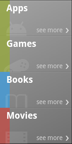
Continuing the series on the more interesting UI pieces of the new Android Market client, today i want to talk about one of the central elements of the landing page – media selector.

This element has a couple of characteristics that, left unattended, would have broken the intended visual appearance. First, note how the vertical gradient runs across all the cells, unifying them into a single UI element. Second, there are multiple overlapping translucent elements combined at different alpha levels and Z order.
First, let’s take a look at the zoomed version of these overlapping elements:

The four elements are:
- Lighter gray thin strip going along the top edge of the cell
- Darker gray thin strip going along the bottom edge of the cell
- Thick color strip going along the left edge of the cell
- Media vertical watermark icon “peeking” from the bottom edge of the cell
If you trace the pixels along the bottom edge of each cell, you will note the overlap, where the pixels from the different elements are blended together creating a nice layered look. The cell layout is a RelativeLayout where each child view (including the text views for the media vertical text and the “see more”) is aligned to the relevant cell edges (with layout_alignParent* attributes). As child views are painted in the order in which they are defined in the layout – which means that the child defined last is painted last – this is the layout order:
- Thick color strip going along the left edge. The background of this child view is masked with 0xC0FFFFFF to hint at the underlying vertical gradient.
- Gray thin strips going along the top and bottom edges. These are translucent as well, achieving a nice highlighted look in the area where they overlap with the thick color strip. This allows changing the color coding of different media verticals without creating any extra assets.
- Media vertical watermark icon in the bottom left corner. It is positioned with negative layout_marginBottom to make it “peek” from the bottom edge. It is translucent as well, further contributing to the nice highlighted overlays along the bottom edge (especially in the colored area).
The order of these child views is important:

The left screenshot shows a different order of the child views. Here, the thick color strip is placed after the thin horizontal gray strips. If you study the cell dividers closely, you will see that this breaks the visual continuity of this bevel when it transitions into the colored area. Even though the translucency is the same, the combined effect is very different.
The right screenshot shows what happens when the light and dark grays of the thin horizontal strips are switched. Following the global lighting model that has the light source at the top of the screen, we now have a raised bevel instead of a lowered bevel. This draws too much attention to the separators that appear are very visible “bumps” on the surface of the unified selector element.
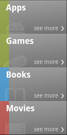
This screenshot highlights the importance of a single vertical gradient applied to the entire selector. Having a separate highlight in each cell adds too much noise and bumpiness to the visual surface. Instead, the entire selector has a background nine-patch with the slight vertical gradient. A final polishing touch is done in the code that populates the content of each cell – the top horizontal line of the top cell and the bottom horizontal line of the bottom cell are two pixels thick instead of one. This further establishes the selector as one visual element while still remaining consistent with the global lighting model. The implementation itself locates the specific child view by its ID using View.findViewById and then sets the height attribute of the getLayoutParams() result.
Stay tuned for more.
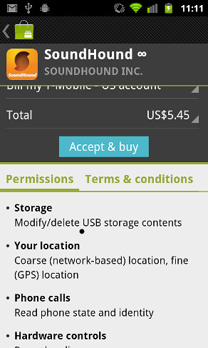
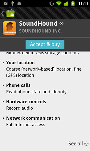
Last week we announced the rollout of a completely redesigned Android Market client, and it’s time to dig a little deeper into some of the more interesting UI pieces. As i mentioned in my Google+ post, the team is committed to a level playing field, and the entire UI is done using only published platform APIs. To kick off this series, let’s look at the combined permissions / purchase page:

Let’s see what happens when the specific application requests a lot of permissions and they don’t fully fit on the screen. As you start scrolling the content, the action bar and the item snippet remain anchored while the rest of the content scrolls:

As the “Accept & buy” button gets to the bottom edge of the item snippet, it snaps to it and does not scroll any more:

Let’s take a look at the implementation. The main page is a vertical linear layout with three child views: action bar, item snippet and a scroll view. This scroll view has two children (see below for why this is not strictly correct): the “main” content and a button row:


You can see the bounds of these two views highlighted in yellow in the screenshots above. While the “Accept & buy” button appears to be part of the scrollable content, in fact it is its sibling. The scroll view content has a dummy child view between the pricing content and the tab strip. This view has the same height as the “Accept & buy” button (plus the few dips for the thick green separator) – creating the perfect illusion of unified content.
Keeping the layout of these two siblling views in sync is the real meat. The parts are:
- As ScrollView can have only one child, the two child views highlighted above are placed within one more container. Let’s call it PurchaseLayout.
- The view containing the button and the thick green separator (which snap together to the bottom edge of the item snippet) is placed as the second child of the PurchaseLayout. This ensures that it is painted on top of the main content and is not obscured during the scrolling.
- As ScrollView does not have an API to attach a scroll listener, a custom extension of ScrollView tracks calls to the onScrollChanged method and notifies a custom listener with the new top scroll position.
- As the user scrolls the content, the listener is notified. The listener implementation uses the current top scroll position to determine the vertical position of the “Accept & buy” button. As long as the purchasing part of the page is visible, the buy button is “anchored” to its bottom edge. Once the purchasing part is completely scrolled away, the buy button is “anchored” to the bottom edge of the item snippet. In this case it is effectively the current top scroll position as the buy button is inside the scroll view.
There are two points that deserve a special mention:
- A simpler option would be to have the buy button be a sibling of the scroll view. This has one big problem – as this snapping content (with dark background and thick green separator) is painted on top of the scroll view, it hides the relevant part of the scroll bar. It is usable, but quite ugly.
- When the content is scrolled and we’ve computed the new vertical position for the buy button, we need to re-layout the content of the scroll view to maintain the unified scrolling visuals. This is usually done with a call to View.requestLayout(). This method, however, schedules an asynchronous layout pass. While it is acceptable for one-off layouts, calling it during fast scrolls can cause very visible vertical tear-offs. We saw that multiple consecutive requestLayout() calls were coalesced – and the buy button was lagging behind the fast moving scrolling content. The solution is to use the synchronous View.offsetTopAndBottom() to ensure smoothly synchronized scrolling no matter how fast the content is scrolled.
With vertical space being a rare commodity on landscape orientation, this page behaves slightly different. Only the action bar stays anchored, with the item snippet “joining” the rest of the scrollable content. The “Accept & buy” button snaps to the bottom edge of the action bar – which did not require any code changes since the actual vertical position is the current top scroll position.
Stay tuned for more.
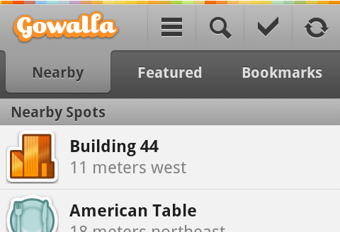
A couple of weeks ago i posted a few screenshots of Gowalla 3 app for the Android platform, and today i want to take a closer look at the great work done by Drew Yeaton (designer, @xeeton) and Philip McAllister (developer, @mcalliph).
This screenshot illustrates the omnipresent header section. It starts with the thin rainbow strip that reinforces the web branding, transitioning into a combination of action bar and tab strip. Note how the single-pixel light gray separator just below the rainbow strip helps the transition from a full-color area into the predominantly monochrome section. Thin vertical icon lines fade away at the ends, providing just enough separation without too much visual noise. The icons themselves have a light halo offset one pixel to the bottom – this effect is mirrored on the text of selected tab. Together with the thin separator line mentioned above this establishes a consistent lighting model.
The selected tab has a nice subdued gradient that smoothly fades its fill into the action bar, with gradually darkening colors as it nears its bottom edge. Here, the design follows the same approach as taken by Safari 4.0 and Firefox 4.0 – both blend the currently selected tab into the address bar: Firefox downward and Safari upward. This is the right decision to make – while the header remains anchored to the top edge of the screen, the content is scrolled vertically below the tab strip; blending the selected tab into the content would have broken the visual continuity on both ends.
This screenshot shows the styling of pressed tabs. A pressed tab (bookmarks in this case) uses the same curvy contour as the selected one, with much darker gradient and the same color “flip” of the tab text.

And here you can see the styling of a pressed action bar button. Note how the gradient fill extends to the vertical separators on both sides (with some fuzziness along the right edge), with a much darker line along the top edge and a fade away towards the bottom. On a related note, the current version of the app does not show any visual indication of focus traversal making it rather hard to navigate the app with a nav ball, d-pad or any other navigation method.

As the information is loaded, the rightmost icon shows a spinning progress indicator. This follows the convention set by modern browsers that combine the opposite-state buttons to save valuable space while still providing visual indication of a running task.

Some pages show a button bar anchored to the bottom edge of the screen. Here, the main call-to-action button uses a strong orange fill, while still maintaining the global lighting model. Note how the button text has a darker shadow offset one pixel to the top. It also looks like the much darker gray color of the button bar background makes the outer dark orange line look fuzzy – this can be addressed, perhaps, by tweaking the colors used for the outer and inner contour along the bottom few pixels.

The button bar does not scroll away with the content. It looks like the designers were aware of the precious vertical space taken by this container, and decided to make its background partially translucent. While this may slightly help in “discovering” the scrollability of the main content, i’m looking forward to see the landscape-optimized layout of screens that currently show three static bars.

And finally here is a full-size screenshot that shows all the elements together – from the selected action bar button mirrored in a small seaglass overlay next to the location name to the drop shadows around the thumbnails, from the styling of “people” / “checkins” buttons to make them appear as part of the same button strip to the precise content alignment in the location summary section – to all the static navigation elements mentioned above.
