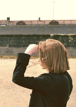
Illustrators at work – interview with Zara Picken
I can trace the origins of my interest in the world of digital illustration to one artist. And her name is Zara Picken. It was this wonderful combination of shapes, colors and textures that drew me in, and it has been a true delight ever since to see her new work coming out on her blog and her Flickr stream. And today I am quite humbled to welcome Zara on my blog, and ask her a few questions about her art and craft.
 Kirill: Tell us a little bit about yourself and how you got started in the field.
Zara: I’m a UK-based illustrator originally from the Walsall in the West Midlands, currently based in the North East of England. I studied on a foundation course at Stafford College and went on to complete a degree in Illustration at the University of the West of England, Bristol.
I’ve been working as a professional illustrator since graduating in 2008. I work with UK and international clients on a wide range of projects across areas including editorial, advertising and more.
Kirill: How has your own stylistic taste evolved over the years? Is there ever a thought of exploring radically different directions? Is there a concern of falling into a certain rigidity of style?
Zara: I am interested in a wide range of aesthetics, beyond design and illustration – I have always been very interested in art, photography and film, for example. I don’t think I’ve ever had one particular stylistic taste – there is so much out there that I admire. I have a blog called Hovering Cat where I have been sharing my favourite finds since 2007.
Concerns about my own style never figure consciously when I am working – the way I work today has evolved from years of developing my process and will most likely continue to change as I carry on making small alterations based on playing and experimenting.
It’s difficult for me to see my own style, the same way that I don’t hear my own accent when speaking. I never notice it until someone points it out to me. Perhaps that’s what style is – the voice in which you naturally speak, not influencing what you say but how you say it. I use my style to communicate and will sometimes alter my tone or the way I word something but at the core it will always be my pronunciation and delivery.
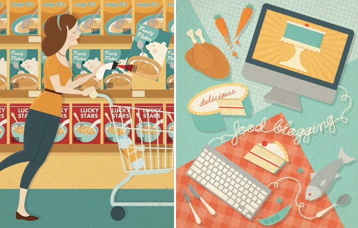
Left – illustration for ShopSmart magazine, right – illustration for Delicious magazine.
Kirill: And on the flip side, do you want people to recognize your work the first time they see your new illustrations?
Zara: People do seem to know it’s my work when they see new pieces but it’s more important to me that the illustrations resonate with people. My work is about communication first and foremost.
My name isn’t the first thing I expect people to think when they see the work, though I think my work is distinct and I aim for it to be eye-catching. There is personality in my work but I don’t want it to be overbearing at the expense of the message I wish to convey.
Kirill: When you transfer your pencil sketches to the digital world, do you try to preserve some amount of hand-drawn imperfection? Is this important to you?
Zara: Sometimes – it depends on the illustration, so I decide on a case-by-case basis. It used to be a bigger concern for me than it is today but I now feel less precious towards my sketches. Imperfection does not equal authenticity – clarity and editing is important, too. Sometimes symmetry and clean lines are required and sometimes a less perfect line or a degree of wonkiness helps.
I aim to be flexible and not so linear in the way I work, both literally and figuratively. My sketching is not hugely influential on the final piece in terms of the finish and manner in which it’s completed. I like to work ideas up a bit more digitally before showing them to clients, to give a better idea of my direction.
Kirill: Do you find yourself spending “too much” time on progressively smaller details? Do you ever wish to go back and tweak a certain illustration after it’s already been published by the client?
Zara: I like to keep illustrations simple and graphic whenever possible. I try not to add smaller details unless they say something or add significantly to the appearance of an illustration. There is always the temptation to dwell on details if work has been completed in advance of a deadline – I’ve found the time is better used by taking a step back and returning with fresh eyes. I try to spend time editing my illustrations, stripping back any extraneous elements.
If a client has published a piece of commissioned work and I later decide to add the image to my portfolio, I might sometimes choose to alter it slightly. It doesn’t mean that I was unhappy with the illustration when published but rather that changing it could help it to fit better alongside other pieces in my portfolio. I guess the fresh eyes also play a part – sometimes time away from an illustration can give a new perspective when revisiting.
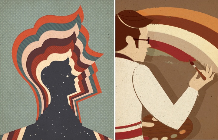
Left – starman, right – retro rainbow.
Kirill: What’s the weirdest client feedback you ever received, if you don’t mind sharing it?
Zara: I was commissioned to create an illustration to accompany an article about wine tasting – upon sending the roughs, I was informed that alcohol could not be depicted within the illustration.
Kirill: Would it be wrong to say that drawing human figures is one of your favorite areas?
Zara: I’ve enjoyed drawing people a lot more since working professionally as an illustrator. At university, I often disliked drawing human figures, due to the way life drawing was taught as a strictly representational exercise. All imagination was eliminated from the process and it certainly was not my favourite area.
I started to enjoy it more when I realised that people could be drawn in a way that matched my graphic design approach and did not have to be so realistic. By simplifying and refining complex areas of human anatomy, worrying less about the “right” and “wrong” ways to do things, people feel more integrated into my compositions and I have more freedom over the way figures can be portrayed.
Kirill: How valuable is self-initiated work for you?
Zara: I would say that it is invaluable. I focus on self-initiated projects whenever I’m not working on commissions. I probably end up doing as much personal work as commissioned – I try to do as much as possible. It’s crucially important to draw images you enjoy and tackle the sort of subject matters you really want to explore. I think this helps me to retain my voice.
Working on self-initiated projects also enables me to try out different ways of working that sometimes inform future commissions. My personal work feeds into my commissioned work, especially when clients cite self-initiated pieces for the direction of a job.
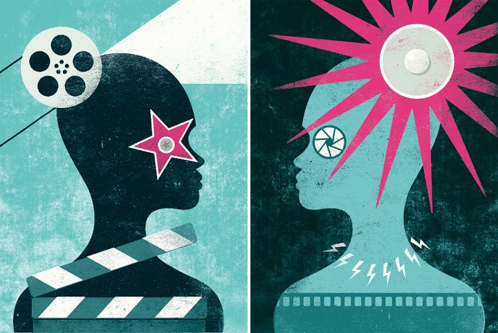
Self initiated “Glare” illustrations (part 1, part 2).
Kirill: And on a related note, do you ever get to take a break as a free-lance illustrator?
Zara: Yes, though I’m still learning to balance my time – I try to make sure that I take the opportunity to have a break when things are quieter, though my immediate impulse is to work on personal illustrations in that time. I think it’s easier when I travel to a different location as the temptation isn’t there to sit behind a desk – the change of scenery can be a pleasant distraction and there is extra motivation to go out and explore.
Kirill: There’s a recent surge of interest in mid-century inspired illustration, photography, fashion and design. Do you see this as a younger “digital” generation trying to recreate the old “analogue” look and capture that spirit?
Zara: I think that this is the reason in some cases. I have a theory that it could be the result of increased access to media from a wider range of times and places. This fits what is happening within wider culture. A comparison could be made to young musicians, who are now able to listen to music from any era thanks to online music services and are therefore influenced or inspired by a broader collection of artists. The sheer volume of material that might never have been seen before is now shared widely with a receptive audience.
Personally, I prefer to embrace the values of mid-century design rather than try to emulate an aesthetic. These principles are appealing in their positivity and playfulness. I want my work to have the same timeless, classic quality inherent in work produced during that era.
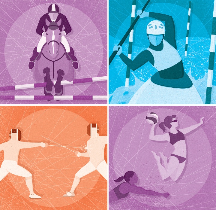
Illustrations for the London 2012 Olympic Games.
Kirill: What do you think when you look at your own work from a few years ago?
Zara: Some pieces stand the test of time better than others but I feel that I have come a long way in the few years I have been working professionally. I sometimes catch sight of illustrations lurking in my archive that I remember being really pleased with at the time and now…not so much.
However, I try not to be too critical of my older work – it has acted as a step towards what I am doing today and one day, the work I am doing today will be considered “old work”. Besides, my favourite piece of work is almost always my most recent.
Kirill: What’s the best thing about being an illustrator?
Zara: I like not knowing what I’ll be doing from one week to the next – it can be a slightly scary way to earn a living but it’s also exciting.
I also like the continuous consumption of coffee.
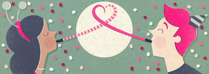
Illustration for an email newsletter.
And here I’d like to thank Zara Picken for taking the time out of her busy schedule to do this interview. You can find Zara’s work on her site, her blog and her Flickr stream. Zara also has active presence on Dribbble and Behance. You can buy selected prints over at Society6.
