Make it look pretty
The “Design Secrets for Engineers” blog post over at Pulse engineering blog opens up with the following:
If you are a designer like me, you must be asked on a regular basis to “make it look pretty.” The request can stroke your designer ego, making you feel like a design rockstar with super powers to make this world a more beautiful place. This is especially true at startups, where you are one of the few, maybe the only designer there. However, it can also be really annoying–almost degrading at times. Thoughts like “why the hell can’t engineers do this on their own? It’s all common sense” always go through my head. If only engineers knew how to do visual design, designers would have more time to focus on cooler, more exciting problems like future product concepts.
This is a snarky, and quite abrasive statement. It diminishes the value of a good UI designer. It implies that if only engineers were to sit down and memorize the eight steps outlined in the article (one of which is “Use Keynote” of all things), they’d be magically imbued with the ability to take any rough wireframe and not only wire it to the data, but also come up with a pixel-perfect polished elegance for every single element. You know, something that usually takes equal parts of talent, years of formal training and even more years of hard work. No wonder that the very first comment from the self-titled engineer was no less snarky:
If only designers would do the parts of their job that isn’t cool, then engineers would have more time to focus on cooler, more exciting problems like building the actual product.
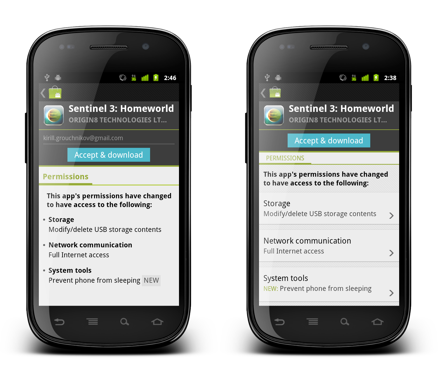
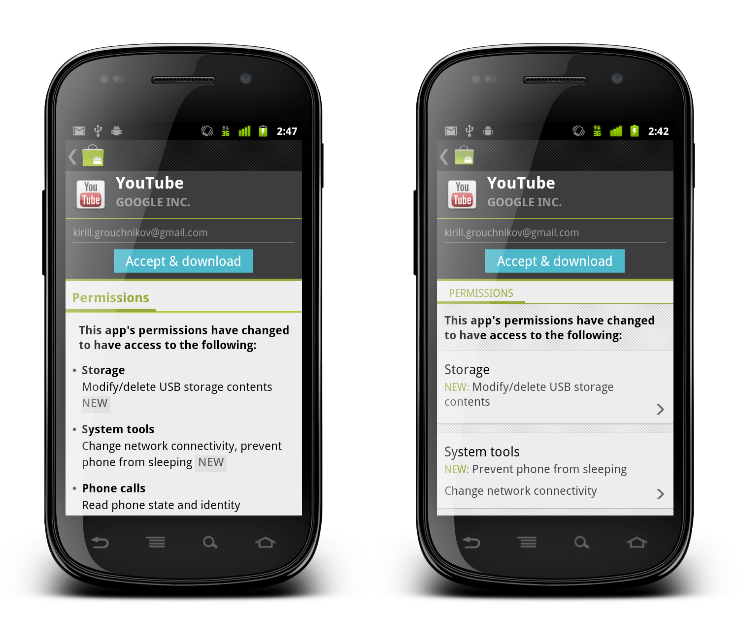
And here i want to illustrate the difference between engineer-driven and design-driven UI, using one of my favorite elements in the new Android Market client. When a developer publishes an update to his app or game and requires new dangerous permissions, the user will be asked to manually approve the permissions before the update is downloaded and installed on the device.
When the user opened the details page of such an app in the old versions of the Market client (pre-3.0), we would display all the permissions required by the new application version. There was no easy way to tell what are the new permissions, unless you went to the system UI, wrote down the permissions required by the currently installed version and compared them to the new list. This has been bothering me for a long time, and we ended up implementing a rather rudimentary way to mark new permissions requested by the published update:
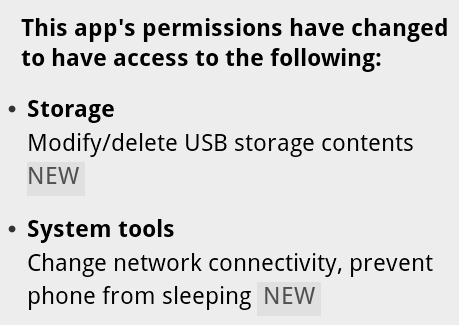
When we concatenate all permissions under the specific category, we check to see whether the specific permission is new. If it is, we add the word “NEW” and style it with different shades of gray (using ForegroundColorSpan and BackgroundColorSpan respectively). If you (as the user) are interested to see what exactly is the update requesting, this allows you to quickly skim through the list and find the answer. Functional, and designed by engineers.
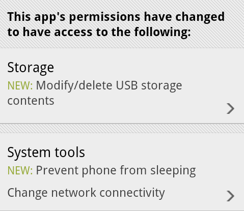
And this is how it looks after it underwent UX and UI treatment by our designers:
Let’s look at the differences:
- Each permission category is separated with the same visual styling as we have on the details page (translucent separator on top and pinstripe footer on bottom). This creates consistency across the entire Market application.
- Each permission category is clickable – denoted by the arrow icon that is used elsewhere to indicate additional content that will be displayed in a separate screen or dialog. Clicking on a section will display a dialog with more detailed information on permissions in that section.
- The category title is no longer bold – but rather uses a slightly bigger font. In the original version the category titles were screaming for attention, where in fact it is the individual permissions that are important for users interested in seeing what level of access the specific application is requesting.
- New permissions in each section are placed in a separate row. If there are multiple new permissions, the word “NEW” will appear only once. This allows for quicker scanning as all new permissions are grouped together, and removes extra noise created by all-caps strings.
- Placing the word “NEW” in the beginning addresses the issue seen in the previous screenshot – where the leading space before the first appearance of the word “NEW” was effectively cut by the linebreak algorithm. This removes the “illusion” of this label being a badge.
- Using the same green color as the rest of supporting elements on the details and purchase pages of applications allows removing the background fill – also removing an awkward visual balance of the gray rectangle that surrounded the word “NEW” in the original implementation.
When you get such a design, you may or may not notice the intertwined subtleties of such a change. It takes some time and practice to detect each specific choice that went into this redesign and understand what it is trying to solve. But that does not mean that after seeing a few of those you (as an engineer) will be able to do the same. Much as with programming, it takes years of constant practice at designing, taking apart, redesigning, brain storming, understanding usability aspects and limitations of device context, absorbing constructive (and sometimes brutal) criticism from your peers and superiors until you get to a point where it just “comes” to you.
When an engineer comes to you and asks you to make it look pretty, it means that the engineer actually understands that a working and functioning implementation is in a bad UX and UI shape – much like a good designer would understand and work within the platform and device limitations. Not all engineers appreciate the difference, and both sides should thrive on an opportunity to collaborate and educate each other on their respective crafts. Starting from the view point of “don’t bother me because i’m working on the next shiny thing” is not only counter-productive, but also engenders a bad environment where both sides passive-agressively blame the other side for shipping bad products.
As a point of reference, here are both implementations side by side. Click to see high-res versions.