The art and craft of screen graphics – interview with Jamie McCallen
Continuing the ongoing series of interviews on fantasy user interfaces, it’s my honor to welcome Jamie McCallen. In this interview he talks about keeping the viewers in the story, the process of designing for screens in film, the differences between on-set and post production work, and the evolution of hardware and software tools at his disposal. In between and around, Jamie dives deeper into the first 15 years of his work that spanned productions as diverse as “Elysium” and “The Age of Adaline”, “Batman v Superman” and “Night at the Museum: Battle of the Smithsonian”, “Star Trek: Beyond” and “Godzilla”, and many more, including his most recent work on “Altered Carbon”, “Skyscraper” and “The Cloverfield Paradox”.

Kirill: Please tell us about yourself and the path that took you to doing screen graphics in film / TV.
Jamie: I am a freelance designer and developer based in Vancouver, Canada. Over the last 15 years, I have worked on just over 40 film and television productions providing interactive desktop and mobile applications and post-production motion graphics.
I took a bit of a detour before getting into the industry. Art and programming had been interests, but I always had a different career in mind. In my teens, I had had art lessons, attended summer computer camps, that sort of thing. In my first years at university, I had taken a few programming courses and I worked one summer developing research applications for a statistics professor. But my intended career path was law and labour relations and over the next few years that’s what I did: law school, human resources manager, lawyer, co-founder of a labour relations non-profit organization. To that point, I had enjoyed the work I was doing, but it was while building the website for the non-profit, that something clicked. I realized I was excited about what I was doing and really enjoyed the combination of coding and design. Not wanting to give that up, I started working with a Vancouver-based team building websites for game companies and their game titles.
Around this time, I had a chance encounter with Rick Lupton, owner of i.Solve, Inc. Rick had heard I was doing some work in Director and inquired if I could build a joystick-controlled gimbal screen for the x-jet in “X2: X-Men United”. Over the next few years, I worked with the i.Solve group and started to design more and more screens.
It would take a few more productions and the opportunity to work with Gladys Tong and the G Creative team before I stopped thinking of myself primarily as a developer and started to consider myself a hyphenate (designer-developer).
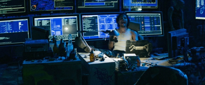
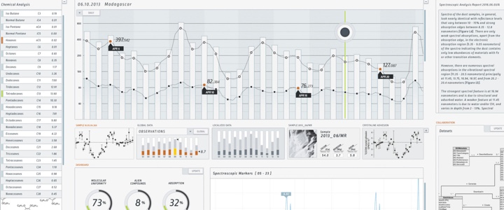
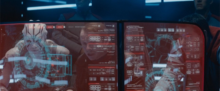
Screen graphics for “Godzilla” under the creative direction of G Creative. Courtesy of Jamie McCallen and Warner Bros.
Kirill: Looking back at your first couple of productions, what was the most unexpected part of working in film?
Jamie: On the first couple of films I worked on, I remember chasing some information that I thought would be helpful while building screens. “What city are they in? What is the last name of that character? What is the exact date?” It took a while to figure out there were often no solid answers and that productions sometimes wanted to keep those aspects as vague as possible on purpose. It just became easier to work around the details and get creative about hiding the holes. Nevertheless, I just remember expecting some of those details, especially timelines, would have been fleshed out.
Kirill: Do you worry about how your work will age / be seen in 20-30 years?
Jamie: Considering some of my work is nearly 15 years old, I should probably start to worry. But, no, I don’t worry about it. Style and design are a product of their time and some will age well, and some won’t.
While designing, I am definitely not thinking about future audiences. But I do have the contemporary audience in mind and am considering what they are familiar with, what visual shorthand can I use to reinforce the message. Mainly, I am trying to produce a style that matches the character and the set design. When my work is seen by future audiences, I just want it to continue to mesh with the overall production.
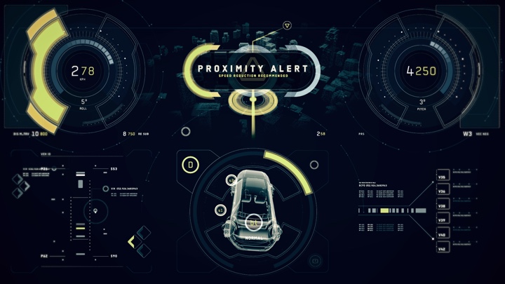
Screen graphics for “2012” under the creative direction of G Creative. Courtesy of Jamie McCallen and Columbia Pictures.
Kirill: Do you find yourself competing with screens in your daily life? How do you craft something compelling that keeps the viewer in the story?
Jamie: Absolutely, I think we all compete with screens to some extent. It’s fairly common to be in situations where a person you are with is trying to finish up a message or post. For the most part, I just keep doing my own thing. If the person knows I am there and chooses to continue with what they are doing, I’ll respect that choice.
It’s kind of the same way in movies. You need to know what your message is competing with and how important it is. It’s not always about demanding attention.
As for your second part of your question, keeping viewers in the story. That’s key. We have all watched a show where something was off. Display graphics can suffer from the same types of problems. Sometimes they can be overly distracting, have awkward mannerisms, look out of place.
So, the first part of designing any screen is to just try to make sure it doesn’t stand out for the wrong reasons. Screens have to play their role. If it is a background textural screen, it should not call too much attention to itself. If a screen is given the chance to drive the story – be a “hero” – it needs to command attention and, as you said, be compelling.
To build a compelling hero screen, I think it should offer something unique and it needs to read clearly. For me, the process starts with the message. What story does the screen need to tell? Usually a screen is only visible for a few seconds, so it is important to figure out the core of the message and eliminate anything else. I try to strip out anything that I can read past and still get the whole message. Some of what is stripped out can be reintroduced later as secondary elements, but the main message should be as simple as possible.
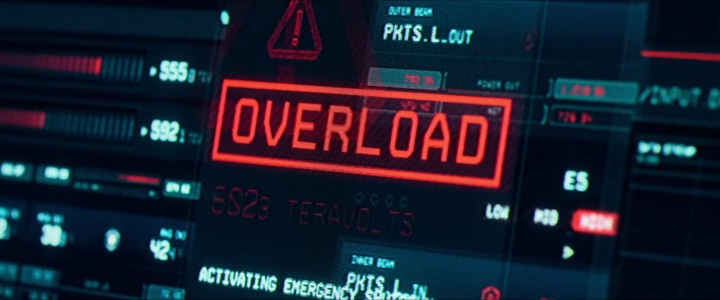
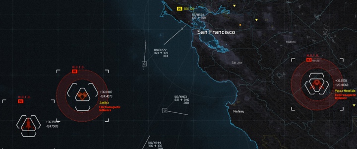
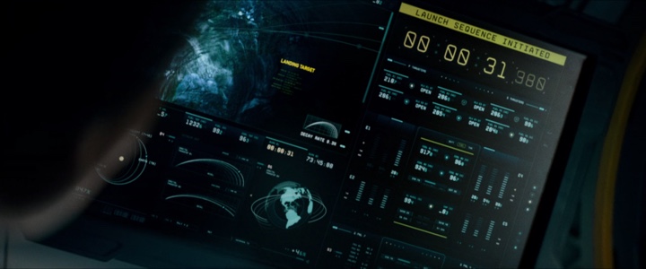
Screen graphics for “Star Trek: Beyond” under the creative direction of G Creative. Courtesy of Jamie McCallen and Paramount Pictures.
With that worked out, I spend most of my time on the graphics that support that message and the UI. The graphic elements are normally what register first and are responsible for defining what the screen is about. Maps, schematics, and scans are pretty standard candidates. The UI often sets the general style, but the main graphic will likely be what is more impactful and memorable.
Once the static designs and style frames start to come together, I turn to motion. Audiences will not be wowed by a simple wipe or slide. I look for ways to introduce compound motions, builds, sympathetic and counter motions, changes of pace. At this stage, I am usually trying to add as much detail and motion as I think the screen will support and that I think feels appropriate. But, I don’t want the motion to get in the way of the message or eat into the limited time that is available for viewers to digest the message.
Throughout the process, I am always revisiting how well the screen fits with the overall production, the set, the characters, the sequence of shots it is in, the tempo, the framing. Hopefully, if it meshes well it should not take the viewer out the story.
Screen graphics for “Rise of the Planet of the Apes” under the creative direction of G Creative. Courtesy of Jamie McCallen and 20th Century Fox.
Kirill: Between ideas in your head and deep knowledge of tools to translate those ideas to the screen, what’s more important in your opinion?
Jamie: Having a clear vision of what I want a screen to be is important. Without it I find it hard to get traction and I have little to guide me or judge my progress against. But the idea is fluid. The process of designing will always test the concept and reveal misconceptions. Also, there are multiple stakeholders that may have differing visions of an agreed upon idea or you are working with an idea that originated with somewhere else entirely – from the script or someone in production or another team member.
So, even though the idea sets the goal, in my opinion, command of the tools is more important. This is a business with tight timelines, multiple decision makers and shifting requests. Being able to execute quickly without a loss in craftsmanship is often what defines success, especially for playback.
Kirill: How would you compare the work on set (playback) with post-production work?
Jamie: Most of the skills required are shared, but the work is very, very different.
For post, everything is pretty clear. It’s like someone turned on the lights. You know how many frames you have to tell the story, you can see the framing, you have the context from the edit and you most likely have access to better assets, 3D models, digital double scans. If you are lucky, you have also already done the playback for the show, so you have access to all of your own assets and know how to best leverage them.
Playback is all about the unknowns. You have no clue how long a shot will be, how the screen will be framed, where in the animation sequence it will be picked up, how it will be used or how the director will want to tell the story. Given the timelines, you are often going from raw concept to a fully interactive screen in a matter of days. The only safe thing to do is to provide as many options as the time allows. Different paths through the sequence, alternate timing, resizable elements, modular content – anything that provides a potential solution to a request that might come.
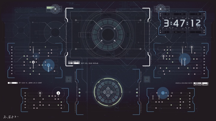
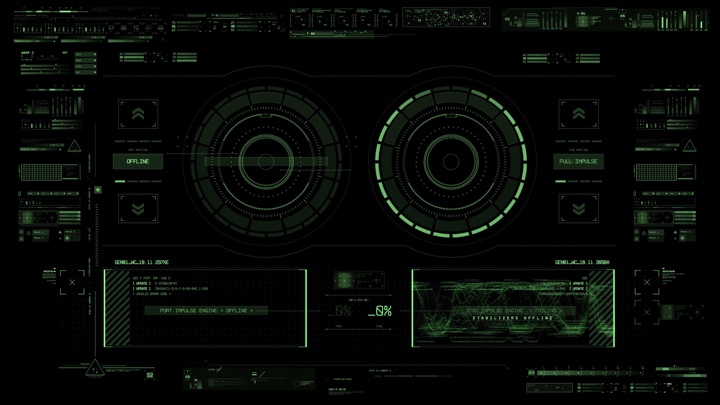
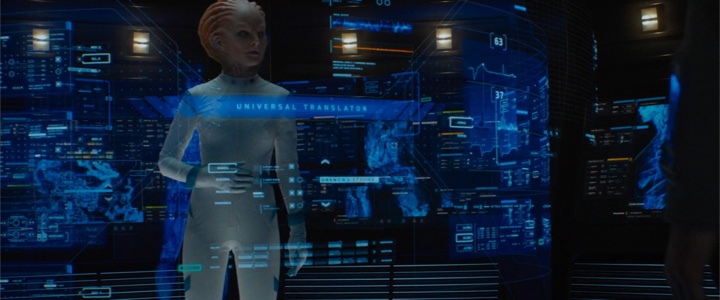
Screen graphics for “Altered Carbon” under the creative direction of G Creative. Courtesy of Jamie McCallen and Skydance Television.
Kirill: Looking back at when you started, do you think it’s easier to get in this field today compared to back then (better software, more affordable hardware, etc)
Jamie: There seem to be fewer financial barriers to entry. You hit most of the points. Software is for the most part less expensive – subscription pricing makes the initial outlay fairly reasonable. Some of the software is available to learn for free. Hardware, in my mind, has always been a trade-off of time and money; you buy what you can afford in exchange for time later on. But at every price point, you get far more power now.
It is also easier to learn the trade. The software has improved in so many ways – capability, usability, documentation.
The biggest change is that there is now a wealth of information online. It’s easier to acquire a skill or learn a technique from a source like GreyscaleGorilla, Cineversity, FxPhd or YouTube. And practically any question or problem you encounter can be solved, if you find the right forum.
Despite all of that, and despite the growing demand for graphics, I am still going to say that it is harder to get into the field now. If the measure is qualified applicants per job available then, most definitely, it is harder to get into the field now.
Kirill: When you are asked what you do for a living, how difficult to convey the complexity of what you do?
Jamie: For the first couple of years, I would try to describe what I did, but I have long since given up going down that rabbit hole. With certain groups, they understood the work in general terms. Genre fans mostly. But for many others, it was an alien concept and resulted in an awkward introduction. Now, in casual situations, I just bypass the specifics and say, “I am a graphic designer in the film industry.” If someone has an interest in the area, then I describe it a little more fully, but most conversations tend to flow into what movies I have worked on, what working on set is like, that sort of thing.
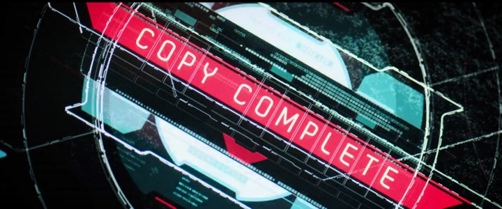
Screen graphics for “Altered Carbon” under the creative direction of G Creative. Courtesy of Jamie McCallen and Skydance Television.
Kirill: How limiting is working within cliches / tropes of “futuristic blue” color palette?
Jamie: Personally, I don’t find it limiting. We see more detail in blue and green. Unfortunately, green comes with certain biases – DOS, sickly, low-tech, organic. Blue is more neutral, so it makes for a fairly safe default color.
But even if the design calls for mostly blue, that is just one variable and all of the remaining creative freedoms are still available.
Mind you, because the “futuristic blue” is so common, whenever there seems like there might be an opening, I usually start my designs with some other color. I will try to make a design work and evaluate whether I think it would be accepted. Most of the time, screens that are purple, yellow, pink or whatever, just seem peculiar and out of place and I convert them to safer color. I keep trying but it takes the right setting or the right character for those palettes to open up.
Kirill: In general, do you start sketching on a piece of paper, or do you go straight to digital tools for your explorations?
Jamie: For UI design, I go straight to digital tools and sketch the odd element.
For screen design and graphic content, I start with sketching. I like to work out sizes and layouts as quickly as possible. The same for when a bank of screens is involved, I will sketch them together to develop an overall layout that works and explore options to find where the messages are best placed. At this stage, I like to just work with them as thumbs filled with raw shapes and squiggles. It is just more unobstructed, and the ideas come freer and faster.
Screen graphics for “Batman v Superman” under the creative direction of G Creative. Courtesy of Jamie McCallen and Warner Bros.
Kirill: Going back to what you said about designing screens that do not stand out, or do not call attention to themselves, would you say that it applies more to films outside of the sci-fi genre, something like “Night at the Museum”, for example? You work on those screens for weeks or even months, and they are almost invisible there in the background.
Jamie: It’s just part of the film industry – you produce the best work you can and everything else is beyond your control.
As for the work being mostly invisible, for a show like “Night at the Museum” [Battle of the Smithsonian] there were very few screens, other than television playback, so there was not really an expectation the work would be particularly visible. Surprisingly, I find that shows with only a couple of screens tend to use them for storytelling and not background. Perhaps, with so few screens, productions avoid bringing in a specialty service or spending some of the budget on display graphics unless they need them to tell the story.
In comparison, more work on large sci-fi productions seems to be destined for background set decoration. Thinking of “Star Trek: Beyond” or “Altered Carbon” there might have been five or ten background screens for every display that was used directly to support the story. At least for playback. In post, those ratios are reversed. Whereas on the non-sci-fi productions, for playback, the ratio is much lower – two or three background screens for every hero screen.
In July, I just finished working on a romantic comedy and of the 20-25 screens they needed, I would expect more than half will be used to directly support the narrative or advance the story. I can think of a few control rooms that I have worked on that had that 20 screens and only had one or two hero screens. That is where a lot of work goes unseen. But you don’t know where the camera will be placed, and it all has to look great.
Kirill: Would you place “Skyscraper” in the same category?
Jamie: Until I watched it, I would have. I came in near the end of the project to populate a couple of control rooms and develop applications for a few of mobile devices. So, from my vantage point, it did not seem like it was going to be a graphics heavy show.
After seeing the finished production, I would put “Skyscraper” in the same category as the “Bourne” or “Mission: Impossible” series – non-sci-fi action movies that use quite a few display graphics. That definitely made sense though since the building was a central character. It needed a style that was recognizable as the building control system – it needed a personality.
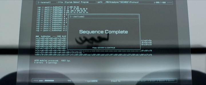
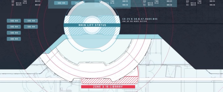
Screen graphics for “Elysium” under the creative direction of G Creative. Courtesy of Jamie McCallen and TriStar Pictures.
Kirill: If I can bring you back to “Chappie” and “Elysium”, it felt to me like screen graphics there had to live in a much more “industrial”, if you will, environment. Those were not the usual clean rooms where every surface looks pristine and almost untouched.
Jamie: The two movies definitely share that in common – neither offered a very utopian view of the future. “Elysium” showed both sides of a class divide – the pristine, glossy spaces as well as the impoverished and industrial sets. “Chappie” was fairly uniform in comparison, but certainly not utopian. It’s harder for me to speak to “Chappie” since I only worked on reshoots in Vancouver and some post-production, so was not involved in the initial designs where the industrial factors would have been more influential.
For “Elysium”, I worked on the playback and post-production. One set that comes to mind that falls in that “industrial” category was “Spider’s Lair”. Looking at an old email, the design brief was literally “opposite of the clean pristine control room of the CCB.” That eventually resolved to the concept of Spider using outdated DOS computers to bypass the more modern systems. The artist renderings also helped to allow us to tailor the designs to the remote set. However, my recollection was that the “industrial” nature of the set had more significant practical implications than design implications – concerns about dust and computer systems and about the display hardware knowing the monitors were going to be spray painted and distressed in other ways.
Screen graphics for “Elysium” under the creative direction of G Creative. Courtesy of Jamie McCallen and TriStar Pictures.
Kirill: Looking back over the last 15 years, does it feel that the projects are growing bigger as far as how many screens they need and how many people collaborate on them?
Jamie: Definitely the projects are increasing in scope and complexity. Thinking back to one of my first shows, to the sets we had worked on for “I, Robot” and “X-Men 3”, a major set might have had something like eight screens and the resolutions were only 1024×768. Now, eight screens would be a relatively small set.
Not only are there more screens per set, but screens are used in a wider range of settings and display graphics are no longer restricted to desktop monitors. Monitor sizes have also grown over the same time and each has two or three times more real estate.
As screens have become more ubiquitous and audiences have become more accustomed to them, I think screens have become a tool that writers and directors are more willing to use to tell critical story points or reinforce the narrative. As a result, there is a call for more hero screens – screens that because of their nature tend to be slightly more complex and elaborate.
For the most part, I think that tools and workflows have improved to handle most of the added demand and complexity, but teams have grown slightly. And as teams have become larger, and we transition between playback and post work, it has allowed for more specialization. Teams are less likely to be a group of generalists and are more likely to be comprised of specialists in motion graphics, 3D, UI design and programming.
Kirill: Do you see a certain visual vocabulary being established, willingly or not, across the productions? Is it more difficult, perhaps, to do something fresh because it might be too distracting for the viewer that is getting used to a certain way of seeing a certain piece of information?
Jamie: I think using the available vocabulary is probably intentional to some degree. Audiences have accumulated a certain understanding from their interactions with computers and from watching other films and television shows. Whenever possible, I try to leverage that knowledge. Something flashing red. A progress bar that is advancing or is stalled. A dialog box that presents a choice.
I tend to conform to this vocabulary because it is effective. The audience knows what is happening without having to work for it. If there is an important message that is attached, the audience can jump right to processing the message.
In the end, the message is always the most important element of the screen. Breaking from the norms can be risky since you risk losing the advantages that the vocabulary offers.
But a screen that successfully breaks norms can be very memorable for that very reason. It can also be very effective in suggesting the technology being used is not typical or ordinary.

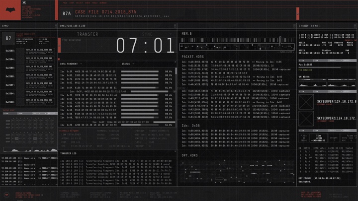
Screen graphics for “The Cloverfield Paradox” under the creative direction of G Creative. Courtesy of Jamie McCallen, Bad Robot and Paramount Pictures.
Kirill: Space exploration is a major cornerstone of sci-fi, and there are so many spaceships that we see in different productions on film and in episodic TV. How was “Cloverfield Paradox” for you?
Jamie: I was invited to work on “The Cloverfield Paradox” in post-production. The team was tasked to design screens to support many of the main story beats, but the screens we were introducing had to feel like they could be in the same family as the existing screens.
Having just worked on “Star Trek: Beyond”, I never felt there was a comparison to “The Cloverfield Paradox”. The two ships had considerably different technologies, capabilities and restrictions. For me, spaceships or bridges aren’t really a defining factor any more than a control room or situation room. It just tends to be a setting that’s used fairly often. If designs start from the bottom and from finding the uniqueness of the production, the set, and the characters – and the logic and style are grounded in that context – those commonalities are more of an afterthought.
Screen graphics for “The Cloverfield Paradox” under the creative direction of G Creative. Courtesy of Jamie McCallen, Bad Robot and Paramount Pictures.
Kirill: How different was it to design for “Altered Carbon” as it happens so far into the future? On one hand it might be an open area to explore, but on the other hand if it’s so different maybe it’s too alien to the viewers.
Jamie: That balance certainly it comes into play. The design cannot be something that is so familiar that it doesn’t seem futuristic. For me, a starting point is choosing not to use certain UI elements that are common in current OSs – windows, taskbars, or menu bars mainly. Making designs more modal and minimal has become part of that shared lexicon we were discussing earlier.
Keeping a design understandable can be achieved using some of that same vocabulary – progress bars, switches, lists, that sort of thing. Those types of UI elements can be highly stylized and yet their purpose still comes through. Regardless whether it is an alien language or completely lacks text, viewers understand them and the function they perform.
Screen graphics for “Altered Carbon” under the creative direction of G Creative. Courtesy of Jamie McCallen and Skydance Television.
Another approach I take with futuristic designs is to start with an analog and extrapolate it beyond what a viewer might be familiar with. There’s a scene near the end of “Altered Carbon” where Vernon and Ava Elliot are downloading a video, manipulating it and then uploading it to another server. I had designed an interface for this task that was simply a set of keyboards with a hard drive and a jog shuttle. Really common elements. However, everything was highly stylized. So, while those were the concepts behind them, when you look at the screen that’s not what you would immediately recognize. To link it to technology that was more advanced, the keyboard split into four different sections with iconography based on quantum computing. As Vernon was typing, he was modifying quantum states and opening/closing gates as opposed to typing words. Basically, I try to use concepts that people are familiar with, but put a different spin on them.
Font and color choices can also help a screen break away from contemporary design as well. Motion can go a long way to differentiate current from future technology. Smooth, intricate and large motions can suggest advanced technology since that is not what we experience every day.
Screen graphics for “Altered Carbon” under the creative direction of G Creative. Courtesy of Jamie McCallen and Skydance Television.
Kirill: Is it boring then to come back to working on screens for non sci-fi productions?
Jamie: Each production offers its own rewards. For instance, I quite enjoyed the romantic comedy I worked on earlier this summer. In some ways it was more challenging to work on a contemporary show that’s replicating a real UI. Viewers are familiar with, for instance, how iOS works. They know how the transitions and interactions are supposed to work and failing to faithfully recreate those will make screens seem uncanny.
Emulating a current OS to exact standards meant getting all of the details right. Programming a mobile application to act properly and yet guide the actor through the steps to tell the story was a welcome challenge. Fictional UI tends to be broader stroke and it was a great exercise to really get into that level of detail.
Kirill: For me, sometimes the “futuristic” part of FUI is in how streamlined and coherent these screens are across the entire set. Almost every time they show real NASA screens, they are nowhere as well-designed as what I see in film.
Jamie: I have had the opportunity to work on a few shows, like “Man of Steel”, that were along those lines and I definitely share your sensibilities. Unless given the mandate, I have tried to reflect the reality of those environments and the understanding that the programs are cobbled together by different groups at different times. The engineers are not developing them using a style guide or to be pretty, just functional.
Screen graphics for “Batman v Superman” under the creative direction of G Creative. Courtesy of Jamie McCallen and Warner Bros.
Kirill: This is what I liked about “Batman v Superman” that had three completely different looks for screens, the dark one for Batcave, the bright one for Lex Luthor and the everyday one for Diana.
Jamie: There were a couple of others like “The Daily Planet” and the situation room which were also a very everyday UI. It was the first time I had a chance to work with Paul Beaudry and he did an amazing job establishing the looks for our designs in the Batcave and for LexCorp.
Screen graphics for “Batman v Superman” under the creative direction of G Creative. Courtesy of Jamie McCallen and Warner Bros.
Kirill: Looking back at your first 15 years, what stays with you from your productions?
Jamie: If you ask me immediately after a show is done, I remember lots of lost weekends and long hours and some of the issues that came with a particular production. But soon after, very few of those thoughts seem important. At that point, specific designs and technical hurdles usually come to mind.
If I look at old work, I think about what I would do differently or how it could be improved. I also see some of the successes, like designs that I am particularly proud of or skills I gained or enhanced. First match-move, first hologram, a challenging composite, that sort of thing
So, basically milestones and favorite designs mixed with a bit of motivation and a few lessons learned.
Kirill: What keeps you going in this particular field?
Jamie: I don’t want to say that you get addicted to the work, but you get accustomed to the pressure and the pace. In some ways, that is part of what keeps me involved. Working in another environment may not be as stimulating and might seem tame in comparison.
There is also a great deal of variety. Each project and each set are different. Each screen is like solving a puzzle and it is the solution that matters. How you get there is fairly open-ended, so it presents many opportunities to experiment, to explore new techniques and stretch technically and artistically.
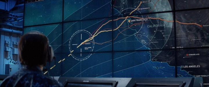
Screen graphics for “Godzilla” under the creative direction of G Creative. Courtesy of Jamie McCallen and Warner Bros.
Within this field, my goal is to continue to advance, tackle bigger challenges and work on projects that offer something new or different. I would love to work on a show with the technical playback complexity of “Alien: Covenant”. But I would also love to embed with a VFX studio to focus exclusively on post work.
There are a few temptations outside of this field though. I have considerable interest in game and mobile UI/UX as well as in AR and VR. Right now, I am also exploring extending Unity and Unreal Engine for use as playback platforms and bridging them with After Effects.
Kirill: Do you get to enjoy watching a movie or a TV show that you’ve worked the first time you watch it, or do you look at your particular pieces and how they were integrated into the final cut?
Jamie: I try to watch all of the shows that I have worked on as soon as they are released. I like to see how the screens were used and assess whether they were successful. But I also like to take in the whole movie or TV show.
Usually, I only get summaries of scenes or a few of script pages, or I might focus on the scenes I have for post and less on others. Even when I generally know the story, there is also a big difference between reading the script and seeing the final production with grading and sound and VFX.
For the most part, I get to enjoy each show like the rest of the audience. Knowing the story has never ruined a show for me – whether it’s a show I have worked on or a book I have read. However, when display graphics are on screen that is where my attention goes. And when I leave the theatre I am often thinking about what I would have done differently on a few shots. Watching movies can be a bit of a drag in that respect.
Screen graphics for “Star Trek: Beyond” under the creative direction of G Creative. Courtesy of Jamie McCallen and Paramount Pictures.
Kirill: Probably that also comes in handy as you grow professionally. I’d imagine that the level of expectations keeps on rising, as the directors and the production people don’t want to repeat whatever was done before.
Jamie: Certainly. That seems to be the trend. I find there is a general process of trying to surpass other shows and to raise the bar. I don’t know if it can continue indefinitely – at some point it may become too much and there will be a reset or counter-movement.
Kirill: Maybe it’s the technical nature of special and visual effects getting continuously better. I’m really looking forward to see how they did Samuel L. Jackson in “Captain Marvel”, because up until now the de-aging techniques have been pretty distracting.
Jamie: Agreed. On the top productions, the quality of visual effects is mind-bogglingly amazing and the quality the integration is equally remarkable. Distinguishing what is real is getter harder every year.
As for de-aging/digital actors, I thought Grand Moff Tarkin was pretty well done. A young Nick Fury is also looking pretty good. It is getting better and some shots seem better than others. At least on Tarkin and the trailer version of Fury, I found shadows helped a lot. Shots that were in full and even lighting seemed a bit off to me. For “Captain Marvel”, I also want to see what they do with Clark Gregg and a young Phil Coulson.
Screen graphics for “Star Trek: Beyond” under the creative direction of G Creative. Courtesy of Jamie McCallen and Paramount Pictures.
Kirill: A couple of years ago they did a re-release of “Terminator 2”, and as I was watching it on the big screen, it was interesting to compare my fond memories of the level of effects when I saw them back in 1991 to how it actually aged in comparison to VFX today. I wonder what my kids will think of the quality of today’s effects in 20-25 years.
Jamie: I think in 20-30 years the medium may be different. There’ll be more realism and I don’t think a viewer will be able to distinguish what was in-camera from what was digital.
But I think the medium will have probably changed in some way – maybe more immersive, possibly more individually tailored or interactive. If someone looks back, current films will probably seem antiquated in some way. I have no doubt today’s films and effects will be something “less” than what is available in 20 years.
Screen graphics for “Star Trek: Beyond” under the creative direction of G Creative. Courtesy of Jamie McCallen and Paramount Pictures.
Kirill: What do you think of the role of technology in our lives?
Jamie: I rely on technology more than I probably should, but I’m not likely to give it up. It can be something as simple as GPS, notes in the cloud or smart home features. They’re convenient. Same for tools that can track performance about things like diet or exercise. In general, I welcome tools that help provide better information or that can simplify a task.
But I’m aware there are potential risks. From personal risks like privacy breaches or identity theft. To broader societal risks like government agencies or corporations having access to or requiring that same data.
The odds on the individual risks seem fairly low. So far, I haven’t suffered any costs from using them. However, I expect the broader societal costs will be more significant down the road. It will not be a zero-sum situation. Technology and big data may not be our friend when it comes to things like targeted pricing, advertising or insurance.
At least those tend to be my feelings towards individualized technology. Social media is a different matter.
Kirill: Recently I find myself spending so much time on Instagram. It’s hard to detach because I don’t know if something really good will pop up right after the next swipe. It’s so distracting and I lose so much time to it.
Jamie: Same. I find most social network platforms are mostly a time sink. But so is television and YouTube and most time on the internet.
The good thing about social media though is, that unlike television, it comes with a few benefits. It can be a good nudge to be more active and get out with friends. Unfortunately, we are also aware of the down sides – bullying, privacy, etc.

Screen graphics for “Elysium” under the creative direction of G Creative. Courtesy of Jamie McCallen and TriStar Pictures.
Kirill: I really want to know how identity and authentication looks like in 10-15 years. Do I need to crack somebody’s password, or do I just look up the answers to security questions like their birthday, maiden name of their mom or the name of their first dog from all the posts that their parents are making right now? How will identity be protected and validated in the world where your entire life is public?
Jamie: I think it will require some changes. I would not be surprised if it became more of a key system, relying less on those memorable things and more on a verifiable token. As you said, it won’t be long before identifying factors like mother’s maiden name or first pet’s name are all available online.
Most things can be replaced if they are compromised – credit cards, passports. I think the worst one is Social Security Numbers (or Social Insurance Numbers here in Canada). All of your interactions with government agencies rely on a single ID. Once that’s compromised, there does not seem to be a good way to fix it. Hopefully that will be improved. Perhaps blockchain or some other key system.
In any event, I think we likely need new ways to prove identity and authentication. But that leads to other questions. How long will that solution hold up? With quantum computing, current technology for encryption/decryption will likely become unreliable. Blockchain as well. So, I think there is a bigger challenge coming in the next 10-20 years and online identification is only one aspect that will be tested.
Kirill: So what I’m hearing from you, on the spectrum between optimism and pessimism you fall on the realism of it.
Jamie: That is probably fair to say. For the most part, I see technological change as positive. But there are often uses that are unexpected and negative. 3D printers in medicine and manufacturing are fantastic, but on the other side it opens the door to printed guns.
Over the next 50 years, there will be more than a few emerging technologies that suffer the same problem. For me, the two big ones are AI and biological printers. Being able to print DNA therapies, pharmaceuticals or food sounds pretty amazing. But there are going to be some very significant downsides to it that we need to prepare for.
Kirill: You’re talking about biological printers, and now I’m thinking that I’d be able to print my favorite chocolate without going to the grocery store.
Jamie: That would be great. There are a lot of benefits to being able to print food or medications, and if it supported by unlimited clean energy, it starts to look like a pretty rosy future.
Kirill: Now you’re talking a bit more like some of those futurists.
Jamie: Still more of a realist. If anything, I lean bit towards pessimist. A couple of those technologies come with some considerable risks even if the odds are extremely low.
Screen graphics for “Altered Carbon” under the creative direction of G Creative. Courtesy of Jamie McCallen and Skydance Television.
Kirill: Looking back at history of human societies, it can be said that laws and regulations were always one step behind the technological advances, always playing catch-up. Perhaps today it is more noticeable because the pace of those advances in accelerating.
Jamie: There are probably a few issues at play. I think there is an inertial factor with legislation. When the technology is first coming out there are lobbyists and big money behind the technology, while the implications of the technology aren’t fully understood by society. A small segment of the population will see the dangers – futurists that can see where that technology might lead. But society as a whole will probably be less engaged or the risks viewed as too remote – at least not sufficient to motivate people to act. That’s where the inertial factor comes into play. It seems to be harder to get laws changed than to establish them.
Beyond that, as we’ve seen on a number of occasions, some politicians are probably not the most technically savvy or progressive individuals. It can also take years before governments shift and are willing to reconsider legislation – two to six years is a long time given the rate technology is changing.
Sadly, playing catch-up is just a part of it. Considering how climate change or net-neutrality have been handled, it does not appear all governments will be up to the task for effectively regulating things like artificial intelligence or nanoparticles or bioengineering.
Kirill: Hopefully the machine uprising or some other doomsday scenario is not going to happen any time soon.
Jamie: Agreed. Hopefully, we can figure it out in the meantime.
Screen graphics for “The Cloverfield Paradox” under the creative direction of G Creative. Courtesy of Jamie McCallen, Bad Robot and Paramount Pictures.
And here I’d like to thank Jamie McCallen for taking the time out of his busy schedule to talk with me about the art and craft of screen graphics, and for sharing the supporting materials for the interview. Connect with Jamie on LinkedIn, and find more of his work on his Behance, Pinterest and Adobe Portfolio profiles. And if you’re interested to read additional interviews about the wonderful world of screen graphics and user interfaces for film and TV, click here for more.
