Illustrators at work – interview with Morgan Schweitzer
Continuing the ongoing series of interviews with illustrators, it is my pleasure to welcome the talented and prolific Morgan Schweitzer. He splits his time between editorial illustrations and motion work that includes character design, concept design, asset creation and storyboard art. His clients include Penguin, Businessweek, Maxim, Psyop, Buck, Stardust and many others. In this interview Morgan talks about his roots, his creative process and designing for various media.
 Kirill: Tell us about yourself and how you started in the field.
Morgan: I studied Visual Communications at Washington University in St Louis. When I first graduated I blindly emailed over 100 commercial animation studios all over the world to see if they had openings. It was only one studio, Nathan Love in New York, that started offering me some freelance work here and there. I did some odd-jobs as a freelancer starting out. I was hired by a talented graphic designer/developer and family friend, Gretchen May. She was working for Massachusetts General Hospital at the time, and hired me to build an illustration library for them. Selling the copyrights to all the images allowed me the financial freedom to move to New York City. Once in NYC I started working for Nathan Love more regularly. In fact, the day they called me in to start was the same day I was supposed to start work as a waiter.
I dropped off my portfolio, sent out mailers and started getting some editorial illustration jobs. For about a year I illustrated a weekly column for the Village Voice. Meanwhile, as other freelance coworkers migrated to other studios, my name got spread around and I started working for more animation studios.

Wraparound cover for PK Pinkerton and the Deadly Desperados book published by Penguin.
Kirill: What informs and shapes your taste and style?
Morgan: I have a real compulsion to discover new artists, designers, and illustrators online. It’s inspiring and eye-opening to see how different artists work, and how they work differently from me.
Kirill: Is there a danger of absorbing too much from what influences you and not finding your own unique voice?
Morgan: There is certainly that danger. My influences are so vast, that I’m never influenced by one artist in particular. I strive to become an amalgam of everything that I love in all that influences me.
However, I struggled for a while…or rather, I thought I was struggling for a while with finding a focus and a voice. As a concept artist I work to invent new styles and aesthetics for each project. Some, styles that I would never pursue within my own artistic exploration. So, for a while I felt like concept art muddled my focus and my own voice. I got confused and thought I needed to stick to a “style” or come up with a “style” that was unique to me.
Then, I stepped back and realized that when given an illustration assignment I would go back to my own default and illustrate the topic in the way that was most comfortable for me. And, while I never equated that with a “style,” what I realized was that the most genuine artistic voices are not determined from a lineup of styles, but rather, just a way of working which is most comfortable and engaging for the artist. That said, I still don’t feel like I have a “style,” and I don’t anticipate ever feeling that way.

Illustration for an article in American Cowboy Magazine about the old Clint Eastwood classic, Fist Full of Dollars
Kirill: There’s a lot of momentum and energy in your illustrations. How do you approach conveying motion in a static image, particularly for human subjects?
Morgan: I’m glad that comes across. My sketches are generally very loose and gestural at first. I try to incorporate some of those gestural qualities to help guide the finished illustration and to exaggerate aspects of the figure that help convey movement.
Kirill: What is the process of designing a book cover? Is it about capturing the story in a single image, or a somewhat looser interpretation that gives you more freedom?
Morgan: For book covers I’ve worked on, I would say it’s not about capturing an actual scene or events from the book, but rather a more general expression of the most iconic elements from the story into an image (without giving anything away). It’s also important for the image to be iconic and readable from afar.
Kirill: Speaking more broadly about cover design, what are your thoughts on increasing prevalence of digital stores – for both music and books? As you’re blocking out the cover elements, do you factor in that people will see the cover – possibly significantly scaled down – on a variety of screen sizes?
Morgan: I think a good cover will hold up. These factors make it even more important for the image to be readable at a small scale. I do tend to examine my illustrations at thumbnail size whether it’s for a cover or not. I find it helps me to see the image more broadly to make sure everything is working together.

Left – illustration for New York Times Magazine, right – illustration for Westchester Magazine.
Kirill: What’s the technical process? Pen-and-paper first, and then transition to digital tools?
Morgan: While I love working with traditional media, my process has become increasingly digital. It’s a time-saver with tight deadlines, and for working in animation with continuous revisions it’s a must. To avoid the sterile, lifeless qualities that digital art can often produce I have amassed a library of paint, ink, and charcoal textures that I use to give my images a bit more of a tactile quality.
Kirill: Once the specific illustration is out of your hands and becomes a part of the final product, do you ever wish to go back and tweak it? Has it ever happened that you had what seemed to be an even better idea after the process has been completed?
Morgan: I have a bad habit of staring at my illustrations for a couple days after I’ve already sent them in to the client. Even when they’re approved I’ll sometimes send in my own revisions after the fact if something starts bugging me later. That said, once I’m finished staring at an illustration, I tend to close the book on it mentally. Overtime, I develop a constructive hatred of all my earlier work. I think that’s an important sign of growth. I’ll never be content with a piece that I’ve improved beyond, so if I weren’t hating everything I’ve ever done, I’d be worried.

Self-initiated work for imagined comic book covers.
Kirill: How do you preserve color fidelity when the final product is targeting print media, such as album or book covers?
Morgan: I’m not as much of a stickler about color as maybe I ought to be. Every monitor is different. Every printer is different. So, it’s kind of an impossible pursuit. I think if the overall color palette is strong as a unit, then it will hold up if all the colors are uniformly shifted.
Kirill: What’s the weirdest client feedback that you’ve received so far, if you don’t mind sharing? Is there any difference between working for smaller publications as opposed to larger corporate clients?
Morgan: To be honest, nothing too weird comes immediately to mind. There are certainly client decisions that I consider to be strange within the context of certain projects, but I can’t think of anything too crazy. Things like the typographic design working against the illustration, or character designs that move away from what the characters are trying to convey.

Type Design for “Crime of Passion” album cover for “Hollywood Kill”.
Kirill: One of the sections on your site is about your lettering projects. Do you see yourself branching out in the future to do type design?
Morgan: I have a background in typography and design, so lettering is something I enjoy. Type is most exciting to me when it’s combined into an illustration. So, I try to incorporate illustrated lettering here and there in my illustrations when possible. However, I don’t have a dedication to type alone the way most type designers do. So, I don’t see that becoming a more prominent aspect of my career.
Kirill: How important is it to invest time in personal projects?
Morgan: I would say it’s very important. It helps to stretch your creativity farther than assignments may allow. Exploring your own creativity in that way is perhaps the most important tool in developing an identifiable voice. All that said, I rarely work on personal projects…something I would very much like to change in the near future.
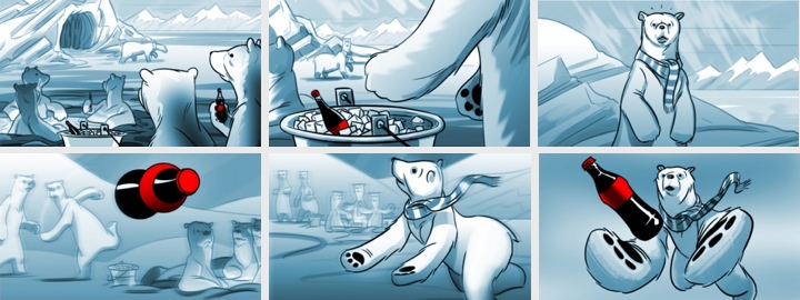
Storyboards for “The Catch” Coca-Cola pitch.
Kirill: What do you do when you run out of ideas and get stuck?
Morgan: I suppose my idea process is a little different for each field. If I ever get stuck coming up with a concept for an editorial illustration, it’s generally as simple as starting to sketch some thumbnails. Seeing different ideas on paper gives way to expanding on those ideas, changing and combining them in different ways. If I ever have trouble starting to sketch thumbnails, I find it helps to start writing down a list of words that correspond to topics in the article.
For character design, when I feel I’ve exhausted all the forms for a particular character exploration, I start to sketch almost without intention. Almost random scribbles. Then I’ll start to turn the scribbles into different forms and generally more exaggerated interesting characters will start to take shape.
Kirill: What’s the best thing about being an illustrator?
Morgan: Hard not to say something totally cliché here. I’d like to say something like…because I love the pursuit of illustration, I rarely feel like I’m working; exploring one’s own creativity is a valuable window oneself; it’s a fulfilling and exciting pursuit to work toward the impossible goal of artistic perfection; but really it’s the danger…and the power, fame, money, cars and women.

Illustration for melba.co.
And here I’d like to thank Morgan Schweitzer for his wonderful work, and for taking the time to answer a few questions I had about his art and craft. You can find his work online at his main portfolio site and his personal Tumblr stream. He’s also active on Facebook and Twitter.
