Jack Hughes is a prolific illustrator with active presence on Dribbble, Tumblr and Twitter. Kicking off a new series of interviews on this blog, I’m delighted to have an opportunity to ask Jack a few questions about the art and craft of illustration in the digital era.
 Kirill: Tell us a little bit about yourself and how you got started in the field.
Jack: I grew up on the periphery of Croydon; South London’s ‘rear end’ as I like to think of it. It’s not actually that terrible, there are far worse places in London, Croydon just has a stigma it can’t seem to rid itself of and the London riots definitely helped remind everyone of that. Art was really the only thing I was ever good at as a child, so naturally stuck with it; in hindsight, not a bad decision. After school I enrolled in a Foundation Degree at Wimbledon College of Art. I’ve said it before, and I’ll say it again, but that year was the most humbling, interesting, encouraging and hilarious years of my life. Sadly my time at Wimbledon came to an all-too-sudden end, but there were good things on the horizon; I was fortunate enough to have been accepted onto the Illustration course at Kingston University (just a stone’s throw away from Wimbledon), which was, in hindsight, a rocky yet invaluable three years. During our London degree show I was lucky enough to be scouted by illustration agency YCN. Unexpectedly, I’ve been freelance since then.
Kirill: What influenced you to develop your style?
Jack: I was never that concerned with developing a style whilst at university; my tutors always said that in time style will just come to you. I still don’t believe that I have a definitive style, but I definitely feel like I’m on my way to one. My influences have shifted over the last few years but there are two that have remained and always will; science and mid-century design. Occasionally the two meet (not as often as I’d like!) and the results are very strange indeed.
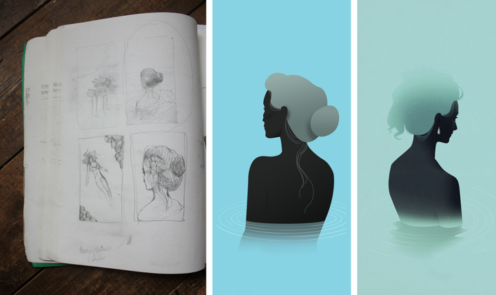
Kirill: Do you keep a sketchbook to develop ideas in between projects?
Jack: I have one big sketchbook permanently sat on my desk; everything goes into this one sketchbook: ideas for commissions, roughs, layouts, lists and personal projects. It’s a complete mess (doggy eared, water damaged, torn out pages etc.) and the majority of it looks like a madman’s inane ramblings that only I can decipher (most of the time anyway!).
Process shot: Iceland – SHOP Magazine
Kirill: How do you approach starting a new project?
Jack: Each project usually starts with a sense of determination and wild imaginings, followed closely by panic and the fear that I’m not good enough to give the commission its full potential. When all mental blocks and avenues are explored (and beaten!), I’ll start getting rough ideas and thumbnails down onto a page as quickly as my pencil will allow. It’s at this point where I hope I’ve struck upon something worth running with. If not, start all over again and hope I don’t go insane.
Kirill: How do you develop concepts for your illustrations?
Jack: It depends on the commission and what the client is after. Sometimes the client has an idea they want you to run with and other times the client will let you do what you like. I generally produce better work with the latter, although sometimes if the former is a really good art director, the end result can be far greater and unlike anything I would have achieved alone. Like most illustrators, I’ll try and reduce the article or commission down to its barest elements and work in ways to combine those elements in a clear visual concept.
Kirill: What drives you in your choice of colours and textures?
Jack: I mentioned earlier I liked mid-century design and this definitely feeds into my working process and outcome. Colours are particularly important to me, almost more so than content and concept; I believe colour is the very foundation of my work.
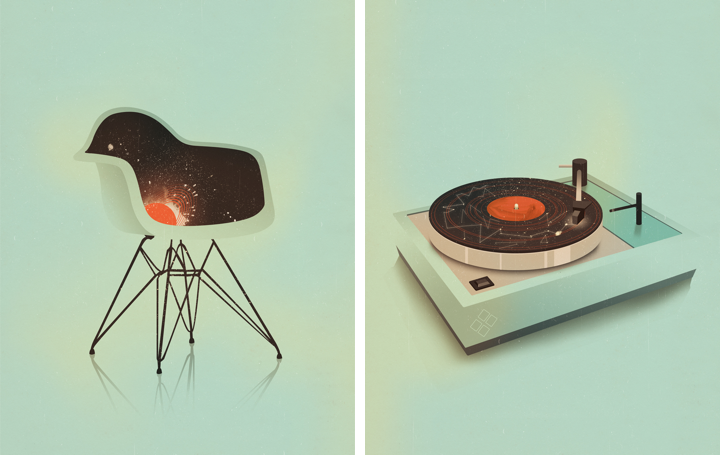
(left) Plastic Chair – Pick Me Up (right) Turntable – Pick Me Up
Kirill: Can you talk about the technical side of your projects? Pen and paper, or digital? What tools do you use and how has that evolved recently?
Jack: My more conceptual illustrations will start out as pencil roughs in my sketchbook, my more figurative fashion illustrations are formed by piecing together parts of photographs, digitally; think Bride of Frankenstein. After that everything is done on the computer, I’m more logical in my technique than I am creative, so working in Photoshop works well for me.
Kirill: How do you preserve colour fidelity when the final product is printed in physical form outside of your control (printing machines vs. the specific monitor setup at your studio)?
Jack: I have two (expensive) TFT monitors which have improved the accuracy of my colour on screen to colour in printed material. Apart from the obvious of working in CMYK, there’s not much else I can do and the rest is in the client’s and printer’s hands.
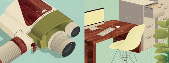
(left) Super 8 – The Gentleman’s Guide to Cocktails (right) Service Charges – FM Magazine
Kirill: What do you love most about being an illustrator?
Jack: Being the boss of my own working hours (which can sometimes be a hindrance) and producing work that not only gives me joy and satisfaction but for others as well. I love to share my work online and scope out how each illustration matches up to the next. Although one thing I do miss is being somewhere, having a studio space and working in a welcoming creative environment. At the moment I work from home because it’s cheaper, but perhaps in the future I’ll have a nice little studio (even if it’s another room besides my bedroom!) to go to, who knows.
Kirill: What do you do when you run out of ideas and get stuck?
Jack: I get annoyed, blame myself and step back to (at least try to) impartially view the situation and what exactly is going wrong. Whenever I find myself in such a mess I’ll just stop working altogether and keep busy doing something fun and distracting for a few hours. I’m an incredibly level headed person, but in the past I used to work myself into small fits of concentrated rage, that doesn’t really happen so much now.
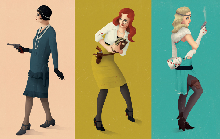
Arkham Investigators – Personal Work
Kirill: How important is it to invest time in your personal projects?
Jack: Incredibly important, although I haven’t had much time recently to work on anything personal, which is a shame; I’m always thinking of new ideas and projects that will sadly never see the light of day, maybe. It’s through personal work where as an illustrator you can really find your voice and develop a style you are happy and comfortable in doing. It’s also a great way to steer your style towards a different set of clientele, especially if you feel like you’re being worked into a rut you’re not happy with.
Kirill: How do you spend time away from work?
Jack: I don’t go a day without thinking about work or doing some, even if it’s a tiny amount, I like to keep on top of things. Although having said that, I do find myself in the same situation of submitting work in the early hours of the day it’s due far too many times. But when I’m not working, I’m either keeping fit, drinking tea, reading, playing video games or getting merry, nothing that exciting really!
Kirill: What keeps you going?
Jack: Determination to do well and to prove any disbelievers or naysayers from my past wrong. Can’t say I had the greatest upbringing, the support was there, but sadly not much else was. Growing up in a less than ideal household, surrounded with people who haven’t really amounted to much and then being the underdog at university has probably driven me to where I am now. I have an incredible fear of failure and of looking back on my life and realising it’s wasted.
Techman – GfK NOP
Kirill: Do you think that advances in software tools and global connectivity are making it simpler to start in your field, and at the same time creating more competition and diversity for the clients to choose from? Does it make harder to stand out?
Jack: Definitely. Unless you get bolstered early on in your career by some huge magazine, blog, agency or individual than it will take you that little bit longer to get yourself noticed. I was thankful enough to be taken on by my agency YCN before I’d even graduated, without their trust and support I wouldn’t be full-time freelance today.
Kirill: There’s a recent surge of interest in mid-century inspired illustration, photography, fashion and design. Do you see this as a younger “digital” generation trying to recreate the old “analogue” look and capture that spirit?
Jack: I never felt like I actively tried to make my work mid-century inspired, at first the colour palette developed and then the rest followed suit, in the shape of a 1950’s themed cocktail book commission. Although having said that I’ve always had a fondness for it, for as long as I can remember actually, my parents had a lot of encyclopaedias from the 60’s I used to draw from (and sometimes in) as a child. It was after the cocktail book commission where I saw my work being steered into a direction I was totally unaware of. It does feel like the internet is trying to redress itself in a kind of faux analogue, which can’t be a bad thing, so long as it rids the shackles of the early 2000’s horrific digital stamp. I also think people’s tastes are changing (for the better), with the digital age brought digital art and photography, which was new and shiny and heavily influenced the next decade or so. Now we can stand back and realise that although we’re moving progressively into a more digital age, design doesn’t necessarily have to reflect that, hence people’s eagerness to embrace vintage inspired design. We’re so saturated with contemporary design, harking back to where most influences lie can only do us good.

The Gentleman’s Guide to Cocktails – Hardie Grant Books
And here I’d like to thank Jack Hughes for finding time in his schedule to talk with me about his work. It’s been a real pleasure, and thanks for kicking off the new series!
I love movies. By a rough estimate I’ve already watched thousands of them, and I hope to watch thousands more in my time. Some are forgettable, some stay with me for a long time, and some have prompted me to delve deeper and start a series of interviews on how movies are made. Despite all the technological advances in home entertainment I still find myself going to the theaters every week, sometimes more than once a week. Twenty five years ago I would have to buy a weekly newspaper that had a special section detailing all the movie theaters and shows in my area, or call an automatic service provided by the closest theater to check what is playing, and when it is playing. Times have changed, and nowadays there are plenty of online resources to check the show times, browse the upcoming movies, watch the trailers and in general be much more informed.
The informed part comes at the price of a wide variety of features available from these online resources, both web sites and native mobile applications. A first-time visitor would have to spend a few moments getting acquainted with the overall structure before locating the path to the information that he is after. After a few visits you know where this information is located, and you can either bookmark it (if the surrounding platform supports this) or remember the sequence of scrolls and clicks that get you to that destination. What is my most frequently visited destination? I go to the theater after putting the kids to bed. So I am looking to see what is the first show of the specific movie in that specific time frame (say, between 8:30 and midnight). And if the movie is not playing in the theater next door, where is it playing, and how the driving distance is going to affect the beginning of my target time frame?
Of course, this information is available in the list of all today’s shows in my area – except that I need to mentally filter out all the noise of the movies I don’t intend to see, and all the shows that fall outside my time frame. Or I can explicitly search for the specific movie and deal with less noise – at the expense of an extra step of the search itself. And every once in a while I start daydreaming about writing a small application that would do just what I want. After all, I write software for living.
And so I start imagining a very focused flow where I select a movie, then the location service kicks in and tells the app my location, and then I tell the app what is my preferred time frame, and the app takes all that and shows me the specific show that is the right match for me. Or maybe a couple if it’s a blockbuster that’s just out. And then I start thinking.
What if I’m at work? I don’t necessarily want the app to use my current location. That’s not my scenario after all. So I’ll need some way to persist the home location so the app can search there. But wait. I work remotely, and visit the main office campus every once in a while. Wouldn’t it be nice to change the default search location for such trips? And while I’m at it, my time frame restrictions are different, as the family stays home and I can go to an earlier show. So I’d expect the app to allow me to change these filtering parameters. But then, when I get back home, I don’t want to spend time configuring the location and time frame. So, hey, let’s support profiles.
I went to see “Moonrise Kingdom” a couple of weeks ago. It’s a wonderful movie, and I already went to see it another time. There was a problem though. It’s not a blockbuster, and the distributor (Focus Features) has opted for a longer but slower rollout in the theaters. During the first few weeks the closest show was about an hour drive away, and I didn’t want to see the movie that much. And so I waited until it got relatively close and then I went to see it. How would I incorporate this into my application?
This becomes sort of a wish list – the movie is out, it’s just not close enough. I could define the maximum distance I want to drive to see the specific movie. I’d then mark the movie and let the application notify me when it’s showing within that distance. But distance is not time. 20 miles can be 20 minutes away on a highway, but 40 minutes away if I have to drive at night through suburban streets. So not only I now have a feature that tracks my wish list and cross references it with nearby theaters, I’ll have to integrate it with some sort of traffic service. But why stop there? There are some movies that I really want to see. I’ll gladly drive twice the time to see that hypothetical movie in the theater. So while I’m thinking about this wish list feature, why not throw in wish list profiles? If I really want to see a movie, let me add it to the wish list and specify how much I want to see that movie. There will be some sort of mapping (or manual input) on how much I’m willing to drive to see the movie. But wait a second, that’s not enough. Suppose that movie is out, and it is within the matching driving distance. But I’m busy this week. So I’d definitely want to add a way to “snooze” the specific entry for a week – or maybe only for a few days. So the app becomes a sort of a moviegoing planner.
Speaking about planning. Now that I have this nice planning feature, why restrict it only to the movies that are out in the theaters? Why not show the list of upcoming movies and let me add them to the wish list? Let’s extend that thought and have some sort of recommendation engine. The application will track which movies I’m searching for and which movies I’m adding to my wish list, and will suggest similar movies. Those movies might be playing right now, or they are coming up in the next few months. The recommendation engine is, of course, not an easy thing to tackle. But if I do it right, the application becomes much more than a planner, it becomes an assistant. Recommendation engines are, of course, tricky. Just ask Netflix. That’s nice to have, but way too much work. As a last thought in this direction, one of the most important inputs would be what you thought about the movie after you’ve watched it. So it’s not enough to maintain a wish list, you’d also need to provide a way to collect and store movie ratings. But let the bygones be bygones. No recommendations.
Back to “Moonrise Kingdom”. I really liked the movie. It’s still out in the theaters. I’ve seen it twice, and I want to see it another time. So there’s going to be some kind of functionality to star a movie. It’s no longer on the wish list, but I still want to see it. Or may be the wish list becomes some sort of a hybrid that combines tracking what I want to see, now and in the future. Is it one list with sections, is it multiple lists, is it some sort of “here’s what you can see today”? Let’s take this “I really liked this movie, so now what” and explore it a little bit further.
The movie is out in the theaters. I can go and see it as many times as I want as long as it’s playing. I cannot buy a BluRay yet. But I can buy a soundtrack. I can go online to a variety of retailers and purchase the digital copy there. Then I can listen to the soundtrack as I’m waiting for the BluRay to come out. But that’s two separate sites / apps that I need to go to. Wouldn’t it be nice to have some sort of integration with the purchase and listening experience right inside my app? Integrating with one store might be possible if it provides some sort of web service APIs to purchase and consume the content. Of course, if you want to keep it really seamless, you’d need some kind of a way for the user to provide the signin credentials and transmit them securely to the third-party store, and that opens up a whole new can of worms. Or maybe that third party store is another application on the same device and it provides a way to integrate these flows in you application. So suddenly you’re thinking about what would be needed on both sides to make this seamless. And that’s only for one digital store. Wouldn’t it be nice to be generic and not rely on any specific APIs that a particular store exposes? So now you’re thinking about some sort of a generic integration between your app and any third-party store, along with a nice plugin mechanism to discover such stores at runtime and allow the user to choose where to buy the soundtrack based on, perhaps, the cheapest alternative, or the encoding quality, or the absence of DRM protection. So that’s a lot of work.
What about the BluRay disc? It usually takes about half a year after the movie has left the theaters. Let’s forget the purchase integration with digital stores. How about tracking the BluRay availability and letting me know that it’s out? So that’s another preference bit to expose in the wish list, and some kind of a new way to expose the full list of tracked movies – sorted, most probably, by the availability date. There’s still some integration with web services that provide this information, but if you’re willing to go for notifications only, it sounds a whole lot less work to do.
And so as I lay in bed thinking about all the nice features to have, I realize that it’s 2AM and it’s time to go to sleep.
“The Elements of Style” is a fantastic writing style guide by William Strunk and E. B. White. One of the recommendations has struck a particular chord with me from the very first time I read that book:
Vigorous writing is concise. A sentence should contain no unnecessary words, a paragraph no unnecessary sentences, for the same reason that a drawing should have no unnecessary lines and a machine no unnecessary parts. This requires not that the writer make all his sentences short, or that he avoid all detail and treat his subjects only in outline, but that every word tell.
This principle applies to any kind of user-facing software, no matter what is the projected or intended demographic and professional profile of the bespoken user. A minimalist feature set is not a goal in itself. A feature is included not because the competition has it, or because marketing says that it’s a great selling point; it is included because it works towards achieving the main product goal. Marc Hedlund provided an honest analysis in his “Why Wesabe lost to Mint” article:
Everything I’ve mentioned — not being dependent on a single source provider, preserving users’ privacy, helping users actually make positive change in their financial lives — all of those things are great, rational reasons to pursue what we pursued. But none of them matter if the product is harder to use, since most people simply won’t care enough or get enough benefit from long-term features if a shorter-term alternative is available.
Every “what if” and every “wouldn’t it be nice” is a double-edged sword. Don’t compete on features, but instead make your every feature work. Create software that is concise. Create software that is vigorous.
In his “Touch means a renaissance for radial menus” Josh Clark argues that the time has come for a widespread adoption of radial menus in touch-based interfaces:
The radial menu is seeing a renaissance in touch interfaces, and that’s a good thing. Microsoft yesterday previewed the Office 15 productivity suite , including OneNote, its first Metro-style app for Office. (Metro is the touch-based design language introduced in Windows Phone and now set to storm Windows 8 this fall.) OneNote features a radial menu as a kind of right-click contextual menu. Tap the ever-present menu circle, and out pops a wheel of icons to work on your current selection. Here’s a clip from yesterday’s demo that illustrates the action.
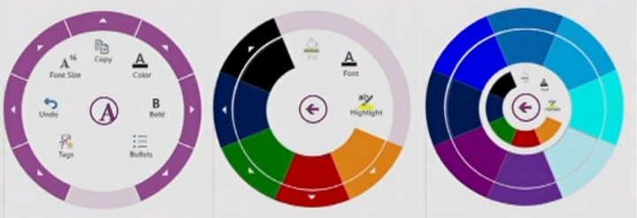
I can think of a few reasons why radial menus have not seen mainstream adoption beyond games. But the main one for me is how it looks to the first time user.
A few days ago I’ve decided to give gReader a try on my Nexus 7. Now while I’m its first time user, it’s certainly not the first time I opened an RSS reader on a smaller screen. I know what features to expect, at least on the basic level. But gReader’s entire interface is icons. A lot of them. Some of them are for basic features, some are for more advanced. And all are exposed via monochrome icons.
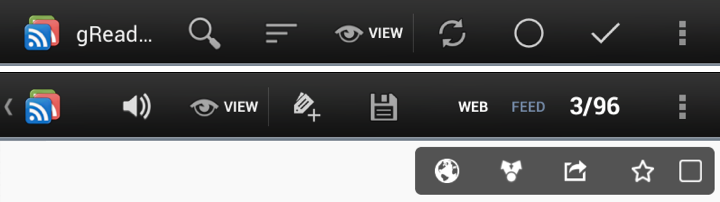
And that’s a problem. I want to become quickly proficient with it, but I don’t want to spend time guessing what each icon does. And not only do I not know what will happen when I press some cryptic icon, I also don’t know what this operation will affect (single entry, all feed entries, all entries under this tag). Most importantly, there’s no way to undo the last operation, or at least none that I could see immediately. After a particularly “unfortunate” tap I ended up marking about 50 entries as ‘read’ and had to spend some time figuring out how to find that exact chunk.
Now back to radial menus. As Josh points out there’s a lot of research that indicates that people are much more efficient once they know the layout of each such menu. In a traditional drop down menu you have a relatively small margin of error when you want to select a specific element; the direction is always the same, and the selection is controlled by how much you move the mouse and how is that translated to onscreen pixels. In a radial menu, however, the distance is the same, but the direction matters. So if you know that ‘bold’ is always to the right, while ‘italic’ is to the top-right, your muscle memory will kick in to remember that:
Even better: you get faster with radial menus over time, because they take advantage of muscle memory in a way that list-based menus cannot. Radial menus are essentially gesture-based: touch-swipe-release. That’s why some call radial menus “marker menus”: it’s like making a mark on the screen. Swiping to 2 o’clock has one meaning, and swiping to 6 o’clock another. Like all physical actions—playing an instrument, typing a keyboard, serving a tennis ball—gestures get embedded in muscle memory, which is faster to access than visual memory. Tap-swipe is faster than scanning for an item in a linear list, just like touch-typing is faster than hunt-and-peck.
But the problem is how well you can present these options to the beginner. A circle of eight icons is nice if each one is immediately and clearly understandable. And some operations are just too complex for a simple pictographic representation. So then you can display text descriptions for each one, but it’s a mess. How do you display them in a way that is quickly scannable, uncluttered and does not take over the entire screen? And doesn’t that take away the very goal of training your muscle memory? And adaptive UIs didn’t work out that well (where the system adapts to your perceived level of expertise and usage patterns).
I think this is what has been standing in the way of translating the relative popularity of radial menus in games (and the shown increase in efficiency for long time usage). Gamers are willing to invest a lot of time if that improves the way they progress in a game. But throwing such an interface at a user of a ‘boring’ software package is going to be quite alienating. It’s going to be interesting to see the user reaction to the proposed radial menu in OneNote.
My most-used browser extension is, undoubtedly, Clearly by Evernote (available for both Chrome and Firefox). It takes something that looks like this:
and turns it into this:
Gone is all the crap that the site wants you to see, and left is the actual content that you have arrived to read. Clearly has a few presents for font choices, sizes and color schemes, and it also allows one to create a completely custom scheme. After staying with the default Clearly theme for a few months I have become quite aware of how comfortable my web reading has become. With a single click of a button I am left with only the article itself. But it went well beyond it, and it took me some time to understand the reason.
As I started the gradual redesign of my own blog a few months ago, I kept coming back to one single question. Imagining myself as the reader of my blog, what would it take me to not click the Clearly button? And so, little by little, I started to take away the visual cruft. Gone is the harsh glare of pure white background and high contrast of pure black text. Instead, I use a quasi-random light-gray texture tile that provides relief while still emphasizing the horizontal direction of the text. Gone is most of the heavy “About me” blurb in the right side bar, and around half of the other sidebar content. Instead, a smaller blurb ends with the “more” link, and the entire sidebar content uses a smaller font size and lighter shade of black. Finally, gone is the entire comment section, as its visual weight has stopped carrying enough value to justify its continued presence. But there was still one more piece left.
Much can be (and has been) said about the choice between serif and sans fonts. There are studies that compare reading speed and legibility, and there are polarized opinions behind every choice. Some sites even go as far as providing a switcher between different fonts, absolving themselves of the hard option of making an actual decision. I wanted to make a decision, and that decision was guided by the same question – why do I enjoy using Clearly so much, and what would it take me to not click that button on my own blog? Which has finally brought me to realize what made my reading so enjoying and comfortable – the default choice of a large variant of PT Serif font.
From there I’ve spent some time going over some of my favorite sites and blogs, looking at their typography and gathering more data to make the choice for my own blog. There was one thing that I was quite clear about – I wanted to have an enjoyable lean-back reading experience, and that ruled out small font sizes from the very beginning. And the more I looked at sans fonts at larger sizes (18 points and above), the more I saw that I was going to use a serif font. Which left two questions – which font and which font size.
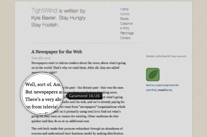
Here are few of the sites that I looked at in my quest (linking to individual entries and detailing the font size / line height). First, Kyle Baxter‘s tightwind.net that uses Adobe Garamond:
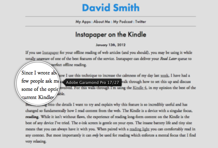
Next, David Smith‘s david-smith.org that uses Adobe Garamond Pro:
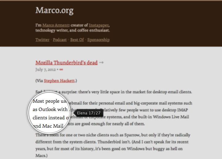
Next up Marco Arment‘s marco.org that uses Elena:
Next, Matt Gemmell‘s mattgemmell.com that uses the aforementioned PT Serif:

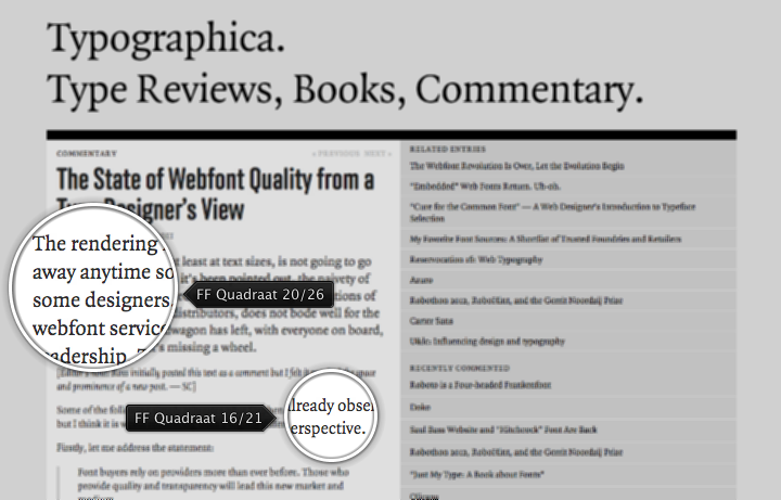
Next one is typographica.org that uses FF Quadraat in two sizes – a bigger one for the opening paragraph, and a smaller one for the rest:
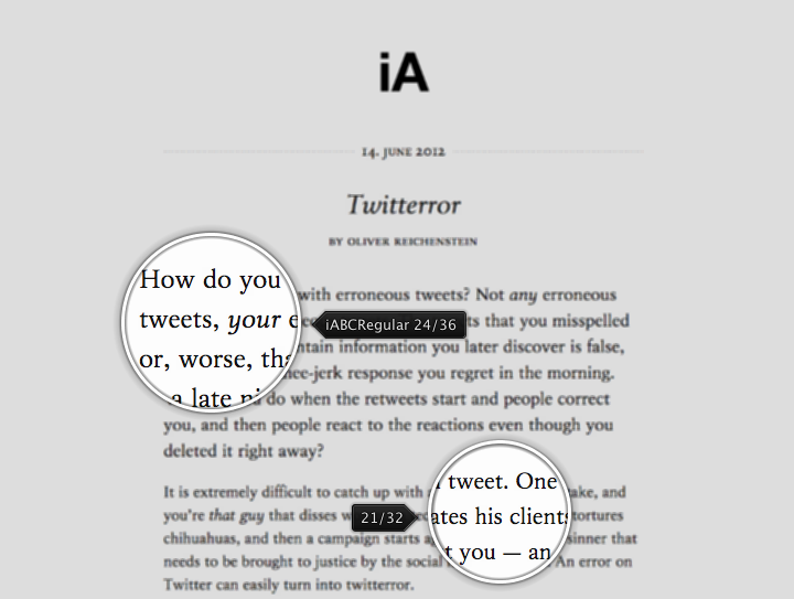
And finally, Oliver Reichenstein‘s informationarchitects.net that uses his own custom iABC font in two sizes – a bigger one for the opening paragraph, and a smaller one for the rest:
As a small detour, I’ve also looked at two of the applications I use occasionally on my mobile devices for more comfortable reading – Flipboard and Pocket:
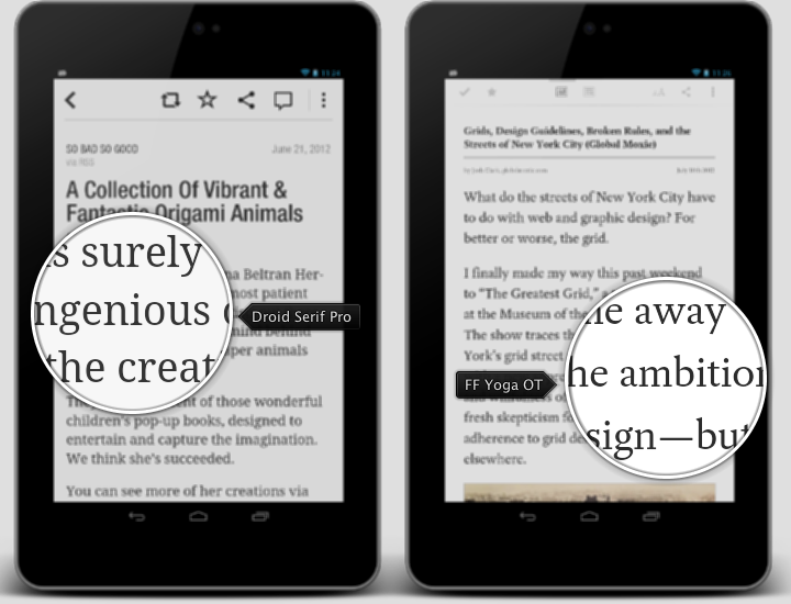
Pocket allows choosing between two bundled fonts – the sans Proxima Nova and the serif FF Yoga OT. Flipboard bundles the sans Neue Helvetica for the main browsing tiles, and uses web views to render the actual articles. The article rendering is not very consistent, using Droid Serif Pro for most of the articles, and a variety of sans and serif fonts for others. This is combined with the lack of user choice to enforce usage of a single consistent font, taking away one of the “selling” points of such an app – consistent, uncluttered and enjoyable reading experience.
The six examples of different web sites shown above are ordered based on the font size – from smallest (16 points) to largest (24 points). The “large” setting of Evernote’s Clearly is 20 points with line height of 30 points, and this was the minimal font size that I was comfortable with. Finally, I did not want to explicitly highlight the first paragraph as done in the last two examples. I do understand the perceived importance of the opening paragraph for those that do quick skimming, but that is not my actual target case.
PT Serif is a free and decent looking serif font. This is what I’ve been using on this blog over the last couple of months. However, it has certain problems with kerning. Here is a very small comparison to Elena, my eventual font choice:
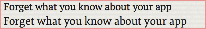
The top line (PT Serif) is quite irregular in the very first word. It starts with quite spacious gaps between the first three letters, and then “rushes in” to complete the next three ones. Compare it to the bottom line (Elena) that has a better consistency, even though some of the gaps still feel a tad too wide.
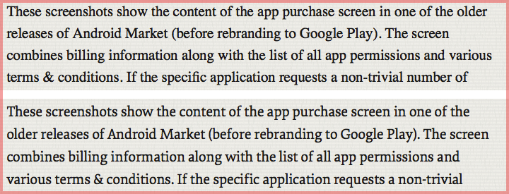
And this screenshot compares how PT Serif (top) and Elena (bottom) handle the body text under my eventual selection of 21 points for font size and 32 points for line height. You can see the better kerning in the words “before” (2nd line), “billing” (3rd line) and “trivial” (4th line), just to point out a few.
Elena is a great and very affordable web font. If you happen to read this article outside of its original form, you’re more than welcome to click through to the original format to judge for yourself. It is rather unfortunate that I only use it on the Mac machines. Much has been said about the difference between rendering engines on Windows and Mac. I would only say that I have not seen a single serif web font that looks good on a Windows browser – including all the sites mentioned here. For now I’m staying with Georgia as the default font for non-Mac platforms.
This would not be complete without adding a few links to sites that provide my daily dose of typography inspiration. In no particular, although alphabetical order, they are:
