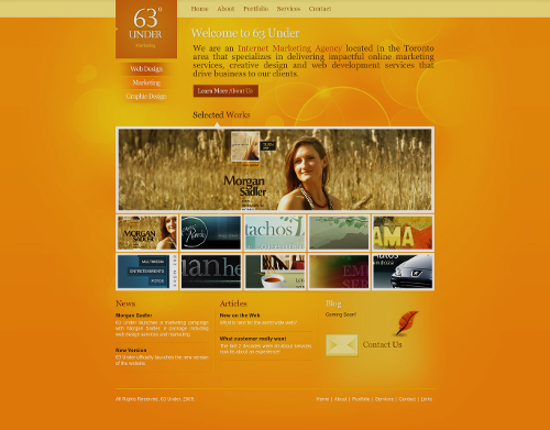
Today’s post highlights the design of 63under.com. I like the exploration of yellow-orange-brown hues, with wide swaths of deep orange alleviated with faded radial highlights, accentuated bokeh circles and beveled separators. The main navigation menu has nice rollover effects that use the same small triangular pointers as seen just above the first row of the embedded portfolio. Overall, the header part has an inviting open feel to it, with the secondary vertical navigation dissolving into the background and large bokeh circles weaving in and out of the wide margins. On a less positive note, the small white texts in the footer are not very readable, and need either darker shadow or an altogether much darker main color. Make sure to visit the “Services” page that uses very attractive arrangement of section icons in the left column (although the solid block rollovers are quite unnecessary).
Every month this series is tracking the latest design trends and collecting the best examples of modern web designs. Here is the list for April 2011 with over a 1000 links from 40 aggregator posts:

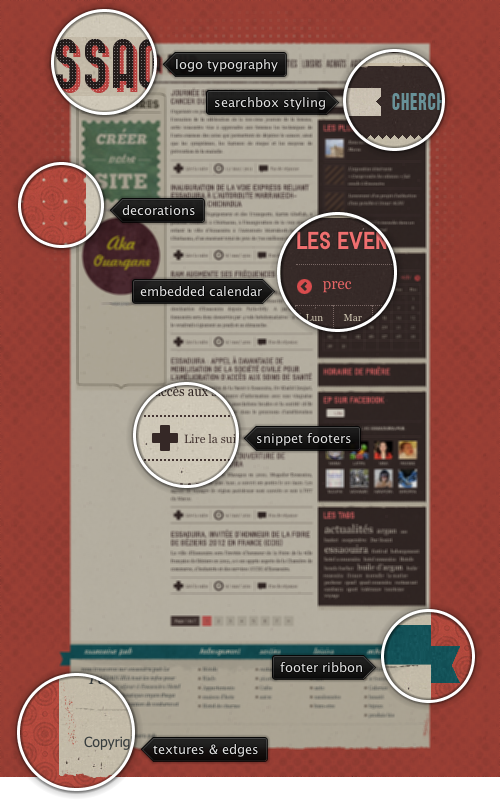
Today’s post highlights the design of Essaouira-Pub.com. The landing page has a nice mix of vintage elements, especially in the usage of textures and background patterns. These elements bring a nice touch to the otherwise imposing pink framing of the main content, mixing noise speckles, fading waves of concentric circles and a three-sided radial dot grid. The color palette feels a little bit overloaded, with vintage pinks, browns, blues and greens switching between background and foreground; perhaps removing the large swaths of brown from the right column would result in a better visual balance, bringing it closer to the printed poster look. The balance is also perturbed by the switch from the three column grid in the main section to the five column grid in the footer. In conclusion, it would be nice to see a little bit more attention to the content arrangement and bring it on par with the overall visual styling.