 Today’s build highlights the design of 2010.BuildConf.com by Andy McMillan (@goodonpaper). After reviewing the sites for HDLive 2010 and dConstruct 2010, it’s time for another designer conference site. This design combines a simple color palette and nicely balanced grid to highlight the conference speakers and extra material.
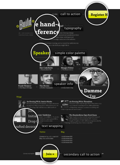
Spare appearance of lime green for section headers and hyperlink rollovers allows using it to draw attention to two action buttons – one if the header and another in the footer. The content is laid out in a four-column grid, with different sections switching to different column spans. Note how the first row of the speaker thumbnails is “missing” the first cell – to balance out the heavy logo just above it; this creates a “content diagonal” that goes from the top left to bottom right. A counter diagonal that connects the action buttons in the header and footer sections brings the balance back to center. The last two sections feel a little off in this regard – with awkward content in the twitter / blog section, an extra wide separator below the “Blog” caption, and off-grid positioning of the footer content. The entry headers in the “Fringe” sections lead to the full content, but are missing the muted double arrow icon found below the speaker thumbnails in the section above; it feels that the UX consistency would be worth a little bit of extra visual noise here.
Be sure to visit the “Workshops” and “Fringe” pages to see consistent application of the same principles throughout the rest of the site. This is quite commendable given how some designers spend a lot of time on the landing page at the expense of the rest of the site.

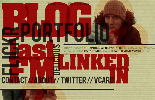
Today’s post highlights the design of OliverKavanagh.com. An instantly memorable landing page that uses overlapping – and sometimes rotated – slabs of extra large texts as navigation links. Note the secondary level of overlapping in the chunky red texts that use a font with a hint of serifs; combined with translucent dark gray color used for the other navigation entries results in an intricate typographical maze that frames the content in the top-right corner.
The texture and color treatment of Oliver’s headshot is my favorite part – note how the three overlapping circles bring out the coarse background texture, with burnt mahogany color deriving from paper yellow, cardboard orange and deep red of the surrounding elements. Moving the mouse over different parts of the page shows simple rollover effects that help understanding which part is active – this is especially helpful given large swaths of overlapping elements.
Finally, a small note on how well the design adapts to different browser window sizes. Just as in case of DesignWise, the actual implementation uses “pre-baked” images – one for each navigation element. While this ensures high-fidelity look, and the pixel-based CSS definitions maintain the exact overlap ratios, the design does not scale well when the browser window is resized – and overflows the right edge on even medium window sizes. It’s hard to say what can realistically be done to accommodate all possible window sizes, or even how far the current state of web typography and the latest CSS support can take designs that rely so heavily on precise typography and positioning.

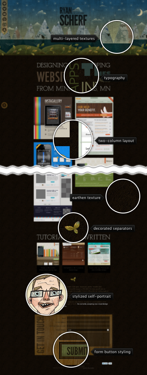
Today’s post highlights the design of RyanScherf.net. An intricate oversized illustration by Jacob Souva of Two Fish Illustration sets the visual tone for the rest of the site, with its dark cool colors and multi-layered grungy textures. The transition from the dim starry sky to mountains to grassy hills completes with the deep brown earthen styling of the main content – a nice break from similarly styled designs that choose to put the “underground” part in a small footer. Consistent use of desaturated browns, greens and blues continues throughout the rest of the site, with decorated separators and wooden texture of the contact form reinforcing the nature-based main illustration theme. Note the two translucent static elements along the left edge of the site that allow quick navigation in this single-page site; the only usability issue with the main navigation strip is that it does not provide any visual indication which icons scroll the site content and which icons lead to external social sites. The site footer can also benefit from extra polish around the budget selector in the contact form and twitter widget in the footer – both stick out like a sore thumb on an otherwise elegantly styled site.
The View.setTag(Object) is a nice API that allows you to attach an arbitrary piece of information to the specific view. For example, you can “point” tweet row view to the data object that has the metadata used to create the view, or “point” the contact row view to the data object that has the metadata about the contact itself (as shown in the QuickContactsDemo). View holders are particularly popular examples of using view tags – if you have homogeneous rows and need to access child views for the specific list row, you create a view holder object that holds references to those child views and access them directly instead of using the View.findViewById() API. See the List14 demo for the full example.
Today i want to talk about how we used the view tags in the following landscape screen that shows the details of the specific Market application:

This screen has two major parts – the left half is static, showing the overview of the application itself and a button to accept the permissions and install the app. The right part is a vertically scrollable information on the app, including the description, screenshots, comments, related apps and more. As with portrait layout of some of the screens, these two views overlap. The thin vertical area that “hosts” the curved right arc of the green section is the intersection area of the two components. The reason for this is purely aesthetic – note how the fading gray background of the section headers extends and disappears behind the curved arc. This creates a nice visual continuity and connection between the two sections, especially during vertical scrolling. Here is another screenshot of the same screen, this time with one of the comments highlighted (note that the comment highlighting will be available in the next Market client release):

There is a lot of information in the right half of the screen, with each section and row implemented with its own layout (where some layouts are reused in other Market client screens, and all layouts are used in the portrait mode). Given that the parent panel intersects with the left half of the screen, we need to have a consistent way of “pushing” the content of each row to the right when it’s displayed in the landscape mode. If we don’t do this, the content will be partially hidden behind the curving arc, resulting in poor user experience.
As mentioned above, some of the child layouts used in this screen are used elsewhere in the application. In addition, the horizontal pixel extent of the arc itself is not known at compile time – it depends on the physical height of the screen and is computed to maintain a consistent perceived curvature across different hardware configurations. Given these two limitations, it was rather impractical – if not impossible – to define the left padding for each one of the child views in the layout definitions themselves. Instead, here is what we do (at least right now):
- Each child layout is defined separately based on the target design. Some views do not have explicit left padding, while some views do.
- At runtime, we use View.getPaddingLeft() to get the original left padding, add the horizontal pixel extent of the arc and drop shadow size scaled to the device density and call View.setPadding() – passing the original top, right and bottom paddings.
- However, you cannot rely on how many layout passes the system will make on each specific row. If you start adding that extra padding on every layout pass in your custom layout, you may end up with double, triple of even more application of the computation above. The solution here is to store the original padding as an Integer tag on the child view. Then, when you need to apply extra padding, you check to see if the tag is already set. If it’s not set, get the current left padding and store it as a tag. If the tag is not null, convert it to Integer and apply extra padding
While the flow above is a nice solution for a custom layout, you can do even better:
- Call View.getViewTreeObserver() and then ViewTreeObserver.addOnPreDrawListener().
- This listener will be notified on every draw operation. In the callback itself you can apply that custom left padding on all the child views. However, you don’t want to do this on every single draw operation.
- To detect the first “real” draw we check to see whether the height of the relevant container is not 0. As long as it is 0, it means that the container has not been laid out within the bounds of its parent.
- The first time the container height is more than 0, we apply the custom left padding and set a boolean flag to return immediately on the next callback invocation.
- In addition, we apply the custom padding whenever a new child is added to the container – to handle cases where a child is added dynamically after the parent has been laid out.
Why go to all this trouble and not set the left padding on the entire right-half container? The answer is simple – that left padding will push all the child views to the right, and while the content will be properly displayed to the right of the curved arc, the section header backgrounds and individual row highlights will not extend behind the arc. They will kind of “hang” next to the carousel creating:

See how the background highlights of the rating widget and the description section header do not extend behind the arc – and compare to the screenshots above.
Finally, getting back to the view tags, don’t forget the View.setTag(int, Object) API that allows setting multiple tags on the same view. Note that you should not define your own integer constants and pass them to this API. Instead, add an ID resource file in your res/ folder and use the generated constant that will be both unique and readable.
![]() Today’s build highlights the design of 2010.BuildConf.com by Andy McMillan (@goodonpaper). After reviewing the sites for HDLive 2010 and dConstruct 2010, it’s time for another designer conference site. This design combines a simple color palette and nicely balanced grid to highlight the conference speakers and extra material.
Today’s build highlights the design of 2010.BuildConf.com by Andy McMillan (@goodonpaper). After reviewing the sites for HDLive 2010 and dConstruct 2010, it’s time for another designer conference site. This design combines a simple color palette and nicely balanced grid to highlight the conference speakers and extra material.

