 Today’s post highlights the design of Ideaware.co. The overall vertical flow follows a popular three-section nature-themed illustration style, with starry cloudy sky in the header, mountain ridges in the middle and underground in the footer. Note the nice transitions between the sections, with a tweeter bird integrated into the tree line, and a stylized skeleton “buried” in the ground. In addition, if you’re running a modern browser, you will see the clouds move in the header section, with an occasional rocket “launching” into the sky. The design consistently employs a few key elements – translucent overlapping layers, double-stitch dashed separator lines and hyperlink styling. I particularly like the peach red ribbon overlay in the navigation menu that shows the current location; muted per-section background textures are a definite plus as well.

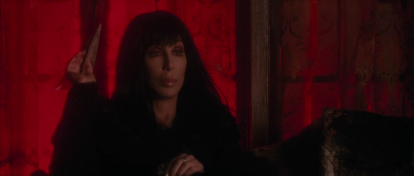
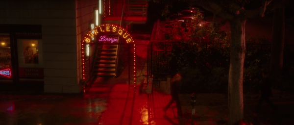
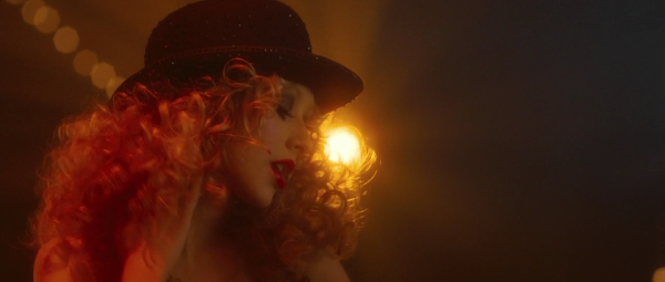
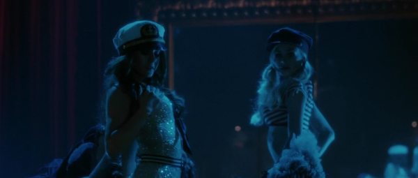
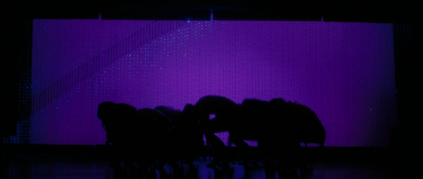
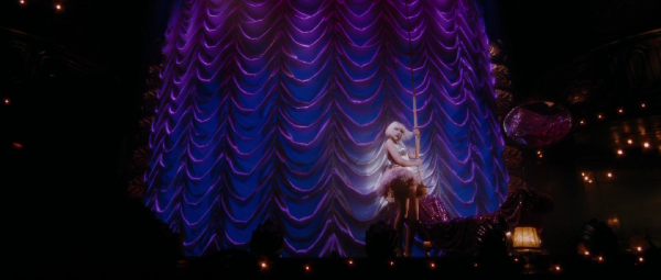
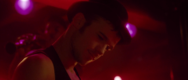
Art direction by Chris Cornwell, costume design by Michael Kaplan. Burlesque joins Chicago and Moulin Rouge with its rich sensual visuals, highlighted in the images below.

 Today’s post highlights the design of WeAreFixel.com. The landing page strikes a nice balance between text sections and images; note a relatively small portfolio slideshow that blends perfectly into the oversized header section. The calligraphic Bistro Script font is a perfect match for the subdued color palette of sand yellow, cardboard orange and faded blue – with further reinforcements of the vintage feel coming from the distressed icons and finely styled section headers. Different sections use different mix of foreground colors, with the orange used consistently for hyperlinks; note how the diagonal pattern in the middle section makes the transition between dark and light sections seem less offensive.
The humorous “We are the … to your …” banner is quite memorable, but it has a couple of problems. First, a lot of the punchlines are rooted deep in american culture and may cause bewilderment and some negative feelings if the prospective client does not understand a certain connection. Second, the position of the reload icon keeps changing based on how long the current line is. If you’re interested in quickly skimming all the combinations, it’s rather distracting to be forced to move the mouse.
On a more positive note, the “View our work” call to action button has just the perfect positioning and styling. It’s located above the fold right next to the portfolio; given that none of the entries use the orange color (an extra credit for choosing screenshots dominated by the main palette colors), it is a very distinct element. It is also situated on the “main diagonal of interest” for the visitors that are used to quickly skim the content. Note how this diagonal is anchored by four elements, all using the orange color. Finally, study the excellent styling of the tweet section in the footer – from the muted calligraphy of the section header to the consistent styling of embedded hyperlinks.
Maciej Ceglowski on developers spending too much time on the underlying pieces at the expense of polishing the UX and UI:
The Pinboard about page says: “There is absolutely nothing interesting about the Pinboard architecture or implementation; I consider that a feature!”
Can you explain why you think that’s a feature?
I believe that relying on very basic and well-understood technologies at the architectural level forces you to save all your cleverness and new ideas for the actual app, where it can make a difference to users.
I think many developers (myself included) are easily seduced by new technology and are willing to burn a lot of time rigging it together just for the joy of tinkering. So nowadays we see a lot of fairly uninteresting web apps with very technically sweet implementations. In designing Pinboard, I tried to steer clear of this temptation by picking very familiar, vanilla tools wherever possible so I would have no excuse for architectural wank.
More thoughts on this from Miguel de Icaza.
