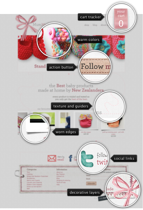
Today’s post highlights the design of MumMade.co.nz, an online store for home-made baby products (design by PixelFusion). Soft pink-brown color palette joins the attractive selection of fabric-inspired textures and illustrations to create an inviting browsing experience. Individual product pages use a carefully crafted item selector, while category pages employ attractively spaced and nicely framed product thumbnails.
Muted pink is used for the hyperlinks, and the site uses the thin serif Archer Light for headers / navigation links and handwritten Bowfin for the social icons. The “About” page uses a professional photograph to create a deeper personal connection which is further reinforced on the “Thanks” page.
On a less positive side, the auto-advance slideshows on the home page are just too much. There are three slideshows, each one with its own cycle. The top one has a ticker that allows manual navigation, but the bottom two are not very usable – there’s just too many transitions with very little control provided to the end user.
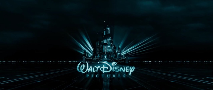
The title sequence sets the visual tone and defines the dominant colors for the entire movie, forgoing the full-color warm palette of the Disney castle for a metallic aquamarine hue and a predominantly dark environment. Once the main character moves into the computer world, two colors dominate the visuals – very desaturated metallic light blue and heavy orange.
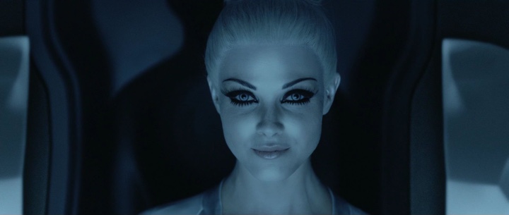
Note how the post-processing has removed almost all the traces of eye and lip color, preserving monochrome light blue surfaces.
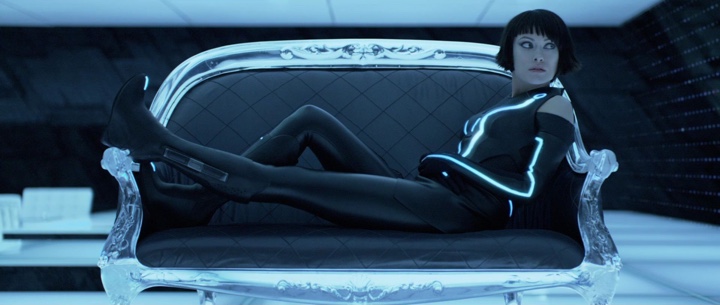
Even a strongly lit floor and glowing costume stripes cast just enough ambient light to accentuate the dark polyester clothes and slanted walls.
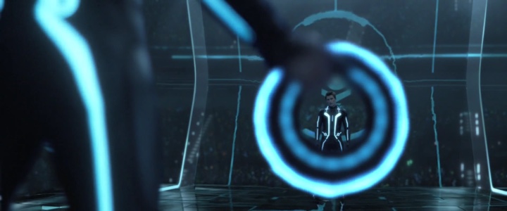
The fighting scenes feature an artful interplay of bright glowing light sources and shiny reflective dark environmental structures.
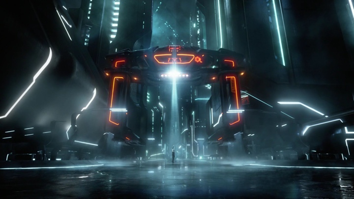
Bright saturated orange serves to create and maintain visual conflict.
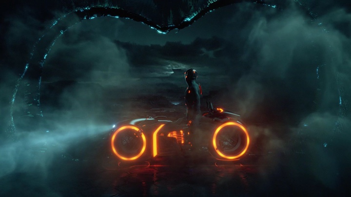
As the conflict grows, orange becomes more pervasive, with perceptible reflections on some of the surfaces.
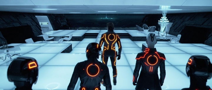
There is no single hue of orange – the light sources span from saturated yellow to a darker reddish hue to create a certain degree of separation between the different characters, while still maintaining an overall connection.
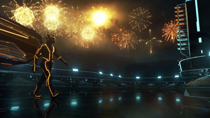
A spectacular array of fireworks is one of the rarer outdoors scenes where the light dominates.
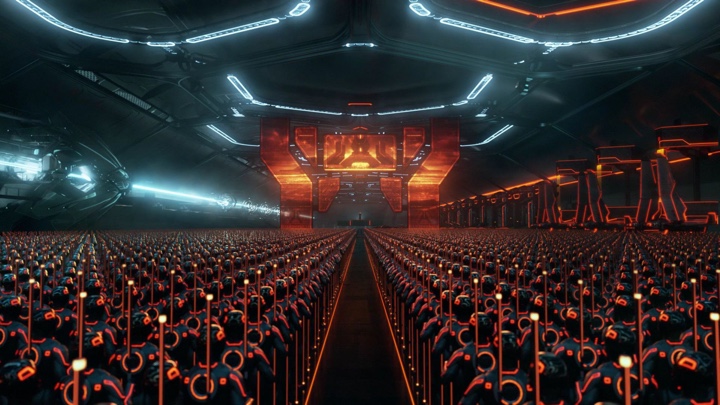
While the army assembly uses more ominous shades of orange to highlight the impending threat.
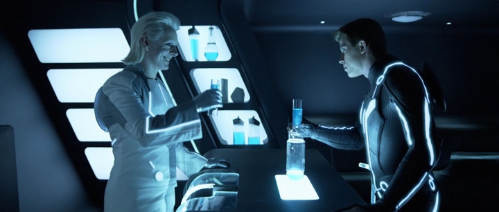
Drinks are one rare source of light, with saturated blue making a rare appearance.
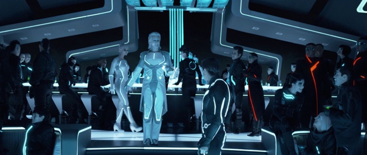
And elsewhere in the club the drinks are acid lime green, adding a small splash of color to the reddish oranges of few of the guests.
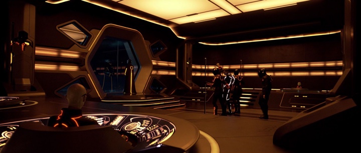
The command center is the only place where the environment is not black. Deep bronze and sepias mesh with desaturated yellow light sources to highlight the importance of this room.
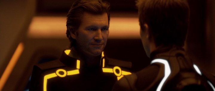
The sepias are extended not only to the costumes, but to the faces and hair.
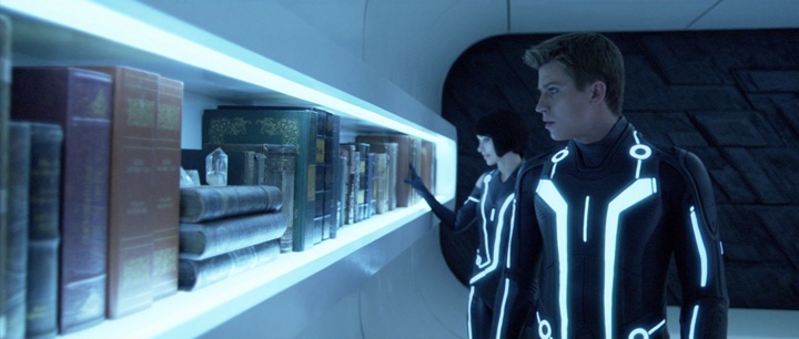
The hideout chambers are a rare multi-color environment. The leather-bound books span purples, greens, blues and browns to highlight the diversity of human-made products.
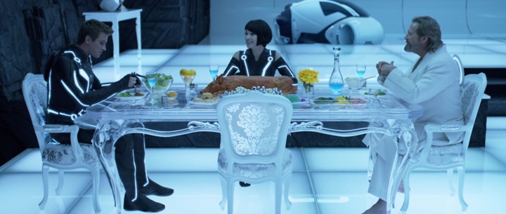
Saturated dark greens make their only appearance in the computer world on the plates of both human characters, along with bright yellow fruit and flowers. Note that this environment is meant to maintain the connection to the human world, and the scene highlights the majority of human characters in a fleeting moment of outward relaxation.
Images and video stills by Walt Disney Pictures. If you’re interested in more details on the design of Tron, take a deeper delve.
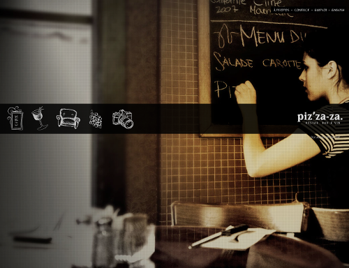
Today’s post highlights the design of Pizzaza.ca, the home page of a local restaurant and wine bar. While home pages for most restaurants choose to use warm saturated colors and vibrant close-up photographs of signature dishes, this site uses a desaturated sepia full-bleed snapshot of a young lady writing the menu on a chalk whiteboard. This scene effectively creates an atmosphere of a warm, ambient, non-corporate and relaxed environment which is further illustrated by the picture gallery. A translucent dark strip extends across the top part of the screen and hosts stippled icons leading to the wine selection, menu entries and other sections; note how the icon style is connected to the chalk whiteboard in the background photo.
Full-bleed background pictures are used on other pages, such as wine selection or employment, but the charming simplicity of the home page is lost in rather garish floating rectangular boxes. Furthermore, these boxes feature completely unnecessary sliding animations that don’t add anything besides full view of the background.
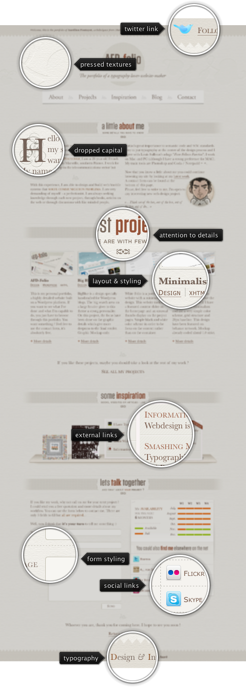
Today’s post highlights the design of the portfolio page of All-For-Design.com by Aurélien Foutoyet. Different shades of sepia for are used for intricate background textures and illustrations, as well as the main body text and header sections. The color palette is completed with orange-brown range used for hyperlinks and some of the headers, along with a few splashed of vivid colors on social icons in the site header and footer.
The four-column grid is preserved throughout the entire page, with some sections spanning two or four columns at a time. Note the perfectly centered content balance to preserve the visual weight, and careful usage of inline images and oversized section separators to break the moderately large text sections into quickly scannable pieces. As an extra visual treat, move the mouse over the different visual elements in the inspiration and social sections.