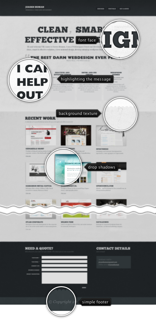
Today’s post highlights the design of JeroenHoman.com. A single-page design chooses to put the portfolio as a three-column grid of small thumbnails (as opposed to a scrollable slideshow), with larger images appearing in lightboxes on click. The top part of the page features a rather haphazard mix of serif and sans-serif large fonts of wildly varying sizes. While it is a common practice to use images for high fidelity display of the text, most of the smaller texts are blurry and not well kerned (see the gap between A and U in “Beautiful design”).
I like the usage of grayscale palette that is combined with large swaths of grungy slightly “stained” background patterns to break the large vertical span of the top section. Subtle drop shadows around the portfolio thumbnails bring them slightly forward, further highlighting their strong grid. The contact form in the footer can lose some of the bold all-caps labels and use fewer font styles. With an overall simplification and cleaning of typography this can become a polished and well rounded experience.

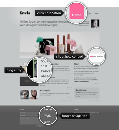
Today’s post highlights the design of Favela.se. A predominantly monochrome palette uses a few splashes of light pink for navigation controls and link rollovers, directing the eye towards a full-width full-color portfolio slideshow that features a smooth auto-advance animation and an ample view into the details of the specific design job. Thumbnails of recent blog entries maintain the same “widescreen” ratio as the portfolio slideshow, and two columns of text snippets separated with custom type headers bring the visual balance back to the center. The only thing i’d change would be to vertically flip the thumbnail portrait next to the contact information in the right side of the header to look towards the main content instead of away from it.
When the alarm clock goes off at seven, i wake up and wearily find my way to the kids room. Exhausted from the late Sunday evening, they hardly wake up when i pick them up and put them in our bed. Weaving in and out of their dreams, instinctively clutching their worn out plush toys, they lay next to me, one on each side. Turning every now and then, catching the last few quiet minutes, still caught in the pretend world of their fairylands. Their little hands rest in mine, warm and defenseless. Half smiling at whatever figments are passing before their eyes, unaware of the sublime beauty of the moment. No fighting over the same toys, no precarious jumping on the sofas, no danger of splashing watercolors on the carpet.
With every minute that passes i know that we’re going to be late to daycare and i’ll get stuck in traffic on the way to work. Somehow it all does not matter. In a few years these moments will be no more. It all seems so far away now, but it is inevitable. And so i lay there, listening to the soft breathing of two small pieces of me, one on each side. It costs nothing and is worth everything.
These are my Monday mornings.

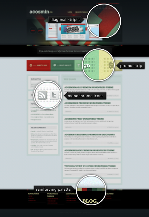
Today’s post highlights the design of ACosmin.com. Thick overlapping diagonal strokes in the header follow a recent trend noted in an earlier entry, and a warm four-color palette is put to a creative use throughout the visual elements, section headers and clickable elements.
On a less attractive side, the all-caps bold serifs are too heavy to be used as blog entry titles, especially given very short cut-off length of entry descriptions. The all-caps are also overwhelming the typography of the site footer, with ragged unevenness of double dotted lines that adds too much visual noise without serving any real purpose.