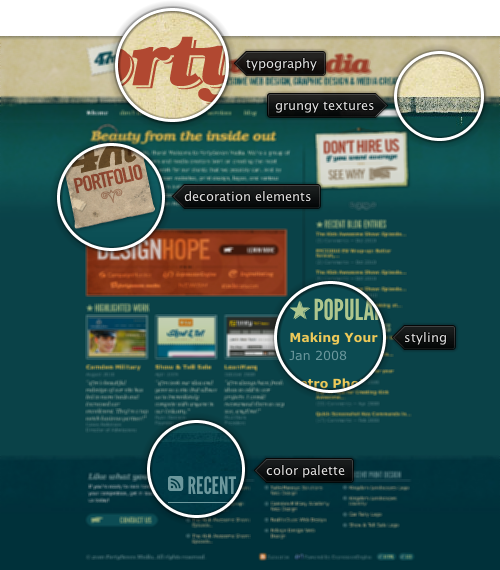
Today’s post highlights the design of FortySevenMedia.com. A fresh look that artfully combines multiple vintage / grungy elements into a cohesive whole, from a cool worn-out color palette of aquamarine, brick orange and sand yellow to irregular noise textures, from old-style stars and pointing hands to tilted and worn out image borders, from vintage ornament fonts to slightly jagged kerning. The aquamarines are the predominant color and are used for the main section background, footer background, footer section headers and some of the links.

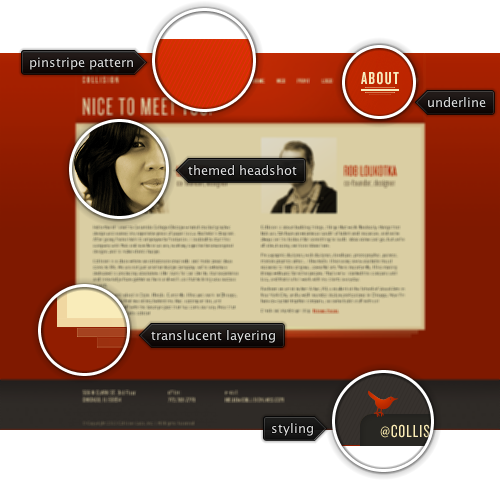
Today’s post highlights the design of CollisionLabs.com. A warm and inviting palette of brick orange, light yellow and slate gray is artfully applied throughout all the pages on the site. Radial highlights and pinstripe background patterns break large white spaces surrounding main content areas. Further usage of thin condensed fonts in the logo, navigation menu and footer contribute to very light appearance of design that relies heavily on texts for arranging the visual elements and navigating on the site.
The “About” page is my favorite, using the main colors (light yellow and slate gray) for duotone large crisp headshots of the studio founders. Note the direction of each headshot – facing the viewer and (slightly) each other – although i would prefer if Rob’s picture on the right side of his name (instead of facing away from it). Also note the perfect flow of the rather large text sections – no white rivers, no ragged edges and perfect vertical alignment at the bottom.
The pinstripe pattern appears twice – in the header and in the footer – further cementing the well thought and perfectly executed design that relies heavily on precise straight lines. Note the beveled separator along the top edge of the footer section, horizontal gradients and double borders in the staggered layering along the bottom edge of the main section and quadruple underlining of the active navigation menu items. And as a final stroke, the thin red line running across the very bottom of the page “hosts” an inset tab with a twitter bird (move the mouse over the tab to see a hover effect).

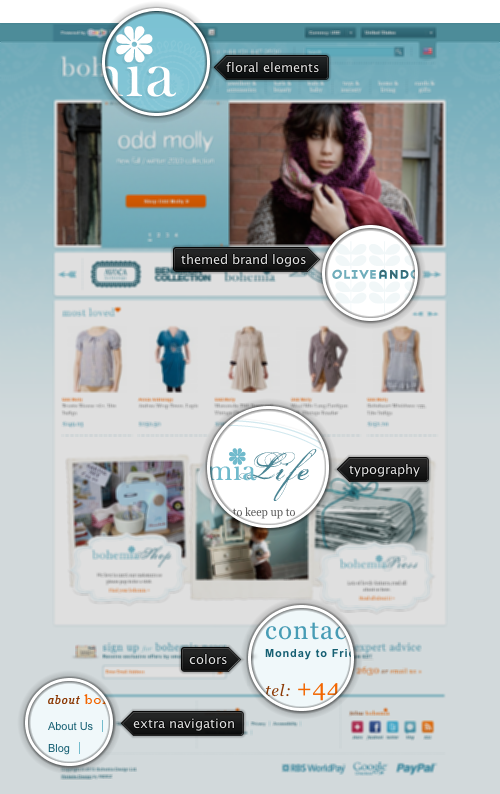
Today’s post highlights the design of BohemiaDesign.co.uk. A carefully crafted design reflects the self-professed refined taste of a boutique shop of hand selected items – from the cerulean color palette to delicate floral background patterns in the header, from ornamental navigation arrows of product slideshows to vignette hand written fonts used in the bottom half, from simple typography to artfully themed icons of external brands.
On a less positive side, the design can be a little bit more consistent in its usage of foreground colors for section headers and links. A mix of slate blue, dark cerulean and orange is inconsistent at best and misleading at worst. It is also not immediately clear what is the interaction between the currency and country dropdowns in the expandable header bar at the top of the page. Changing a country also selects the matching currency, but changing the currency does not change the country selection.
Yet another language drop down causes automatic translation of the content and poses many more problems that it solves (or aims to solve). Things such as image-based menu header that remains untranslated, translated content that overflows the intended visual bounds (try switching to German and scroll all the way down), mismatch between orientation of textual and visual elements under right-to-left languages (switch to Hebrew), mix of translated and non-translated content in the same text block (switch to Russian) are just a few examples of how an automatic tool can destroy a hand tuned visual structure.

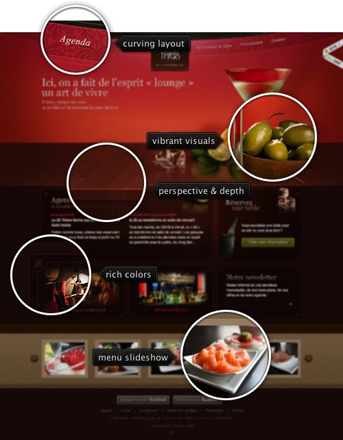
Today’s post highlights the visuals of Le28Thiers.Fr. A rich warm color palette of mahoganies and deep peaches, fine wooden textures and baroque illustrations create an aura of exclusivity and refinement. The eye is immediately drawn to the martini glass surrounded by ripe citrus fruit and green olives. Polished wooden texture with vanishing perspective, radial highlights and blurred reflection create an inviting three dimensional scene (that is unfortunately marred by the optically incorrect reflection of the glass stem).
The menu slideshow whets the appetite by showing an attractive selection of dishes and drinks, with full size pictures shown in lightbox on clicking each item. The menu entries are also highlighted in other parts of the site, this time using a Flash-based clicker that features complex rollover effects that combine zooming, blurring and translucent description tooltips.