Today’s post highlights the design of CreativeMints.com by Mike Muzhychkov. You may remember Mike’s other creation, EmotionsLive.com that was featured in this series a few months ago. The instantly memorable style that combines rich saturated colors, oversized illustrations, decorated fonts and soft highlights turns what might have been a gaudy display of oranges, purples and greens into a lush and enjoyable creation.
Soft animation effects on the navigation menu, “new and noteworthy” accordion and section transitions triggered by the arrow icons along the right side of this single-page design add an extra dimension of finesse. The smooth animations continue in the cross fades initiated by clicking on portfolio thumbnails; unfortunately the transition to the full-size lightbox is rather abrupt and can use some extra love in the next revision of this otherwise engaging experience.

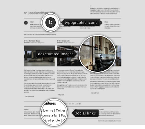
Today’s post highlights the design of CoolAndTheGuide.com by Dustin Heerkens. A stark monochromatic palette sets a spartan tone to the site dominated by typography and large desaturated images of interior design. Note the interesting switch between four column grid of header / footer and three column grid of the main content (and the top-right intro text blurb). This works quite well for the large text sections, but creates a certain visual imbalance between large images in the main section and small round icons in the header; this imbalance can perhaps be addressed by moving the icons to be above the navigation menu entries instead to the left of them.
Opting for smaller font sizes creates a number of problems. Rather large text sections in the main content require more effort to read, partially due to 11px Arial with thin stems that are rendered quite unevenly on LCD screens. Zooming in the content to address the legibility issues makes all columns wider (instead of preserving fixed pixel sizes), breaking the horizontal containment within the browser window. In addition, the styling does not provide any visual indication of what is a hyperlink – the links are indistinguishable from the regular content. My overall feeling is that the strong focus on the spartan palette and typography has unnecessarily sacrificed the usability and navigation ease.
Guy Deutscher‘s new book, “Through the Language Glass” raises a few interesting questions about the evolution of naming abstract concepts, such as color, direction and gender, in different cultures. It’s a rather broad subject and, as is often the case with inexact sciences, there’s a lot of things that cannot be put in clearly labeled and neatly separated bins. One of the main arguments put forth in the book is about the influence of “basic” colors on the subjective perception of the outside world.
A basic color is loosely defined as a color that is taught to young children. Something along the lines of “this block is yellow, and this block is orange”. In this scenario, a darker shade of orange is still orange, and the children learn the “unspoken” boundaries between primary colors, where hue is the main driving separator, and brightness / saturation are ignored. The book describes a series of experiments that try to assess how these boundaries affect the way we process the color information. The central experiment highlighted by Guy took advantage of the way Russian culture differentiates between two different “types” of blue – the darker saturated one, and the lighter hue usually referred to as “sky blue”. To illustrate this difference, here are the rainbow colors as taught in English (following the original categories created by Isaac Newton):
wa wa wa wa wa wa wa – red orange yellow green blue indigo violet
And this is how I (a native Russian speaker) was taught to separate the rainbow colors:
wa wa wa wa wa wa wa – red orange yellow green cyan blue purple
Now, there is nothing inherently wrong with these two models. The only difference is that sky blue (or cyan, if you will) is taught as a basic color in Russian culture. Instead of saying that “the sky is blue”, i say “the sky is cyan” – which sounds quite strange in English (more on this later), but perfectly acceptable in Russian, since the Russian word for it (goluboy) is a name of the basic color. Starting from this difference in how two cultures separate the rainbow colors, the experiment highlighted in the book shows that there is a measurable difference in color-based tasks performed by native English and native Russian speakers. The book has more details on the experiments, and Guy makes some interesting theories based on those experiments. Since this entry is about a broader topic of naming colors, I’m going to talk more about his theories (and why i don’t agree with him) in the next entry.
The basic colors shape the way we talk about the world, be it physical objects, or their representation on the computer displays. A young child can be easily overwhelmed with all the things he needs to learn in order to be able to communicate with the world and express his thoughts and needs. There are two main reasons to bucket the visible color spectrum into basic colors. First, it reduces the number of new words that the child needs to learn. Second, color naming is a very subjective and inexact area.
For example, take a look at this collection of 50 brown designs. While they are all “obviously” brown, they are also all “obviously” different browns. We don’t have any problem applying the word brown to any of these separate colors. There’s a certain degree of “redness” or “greenness” to some of the browns, and they also differ in saturation and brightness. However, they are all lumped under the broad definition of brown as a basic color. As an experiment, take the first two browns in that link and try to articulate the difference. And once you get past the difference in hue and saturation, the next task is to name each one of these two browns in a single and unambiguous word. A word that can be said to the person sitting next to you looking at the same 50 screenshots so that he’ll immediately point to the specific one you had in mind.
And you don’t even need to go that far. What is the “canonical” green? Is wa the one? Or perhaps wa ? The first one is “pure” green as defined by the RGB components (no red, full green, no blue). The second is closer to the “average” green seen in nature (grass, tree leaves) and is a darker shade of the first one. And there’s a whole bunch of greens in between, and slightly to the “sides” – where it starts getting closer to yellow on one side and blue on the other side. And it’s these sides that present a rather perplexing paradox. English has a bunch of names for the “in between” colors, but those names are almost never used in every day speech.
While children grow up to learn dozens (if not hundreds) of names for animals, flowers, vehicles and other objects, English is stuck with 11 basic colors – black, blue, brown, gray, green, orange, pink, purple, red, white and yellow. Anything beyond that is quite incidental and is confined to books and highly specialized industries (graphic design, fashion, …) A quick look in the thesaurus reveals a startling variety of beautiful color names that can enrich our everyday vocabulary. At the intersection of green and blue you can find azure, cerulean, cyan, celeste, cerulescent and mineral-based turquoise, aquamarine, sapphire, cobalt and lapis. At the intersection of blue and red you can find lilac, violet, fuchsia, mauve, purpure and nature-based lavender, amethyst, heliotrope, mulberry, amaranthine, hyacinthe and aubergine.
There’s a whole bunch of color naming systems. From number-based hues of Pantone to rather imaginative names of Plochere (did you know that amulet and universal are color names), there’s no shortage of attempts at formalizing the naming conventions targeting specialized niches. In the meantime, let’s agree that the color of the sky is not really blue, and let’s continue calling it blue nonetheless.

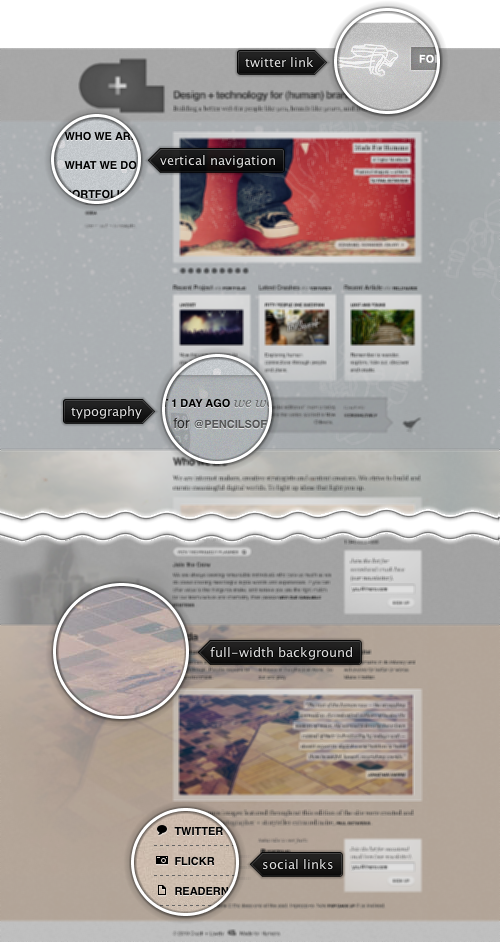
Today’s post highlights the design of CrushLovely.com. Following the recently popular trend, the site has been redesigned a few months ago into a visually attractive single page, multi section journey. Anchoring the navigation with an oversized icon and vertically oriented menu that stay at the same position no matter how far along you scroll, the design features eight large sections, each with its own styling, and all following the same strong and balanced three-column grid.
Each section uses an oversized image that serves two purposes. First, it breaks the rather large swaths of texts and lets the eye quickly scan the content. Second, the color palette of the image (and sometimes the image itself) is used as the background texture of the specific section; see the bleeding washed out full width background fill of the last two sections for the examples.
The three column grid is rigidly maintained throughout all the sections. Some have their entire content spanning the full width, some alternate between 1-2 and 2-1, and some use all three columns for smaller portfolio thumbnails. This level of attention to details can also be seen in precise separator lines, artfully styled embedded tweet and clean typography that uses a mix of Georgia and Helvetica.