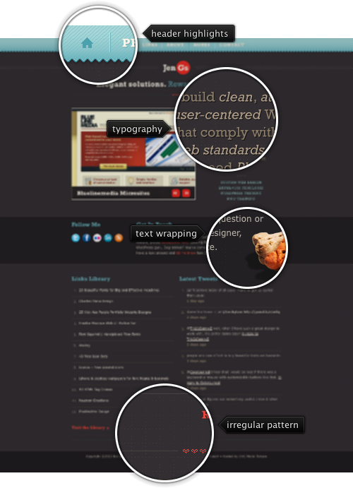
Today’s post highlights the design of Jen.gs, the personal website of Jen Germann. An interesting color scheme uses dark melanzane for background, light gray for main text, light blue for section headers and sunset orange for links; the orange color is also used in the main logo and two separators. The main section uses Cufon for precise and clean typography.
An excellent semi-random dotted background grid pattern is unnecessarily broken by too many horizontal separators – especially in the links / tweets section. Not only do the separators break the background grid lines, they also are not horizontally aligned between the two bottom sections. In addition, item numbers can be better aligned with item texts. The “Visit the library” / “Read the rest” links are not vertically aligned, and use different amount of white space between the text and double arrows.
I’ve spend the last few days pushing a few pixels improving the alignment of ribbon band controls in the latest Flamingo 5.0dev. This is how it looked before:

And this is how it looks now:

Main improvements:
- Equal amount of horizontal white space around the controls
- Equal amount of vertical white space between the buttons
- Aligning bottom edges of controls across columns
The change is in Flamingo 5.0dev only, so you can still use the final 6.0 releases of Substance core and Substance Flamingo plugin. There’s also a matching test case using the excellent FEST library. Thanks to Ivan for pointing this out and testing the fixes.

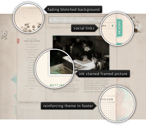
Today’s post highlights the design of MuttInk.com. Featuring an unorthodox layout, the design uses washed out browns, green blues and oranges as the primary color. Hand crafted illustrations employ irregular overlapping ink stains which can be seen on the sidebars and the main illustration, straight but smeared guider lines, the main site logo and creature illustrations in the sidebars. The entire layout is framed by large sidebars that use fading horizontal lines, further reinforcing the hand crafted sketches. The navigation menu in the header uses a beautiful and precise grid, and the same washed out green blue color for highlights. The only thing i would change is to make the fonts bigger for better legibility.

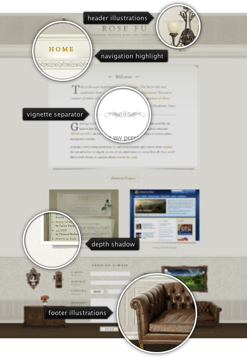
Today’s post highlights the design of RoseFu.net. Set in a soothing beige theme, it uses a pervasive and consistent illustration motive that starts with vintage chandeliers in the header, continues with framed section in the main area and is completed with a full furniture set that frames the footer contents. The vintage tone set by the color scheme is reinforced by using tapestry background texture and antique look of chandeliers, furniture and wall hangings. Note how the davenport and the chest add depth to the footer section by using shadows and lighting. Vignette separators and borders in the main area complete the overall look. The main section has a lot of whitespace around the elements, and features a simple and strong two-column grid that aligns well with the main header navigation menu.

