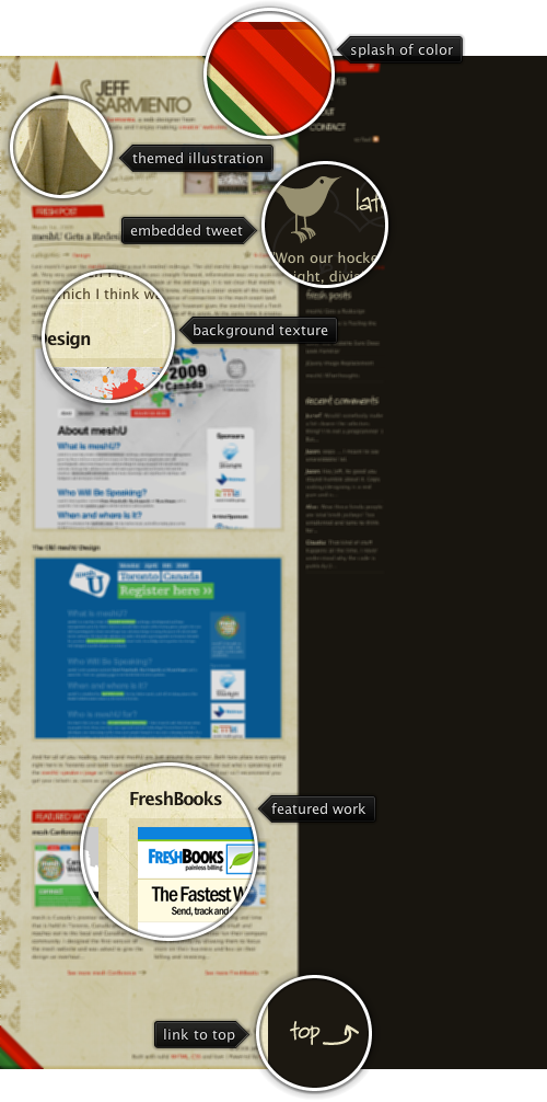
Today’s post highlights the design of JeffSarmiento.com. Set in earthen brown colors, it uses splashes of strong reds, greens and oranges in header / footer diagonal stripes to add a vibrant touch. This approach can also be seen in the illustration of the rocket ship that uses saturated orange colors atop the otherwise themed hull. The design is rife with hand drawn illustrations. These include the header titles, post title underline, stars / arrows next to some of the links, background illustrations for the tweet section and the rocket ship, as well as background texture for the main column.
The navigation menu deserves special attention. While most of the sites place it along the top or the left edge, this site places the navigation menu along the right edge. To alleviate the proximity to the string saturated stripes of color right next to it, the menu items use large font with custom kerning. To further reinforce the importance of the elements, each navigation item uses one of the adjacent colors for its background – red, orange, yellow, green and brown. Move the mouse over the navigation menu to see additional hand-drawn illustrations.
Flamingo component suite began its life in January 2006 when Rick Jeliffe of Topologi has contacted me and proposed to open-source their own implementation of the breadcrumb bar component. In the years since i have hacked at different pieces of the breadcrumb bar implementation. As with any significant piece of code that you get to maintain and extend, it takes some time to find your way around the code, and this was no exception.
Piece by piece i cleaned the component API, refactored the code into the model and UI delegates and integrated the API with the command button panel. The last (almost) untouched piece was the painting of individual segments. It was rather cumbersome, and i finally got around to replacing it all with command buttons. This not only helped removing a lot of code that was implementing the same functionality available in command buttons, but also pointed out missing pieces that were added in the last few weeks to command buttons and command popup menus.
If you’re using the breadcrumb bar component in your application, you should not see any difference – except more polished look. If you’re using command buttons in your application, here are a couple of tips on how to use them to their fullest potential. First, a screenshot of a file explorer that uses the breadcrumb bar (under the Gemini skin from Substance look-and-feel):

When the breadcrumb segment is inactive, its arrow points to the side. When the mouse is over the arrow icon, the arrow points downwards. Here is how the command button is configured:
button.setDisplayState(CommandButtonDisplayState.MEDIUM);
button.setPopupOrientationKind(CommandButtonPopupOrientationKind.SIDEWARD);
button.setHGapScaleFactor(0.75);
button.getPopupModel().addChangeListener(new ChangeListener() {
   @Override
   public void stateChanged(ChangeEvent e) {
      PopupButtonModel model = button.getPopupModel();
      boolean displayDownwards = model.isRollover()
            || model.isPopupShowing();
      CommandButtonPopupOrientationKind popupOrientationKind = displayDownwards ?
            CommandButtonPopupOrientationKind.DOWNWARD
            : CommandButtonPopupOrientationKind.SIDEWARD;
      button.setPopupOrientationKind(popupOrientationKind);
   }
});
First, we configure the button to be in MEDIUM display state (small icon and text right beside it), set the popup orientation kind to SIDEWARD and set the horizontal gap scale factor to 0.75 (to have smaller horizontal gap between the icon, text and arrow). Then, we add a ChangeListener to the button’s popup model. The listener checks to see if the mouse is over the popup area with PopupButtonModel.isRollover() or the popup is showing with PopupButtonModel.isPopupShowing(). Then we call JCommandButton.setPopupOrientationKind with DOWNWARD if either condition holds, or SIDEWARD otherwise. This is it – and using only published JCommandButton APIs.
If you use the breadcrumb bar in your application, try showing the popup menu and then move the mouse along the breadcrumb bar while the popup menu is showing. You will see that when you move the mouse over the popup area of another segment, the breadcrumb bar will automatically show the popup menu for that segment – without a need to click it. Here is the relevant code:
button.getPopupModel().addChangeListener(new ChangeListener() {
   boolean rollover = button.getPopupModel().isRollover();

   @Override
   public void stateChanged(ChangeEvent e) {
      SwingUtilities.invokeLater(new Runnable() {
         @Override
         public void run() {
            boolean isRollover = button.getPopupModel()
                  .isRollover();
            if (isRollover == rollover)
               return;

            if (isRollover) {
               // does any *other* button show popup?
               for (JCommandButton bcbButton : buttonStack) {
                  if (bcbButton == button)
                     continue;

                  if (bcbButton.getPopupModel().isPopupShowing()) {
                     // scroll to view
                     scrollerPanel.scrollToIfNecessary(button
                           .getBounds().x, button.getWidth());
                     // simulate click on the popup area
                     // of *this* button
                     button.doPopupClick();
                  }
               }
            }

            rollover = isRollover;
         }
      });
   }
});
What do we have here? Once again, we add a ChangeListener to the popup model of every segment. In the listener we are tracking changes to the rollover state. If we detect a change, and the new value is true, we go over all the buttons in the breadcrumb bar and try to locate a button that displays the popup menu (there can only be at most one at any time). If we found any – using PopupButtonModel.isPopupShowing() – it means that we need to show the popup menu for our button. We ask the scroller panel that wraps the breadcrumb bar to scroll our button so that it becomes full visible (more on this in the next blog entry) and then call JCommandButton.doPopupClick(). Internally this is handled as a regular mouse click on the popup area – dismissing the current popup menu, invoking the popup callback of our button to return the popup menu and displaying the popup menu aligned with our button.
In addition to being able to use the powerful published APIs of the command buttons, the breadcrumb bar now looks much better – both under core look-and-feels, and under the different Substance skins. The screenshot above shows the breadcrumb bar under Gemini skin that uses dark background for the header section. The breadcrumb bar gets all the right visuals since it is now implemented with command buttons which get all the right colors, and rollover animations.
If you want to take the new breadcrumb bar (with the same external APIs) for a spin, you will need the following:
Note that the last two are required if you’re running your application under one of Substance skins. You will need the 6.1dev drop of Substance Flamingo plugin – the latest 5.0dev drop of Flamingo core is incompatible with the 6.0 release of Substance Flamingo plugin – as mentioned before.

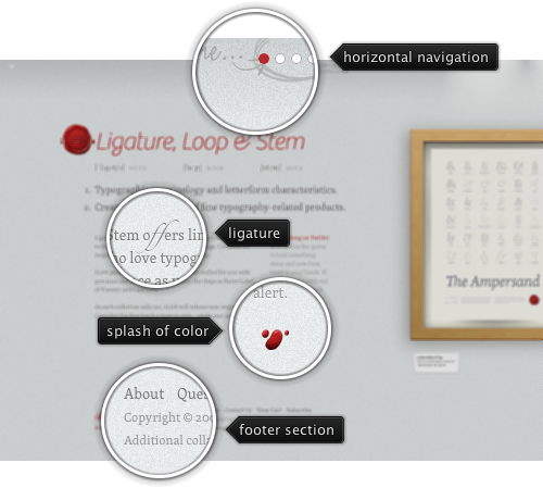
Today’s post highlights the design of LigatureLoopAndStem.com. With finely-grained background texture, plenty of white space, excellent typography and splash of red color to offset the monochrome color scheme it is a perfect example of minimalistic web design. The main page provides a few visual clues to use horizontal navigation. The clues include the explanation text on the navigation bar, cut-off screenshot of the first poster and the small arrow icons in the top-left and top-right corners.

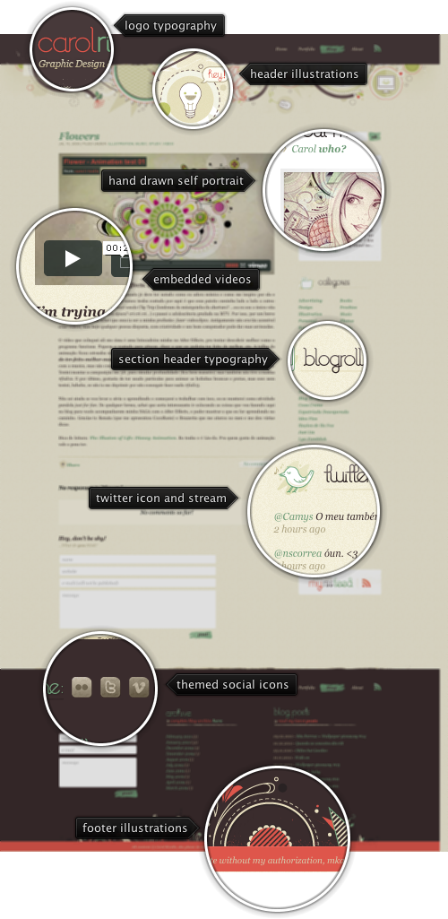
Today’s post highlights the design of CarolRivello.com. The site features intricate hand-drawn illustrations in the header and footer sections, using the primary dark brown, dark orange and desaturated bottle green colors. Hand-drawn illustrations are pervasive throughout the site – used as leading artwork for all blog entries, self-portrait in the “about me” section, section header icons and felt-tip backgrounds for the buttons. The same desaturated bottle green is used for all the links, with the exception of footer section headers which are not clickable. Dark orange is used when the mouse is hovering over the links, and for the footer section sub-headers. The hand-drawn theme is further reinforced by custom typography and unusual ligatures in the main site logo and all section headers. When you visit the site, move the mouse over the navigation menu (both header and footer) for nice animated rollover effects.
