Meet the Green Goblin, part 3
Last Friday we announced a significant update to the Android Market client. A whole slew of features went into this update (and many more are to come), and this week the pixel geek in me will be talking about the new visual design of the application. Today it’s time to dive into the mechanics behind the swooshy header. The new green header is used in all Market client screens, creating visual continuity throughout the various browsing and purchasing flows. It has a whole bunch of different gradients and highlight streaks, but there’s one important thing to notice – the visuals are the same no matter the size of the header or the orientation of the device. Here is the new header in home screen under portrait mode:

And here is the header of the same screen under landscape mode:

Note how the long diagonal highlight streak that starts around the top-left corner and goes towards the bottom-right corner always intersects the curved edge – bottom in portrait and right in landscape. Let’s see the header in the portrait category listing page:

There are a couple of things worth noticing. First, the visual design maintains the connection to the main browsing pages by adding a curved bottom edge to the tab strip. Second, note how the main header visuals are maintained here without being vertically squished. The long diagonal highlight streak still intersects the curved edge, but much closer to the left edge, and you don’t even see the double converging highlights that run in the bottom part of the taller header. And here is the same header for search results (also used in my apps and all the purchase pages):

With even less height, squishing the full visuals would look very bad; instead, we only show some of the highlight streaks.
And now the fun part – how is this implemented? It’s highly recommended to always consider using nine-patch images as your first choice. It allows you to separate the visual styling from the application functionality, skin controls of different sizes in a consistent manner and take advantage of hardware acceleration (when available) since the vast majority of the system controls are styled using nine-patches. Is this what we’re currently using for the new Market client? No. Let’s see why.
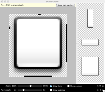
Nine-patches are great if you have visual areas that are “stretchable”. Take a look at the images in the official documentation:

Nine-patch is just a 3*3 grid. The four corners are not scaled at all and are well-suited for rounded corners and varying drop-shadows. The top and bottom pieces are stretched horizontally, while the left and right pieces are scaled vertically. Finally, the center piece is scaled along both axes. This means that if you place any non-linear gradient or path in one of the non-corner areas, it will be stretched. Looking back at the target visuals of the new green header, you can see that there is nothing that can be stretched without ruining the visual appearance. While you can stretch most of the gradients, what about the highlight streaks? Scaling them up or down would result in blurry or pixelated paths. What about the curved edges? As mentioned in the first installment, the actual arc curvature depends on the pixel size of the screen, and scaling a curved anti-aliased path would result, once again, in either blurry or pixelated visuals. Less ass than what we had before, but ass nonetheless.
So instead, we’re drawing the new header visuals in code. There are no images, just a whole bunch of trigonometry, geometry and a few selected Canvas calls. The next screenshot shows a rough analysis of the swooshy header

Here we identify a number of different areas, each one with its own contour and gradient, and a number of highlight streaks, each with its own path, thickness and gradient. I could probably write another 3-4 blog entries documenting all the pixel-level details of the implementation; join the team to see the code. Just a few points worth mentioning:
- Never ever ever allocate new objects in your custom layout or draw methods, especially if you’re doing any type of animation. Allocating lots of small objects makes garbage collector sad and your animations jerky.
- Call setWillNotDraw(false) in the constructor of your custom view group that implements the onDraw(Canvas). Otherwise your custom drawing will not be called. If your custom view does not extend the ViewGroup, no need to call this method.
- Canvas.clipPath(Path) is your friend for any non-trivial custom painting code. Surround it with Canvas.save() and Canvas.restore() so that you don’t need to worry about subsequent graphic calls on the Canvas object. But make absolute sure that they match – if you call Canvas.restore() one too many times, it will affect the visual appearance in most unpredictable ways. You can also use a more reliable Canvas.restoreToCount() – thanks to Romain for the tip.
- If your clip path contains diagonal lines or arcs and you then call Canvas.drawPath when the paint style is FILL, you will end up with aliased edge (diagonal or curved). Instead, you will need to compute the clipped path yourself (brush up on your trig). Don’t forget to call Paint.setAntiAlias(true). This may be less noticeable on higher-density screens such as Droid X or Nexus S, but is extremely visible on lower end hardware such as G1 or Flipout.
- Drop shadows that follow custom paths are tricky. Our design calls for a translucent drop shadow that follows the curved arc. After trying a number of options, with Paint.setShadowLayer and RadialGradient among them, the most performant one turned out to be drawing a series of arcs. The arcs start from the thickest stroke with the lowest alpha and progress towards the thinnest stroke with the highest alpha. There is no best option that fits all requirements. It depends on the specific visuals that you’re looking for and how heavy the performance aspect of each specific implementation is.
- Gradients that use translucent or transparent colors should use the RGB values that match the background color (more info here).
- Don’t use direct pixel values. Multiply all such values by the Context.getResources().getDisplayMetrics().density.
- Don’t use hard coded colors. Extract them to res/colors.xml and load them once with Resources.getColor().
- Math is your friend. Don’t be afraid of it.
- Never ever ever allocate new objects in your custom layout or draw methods, especially if you’re doing any type of animation. Allocating lots of small objects makes garbage collector sad and your animations jerky.

That’s it for today. Tomorrow i’ll talk about various random bits and pieces.